
 Jayavigneshwaran G
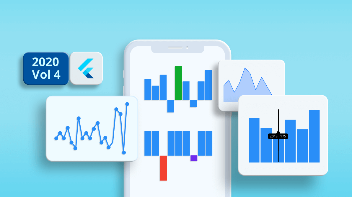
A new Spark Charts (Sparkline Charts) widget has been added to the Syncfusion Flutter platform in the 2020 Volume 4 release. It is a lightweight chart that can fit in a very small area. With this chart, you can elegantly display trends in the data and convey quick information to the user. It has simplified APIs to populate and visualize data quickly.
Some of the use cases of spark charts are as follows:
- You can easily place it in a data grid cell.
- It can also be placed inline of paragraph text.
- You can use it to visualize the CPU performance and disk usage with a real-time live chart in the Windows task manager, etc.
The Flutter Spark Charts widget comes with the following key features:
- Four chart types
- Data binding
- Three axis types
- Markers and data labels
- Plot band
- Trackball
- Special point customization
Let’s look at them along with code examples!
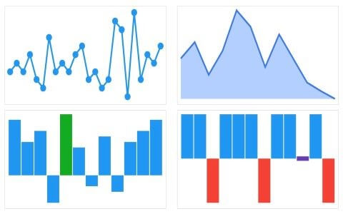
Chart types
The Spark Charts widget supports the following four chart types. Each one is implemented as a separate widget.
| Chart type | Widget | Usage |
| Line chart | SfSparkLineChart | Used to identify patterns and trends in data, such as seasonal effects, with large changes and turning points over a period of time. |
| Area chart | SfSparkAreaChart | Used when the magnitude of a trend is to be communicated rather than individual data values. |
| Bar (Column) chart | SfSparkBarChart | Used to compare several items in a specific range of values. |
| Win loss chart | SfSparkWinLossChart | Used to show whether each value is positive or negative while visualizing a win/loss scenario. |
Refer to the following code example for the Sparkline Charts.
[Dart]
@override
Widget build(BuildContext context) {
  return Container(
    child: SfSparkLineChart()
  );
}
Data binding
Spark Charts accept both one- and two-dimensional data as input.
In one dimensional data binding, use the default constructor while binding a list of numeric values to the spark charts. Those numeric values will be considered y-values and their corresponding linear index values (0, 1, 2, …) will be considered x-values internally in this case.
Refer to the following code example.
[Dart]
SfSparkAreaChart(
  data: <double>[10, 6, 8, 11, 5]
)
As mentioned already, you can bind two-dimensional data to the Flutter Spark Charts widget. You can also bind custom x- and y-values, i.e. numeric, category and date-time values can be bound in this case. The x- and y-values will be displayed in the trackball tooltip. You can bind the custom data source to spark charts using the custom constructor in the widget class.
Refer to the following code example.
[Dart]
SfSparkAreaChart.custom(
  dataCount: 5,
  xValueMapper: (index) => data[index].xval,
  yValueMapper: (index) => data[index].yval
)

final List<SalesData> data = [
  SalesData(xval: 'John', yval: 10),
  SalesData(xval: 'Mary', yval: 6),
  SalesData(xval: 'Michael', yval: 8),
  SalesData(xval: 'Joy', yval: 11),
  SalesData(xval: 'Jack', yval: 5)
];

class SalesData {
  SalesData({this.xval, this.yval});
  final String xval;
  final double yval;
}
Axis types
Spark Charts support the following axis types:
- Numeric
- Category
- Date-time
Note: A Spark Charts’ x-value can be any one of these data types and y-value should always be numeric.
As stated in the previous topic, you can bind the custom data source to spark charts using the custom constructor. In the following code snippet, a date-time value is bound to the spark chart.
[Dart]
SfSparkBarChart.custom(
  dataCount: 5,
  xValueMapper: (index) => data[index].xval,
  yValueMapper: (index) => data[index].yval
)

final List<SalesData> data = [
  SalesData(xval: DateTime(2018, 0, 1), yval: 4),
  SalesData(xval: DateTime(2018, 0, 2), yval: 4.5),
  SalesData(xval: DateTime(2018, 0, 3), yval: 8),
  SalesData(xval: DateTime(2018, 0, 4), yval: 7),
  SalesData(xval: DateTime(2018, 0, 5), yval: 6)
];

class SalesData {
  SalesData({this.xval, this.yval});
  final DateTime xval;
  final double yval;
}
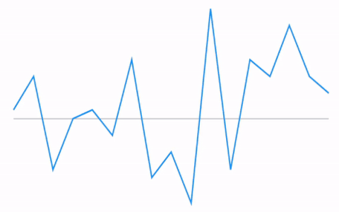
Marker and data labels
Marker
A marker is used to provide information about the exact point location in Spark Charts. You can add a shape to adorn each data point. You can also enable and customize the markers using the marker property. It can be enabled for all the data points or for the high, low, first, or last data points.
Note: The markers are applicable only to line and area chart types.
Refer to the following code example.
[Dart]
SfSparkLineChart(
marker: SparkChartMarker(
borderColor: Colors.orange,
borderWidth: 2,
displayMode: SparkChartMarkerDisplayMode.all
)
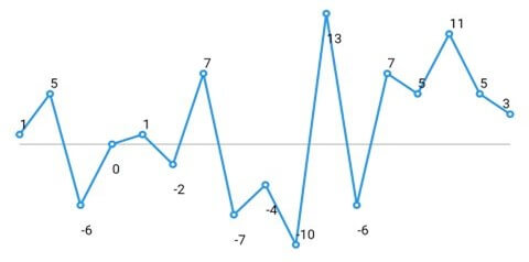
)Data labels
Data labels are used to display the values of data points to improve the readability of a chart. You can easily display labels by setting values to the labelDisplayMode property. Like the markers, data labels can also be enabled for all the data points or for the high, low, first, or last data points.
Refer to the following code.
[Dart]
SfSparkLineChart(
  labelDisplayMode: SparkChartLabelDisplayMode.all
)
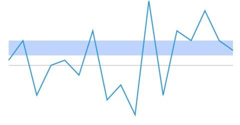
Plot band
Plot bands are used to highlight a particular region in the Spark Chart’s vertical axis. You can easily render a plot band by specifying the start and end range and fill color values.
Refer to the following code example.
[Dart]
SfSparkLineChart(
  plotBand: SparkChartPlotBand(
    start: 5,
    end: 8,
    color: Colors.blue
  )
)
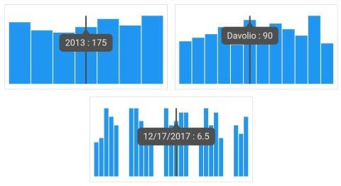
Trackball
This feature allows you to display the tooltip for the data points closest to the point you touch in the chart area. This feature can be used instead of the data label feature when you cannot show data labels for all the data points due to space constraint.
You can activate the trackball feature by using the activationMode property. Once it is activated, it will appear in the UI. You can move it by touching it in the chart.
Refer to the following code example.
[Dart]
SfSparkLineChart(
  trackball: SparkChartTrackball
  (
    width: 2,
    color: Colors.black,
    activationMode: SparkChartActivationMode.doubleTap
  )
)
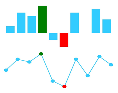
Special point customization
The color of special points, such as high, low, first, and last data points, can be customized to highlight them. For example, in the win-loss chart type, you can easily customize the tie point color.
Refer to the following code example.
[Dart]
SfSparkBarChart(
  highPointColor: Colors.green,
  lowPointColor: Colors.red
)
Useful links
If you want more information about our new Flutter Spark Charts widget, please refer to the following links:
Conclusion
I hope you now have a clear idea of the Flutter Spark Charts widget and its features. It will be useful wherever you wish to fit a chart in a very small area in your Flutter applications. This widget is available in our 2020 Volume 4 release.
Browse our documentation to learn more about our Flutter widgets. You can also see Syncfusion’s Flutter app with many examples in this GitHub repo. Don’t miss our demo app in Google Play and the App Store.
If you aren’t a customer yet, you can try our 30-day free trial to check out these features.
Also, if you wish to send us feedback or would like to submit any questions, please feel free to post them in the comments section of this blog post. You can also contact us through our support forum, feedback portal, or Direct-Trac support system. We are always happy to assist you!
 No spam, just valuable updates.