
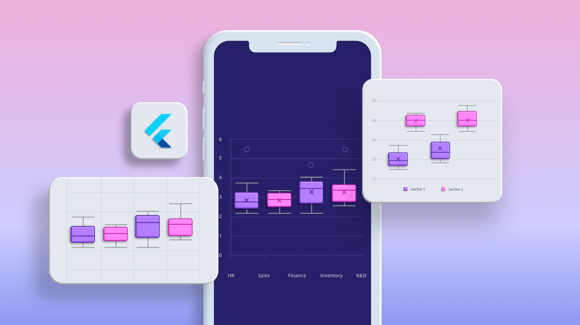
Our Syncfusion Flutter Charts widget provides 30+ of the most popular and widely used charts, like line, column, bar, pie, and doughnut. These charts include rich, interactive, customizable features that serve a world-wide audience with globalization and localization features.
To add to our collection, we have included the following two new chart types in our Flutter Charts widget in this 2020 Volume 3 release:
In this blog, I will walk you through how to create a box and whisker chart and the features available in it. The waterfall chart will be explained in another, separate blog. Besides these chart types, we have also implemented and included various new features in Flutter Charts. You can find details about those in this blog: What’s New in 2020 Vol 3: Flutter Charts.
Let’s explore the features of the new box and whisker chart!
Overview
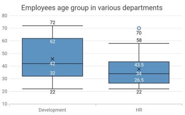
The box and whisker chart is used to visualize a group of numerical data through their quartiles. It is also referred to as box plot chart. Box plots may also have lines extending vertically from the boxes (whiskers) indicating variability outside the upper and lower quartiles.
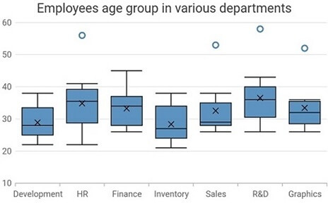
The box and whisker chart takes the following values as input.
| Value | Type | Description |
| X | Int/ Double/ String/ DateTime | X-axis value of the data point. |
| Y | List of int or double values | Y-axis value of the data point. |
Based on the data, the following values will be determined:
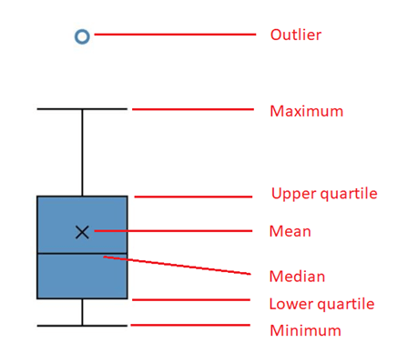
- Minimum
- Maximum
- Median
- Mean
- Lower quartile
- Upper quartile
- Outliers
The following image shows the elements in a box and whisker chart.
To render a box and whisker chart, create an instance of the BoxAndWhiskerSeries and add it to the series collection property of SfCartesianChart.
Refer to the following code.
[Dart]
SfCartesianChart(
  series: <BoxAndWhiskerSeries<ChartData, String>>[
    BoxAndWhiskerSeries<ChartData, String>(
      dataSource: <ChartData>[
        ChartData('Development', [22, 22, 23, 25, 25, 25, 26, 27, 27]),
        ChartData('HR', [22, 24, 25, 30, 32, 34, 36, 38, 39, 41]),
        //...
      ],
      xValueMapper: (ChartData data, _) => data.x,
      yValueMapper: (ChartData data, _) => data.y
    ),
  ]
)
Box plot mode
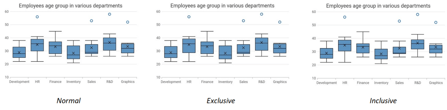
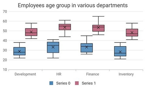
The following are the three different modes of box plot rendering:
- Exclusive: The quartile values are calculated using the formula (N+1) * P (N count, P percentile), and their index value starts from 1 in the list.
- Inclusive: The quartile values are calculated using the formula (N−1) * P (N count, P percentile), and their index value starts from 0 in the list.
- Normal: The quartile values are calculated by splitting the list and getting the median values.
The required box plot mode can be achieved by specifying the values to the boxPlotMode property. The default value is BoxPlotMode.normal.
Refer to the following code.
[Dart]
SfCartesianChart(
  series: <BoxAndWhiskerSeries<ChartData, String>>[
    BoxAndWhiskerSeries<ChartData, String>(
      dataSource: boxAndWhiskerData,
      xValueMapper: (ChartData data, _) => data.x,
      yValueMapper: (ChartData data, _) => data.y,
      boxPlotMode: BoxPlotMode.normal
    )
  ]
)
Mean value
A cross symbol is displayed in the box and whisker chart to indicate the mean value. It can be either displayed or hidden by specifying a value to the showMean property. The default value is true.
Refer to the following code.
[Dart]
SfCartesianChart(
  series: <BoxAndWhiskerSeries<ChartData, String>>[
    BoxAndWhiskerSeries<ChartData, String>(
      dataSource: boxAndWhiskerData,
      xValueMapper: (ChartData data, _) => data.x,
      yValueMapper: (ChartData data, _) => data.y,
      showMean: false
    )
  ]
)
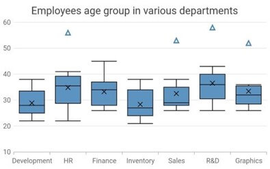
Outliers
The outliers are shown above the maximum quartile. To customize the appearance of an outlier, you can use the properties in the MarkerSettings class.
Refer to the following code.
[Dart]
SfCartesianChart(
  series: <ChartSeries<ChartData, double>>[
    BoxAndWhiskerSeries<ChartData, double>(
      dataSource: boxAndWhiskerdata,
      xValueMapper: (ChartData data, _) => data.year,
      yValueMapper: (ChartData data, _) => data.number,
      markerSettings: MarkerSettings(
        shape: DataMarkerType.triangle
      )
    )
  ]
)
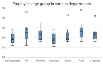
Width and spacing customization
Similar to the column chart, the width and spacing of the data points in the box and whisker chart can also be customized using the width and spacing properties in the series.
Refer to the following code.
[Dart]
SfCartesianChart(
  series: <BoxAndWhiskerSeries<ChartData, String>>[
    BoxAndWhiskerSeries<ChartData, String>(
      dataSource: boxAndWhiskerData,
      xValueMapper: (ChartData data, _) => data.x,
      yValueMapper: (ChartData data, _) => data.y,
      width: 0.5,
      spacing: 0.5
    )
  ]
)
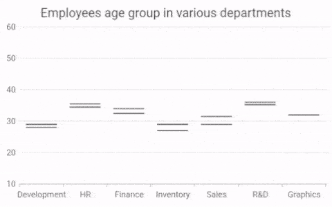
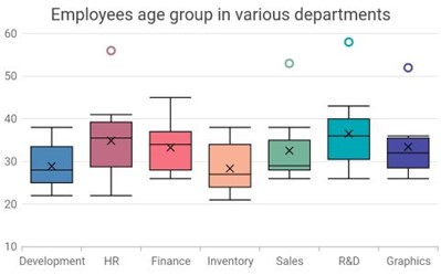
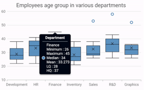
Other supported features
As with other chart types, all major chart features are supported: data labels, animation, multiple series, side by side series placement, inversed axis, transposed axis, legend, tooltip, zooming and panning, etc.
Refer to the following images.
Helpful links
For more details about the box and whisker chart type, you can refer to the following links:
Conclusion
I hope you now understand the box and whisker chart and its available functionalities in Syncfusion Flutter Charts. With this chart type, you can compare data sets from various categories. You can download this widget in our 2020 Volume 3 release.
If you aren’t a customer yet, you can try our 30-day free trial to check out these features.
Also, if you wish to send us feedback or would like to submit any questions, please feel free to post them in the comments section of this blog post. You can also contact us through our support forum, feedback portal, or Direct-Trac support system. We are always happy to assist you!


 No spam, just valuable updates.