
TL;DR: Picking the perfect chart for your income and expense data is key! Explore 7 effective Flutter chart types to illuminate your financial insights, from classic column charts to informative waterfall charts. Explore and choose the chart that best suits your financial story.
Income and expense tracking is crucial to any business, no matter if it’s a start-up or a well-established company. For entrepreneurs, income and expenses will be the first things they need to track to assess how well their business runs. Charts play an important role in visualizing these numbers. However, you should carefully choose the appropriate chart type for your data story to convey information clearly. In this blog, I will walk you through the seven best chart types for visualizing your income and expenditure details.
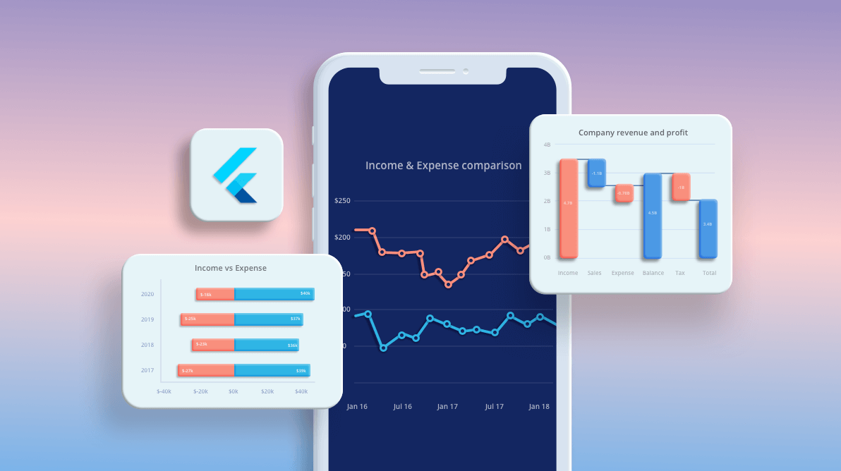
I have used the Syncfusion Flutter Charts widget to illustrate the chart types, but they are not limited to Flutter, and you will find these chart types in other platforms as well.

#1 Column Chart
The Flutter Column Chart, also known as the vertical bar chart, uses vertical bars to display different values for one or more items. It is the most common chart type used to compare values across categories.
In our case, you can visualize various scenarios like comparing your income and expense details across various years, comparing a single year’s data divided into various categories, comparing your details with a competitor’s, etc.
In the following example, I show the income and expense details of several years using two-column series.
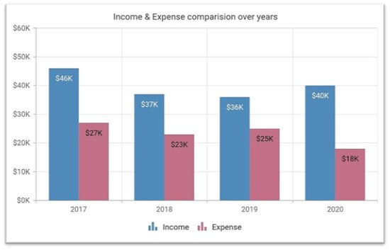
You can use the ColumnSeries class in the SfCartesianChart widget from the Syncfusion Flutter Charts to achieve this output.
Refer to the following code example.
SfCartesianChart(
series: <ColumnSeries<ChartData, num>>[
ColumnSeries<ChartData, num>(
dataSource: incomeData,
xValueMapper: (ChartData data, _) => data.x,
yValueMapper: (ChartData data, _) => data.y,
name: 'Income'
),
ColumnSeries<ChartData, num>(
dataSource: expenseData,
xValueMapper: (ChartData data, _) => data.x,
yValueMapper: (ChartData data, _) => data.y,
name: 'Expense'
)
]
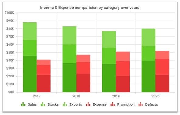
)Similarly, you can use the Stacked Column Chart if you wish to split up the income and expense columns and compare them across various categories. This gives you an in-depth picture of which category contributes to more income, etc. You can use the StackedColumnSeries class in the SfCartesianChart widget to achieve this.
Note: For more details, please refer to our Flutter web Column Chart demo and documentation.
#2 Waterfall Chart
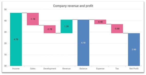
The Flutter Waterfall Chart shows gradual changes in the quantitative value of an entity that is subject to change by increments or decrements. This is one of the best chart types for visualizing income, expenses, and profit/loss details. We can specify the incomes as positive values and expenses as negative values. We can also display different colors for positive, negative, intermediate, and total data points to differentiate them from one another.
In the following example, I have plotted revenue and expense details in various categories, along with the net profit at the end. This is achieved by using the WaterfallSeries class from the SfCartesianChart widget.
Refer to the following code example.
SfCartesianChart(
  series: <WaterfallSeries<ChartData, String>>[
    WaterfallSeries<ChartData, String>(
      dataSource: chartData,
      xValueMapper: (ChartData data, _) => data.x,
      yValueMapper: (ChartData data, _) => data.y,
      intermediateSumPredicate: (ChartData data, _) => data.intermediateSumPredicate,
      totalSumPredicate: (ChartData data, _) => data.totalSumPredicate,
      color: Color.fromRGBO(0, 189, 174, 1),
      negativePointsColor: Color.fromRGBO(229, 101, 144, 1),
      intermediateSumColor: Color.fromRGBO(79, 129, 188, 1),
      totalSumColor: Color.fromRGBO(79, 129, 188, 1)
    )
  ]
)
If you wish to compare values from previous years, then you can use multiple series in a waterfall chart, or you can render multiple waterfall charts for them.
In the following example, I have transposed the chart and rendered a vertical waterfall chart for better understanding.
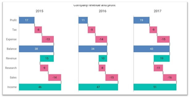
Note: For more details, please refer to this Flutter web Waterfall Chart demo and documentation.
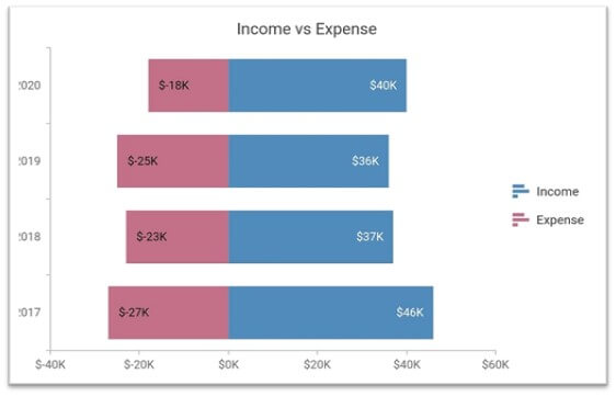
#3 Negative Stacked Bar Chart
The Flutter Stacked Bar Chart plots data points on top of each other using horizontal bars. Like in the waterfall chart, we can visualize the income with positive values and expenses with negative values, which forms the negative stacked bar chart. This gives a clear-cut comparison of the data.
This chart can be achieved using the StackedBarSeries class from the SfCartesianChart widget. In the following example, I have used two stacked bar series.
Refer to the following code example.
SfCartesianChart(
  series: <CartesianSeries<ChartData, num>>[
    StackedBarSeries<ChartData, num>(
      dataSource: incomeData,
      xValueMapper: (ChartData data, _) => data.x,
      yValueMapper: (ChartData data, _) => data.y,
      name: 'Income'
    ),
    StackedBarSeries<ChartData, num>(
      dataSource: expenseData,
      xValueMapper: (ChartData data, _) => data.x,
      yValueMapper: (ChartData data, _) => data.y,
      name: 'Expense'
    )
  ]
)
Note: For more details, please refer to this Flutter web Stacked Bar Chart demo and documentation.
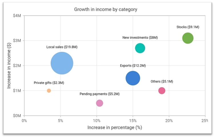
#4 Bubble Chart
The Flutter Bubble Chart is used to visualize 3-dimensional data. It takes three parameters as inputs: x, y, and the size values of the bubble. It can be used when you have to convey additional information to the users.
In the following example, various categories that contribute to the income are plotted. The x-axis value depicts the increased percentage over the last year, the y-axis value depicts the increased value over the last year, and the size of the bubble represents the exact value.
From the chart below, we can conclude that the growth of exports is 15%, its value is increased by $1.3M, and its current value is $12.2M. Use the BubbleSeries class from the SfCartesianChart widget to achieve this.
Refer to the following code example.
SfCartesianChart(
  series: <BubbleSeries<IncomeData, num>>[
    BubbleSeries<IncomeData, num>(
      dataSource: chartData,
      xValueMapper: (IncomeData data, _) => data.x,
      yValueMapper: (IncomeData data, _) => data.y,
      sizeValueMapper: (IncomeData data, _) => data.size
    )
  ]
)
Note: For more details, please refer to this Flutter web Bubble Chart demo and documentation.
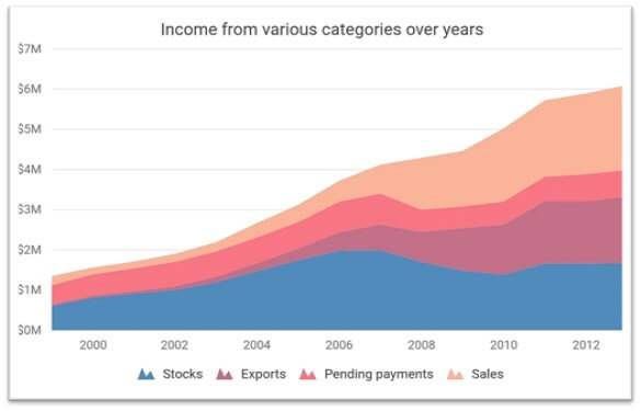
#5 Stacked Area Chart
In the Flutter Stacked Area Chart, the data points are stacked on top of each other. As this sums up a category’s values, you can see the overall contribution of each category and show the trend of the data.
In the following example, I have visualized income data divided by various categories over several years. Each category is visualized as a series. This is achieved using the StackedAreaSeries in the Cartesian chart widget.
Refer to the following code example.
SfCartesianChart(
  series: <CartesianSeries<ChartData, DateTime>>[
    StackedAreaSeries<ChartData, DateTime>(
      dataSource: stocks,
      xValueMapper: (ChartData data, _) => data.x,
      yValueMapper: (ChartData data, _) => data.y,
      name: 'Stocks',
    ),
    StackedAreaSeries<ChartData, DateTime>(
      dataSource: exports,
      xValueMapper: (ChartData data, _) => data.x,
      yValueMapper: (ChartData data, _) => data.y,
      name: 'Exports',
    ),
   // Two more series.
  ]
)
Note: For more details, refer to Flutter Stacked Area Chart demo and documentation.
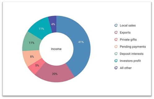
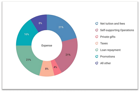
#6 Pie and doughnut charts
The Flutter Pie and Doughnut Charts are two widely used chart types that present data in a circular graph. They are used for visualizing various scenarios, but one main purpose for choosing them is to visualize percentage data, where the sum of all the slices will be 100.
In our case, we are going to visualize each category’s contribution toward income and expenses in percentages. The sum of all the categories will be 100%.
In the following example, I have used the DoughnutSeries class from the SfCircularChart widget.
SfCircularChart(
  series: <DoughnutSeries<ChartData, String>>[
    DoughnutSeries<ChartData, String>(
      dataSource: incomeData,
      xValueMapper: (ChartData data, _) => data.x,
      yValueMapper: (ChartData data, _) => data.y,
      name: 'Income'
    )
  ]
)
Similarly, you can use the pie series, as well. But one drawback of using these chart types is you have to use two charts for visualizing income and expense details separately.
Note: For more details, refer to the following:
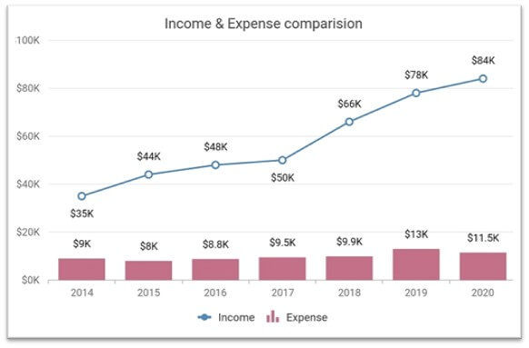
#7 Combination and mixed chart
The SfCartesianChart widget allows you to render a combination of different types of series, i.e. you can render two or more types of series in a single chart.
In the following example, I have used the line series to visualize income and the column series for the expenses. In this way, we can avoid confusion and enhance the readability of the data.
Refer to the following code example.
SfCartesianChart(
series: <CartesianSeries<ChartData, num>>[
LineSeries<ChartData, num>(
dataSource: incomeData,
xValueMapper: (ChartData data, _) => data.x,
yValueMapper: (ChartData data, _) => data.y,
name: 'Income'
),
ColumnSeries<ChartData, num>(
dataSource: expenseData,
xValueMapper: (ChartData data, _) => data.x,
yValueMapper: (ChartData data, _) => data.y,
name: 'Expense'
)
]
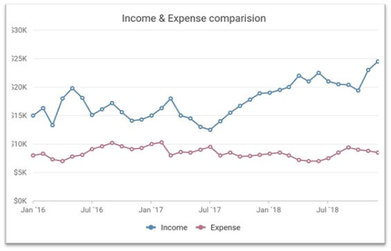
)If we want to compare huge amounts of data (for example, the past five years of monthly sales), the best option is to choose the line chart. From one, the user can understand trends quickly.
In the following example, I have rendered two line series. One is for the income, and other is for the expense details.
Note: For more details, please refer to this Flutter web combination chart demo and documentation.
Conclusion
Thanks for reading! We hope that these tips will help you to choose the right chart type for visualizing the income and expenses of a company. Check out our Charts component for other platforms besides Flutter, including:
Browse our documentation to learn more about our other Flutter widgets. You can also see our Syncfusion Flutter app with many examples in this GitHub repo. Don’t miss our demo app in Google Play and the App Store.
If you aren’t a customer yet, you can try our 30-day free trial to check out these features.
Also, if you wish to send us feedback or would like to submit any questions, please feel free to post them in the comments section of this blog post. You can also contact us through our support forum, feedback portal, or support portal. We are always happy to assist you!


 No spam, just valuable updates.