TL;DR: Celebrating our 50th Chart of the Week milestone, made possible by our readers’ steadfast support. Dive into the expertly crafted visualizations using Syncfusion Charts controls.
We’re thrilled to celebrate a golden milestone for our cherished Chart of the Week blog series! So far, we have published 50 insightful blogs in this series! We want to start by extending a heartfelt thank you to all our dedicated readers. Your engagement and support fuel our commitment to delivering high-quality blogs tailored to real-time scenarios.
Our mission has been to seamlessly blend real-time data with innovative, visually appealing designs using Syncfusion Chart controls. Throughout this series, we’ve explored various topics and scenarios, showcasing the flexibility and strength of Syncfusion Charts on both desktop and mobile platforms.
This milestone of 50 blog posts marks a significant accomplishment and fuels our excitement for the future. We’re incredibly grateful to have you join us on this data visualization journey every step of the way. Here’s to uncovering new topics, exploring uncharted territory, and crafting even more exceptional chart blogs in the weeks ahead!
Stay tuned! In this celebratory blog, we’ll recap the journey through these 50 insightful charting solutions that have empowered us to visualize and interpret data in innovative and impactful ways.
Top 10 articles that our users loved
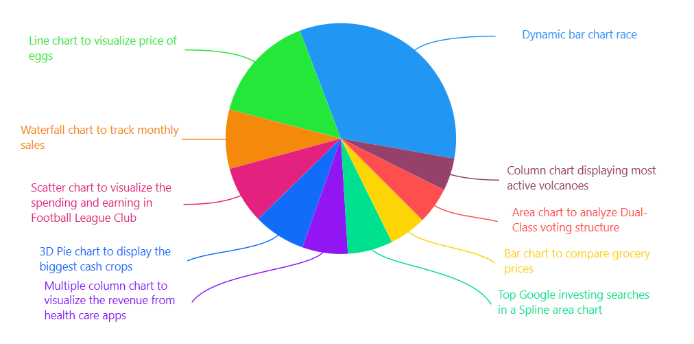
Let’s revisit some of the chart-toppers! The following image illustrates the top 10 articles that resonated most with our valued readers.
Charting the charts: Our top 3 hits!
Let’s highlight the top 3 articles that not only captured widespread attention and garnered positive reader feedback but also achieved impressive search engine rankings.
- Dynamic Bar Race Chart for the Top 10 Populations in the World: This blog ignited our users’ curiosity, offering a dynamic way to visualize population data for the world’s top 10 countries.
- Line Chart to Visualize the Surge in the US Egg Prices: Demonstrates how to create a line chart that effectively tracks the upward trend in the US egg prices, empowering you to stay informed and make smarter shopping decisions.
- Waterfall Chart to Track Monthly Sales: Any business must understand sales fluctuations. This blog showcased the power of waterfall charts, enabling you to visualize your monthly sales journey.
Unveiling data insights: A journey through top charts with UX focus
Let’s see some of our most popular charts, categorized by the specific user experience (UX) focus they address. This journey will equip you with the knowledge to choose the right chart type and effectively communicate the data.
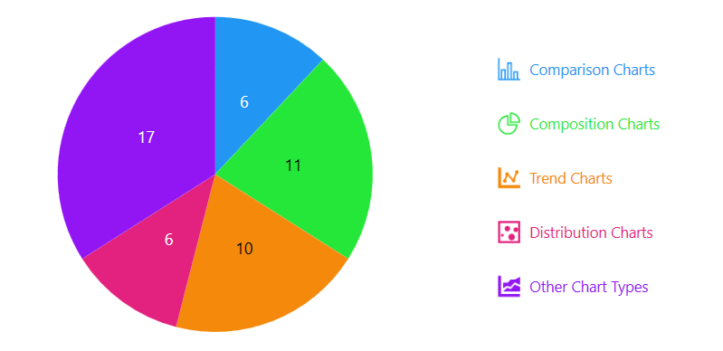
Before we delve into specific chart types, let’s take a quick look at the different UX focuses we’ll be exploring, along with the number of “Chart of the Week” blog examples featured for each category.
Refer to the following image.
1. Shining a light on comparisons: Charts for contrasting and comparing data
Comparison charts are ideal for showcasing differences or similarities between data points. They help viewers grasp trends and make comparisons quickly. Here are some top examples from our “Chart of the Week” series:
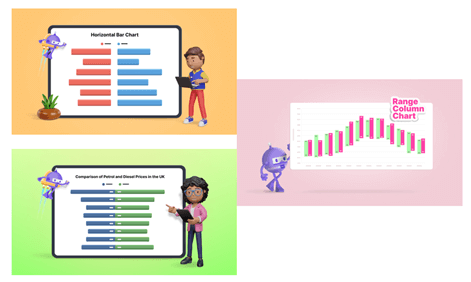
- Horizontal Bar Chart to Compare Grocery Prices Between Two Countries: Compares grocery prices, facilitating a straightforward assessment of price differences between the two countries.
- Range Column Chart to Compare Average Temperature Variations in Rome: Visually depicts temperature variations in Rome, enabling viewers to compare average temperatures over a specific period.
- Tornado Chart for Comparing Petrol and Diesel Prices in the UK: Comparing petrol and diesel prices in the UK, highlighting price differences between the fuels.
2. Unveiling data’s makeup: Charts for composition
This category would include entries that showcase using charts to show the composition of a whole. Here are some top examples from our “Chart of the Week” series:
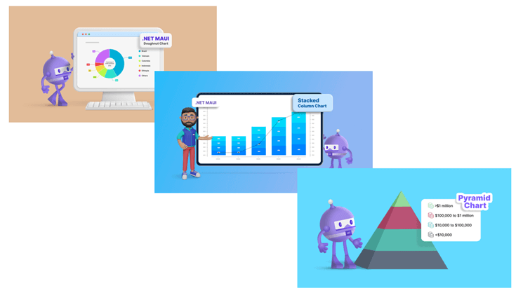
- Doughnut Chart for the World’s Top Coffee-Producing Countries: Clearly shows the proportional contribution of each major coffee producer to global production.
- Pyramid Chart for Global Wealth Distribution: Visualizes the distribution of wealth across different income groups, highlighting the concentration of wealth. Effectively depicts the hierarchical structure of wealth distribution (composite of income groups) within a society (composite chart’s whole).
- Stacked Column Chart for Global Smartphone Shipments: Visualizes how individual smartphone brands contribute to the market share.
3. Trend charts: Unveiling patterns over time
Trend charts are for visualizing changes in data over time. They help you identify patterns, track progress, and forecast future possibilities. Here are some examples from our “Chart of the Week” series:
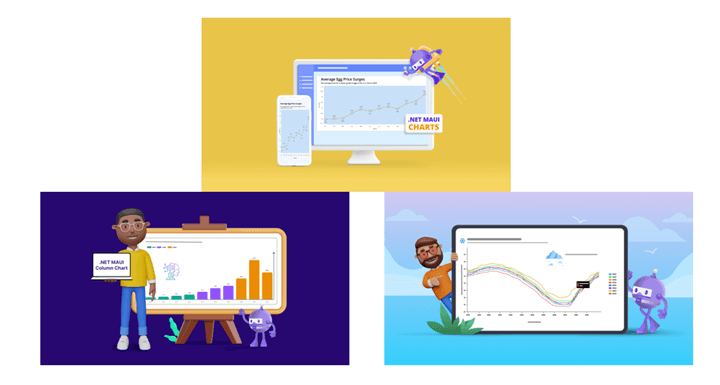
- Line Chart to Visualize the Surge in U.S. Egg Prices: Effectively tracks the upward trend of U.S. egg prices over time.
- Column Chart to Visualize Corporate Investment in Artificial Intelligence (AI): This chart depicts the trend of corporate investment in AI over time.
- Fast Line Chart to Visualize the Arctic Sea Ice Extent Since 2000: Clearly shows the decline in the Arctic Sea ice extent over the past two decades.
4. Distribution charts: Unveiling the data landscape
Distribution charts are powerful tools for understanding how your data points are spread out. They help you visualize your dataset’s central tendency, variability, and potential outliers. Here are some examples from our “Chart of the Week” series:
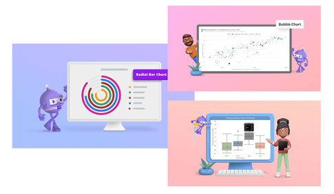
- Box and Whisker Chart for Machine Impact Test Analysis: Summarizes the distribution of machine impact test results, highlighting the median, quartiles, and potential outliers.
- Radial Bar Chart for the Most and Least Powerful Passports in 2023: Showcases the distribution of passport power rankings for different countries in 2023.
- Bubble Chart to Visualize Healthcare Spending and Life Expectancy Data: Visualizes the relationship between healthcare spending and life expectancy across different countries, with bubble size representing additional data points.
5. Other chart types: Expanding your visualization options
While comparison, composition, trend, and distribution charts are fundamental tools, a broader world of data visualization possibilities exists. Here are some “out of the box” examples from our “Chart of the Week” series that showcase the versatility of our charts:

- Sunburst Chart to Visualize the Most Popular Wikipedia Articles: Sunburst charts depict hierarchical relationships. This example explores the popularity of Wikipedia articles, visually connecting subcategories to broader categories.
- Error Bar Chart to Visualize the Thermal Expansion of Materials: Error bar charts effectively represent data with inherent variability. This example depicts the thermal expansion of materials, highlighting the range of potential expansion values for different materials.
- Pareto Chart to Identify Key Customer Complaints: A pareto chart combines a bar chart and a line chart, providing a powerful tool for identifying the vital few issues contributing to most problems. This is instrumental in customer service, allowing you to prioritize efforts for maximum customer satisfaction improvement.
6. Chart customization for enhanced visual appeal
Our “Chart of the Week” series goes beyond showcasing the power of different chart types. We also explore the art of chart customization to create visually engaging experiences.

Here are some examples:
- Custom Bar Chart for Global Renewable Energy Employment Trends: This customized bar chart shows male and female employees represented by distinct icons within the bar segments, adding a layer of visual interest.
- Column Chart to Visualize the Most Sustainable Milk: Each segment is shaped like a milk container in this custom chart. This playful customization instantly conveys the data’s theme and makes it more memorable for viewers.
- Bar Chart for the US’s Most Traded Goods with China: Customizing the bar segments can transform the default bar chart. Imagine incorporating images of the most traded goods alongside the data points. This creates a richer visual experience and allows viewers to connect the data points to tangible products.
These are just a few examples of how we leverage customization to create “Chart of the Week” entries that are informative and visually captivating.
Your feedback is invaluable to us. It guides the future direction of “Chart of the Week.” We invite you to actively participate by sharing your thoughts, questions, and chart requests in the comments below.
To ensure you remain up-to-date with the “Chart of the Week” series, we encourage you to subscribe to our blog series.
Conclusion
We extend a heartfelt thank you to our dedicated readers. Your continued engagement with the “Chart of the Week” series fuels our passion for delivering valuable content. Keep an eye out for thrilling advancements as we set sail into the next phase of “Chart of the Week”!
Current customers can download the new version of Essential Studio® from the License and Downloads page. If you are not a Syncfusion customer, try our 30-day free trial to check out our incredible features.
If you require assistance, please don’t hesitate to contact us via our support forum, support portal, or feedback portal. We are always eager to help you!


