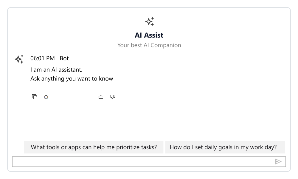
ESSENTIAL STUDIO® 2025 VOLUME 4
What's New in Essential Studio® for WinForms
2025 Volume 4 boosts our Windows Forms suite with row reordering and cross-grid movement for the DataGrid, precise value preservation in the Numeric TextBox, and an improved appearance for the disabled state in the DateTimePicker.
Common
- Added support for .NET 10 via dedicated assemblies.
- Added support for Visual Studio 2026.
.NET Core Designer support
Enhanced .NET Core Designer support with custom UITypeEditors and CollectionEditors for WinForms controls to simplify design‑time configuration.
UITypeEditor now supports custom editor UIs (such as color pickers, dropdowns, or dialogs) for properties in the property grid or Visual Studio designer across the following controls:
- Excel-like Grid: GridFontInfoEditor
- Tooltip: ToolTipInfoUITypeEditor
- Calculator: CalculatorCultureEditor
- Currency TextBox: CurrencyCultureEditor
- MaskedTextBox: MaskedEditCultureEditor
- TabControl: TabStyleEditor
- Docking Manager: DockAbilityEditor
- Ribbon: ToolStripItemsEditor
- Ribbon: MenuDropDownEditor
CollectionEditor provides a ready-made design-time dialog to add, remove, or edit items in collection properties (such as List
- Excel-like Grid: GridBaseStyleCollectionEditor
- GridGroupingControl: GroupingCollectionEditor
- Breadcrumb: CustomButtonCollectionEditor
- CommandBarController: CommandBarsCollectionEditor
- Ribbon: BackstageCollectionEditor
- Menu: BarItemsCollectionEditor
DataGrid
Row drag and drop
The drag-and-drop functionality lets users reorder rows in a grid and move rows between grids.

Grid Control
Load controls inside cells
The WinForms Grid control supports embedding controls directly within grid cells while maintaining smooth scrolling and interaction.
Numeric TextBox
Preserve data accuracy
To ensure precise calculations and reliable data processing, the Numeric TextBox supports retaining precise numeric values even when a formatted version is displayed. This enhancement helps maintain consistency between user-facing formats and back-end data operations.
DateTimePicker
Disabled state appearance
The appearance of the DateTimePicker’s text box in its disabled state is enhanced to ensure consistent styling with the applied themes.