
Welcome to the second blog of our blog series, Chart of the Week!
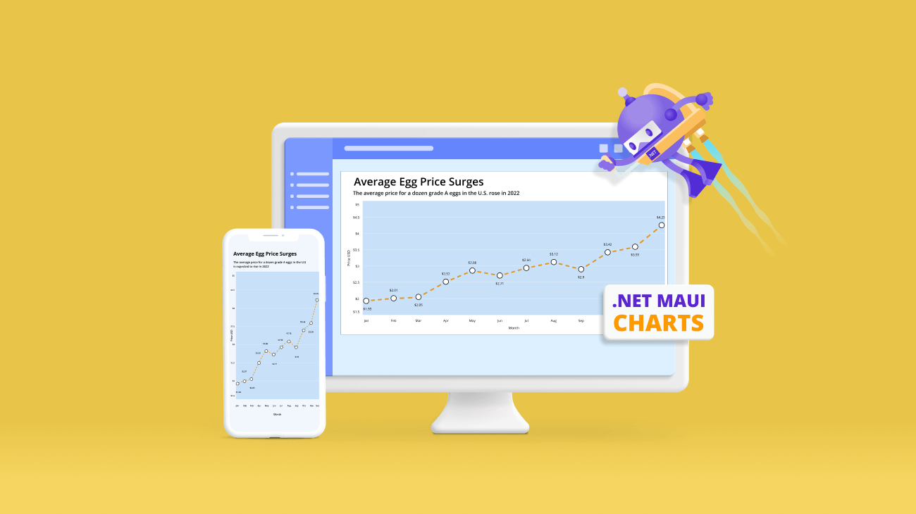
Today, we are going to create a line chart to visualize the rising average egg prices in the U.S. using the Syncfusion .NET MAUI line chart control. This control is supported on both desktop (Windows and MacCatalyst) and mobile platforms (Android and iOS).
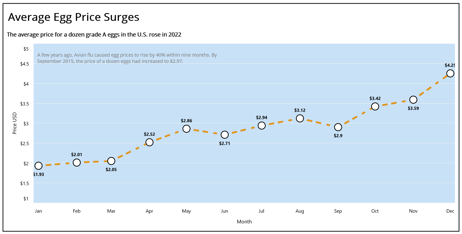
Due to avian influenza, the national average egg price in the United States has increased by 120% since the beginning of 2022. The national average cost for a dozen large, grade A eggs more than doubled, from $1.93 in January to $4.25 in December 2022.
Let’s see the steps to create a line chart visualizing the surge in U.S. egg prices in 2022 using the Syncfusion .NET MAUI line chart control.
Step 1: Gathering surge in egg price data
Before creating a chart, we should gather the egg price data from the United States consumer price index.
For this blog, we are obtaining data on the rise in egg prices from January to December 2022. You can also download it as a CSV file.
Step 2: Preparing the data for the chart
To create a line chart in .NET MAUI, we should provide the egg price data in a specific format. Therefore, create the EggPriceModel class to hold monthly data using the Month and AveragePrice properties.
Refer to the following code example.
public class EggPriceModel
{
    public DateTime Month { get; set; }
    public double AveragePrice { get; set; }

    public EggPriceModel(DateTime month, double averagePrice)
    {
       Month = month;
       AveragePrice = averagePrice;
    }
}
Next, generate the collection of egg prices with the help of the AverageEggPrices class and its AveragePrices property. Convert the CSV data to a collection of egg prices using the ReadCSV method and store it in the AveragePrices property.
public class AverageEggPrices
{
    private List<EggPriceModel> averagePrices;
    public List<EggPriceModel> AveragePrices
    {
       get{ return averagePrices; }
       set
       {
          averagePrices = value;
       }
    }

    public AverageEggPrices()
    {
        AveragePrices = new List<EggPriceModel>(ReadCSV());
    }

    public IEnumerable<EggPriceModel> ReadCSV()
    {
        Assembly executingAssembly = typeof(App).GetTypeInfo().Assembly;
        Stream inputStream = executingAssembly.GetManifestResourceStream("EggPriceChart.Resources.Raw.eggpricechart.csv");

        string? line;
        List<string> lines = new List<string>();

        using StreamReader reader = new StreamReader(inputStream);
        while ((line = reader.ReadLine()) != null)
        {
           lines.Add(line);
        }

        return lines.Select(line =>
        {
           string[] data = line.Split(',');
           DateTime date = DateTime.ParseExact(data[0], "MMMM", CultureInfo.InvariantCulture);
           return new EggPriceModel((date), Convert.ToDouble(data[1]));
        });
   }
}
Step 3: Configuring the Syncfusion .NET MAUI Cartesian Charts
Let’s configure the Syncfusion .NET MAUI Cartesian Charts control using this documentation.
Refer to the following the code example.
<chart:SfCartesianChart >
 <chart:SfCartesianChart.XAxes>
  <chart:DateTimeAxis >
  </chart:DateTimeAxis>
 </chart:SfCartesianChart.XAxes>

 <chart:SfCartesianChart.YAxes>
  <chart:NumericalAxis>
  </chart:NumericalAxis>
 </chart:SfCartesianChart.YAxes>
</chart:SfCartesianChart>
Step 4: Binding egg price data
Now, let’s bind the egg price data in the chart using the LineSeries. Refer to the following code example.
<chart:LineSeries XBindingPath="Month" YBindingPath="AveragePrice" ItemsSource="{Binding AveragePrices}">
</chart:LineSeries>
In this example, we bound our chart to the AveragePrices property containing the monthly egg price data. We have also specified the x and y critical paths with the Month and AveragePrice properties, respectively, which inform the chart about the data points to be utilized for the x- and y-axes.
Step 5: Customizing the chart appearance.
We can customize the line chart’s appearance by changing the axis elements’ appearance, like showing data labels at the line points, changing the line style, adding data markers, and adding titles to the charts.
Refer to the following code example to customize the line chart title using the Title property.
<chart:SfCartesianChart.Title>
 <Grid HeightRequest="100">
  <Grid.RowDefinitions>
   <RowDefinition Height="0.7*"/>
   <RowDefinition Height="0.3*"/>
  </Grid.RowDefinitions>
  <Label Grid.Row="0" Margin="3" Text="Average Egg Price Surges" HorizontalOptions="StartAndExpand"
         VerticalOptions="CenterAndExpand"
         FontAttributes="Bold" TextColor="Black" FontSize="Header" />
  <Label Grid.Row="1" HorizontalOptions="StartAndExpand" VerticalOptions="CenterAndExpand"
         Text="The average price for a dozen grade A eggs in the U.S. rose in 2022"
         TextColor="Black" FontAttributes="Bold" FontSize="20"/>
 </Grid>
</chart:SfCartesianChart.Title>
Let’s customize the axis title and set the interval type, text color, font size, and other properties.
<chart:SfCartesianChart.XAxes>
 <chart:DateTimeAxis ShowMajorGridLines="False" IntervalType="Months" Interval="1"
                     EdgeLabelsDrawingMode="Fit">
  <chart:DateTimeAxis.Title>
   <chart:ChartAxisTitle TextColor="Black" FontSize="14" Text="Month">
   </chart:ChartAxisTitle>
  </chart:DateTimeAxis.Title>
 </chart:DateTimeAxis>
</chart:SfCartesianChart.XAxes>

<chart:SfCartesianChart.YAxes>
 <chart:NumericalAxis>
  <chart:NumericalAxis.Title>
   <chart:ChartAxisTitle TextColor="Black" FontSize="14" Text="Price USD">
   </chart:ChartAxisTitle>
  </chart:NumericalAxis.Title>
 </chart:NumericalAxis>
</chart:SfCartesianChart.YAxes>
Refer to the following code example to customize the line chart’s axis lines and tick lines.
<chart:SfCartesianChart.XAxes>
 <chart:DateTimeAxis >
  <chart:DateTimeAxis.AxisLineStyle>
   <chart:ChartLineStyle Stroke="GhostWhite" />
  </chart:DateTimeAxis.AxisLineStyle>

  <chart:DateTimeAxis.MajorTickStyle>
   <chart:ChartAxisTickStyle Stroke="GhostWhite" />
  </chart:DateTimeAxis.MajorTickStyle>
 </chart:DateTimeAxis>
</chart:SfCartesianChart.XAxes>

<chart:SfCartesianChart.YAxes>
 <chart:NumericalAxis  >
  <chart:NumericalAxis.AxisLineStyle>
   <chart:ChartLineStyle Stroke="GhostWhite" />
  </chart:NumericalAxis.AxisLineStyle>

  <chart:NumericalAxis.MajorTickStyle>
   <chart:ChartAxisTickStyle Stroke="GhostWhite" />
  </chart:NumericalAxis.MajorTickStyle>
 </chart:NumericalAxis>
</chart:SfCartesianChart.YAxes>
Refer to the following code example to customize the axis labels using the LabelFormat property and set the Minimum and Maximum properties for the NumericalAxis.
<chart:SfCartesianChart.XAxes>
 <chart:DateTimeAxis.LabelStyle>
  <chart:ChartAxisLabelStyle LabelFormat="MMM" FontSize="13"
                             TextColor="Black"  />
 </chart:DateTimeAxis.LabelStyle>
 </chart:DateTimeAxis>
</chart:SfCartesianChart.XAxes>

<chart:SfCartesianChart.YAxes>
 <chart:NumericalAxis  Minimum="1.5" Maximum="5">
  <chart:NumericalAxis.LabelStyle>
   <chart:ChartAxisLabelStyle LabelFormat="$###.##" FontSize="13"
                              TextColor="Black"  />
  </chart:NumericalAxis.LabelStyle>
 </chart:NumericalAxis>
</chart:SfCartesianChart.YAxes>
Then, customize the line stroke style, color, and width using the StrokeDashArray, Fill, and StrokeWidth properties, respectively.
<chart:LineSeries x:Name="series" Fill="#e19620" StrokeWidth="5" StrokeDashArray="2,3,3"
                  XBindingPath="Month" YBindingPath="AveragePrice" ShowMarkers="True"
                  ShowDataLabels="True" ItemsSource="{Binding AveragePrices}">
</chart:LineSeries>
Customize the chart data labels using the CartesianDataLabelSettings property and the label style with the appropriate format. To show the data labels, we need to enable the ShowDataLabels property in the LineSeries.
<chart:LineSeries.DataLabelSettings>
 <chart:CartesianDataLabelSettings LabelPlacement="Outer" UseSeriesPalette="False">
  <chart:CartesianDataLabelSettings.LabelStyle>
   <chart:ChartDataLabelStyle LabelFormat="$###.##" Margin="0,25,0,0" LabelPadding="10"                            FontAttributes="Bold"  />
  </chart:CartesianDataLabelSettings.LabelStyle>
 </chart:CartesianDataLabelSettings>
</chart:LineSeries.DataLabelSettings>
Then, customize the chart’s data points using the MarkerSetting property and enable the markers using the ShowMarkers property in the LineSeries.
<chart:LineSeries.MarkerSettings>
 <chart:ChartMarkerSettings  Height="55" Width="20" Fill="white" Type="Circle"
                             Stroke="Black" StrokeWidth="2" >
 </chart:ChartMarkerSettings>
</chart:LineSeries.MarkerSettings>
Finally, let’s customize the chart’s plot area like in the following code example.
<chart:SfCartesianChart.PlotAreaBackgroundView>
 <AbsoluteLayout BackgroundColor="#c8e1f7">
  <Label LineBreakMode="WordWrap" Margin="10" TextColor="Gray"
         WidthRequest="{OnPlatform Android='300',WinUI='500',iOS='300',MacCatalyst='500'}"
         Text="A few years ago, Avian flu caused egg prices to rise by 40% within nine months. By September 2015, the price of a dozen eggs had increased to $2.97."
         FontSize="{OnPlatform WinUI='13',Android='10',MacCatalyst='13',iOS='10'}"
         AbsoluteLayout.LayoutBounds="0,0.04,-1,-1"
	 AbsoluteLayout.LayoutFlags="PositionProportional"/>
 </AbsoluteLayout>
</chart:SfCartesianChart.PlotAreaBackgroundView>
After executing these code examples, we will get the output like in the following image.
GitHub reference
For more details, refer to the demo on GitHub.
Conclusion
Thanks for reading! In this blog, we have seen how to use the Syncfusion .NET MAUI line chart to visualize the rise in U.S. egg prices in 2022. Like this, you can also visualize other trends and changes in prices over time. We encourage you to try the steps discussed and share your thoughts in the comments below.
If you require assistance, please don’t hesitate to contact us via our support forum, support portal, or feedback portal. We are always eager to help you!


 No spam, just valuable updates.