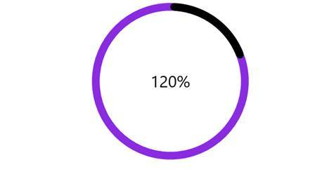
We use cookies to give you the best experience on our website. If you continue to browse, then you agree to our privacy policy and cookie policy. Image for the cookie policy date
close icon

Doghnut Chart with different color after 100% of the chart

Hello,

My requirement is to draw the fact that a percentage has been overlapped and drow it using a doughnut chart. For example, given the circle as 100%, I have to color differently the fact that it went 105% by coloring the 5% in a different color. Something like in the image below. 
Is that possible using the Doghnut Chart ? 

Thank you


3 Replies

RA Rachel A Syncfusion Team June 19, 2019 01:52 PM UTC

Hi Codrina, 
 
Greetings from Syncfusion. We can achieve your requirement by changing the color in TrackColor property when value exceed 100 as shown in the below code example. 
 
[C#] 
          if (value > 100) 
            { 
                TrackColor = Color.BlueViolet; 
                value = value % 100; 
            } 
            else 
            { 
                TrackColor = Color.Gray; 
            }             
 
[XAML] 
<chart:DoughnutSeries IsStackedDoughnut="True" TrackColor="{Binding TrackColor}" CapStyle="BothCurve" MaximumValue="100" Spacing="0.5" Color="Black" ItemsSource="{Binding DoughnuSeriesData}" XBindingPath="Percentage" YBindingPath="Value"> 
. . . 
 
    </chart:DoughnutSeries> 
 
 
Refer the below link to know more about doughnut configuration.  
 
Also, we have prepared sample you can download from below link. 
 
Regards, 
Rachel.


CM Codrina Merigo July 8, 2019 01:14 PM UTC

thank you very much!

works very well


RA Rachel A Syncfusion Team July 8, 2019 01:19 PM UTC

Hi Codrina, 
 
Thanks for your valuable feedback. 
 
Please revert us if you have any other queries. 
 
Regards, 
Rachel. 


Loader.
Live Chat Icon For mobile
Up arrow icon