
 Saiyath Ali Fathima M
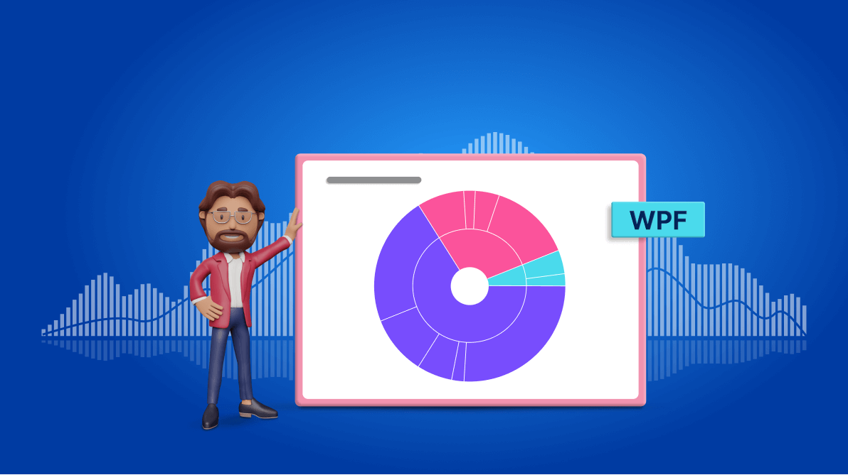
TL;DR: Let’s craft a WPF Sunburst Chart dashboard to get detailed insights into the Syncfusion Chart of the Week blog series. We’ll learn to collect and bind the data to the chart and visualize the blog data in detail using a list view. We’ll also customize the dashboard’s appearance for better visibility.
Welcome to another edition of the Chart of the Week blog series!
We are excited to share that we have reached a milestone by publishing 50 different blog posts combining real-time data with creative and visually engaging designs, utilizing Syncfusion Charts controls.
Today, we’ll explore a detailed view of the Syncfusion Chart of the Week blog series with a dashboard using the Syncfusion WPF Sunburst Chart and a ListView. We’ll visualize the blog details by platform and category-wise with its Title and URL, Category, and Chart Type.
The dashboard that we plan to create is shown in the following image.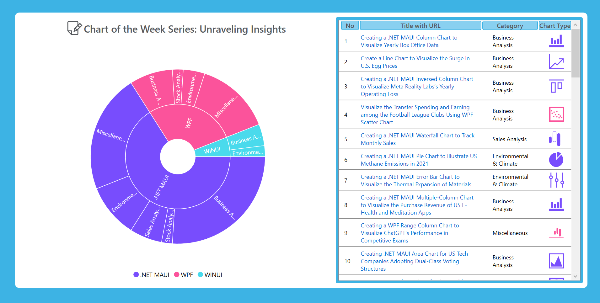
Let’s visualize the data on the published editions under the Syncfusion Chart of the Week blog series using the Syncfusion WPF Sunburst Chart.
Step 1: Gathering the data
Before we create a dashboard, we need to gather data on the published edition of the “Chart of the Week” from Syncfusion blogs.
Step 2: Populating the data for the Chart and ListView
Let’s create the ArticleModel class with the Platform, Count, Icon, Category, Name, and URL attributes.
Refer to the following code example.
public class ArticleModel
{
     public string? Platform { get; set; }
     public double Count { get; set; }
     public string? Icon { get; set; }
     public string? Category { get; set; }
     public string? Name { get; set; }
     public string? URL { get; set; }

     // Chart ItemSource
     public ArticleModel(string platform, double count , string category)
     {
         Platform = platform;
         Count = count;
         Category = category;
     }

     // ListView ItemSource
     public ArticleModel(string platform,string icon, string category, string name, string url)
     {
         Platform = platform;
         Icon = icon;
         Category = category;
         Name = name;
         URL = url;
     }
}
Then, the data collection will be generated using the ArticleData class, which has the Data, Blogs, and SelectedBlogs properties that demonstrate the details of the blogs.
Refer to the following code example.
Public class ArticleData
{
    public ObservableCollection<ArticleModel> Data { get; set; }
    public List<ArticleModel> Blogs { get; set; }
    public List<ArticleModel> SelectedBlogs { get; set; }

    public ArticleData()
    {
        // Platform, icon, title, and URL of the published blogs for ListView.
        Assembly executingAssembly = typeof(App).GetTypeInfo().Assembly;
        using (var stream = executingAssembly.GetManifestResourceStream("ChartOfTheWeekData.Resources.data.json"))
        using (TextReader textStream = new StreamReader(stream))
        {
            var data = textStream.ReadToEnd();
            data = data.Trim();
            Blogs = JsonConvert.DeserializeObject<List<ArticleModel>>(data);
        }

        // Platform, blog count and its category of the published blogs for WPF Sunburst Chart.
        Data = new ObservableCollection<ArticleModel>
        {
            new ArticleModel(".NET MAUI",13, "Business Analysis"),
            new ArticleModel(".NET MAUI",1, "Stock Analysis"),
            new ArticleModel(".NET MAUI",3, "Sales Analysis"),
            new ArticleModel(".NET MAUI",5, "Environmental & Climate"),
            new ArticleModel(".NET MAUI",11, "Miscellaneous"),

            new ArticleModel("WPF",4, "Business Analysis"),
            new ArticleModel("WPF",1, "Stock Analysis"),
            new ArticleModel("WPF",2, "Environmental & Climate"),
            new ArticleModel("WPF",7, "Miscellaneous"),

            new ArticleModel("WINUI",2, "Business Analysis"),
            new ArticleModel("WINUI",1, "Environmental & Climate"),
        };

        SelectedBlogs = Blogs.ToList();
    }
}
In the above code, we’ve converted the JSON data to a collection using StreamReader and JsonConvert.DeserializeObject methods from the Newtonsoft.Json package. Then, we stored the converted data in the appropriate properties.
Step 3: Defining the layout
Let’s define the layout by adding a border and a Grid to place the elements. Refer to the following code example.
<Border Margin="30" Padding="10" BorderThickness="2" CornerRadius="10" Background="#FFFFFF">
 <Grid>
  <Grid.ColumnDefinitions>
   <ColumnDefinition Width="1.28*"/>
   <ColumnDefinition Width="*"/>
  </Grid.ColumnDefinitions>
 </Grid>
</Border>
Step 4: Configuring the Syncfusion WPF Sunburst Chart
Let’s configure the Syncfusion WPF Sunburst Chart control using this documentation.
<chart:SfSunburstChart Grid.Column="0">

</chart:SfSunburstChart>
Step 5: Configuring the WPF framework ListView
Now, configure the WPF ListView to display the blog details.
<Border Grid.Column="1" CornerRadius="3" Background="#3DB3E4">

 <ListView>
 </ListView>

</Border>
Step 6: Binding the blog data to the WPF Sunburst Chart
Then, bind the collected blog data to the WPF Sunburst Chart.
<chart:SfSunburstChart ItemsSource="{Binding Data}" ValueMemberPath="Count">

 <chart:SfSunburstChart.Levels>
  <chart: SunburstHierarchicalLevel GroupMemberPath="Platform"/>
  <chart:SunburstHierarchicalLevel GroupMemberPath="Category"/>
 </chart:SfSunburstChart.Levels>

</chart:SfSunburstChart>
Here, we’ve bound the blog Data to the Sunburst Chart’s ItemsSource property. The SunburstHierarchicalLevel defines the properties specified in the GroupMemberPath, such as Platform and Category. The ValueMemberPath property calculates the size of each arc segment based on the blog count.
Step 7: Binding the blog data to the WPF ListView
Bind the collected blog details to the WPF ListView, which includes the name, URL, category, and chart-type icon used in the published blogs.
Refer to the following code examples.
XAML
<ListView ItemsSource="{Binding SelectedBlogs}" Margin="5" Background="#FFFFFF" x:Name="listView" >

 <ListView.View>
  <GridView>
   <GridViewColumn Header="No" Width="40">
    <GridViewColumn.CellTemplate>
     <DataTemplate>
      <TextBlock Text="{Binding Converter={StaticResource indexToCountConverter},ConverterParameter={x:Reference listView}}" Foreground="Black" Margin="5,0,0,0"/>
     </DataTemplate>
    </GridViewColumn.CellTemplate>
   </GridViewColumn>

   <GridViewColumn Header="Title with URL" Width="260">
    <GridViewColumn.CellTemplate>
     <DataTemplate>
      <TextBlock TextWrapping="Wrap">
       <Hyperlink Click="Hyperlink_Click" NavigateUri="{Binding URL}" TextDecorations="None">
        <Run Text="{Binding Name}"/>
       </Hyperlink>
      </TextBlock>
     </DataTemplate>
    </GridViewColumn.CellTemplate>
   </GridViewColumn>

   <GridViewColumn Header="Category" Width="120">
    <GridViewColumn.CellTemplate>
     <DataTemplate>
      <TextBlock Text="{Binding Category}" TextWrapping="Wrap" Foreground="Black" HorizontalAlignment="Center" Margin="20,0,0,0"/>
     </DataTemplate>
    </GridViewColumn.CellTemplate>
   </GridViewColumn>

   <GridViewColumn Header="Chart Type">
    <GridViewColumn.CellTemplate>
     <DataTemplate>
      <Path Data="{Binding Icon}" Fill="{Binding Converter={StaticResource pathColorConverter}}" Margin="20,0,0,0"/>
     </DataTemplate>
    </GridViewColumn.CellTemplate>
   </GridViewColumn>
  </GridView>
 </ListView.View>
</ListView>
C#
private void Hyperlink_Click(object sender, RoutedEventArgs e)
{
     var hyperlink = (Hyperlink)sender;
     var url = hyperlink.NavigateUri.AbsoluteUri;
     System.Diagnostics.Process.Start(new ProcessStartInfo(url) { UseShellExecute = true });
}
Step 8: Customizing the chart’s appearance
Let’s customize the appearance of the WPF Sunburst Chart for better visualization.
Add the chart title
Adding a title to the chart improves the readability of the data. Refer to the following code example to add a chart title and an image.
<chart:SfSunburstChart.Header>
 <Grid>
  <Grid.ColumnDefinitions>
   <ColumnDefinition Width="Auto"/>
   <ColumnDefinition Width="*"/>
  </Grid.ColumnDefinitions>
  <Path Grid.RowSpan="2" Data="{StaticResource PathData}" Margin="0,8,0,6" Fill="#575A5E" Height="50" Width="50"/>
  <Label Grid.Column="1" Margin="-20,5,0,0" Content="Chart of the Week Series: Unraveling Insights" FontSize="21" FontWeight="SemiBold" Foreground="#575A5E"/>
 </Grid>
</chart:SfSunburstChart.Header>
Customize the chart color and size
Here, we will enhance the chart’s appearance by adjusting its size and color scheme to differentiate the blogs published based on the platforms and their categories. This can be achieved through the Radius, Palette, and ColorModel properties, as follows.
<chart:SfSunburstChart Radius="0.8" Palette="Custom">

 <chart:SfSunburstChart.ColorModel>
  <chart:SunburstColorModel>
   <chart:SunburstColorModel.CustomBrushes>
    <SolidColorBrush Color="#784DFD"/>
    <SolidColorBrush Color="#FB539B"/>
    <SolidColorBrush Color="#4ADAEC"/>
   </chart:SunburstColorModel.CustomBrushes>
  </chart:SunburstColorModel>
 </chart:SfSunburstChart.ColorModel>

</chart:SfSunburstChart>
Add the chart legend
Refer to the following code example to enable and position the chart legend.
<chart:SfSunburstChart.Legend>
 <chart:SunburstLegend DockPosition="Bottom" ClickAction="None"/>
</chart:SfSunburstChart.Legend>
Add the data label
Enabling chart data labels using the ShowLabel property in the DataLabelInfo class can make the data easier to read.
<chart:SfSunburstChart.DataLabelInfo>
 <chart:SunburstDataLabelInfo ShowLabel="True" />
</chart:SfSunburstChart.DataLabelInfo>
Add the interactive tooltip
Adding tooltips can enhance the interactivity of our WPF Sunburst Chart. They provide additional information or metadata when a segment is tapped or hovered over. Using the TooltipTemplateproperty, we can customize the appearance of the tooltip.
Refer to the following code example.
<chart:SfSunburstChart.Behaviors>
 <chart:SunburstToolTipBehavior ShowToolTip="True">
  <chart:SunburstToolTipBehavior.ToolTipTemplate>
   <DataTemplate>
    <Border BorderThickness="1.5" BorderBrush="White">
     <Border BorderThickness="2" BorderBrush="{Binding Interior}">
      <StackPanel Orientation="Horizontal" Background="Black">
       <Label Content="{Binding Category}" FontSize="12.5"  Foreground="White"/>
       <Label Content=":" FontSize="12.5" Foreground="White"/>
       <Label Content="{Binding Value}" FontSize="12" FontWeight="SemiBold" Foreground="White"/>
      </StackPanel>
     </Border>
    </Border>
   </DataTemplate>
  </chart:SunburstToolTipBehavior.ToolTipTemplate>
 </chart:SunburstToolTipBehavior>
</chart:SfSunburstChart.Behaviors>
Adding the selection support
The selection feature helps us to highlight a specific data point when tapping. We can also customize the selection option type using the SelectionType property. Here, we’ve configured the ListView to update it based on the platform selected on the Sunburst Chart.
Refer to the following code examples.
XAML
<chart:SfSunburstChart SelectionChanged="SfSunburstChart_SelectionChanged">

 <chart:SfSunburstChart.Behaviors>
  <chart:SunburstSelectionBehavior SelectionType="Group"/>
 </chart:SfSunburstChart.Behaviors>

</chart:SfSunburstChart>
C#
private bool isSegmentSelected = false;

private void SfSunburstChart_SelectionChanged(object sender, SunburstSelectionChangedEventArgs e)
{
     var selectedSegment = e.SelectedSegment;
     string? segmentName = "";

     if (selectedSegment != null && !isSegmentSelected)
     {
         isSegmentSelected = true;
         segmentName = (selectedSegment.Parent?.Category ?? e.SelectedSegment.Category)?.ToString();
         viewModel.SelectedBlogs.Clear();
         var blogsToAdd = viewModel.Blogs.Where(b => b.Platform == segmentName).ToList();

         foreach (var blog in blogsToAdd)
         {
             viewModel.SelectedBlogs.Add(blog);
         }

         listView.Items.Refresh();
     }
     else if (isSegmentSelected)
     {
         viewModel.SelectedBlogs.Clear();
         foreach (var blog in viewModel.Blogs)
         {
             viewModel.SelectedBlogs.Add(blog);
         }

         listView.Items.Refresh();
         isSegmentSelected = false;
     }
}
Step 9: Customize the ListView appearance
To further enhance the visualization, let’s customize the appearance of the WPF ListView.
Customize the item container style
We can customize the ListView container UI using the ItemContainerStyle property.
<ListView.ItemContainerStyle>
 <Style TargetType="ListViewItem">
  <Setter Property="Template">
   <Setter.Value>
    <ControlTemplate TargetType="ListViewItem">
     <Border Background="{TemplateBinding Background}" BorderThickness="0,0,0,1" BorderBrush="Gray" >
      <GridViewRowPresenter Content="{TemplateBinding Content}" Margin="0,5,0,5" Columns="{TemplateBinding GridView.ColumnCollection}"/>
     </Border>
    </ControlTemplate>
   </Setter.Value>
  </Setter>
 </Style>
</ListView.ItemContainerStyle>
Customize the column header container style
Then, customize the ListView header’s corner radius, border, and background using the ColumnHeaderContainerStyle property in the GridView.
Refer to the following code example.
<ListView.View>
<GridView>
<GridView.ColumnHeaderContainerStyle>
<Style TargetType="{x:Type GridViewColumnHeader}">
<Setter Property="Template">
<Setter.Value>
<ControlTemplate TargetType="{x:Type GridViewColumnHeader}">
<Border BorderThickness="1.5,1,1.5,1.5" BorderBrush="#3DB3E4" Background="#89d0f0" Margin="2,0,0,2" CornerRadius="3">
<TextBlock x:Name="ContentHeader" Text="{TemplateBinding Content}" Width="{TemplateBinding Width}" TextAlignment="Center" Foreground="#575A5E" FontSize="13.5" FontWeight="SemiBold"/>
</Border>
</ControlTemplate>
</Setter.Value>
</Setter>
</Style>
</GridView.ColumnHeaderContainerStyle>
</GridView>
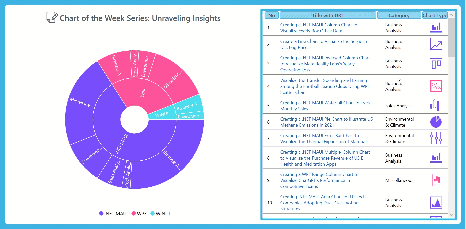
</ListView.View>After executing the above code examples, we’ll get the following output image.
GitHub reference
For more details, refer to the project on GitHub.
Conclusion
Thanks for reading! In this blog, we have seen how to visualize the Syncfusion Chart of the Week blog series in detail using the WPF Sunburst Chart control. We encourage you to try the steps discussed in this blog and share your thoughts in the comments below.
You can also contact us via our support forum, support portal, or feedback portal. We are always happy to assist you!


Related blogs
- Reached 50! A Milestone for the Chart of the Week Blog Series
- Navigate PDF Annotations in a TreeView Using WPF PDF Viewer
- Chart of the Week: Creating a WPF 100% Stacked Area Chart to Visualize the World Vehicle Production in Major Countries
- Chart of the Week: Creating a WPF Stacked Area Chart to Visualize Wealth Distribution in the U.S.
 No spam, just valuable updates.