
 Arul Jenith Berkmans
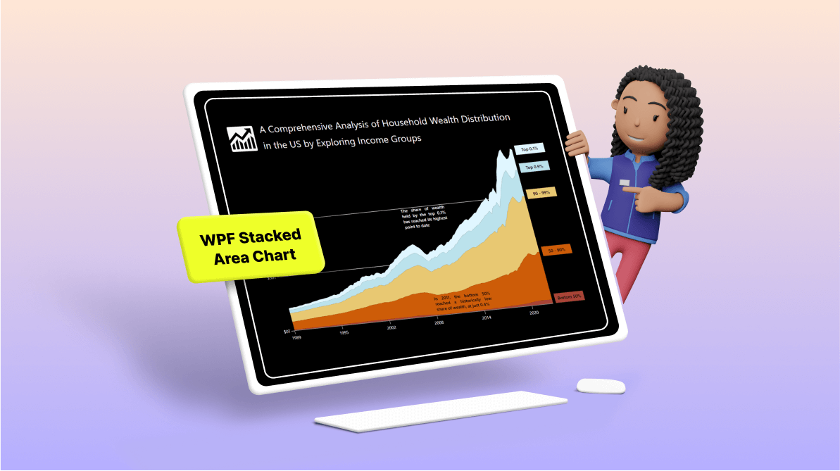
TL;DR: Learn to visualize wealth distribution in the U.S. from 1990 to 2023 using Syncfusion WPF Stacked Area Chart. Explore a step-by-step guide on data preparation, chart layout design, customization, and more. Dive into insightful analysis with this powerful tool!
Welcome to our Chart of the Week blog series!
Today, we will visualize the U.S. wealth distribution data based on income groups using the Syncfusion WPF Stacked Area Chart.
The WPF Stacked Area Chart is a data visualization tool used to represent the cumulative values of different categories over time. It comprises multiple data series stacked on each other, with the area below the lines filled with colors to differentiate between the categories.
The following image shows the chart we’re going to create.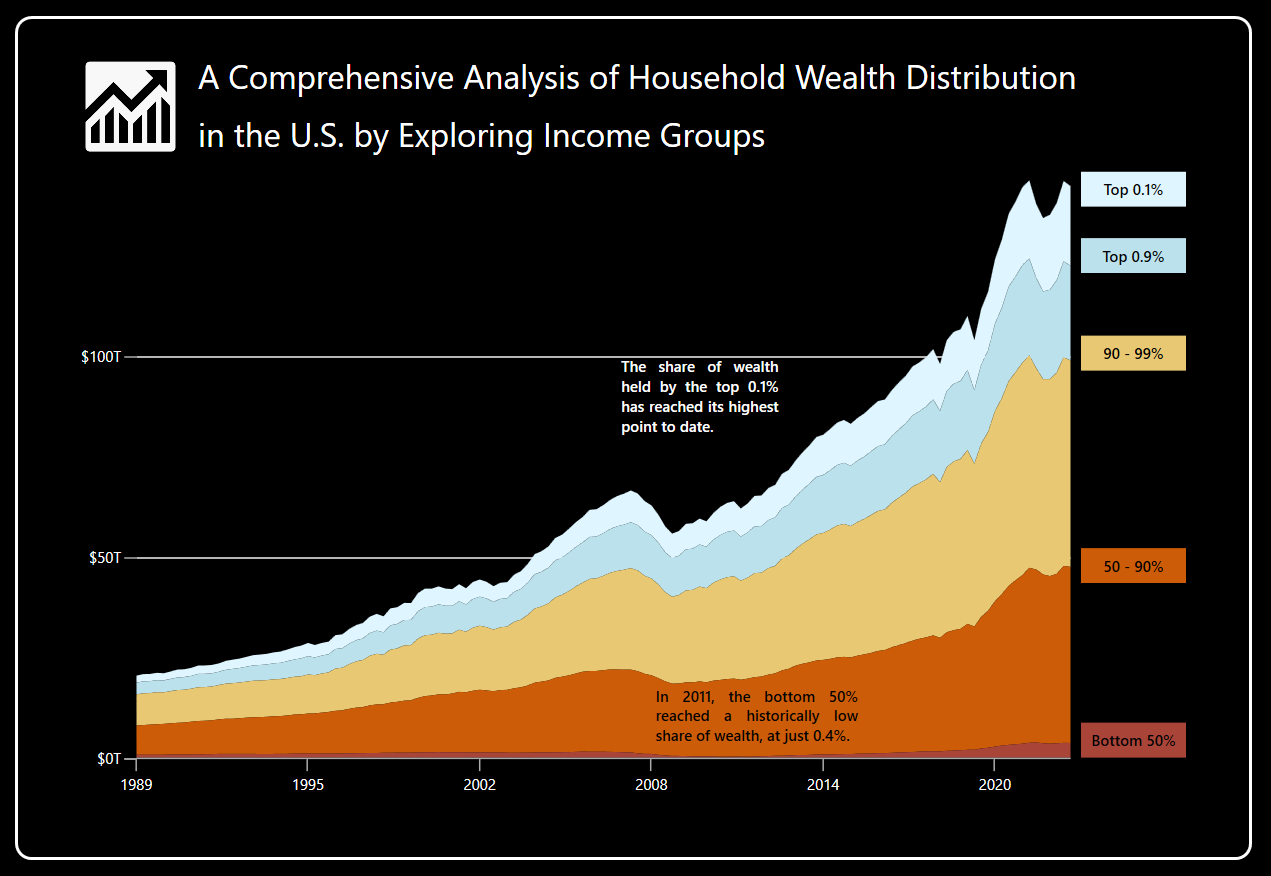
Let’s get started!
Step 1: Gathering the data
Before creating the chart, we should collect the data from the wealth distribution report. We can also download the data in CSV format.
Step 2: Prepare the data for the chart
Let’s design the WealthData class with the Date and Value properties to encapsulate the details of wealth distribution.
Refer to the following code example.
public class WealthData
{
     public string Date { get; set; }
     public double Value { get; set; }
     public WealthData(string date, double value)
     {
         Date = date;
         Value = value;
     }
}
Now, design the LabelItem class with the Content and Position properties to encapsulate the details of custom axis labels.
Refer to the following code example.
public class LabelItem
{
    public string? Content { get; set; }
    public double Position { get; set; }
}
Then, configure the HouseHoldWealthData class to organize the assortment of data regarding wealth distribution across income groups over different periods. Subsequently, this data will be stored in an observable collection utilizing the different properties based on income groups.
Refer to the following code example.
public class HouseHoldWealthData
{
     public ObservableCollection<WealthData> Bottom50Data { get; set; }
     public ObservableCollection<WealthData> Next40 { get; set; }
     public ObservableCollection<WealthData> Top9 { get; set; }
     public ObservableCollection<WealthData> Top1 { get; set; }
     public ObservableCollection<WealthData> TopPoint1 { get; set; }

     public List<LabelItem> Labels { get; set; }

     public HouseHoldWealthData()
     {
         Bottom50Data = new ObservableCollection<WealthData>();
         Next40 = new ObservableCollection<WealthData>();
         Top9 = new ObservableCollection<WealthData>();
         Top1 = new ObservableCollection<WealthData>();
         TopPoint1 = new ObservableCollection<WealthData>();
         Labels = new List<LabelItem>();

         ReadCSV();
     }
}
Then, the CSV data will be converted to a data collection using the ReadCSV method. Each collection’s maximum values will be collected to update the custom label position.
Refer to the following code example.
public void ReadCSV()
{
    Assembly executingAssembly = typeof(App).GetTypeInfo().Assembly;
    Stream inputStream = executingAssembly.GetManifestResourceStream("WhealthDistributionSample.dfanetworthlevels.csv");
    List<string> lines = new List<string>();
    if (inputStream != null)
    {
        string line;
        StreamReader reader = new StreamReader(inputStream);
        while ((line = reader.ReadLine()) != null)
        {
            lines.Add(line);
        }
        lines.RemoveAt(0);

        double _bottom50 = 0, _next40 = 0, _top9 = 0, _top1 = 0, _topPoint1 = 0;

        foreach (var dataPoint in lines)
        {
            string[] data = dataPoint.Split(',');
            string[] date = data[0].Split(':');

            switch (data[1])
            {
                case "Bottom50":
                    var bottom50value = Convert.ToDouble(data[2]);
                    Bottom50Data.Add(new WealthData(date[0], bottom50value));
                    _bottom50 = Math.Max(bottom50value, _bottom50);
                    break;
                case "Next40":
                    var next40Value = Convert.ToDouble(data[2]);
                    Next40.Add(new WealthData(date[0], next40Value));
                    _next40 = Math.Max(next40Value, _next40);
                    break;
                case "Next9":
                    var next9Value = Convert.ToDouble(data[2]);
                    Top9.Add(new WealthData(date[0], next9Value));
                    _top9 = Math.Max(next9Value, _top9);
                    break;
                case "RemainingTop1":
                    var remainingTop1Value = Convert.ToDouble(data[2]);
                    Top1.Add(new WealthData(date[0], remainingTop1Value));
                    _top1 = Math.Max(remainingTop1Value, _top1);
                    break;
                default:
                    var topPoint1Value = Convert.ToDouble(data[2]);
                    TopPoint1.Add(new WealthData(date[0], topPoint1Value));
                    _topPoint1 = Math.Max(topPoint1Value, _topPoint1);
                    break;
            }

        }
        AddCustomLabels(_bottom50, _next40, _top9, _top1, _topPoint1);

    }
}
Let’s add the custom labels and position them using the Content and Position properties, respectively, in the Labels collection. Here, we will position the custom labels for each series at their maximum value data point.
Refer to the following code example.
private void AddCustomLabels(double bottom50, double next40, double top9, double top1, double topPoint1)
{
    next40 += bottom50;
    top9 += next40;
    top1 += top9;
    topPoint1 += top1;

    Labels.Add(new LabelItem() { Position = bottom50, Content = "Bottom 50%" });
    Labels.Add(new LabelItem() { Position = next40, Content = "50 - 90%" });
    Labels.Add(new LabelItem() { Position = top9, Content = "90 - 99%" });
    Labels.Add(new LabelItem() { Position = top1, Content = "Top 0.9%" });
    Labels.Add(new LabelItem() { Position = topPoint1, Content = "Top 0.1%" });
}
Step 3: Adding a border to the chart
Before creating the chart, let’s add a border. This helps us organize and visualize the data efficiently.
Refer to the following code example.
<Window x:Class="WealthDistributionSample.MainWindow"
        xmlns:local="clr-namespace:WealthDistributionSample"
        Title="MainWindow" Height="650" Width="879" Background="Black">

  <!—Set border for the chart-->
  <Border Margin="20"
          BorderThickness="2"
          BorderBrush="White"
          CornerRadius="10">
     <!—Create the chart inside the border-->
  </Border>

</Window>
Step 4: Configure the Syncfusion WPF Charts control
Now, configure the Syncfusion WPF Charts control utilizing this documentation.
Refer to the following code example.
<charts:SfChart x:Name="chart">

  <charts:SfChart.PrimaryAxis>
   <charts:CategoryAxis/>
  </charts:SfChart.PrimaryAxis>

  <charts:SfChart.SecondaryAxis>
   <charts:NumericalAxis/>
  </charts:SfChart.SecondaryAxis>

</charts:SfChart>
Step 5: Bind the data to the WPF Stacked Area Chart
We will utilize the Syncfusion WPF StackingAreaSeries to visualize the wealth distribution data. Ensure that the HouseHoldWealthData class is configured to establish a binding between its properties and the Chart’s DataContext.
Refer to the following code example.
<charts:SfChart>

 <charts:SfChart.DataContext>
  <local:HouseHoldWealthData x:Name="viewModel"/>
 </charts:SfChart.DataContext>

 <charts:StackingAreaSeries ItemsSource="{Binding Bottom50Data}"
                            XBindingPath="Date"
                            YBindingPath="Value" />

 <charts:StackingAreaSeries ItemsSource="{Binding Next40}"
                            XBindingPath="Date"
                            YBindingPath="Value"/>

 <charts:StackingAreaSeries ItemsSource="{Binding Top9}"
                            XBindingPath="Date"
                            YBindingPath="Value"/>

 <charts:StackingAreaSeries ItemsSource="{Binding Top1}"
                            XBindingPath="Date"
                            YBindingPath="Value”/>

 <charts:StackingAreaSeries ItemsSource="{Binding TopPoint1}"
                            XBindingPath="Date"
                            YBindingPath="Value"/>

</charts:SfChart>
In the above code example, each series’ XBindingPath and YBindingPath properties are bound with the respective series’ Date and Value properties, respectively.
Step 6: Create the duplicate axis to customize the chart
Let’s showcase the income group details in each series for better visualization. To achieve this, we will use the duplicate Y-axis to display custom labels.
First, we will create the NumericalAxis (Y-axis positioned at the left) in the chart’s Resources property and assign the axis to each series’ YAxis property. This will act as the major Y-axis for the chart’s series.
Then, we will create a secondary Y-axis as a duplicate one (Positioned at the right) to showcase the custom labels. Next, bind the Labels collection to the LabelsSource property and set the PositionPath and ContentPath properties.
Refer to the following code example.
<charts:SfChart>

 <charts:SfChart.Resources>
  <charts:NumericalAxis x:Key="yAxis"
                        ActualRangeChanged="NumericalAxis_ActualRangeChanged" />
 </charts:SfChart.Resources>
      . . .

 <charts:SfChart.SecondaryAxis>
  <charts:NumericalAxis x:Name="customAxis
                        OpposedPosition="True"
                        ShowGridLines="False"
                        Interval="0.25"
                        LabelsSource="{Binding Labels}"
                        ContentPath="Content"
                        PositionPath="Position">

   <charts:NumericalAxis.LabelTemplate>
    <DataTemplate>
     <!—using a color converter for returning the border background color based on the label content -->
      <Border Width="70" Background="{Binding LabelContent, Converter= {StaticResource ColorCoverter}}">
       <Label Content="{Binding LabelContent}" FontWeight="Bold" Foreground="Black" HorizontalContentAlignment="Center"/>
      </Border>
    </DataTemplate>
   </charts:NumericalAxis.LabelTemplate>

  </charts:NumericalAxis>
 </charts:SfChart.SecondaryAxis>

 <charts:StackingAreaSeries YAxis="{StaticResource yAxis}" />
 <charts:StackingAreaSeries YAxis="{StaticResource yAxis}" />
 <charts:StackingAreaSeries YAxis="{StaticResource yAxis}" />
 <charts:StackingAreaSeries YAxis="{StaticResource yAxis}" />
 <charts:StackingAreaSeries YAxis="{StaticResource yAxis}" />

</charts:SfChart>
The custom labels will be positioned based on the axis values (EX: 50- 90%). To achieve this, we will add the values for the Maximum and Minimum properties of the duplicate axis based on the major YAxis’ ActualMaximum and ActualMinimum values.
private void NumericalAxis_ActualRangeChanged(object sender, ActualRangeChangedEventArgs e)
{
    customAxis.Maximum = (double?)e.ActualMaximum;
    customAxis.Minimum = (double?)e.ActualMinimum;
}
Step 7: Customize the chart appearance
Let’s customize the appearance of the Syncfusion WPF Stacked Area Chart to enhance its readability.
Customize the chart header
Refer to the following example to customize the chart header.
. . .

<charts:SfChart.Header>

 <Border>
  <Grid  x:Name="header">

   <Grid.ColumnDefinitions>
    <ColumnDefinition />
    <ColumnDefinition Width="5*"/>
   </Grid.ColumnDefinitions>

   <Image Source="Wealth.png" Grid.Column="0" Margin="0,5,0,5" Width="70" Height="60"/>

   <StackPanel Grid.Column="1"
               Margin="5,2,0,0"
               HorizontalAlignment="Left"
               Orientation="Vertical">
    <Label Content="A Comprehensive Analysis of Household Wealth Distribution"
           FontSize="22"
           FontFamily="AntaRegular"
           Foreground="White"/>

    <Label Content="in the U.S. by Exploring Income Groups."
           FontSize="22"
           Margin="0,2,0,0"
           FontFamily="AntaRegular"
           Foreground="White"/>
   </StackPanel>
  </Grid>

 </Border>

</charts:SfChart.Header>

. . .
Customize the axis
Refer to the following code example. Here, we are going to customize the Y-axis in the chart.
<charts:SfChart.Resources>

 <charts:NumericalAxis Interval="50000000"
                       LabelCreated="NumericalAxis_LabelCreated"
                       Maximum="146000000” >

  <charts:NumericalAxis.LabelStyle>
   <charts:LabelStyle Foreground="White"/>
  </charts:NumericalAxis.LabelStyle>

  <charts:NumericalAxis.AxisLineStyle>
   <Style TargetType="Line">
    <Setter Property="StrokeThickness" Value="0"/>
   </Style>
  </charts:NumericalAxis.AxisLineStyle>

 </charts:NumericalAxis>

</charts:SfChart.Resources>
Let’s modify the content of the axis labels using the LabelCreated event.
private void NumericalAxis_LabelCreated(object sender, LabelCreatedEventArgs e)
{
     double value = Convert.ToDouble(e.AxisLabel.LabelContent);
     double trillionValue = value / 1000000;
     if(trillionValue <= 100)
     {
         e.AxisLabel.LabelContent = $"${trillionValue}T";
     }
     else
     {
         e.AxisLabel.LabelContent = string.Empty;
         e.AxisLabel.Position = 0;
     }
}
Then, customize the X-axis by referring to the following code example.
<charts:SfChart.PrimaryAxis>

 <charts:CategoryAxis Interval="25"
                      ShowGridLines="False">
  <charts:CategoryAxis.LabelStyle>
   <charts:LabelStyle Foreground="White"/>
  </charts:CategoryAxis.LabelStyle>
 </charts:CategoryAxis>

</charts:SfChart.PrimaryAxis>
Customize the chart series
Now, customize each stacked area series’ color using the Interior property.
.. .
<charts:StackingAreaSeries Interior="#A94438"  />
<charts:StackingAreaSeries Interior="#CD5C08"  />
<charts:StackingAreaSeries Interior="#E8C872"  />
<charts:StackingAreaSeries Interior="#BBE2EC"  />
<charts:StackingAreaSeries Interior="#DFF5FF"  />
 . . .
Adding annotations to the chart
Next, we’ll enhance the chart’s readability with the Text Annotation to provide contextual insights.
<charts:SfChart.Annotations>

 <charts:TextAnnotation CoordinateUnit="Axis"  Y1="100000000" X1="70.60" >

  <charts:TextAnnotation.ContentTemplate>
   <DataTemplate>
    <StackPanel>
     <TextBlock Text="The share of wealth held by the top 0.1% has reached its highest point to date."
                Foreground="White"
                FontSize="10"
                FontWeight="Medium" Width="105" Height="60"
                TextAlignment="Justify"
                TextWrapping="Wrap"/>
    </StackPanel>
   </DataTemplate>
  </charts:TextAnnotation.ContentTemplate>

 </charts:TextAnnotation>

 <charts:TextAnnotation CoordinateUnit="Axis"  Y1="18000000" X1="75.60" >

  <charts:TextAnnotation.ContentTemplate>
   <DataTemplate>
    <StackPanel>
     <TextBlock Text="In 2011, the bottom 50% reached a historically low share of wealth, at just 0.4%."
                Foreground="Black"
                FontSize="9"
                FontWeight="Medium" Width="120" Height="50"
                TextAlignment="Justify"
                TextWrapping="Wrap"/>
    </StackPanel>
   </DataTemplate>
  </charts:TextAnnotation.ContentTemplate>

 </charts:TextAnnotation>

</charts:SfChart.Annotations>
After executing these code examples, we will get the output that resembles the following image.
GitHub reference
For more details, refer to visualizing the U.S. wealth distribution data using the WPF Stacked Area Chart GitHub demo.
Conclusion
Thanks for reading! In this blog, we’ve seen how to visualize data on wealth distribution in the U.S. based on income groups using the Syncfusion WPF Stacked Area Chart. We strongly encourage you to follow the steps outlined in this blog and share your thoughts in the comments below.
The existing customers can download the new version of Essential Studio® on the License and Downloads page. If you are not a Syncfusion customer, try our 30-day free trial to check out our incredible features.
You can also contact us through our support forums, support portal, or feedback portal. We are always happy to assist you!


Related blogs
- Chart of the Week: Creating a WPF 3D Column Chart to Visualize the Panama Canal’s Shipment Transit Data
- Chart of the Week: Creating a WPF Chart Dashboard to Visualize the 2023 World Billionaires list
- Harmonizing Powerhouses: Syncfusion WPF Controls Are Now Compatible with Avalonia XPF
- Chart of the Week: Creating a WPF Bar Chart to Visualize the Homelands of America’s International Students
 No spam, just valuable updates.