
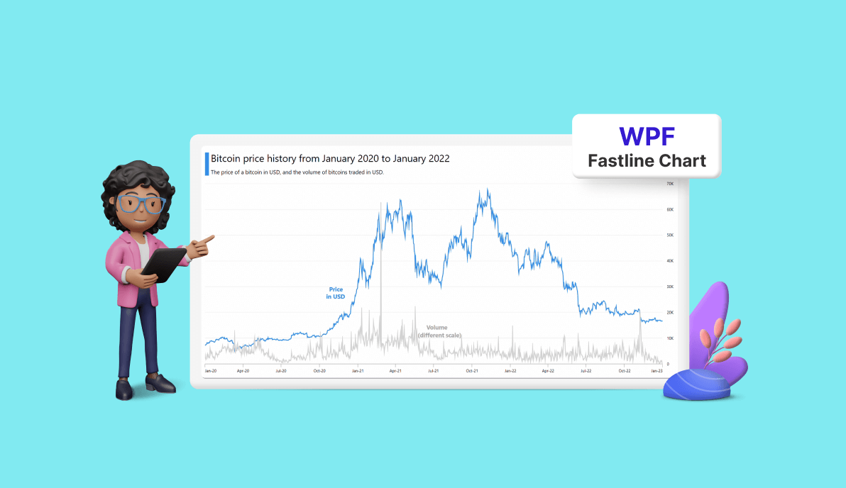
Welcome to our Chart of the Week blog series!
Today, we‘ll use the Syncfusion WPF Fast Line Chart to visualize cryptocurrency trade analysis, focusing on the historical price trends and trading volumes of Bitcoin.
We will put particular emphasis on how the value of Bitcoin has evolved over a specific time frame. This blog aims to provide a comprehensive understanding of cryptocurrency trade analysis.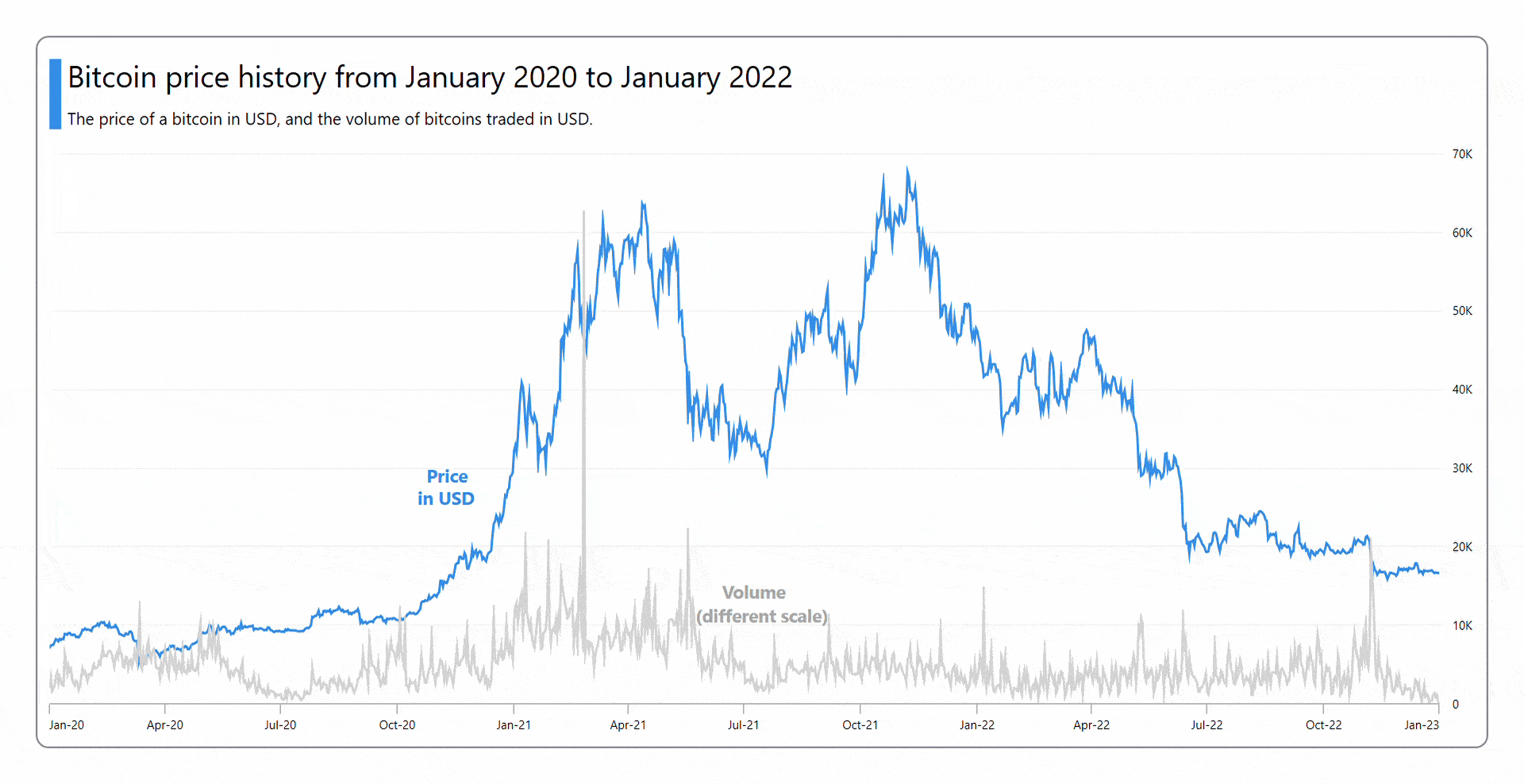
Let’s get started!
Step 1: Collecting the data
First, we need to collect cryptocurrency trade data on Bitcoin’s price and volume trends from Yahoo Finance. Specifically, we’ll use data from Jan. 1, 2020, to Jan. 1, 2023.
Step 2: Preparing the data for the chart
Then, create the BitCoinModel class to store Bitcoin data using the Date, BitCoinPrice, and Volume properties.
Refer to the following code example.
public class BitCoinModel
{
    public DateTime Date { get; set; }
    public double BitCoinPrice { get; set; }
    public double Volume { get; set; }
    public BitCoinModel(DateTime dateTime, double bitCoinPrice, double volume)
    {
        Date = dateTime;
        BitCoinPrice = bitCoinPrice;
        Volume = volume;
    }
}
Next, generate the Bitcoin data collection using the BitCoinViewModel class and its BitcoinCollection property. Then, assign the CSV data to the Bitcoin data collection using the ReadCSV method, which stores it in the BitcoinCollection property.
Refer to the following code example.
public class BitCoinViewModel
{
    List<BitCoinModel> bitCoinCollection;
    public List<BitCoinModel> BitCoinCollection
    {
        get
        {
            return bitCoinCollection;
        }
        set
        {
            bitCoinCollection = value;
        }
    }
    public BitCoinViewModel()
    {
        BitCoinCollection = new List<BitCoinModel>();
        ReadCSV("BitCoinTradeAnalysisDemo.Resources.data.csv");
    }
    private void ReadCSV(string resourceStream)
    {
        Assembly executingAssembly = typeof(App).GetTypeInfo().Assembly;
        Stream? inputStream = executingAssembly.GetManifestResourceStream(resourceStream);
        string? line;
        List<string> lines = new List<string>();
        if (inputStream != null)
        {
            using StreamReader reader = new StreamReader(inputStream);
            while ((line = reader.ReadLine()) != null)
            {
                lines.Add(line);
            }
            lines.RemoveAt(0);
            foreach (var dataPoint in lines)
            {
                string[] data = dataPoint.Split(',');
                //To get the date data.
                DateTime date = DateTime.Parse(data[0]);
                //To get the price data in thousands (K).
                var price = Convert.ToDouble(data[5])/1000;
                //To get the volume data in billions (B).
                var volume = Convert.ToDouble(data[6])/ 1000000000;
                BitCoinCollection.Add(new BitCoinModel(date, Math.Round(price, 2), Math.Round(volume, 2)));
            }
        }
    }
}
Step 3: Configuring the Syncfusion WPF Charts control
Configure the Syncfusion WPF Charts control by following this documentation.
Refer to the following code example.
<chart:SfChart>

 <!--Initialize the axis for chart-->
 <chart:SfChart.PrimaryAxis>
  <chart:DateTimeAxis>
  </chart:DateTimeAxis>
 </chart:SfChart.PrimaryAxis>

 <chart:SfChart.SecondaryAxis>
  <chart:NumericalAxis>
  </chart:NumericalAxis>
 </chart:SfChart.SecondaryAxis>

</chart:SfChart>
Step 4: Binding data to the chart
We’ll be utilizing the Syncfusion WPF FastLineSeries instance to bind the Bitcoin data. This will enable us to analyze cryptocurrency trading trends effectively in the chart.
In this example, we need two fast-line series, one to analyze Bitcoin price and another to analyze Bitcoin volume. The Syncfusion WPF Charts control provides a way to arrange multiple series inside the same chart area.
Refer to the following code example.
<chart:SfChart>

 <!--Initialize the series for chart-->
 <chart:FastLineSeries ItemsSource="{Binding BitCoinCollection}"
                       XBindingPath="Date"
                       YBindingPath="BitCoinPrice">
 </chart:FastLineSeries>
 <chart:FastLineSeries ItemsSource="{Binding BitCoinCollection}"
                       XBindingPath="Date"
                       YBindingPath="Volume">
 </chart:FastLineSeries>

</chart:SfChart>
In the previous code example for Bitcoin price data, we bound the BitCoinCollection with the ItemSource property. We also specified the XBindingPath and YBindingPath with the Date and BitCoinPrice properties, respectively.
For Bitcoin volume data, we associated the BitCoinCollection with the ItemSource property and designated the XBindingPath and YBindingPath using the Date and Volume properties, respectively.
Step 5: Multi-Axis integration
As I said before, for this demo, we’ll utilize two fast-line series to analyze Bitcoin price and volume data. To do this, we use a shared x-axis and two y-axis for Bitcoin price and another for Bitcoin volume analysis.
In SfChart, each series type includes two properties: XAxis and YAxis, which support multiple axes. For the Bitcoin price FastLineSeries, it automatically uses the chart’s default x- and y-axes. To add an additional y-axis for the Bitcoin volume FastLineSeries, you must assign the required y-axis within the series.
Refer to the following code example to add an additional y-axis for representing Bitcoin volume in the fast line graph.
<chart:SfChart >

 <!—Series 1-->
 <chart:FastLineSeries>
 </chart:FastLineSeries>

 <!—Series 2 with additional y- axis-->
 <chart:FastLineSeries>
  <chart:FastLineSeries.YAxis>
   <chart:NumericalAxis/>
  </chart:FastLineSeries.YAxis>
 </chart:FastLineSeries>

</chart:SfChart>
Step 6: Customizing the chart appearance
We can enhance the appearance of the WPF fast line chart by customizing its elements.
Personalized titles
We can employ the Header property to define the chart’s title, improving the readability of the displayed data. Additionally, the header can be positioned on the left or right side of the chart using the HorizontalHeaderAlignment property.
Refer to the following code example.
<chart:SfChart HorizontalHeaderAlignment="Left" >

 <chart:SfChart.Header>
  <Border BorderBrush="White" Margin="0, 0, 0, 10">
   <StackPanel Orientation="Horizontal">
    <Grid Width="10" Background="#2C8CEE" Margin="0, 8, 0, 5"/>
    <StackPanel>
     <TextBlock FontSize="25" Margin="5" Text="Bitcoin price history from January 2020 to January 2022"/>
     <TextBlock FontSize="14" Margin="5" Text="The price of a bitcoin in USD, and the volume of bitcoins traded in USD."/>
    </StackPanel>
   </StackPanel>
  </Border>
 </chart:SfChart.Header>

</chart:SfChart>
Axis customization
We can customize the chart axis and its elements like in the following code example. For better readability, we will make the y-axis representing Bitcoin volume invisible by setting the axis Visibility property to Collapsed.
XML
<chart:SfChart>

 <chart:SfChart.Resources>
  <Style TargetType="Line" x:Key="secondaryTicklineStyle">
   <Setter Property="Stroke" Value="LightGray"/>
   <Setter Property="StrokeThickness" Value="0"/>
  </Style>
  <DataTemplate x:Key="postfixLabelTemplate">
   <TextBlock FontSize="10" VerticalAlignment="Center" Text="K"/>
  </DataTemplate>
 </chart:SfChart.Resources>

 <!--Initialize the axis for the chart-->
 <chart:SfChart.PrimaryAxis>
  <chart:DateTimeAxis IntervalType="Months" Interval="3"
                      LabelFormat="dd-MMM-yy"
                      LabelCreated="DateTimeAxis_LabelCreated"
                      EdgeLabelsDrawingMode="Shift"
                      EdgeLabelsVisibilityMode="AlwaysVisible"
                      ShowGridLines="False">
  </chart:DateTimeAxis>
 </chart:SfChart.PrimaryAxis>

 <chart:SfChart.SecondaryAxis>
  <chart:NumericalAxis ShowGridLines="True"
         PostfixLabelTemplate="{StaticResource postfixLabelTemplate}"
         OpposedPosition="True" Interval="10"
         MajorTickLineStyle="{StaticResource secondaryTicklineStyle}">
   <chart:NumericalAxis.AxisLineStyle>
    <Style TargetType="Line">
     <Setter Property="Stroke" Value="White"/>
    </Style>
   </chart:NumericalAxis.AxisLineStyle>
  </chart:NumericalAxis>
 </chart:SfChart.SecondaryAxis>

 <!--Initialize the series 1 for chart-->
 <chart:FastLineSeries>
 </chart:FastLineSeries>

 <!—Series 2 with additional y-axis-->
 <chart:FastLineSeries>
  <chart:FastLineSeries.YAxis>
   <chart:NumericalAxis ShowGridLines="False" Visibility="Collapsed"/>
  </chart:FastLineSeries.YAxis>
 </chart:FastLineSeries>

</chart:SfChart>
C#
private void DateTimeAxis_LabelCreated(object sender, LabelCreatedEventArgs e)
{
    var axis = sender as DateTimeAxis;
    if (axis != null)
    {
        if (DateTime.TryParse(e.AxisLabel.LabelContent.ToString(), out var axisValue))
        {
            e.AxisLabel.LabelContent = axisValue.ToString("MMM-yy", CultureInfo.InvariantCulture);
        }
    }
}
Series customization
Refer to the following code example to set the fill colors for the FastLineSeries using the Interior property.
<chart:SfChart>

 <chart:FastLineSeries Interior="#2C8CEE">
 </chart:FastLineSeries>
 <chart:FastLineSeries Interior="LightGray">
 </chart:FastLineSeries>

</chart:SfChart>
Step 7: Adding interactivity support
We’ll incorporate the Trackball feature, which enhances interactivity by allowing you to track a data point with the cursor closely.
Refer to the following code example.
<chart:SfChart>
  <chart:SfChart.Resources>
  <DataTemplate x:Key="trackballLabelTemplate">
   <Border CornerRadius="5" BorderThickness="1"
           Background="White" Margin="8">
    <StackPanel>
     <TextBlock Foreground="Blue" FontWeight="Bold" Text="Bitcoin Price"/>
     <TextBlock Foreground="Black" Text="{Binding ValueY, StringFormat={}{0}K}"/>
    </StackPanel>
   </Border>
  </DataTemplate>

  <DataTemplate x:Key="trackballLabelTemplate2">
   <Border CornerRadius="5" BorderThickness="1"
           Background="White" Margin="8">
    <StackPanel>
     <TextBlock Foreground="#808080" Text="Volume" FontWeight="Bold"/>
     <TextBlock Foreground="Black" Text="{Binding ValueY, StringFormat={}{0}B}"/>
    </StackPanel>
   </Border>
  </DataTemplate>
 </chart:SfChart.Resources>

 <!--Initialize the axis for chart-->
 <chart:SfChart.PrimaryAxis>
  <chart:DateTimeAxis ShowTrackBallInfo="True">
  </chart:DateTimeAxis>
 </chart:SfChart.PrimaryAxis>

 <chart:SfChart.Behaviors>
  <chart:ChartTrackBallBehavior/>
 </chart:SfChart.Behaviors>

 <!--Initialize the series 1 for chart-->
 <chart:FastLineSeries ShowTrackballInfo="True" TrackBallLabelTemplate="{StaticResource trackballLabelTemplate}">
 </chart:FastLineSeries>

 <!--Series 2 with additional Y y-axis-->
 <chart:FastLineSeries ShowTrackballInfo="True" TrackBallLabelTemplate="{StaticResource trackballLabelTemplate2}"/>

</chart:SfChart>
Step 8: Adding chart annotations
You can add annotations to pinpoint specific areas of interest within the chart. In this instance, we’ll use text annotations to emphasize particular contexts within the chart area.
Refer to the following code example.
<chart:SfChart>

 <chart:SfChart.Annotations>
  <chart:TextAnnotation Text="Price" X1="2020/10/25" Y1="30.5"
                        Foreground="#2C8CEE" FontSize="15"
                        FontWeight="Bold"/>
  <chart:TextAnnotation Text="in USD" X1="2020/10/18" Y1="27.7"
                        Foreground="#2C8CEE" FontSize="15”
                        FontWeight="Bold"/>
  <chart:TextAnnotation Text="Volume" X1="2021/06/15" Y1="15.7"
                        Foreground="DarkGray" FontSize="15”
                        FontWeight="Bold"/>
  <chart:TextAnnotation Text="(different scale)" X1="2021/05/25" Y1="12.7"
                        Foreground="DarkGray" FontSize="15"
                        FontWeight="Bold"/>
 </chart:SfChart.Annotations>

</chart:SfChart>
After executing the previous code examples, we’ll get an output like in the following GIF image.

GitHub reference
For more information, refer to the demo on GitHub.
Conclusion
Thanks for reading! In this blog, we’ve explored how to visualize the data on cryptocurrency trade trends using the Syncfusion WPF Fast Line Chart. We encourage you to follow the steps outlined in this blog and share your feedback in the comments section below.
Current customers can download the new version of Essential Studio® from the License and Downloads page. If you are not a Syncfusion customer, try our 30-day free trial to check out the Charts control’s features.
If you require assistance, please don’t hesitate to contact us via our support forum, support portal, or feedback portal. We are always eager to help you!


Related blogs
- Chart of the Week: Creating a WPF Column Chart for Countries with the Most Active Volcanoes
- Streamline Your WPF Development with Syncfusion: Introducing the WPF Template Studio for Visual Studio
- Chart of the Week: Creating A Trend Line Using WPF Charts to Visualize Rapid Heating in North American Oceans
- Chart of the Week: Creating a WPF Doughnut Chart for the Top Rice-Exporting Countries
 No spam, just valuable updates.