
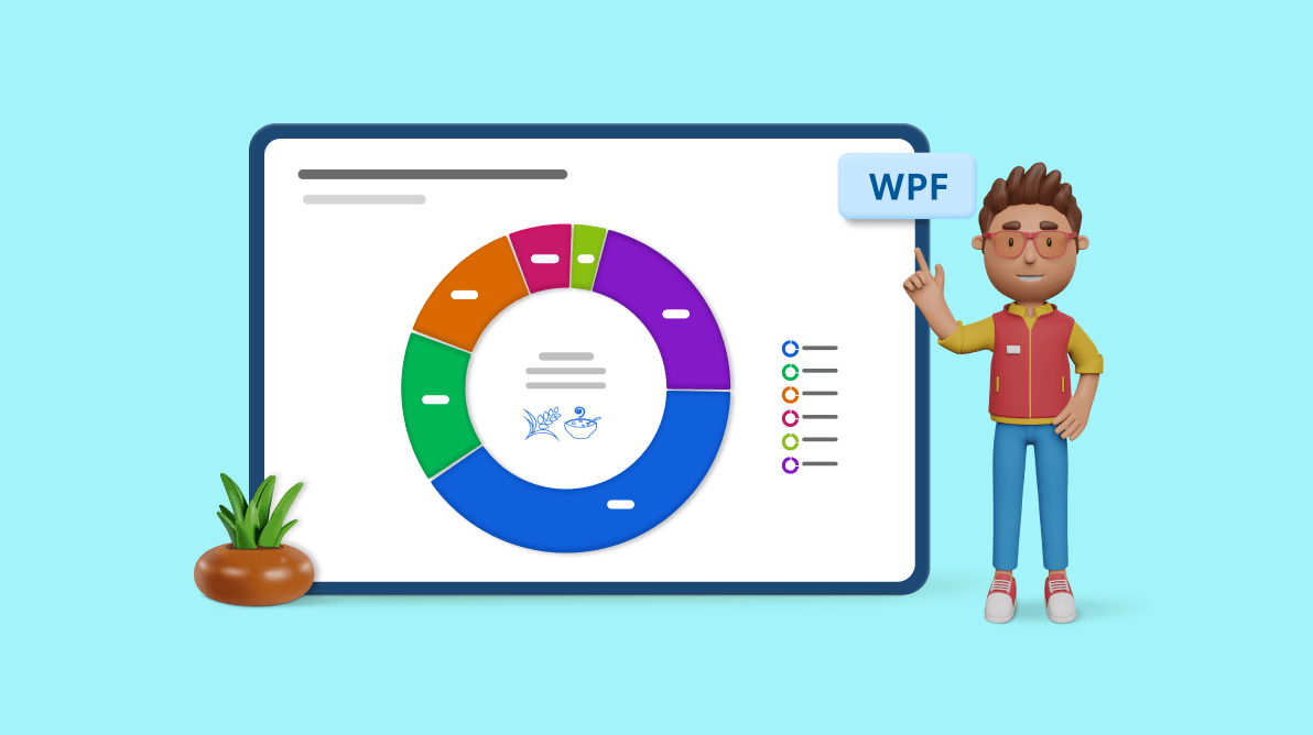
Welcome to our Chart of the Week series!
Today, we will use the Syncfusion WPF Doughnut Chart control to showcase the ratios of the world’s biggest rice exporters.
In 2022, rice exports totaled 55.64 million tons, which is 0.48 million tons less than the previous year. Rice exports significantly impact global trade dynamics because rice is a staple food around the world.
 Let’s see the steps to visualize rice exports using the Syncfusion WPF Doughnut Chart.
Step 1: Gathering data on rice exports
Before creating the chart, we need to gather the data on rice exports from the United States Department of Agriculture. Specifically, we use the data provided on page 24 of this report.
Step 2: Preparing data for the chart
Define the RiceExporterModel class with the Country and Value properties to store the rice export data for the chart.
public class RiceExporterModel
{
   public string Country { get; set; }
   public double Value { get; set; }

   public RiceExporterModel(string country, double value)
   {
      Country = country;
      Value = value/1000; //Thousand to million conversion
   }
}
Generate the data collection that illustrates the rice export sources using the WorldRiceExporters class with the ExportData property.
public class WorldRiceExporters
{
public List<RiceExporterModel> ExportData { get; set; }
public WorldRiceExporters()
{
ExportData = new List<RiceExporterModel>
{
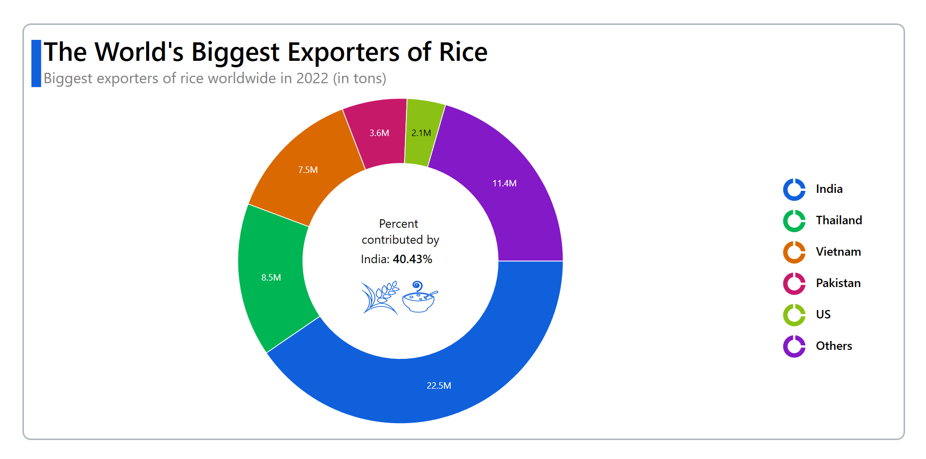
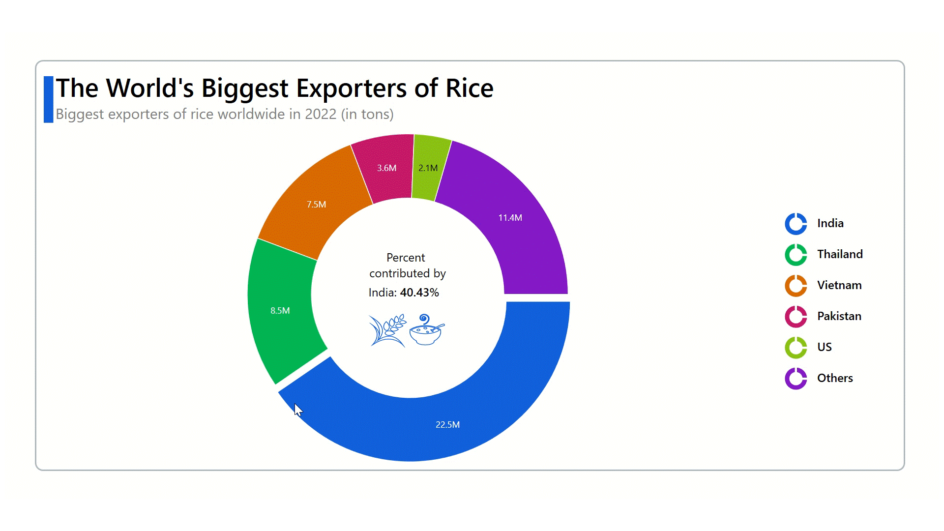
new RiceExporterModel("India", 22500),
new RiceExporterModel("Thailand", 8500),
new RiceExporterModel("Vietnam",7500 ),
new RiceExporterModel("Pakistan", 3600),
new RiceExporterModel("US", 2125),
new RiceExporterModel("Argentina", 400),
new RiceExporterModel("Australia",275 ),
new RiceExporterModel("Brazil",1100 ),
new RiceExporterModel("Burma", 1850),
new RiceExporterModel("Cambodia", 1800),
new RiceExporterModel("China",1800 ),
new RiceExporterModel("European Union", 400),
new RiceExporterModel("Guyana", 440),
new RiceExporterModel("Paraguay", 820),
new RiceExporterModel("Turkey",240 ),
new RiceExporterModel("Uruguay", 900),
new RiceExporterModel("Others", 1398),
};
}
}Step 3: Configuring the Syncfusion WPF Charts control
Let’s use this documentation to configure the Syncfusion WPF Charts control.
Refer to the following code example.
<Chart:SfChart>

</Chart:SfChart>
Step 4: Binding data to the doughnut chart
To visualize the rice export data, we’ll use the Syncfusion DoughnutSeries.
Refer to the following code example. In it, we’ve bound the ItemSource, XBindingPath, and YBindingPath properties with the ExportData, Country, and Value properties, respectively.
<Chart:SfChart>
 <chart:DoughnutSeries ItemsSource="{Binding ExportData}" XBindingPath="Country" YBindingPath="Value"/>
</Chart:SfChart>
Step 5: Customizing the chart appearance
We can enhance the appearance of the WPF Doughnut Chart by customizing its elements, such as the title, legend, center view, and data labels.
Customizing the chart title
The data presented in the chart can be more easily understood by adding a title. Refer to the following code example to customize the chart title.
<chart:SfChart HorizontalHeaderAlignment="Left">
 <chart:SfChart.Header>
  <Grid Margin="0,0,0,10">
   <Grid.ColumnDefinitions>
    <ColumnDefinition Width="13"/>
    <ColumnDefinition Width="*"/>
   </Grid.ColumnDefinitions>
   <StackPanel Orientation="Vertical" Margin="0,10,0,0" Background="#1060DC"/>
   <StackPanel Grid.Column="1" Margin="3,0,0,0">
    <TextBlock Text="The World's Biggest Exporters of Rice" FontSize="35" FontWeight="SemiBold" Foreground="Black"/>
    <TextBlock Text="Biggest exporters of rice worldwide in 2022 (in tons)" FontSize="20" Foreground="Gray"/>
   </StackPanel>
  </Grid>
 </chart:SfChart.Header>
</chart:SfChart>
Adding data labels
We can further make the data easier to read by enabling the chart data labels and customizing the label format and margin using the AdornmentsInfo property.
<Chart:DoughnutSeries.AdornmentsInfo>
 <chart:ChartAdornmentInfo ShowLabel="True" SegmentLabelFormat="#.#'M" Margin="0.4"/>
</Chart:DoughnutSeries.AdornmentsInfo>
Customizing the WPF Chart legend
Refer to the following code example to enable and customize the legend, which indicates which rice-exporting countries are associated with each segment.
<Chart:SfChart.Legend>
 <chart:ChartLegend DockPosition="Right">
  <Chart:ChartLegend.ItemTemplate>
   <DataTemplate>
    <StackPanel Orientation="Horizontal">
     <Grid Margin="10">
      <Path Data="{StaticResource LegendData1}" Fill="{Binding Interior}">
       <Path.RenderTransform>
        <ScaleTransform ScaleX="1.5" ScaleY="1.5"/>
       </Path.RenderTransform>
      </Path>
      <Path Data="{StaticResource LegendData2}" Fill="{Binding Interior}">
       <Path.RenderTransform>
        <ScaleTransform ScaleX="1.5" ScaleY="1.5"/>
       </Path.RenderTransform>
      </Path>
     </Grid>
     <TextBlock Text="{Binding Label}" FontSize="16" Margin="15,15,0,0" FontWeight="SemiBold"/>
    </StackPanel>
   </DataTemplate>
  </Chart:ChartLegend.ItemTemplate>
 </Chart:ChartLegend>
</Chart:SfChart.Legend>
Customizing the chart color and size
We can enhance the chart’s size and color and group the data points that are less than a specific value by using the DoughnutSize, Palette, Stroke, StrokeThickness, and GroupTo properties.
<chart:DoughnutSeries DoughnutSize="1" Stroke="White" StrokeThickness="1" Palette="Custom" GroupTo="{Binding GroupTo}">

  <Chart:DoughnutSeries.ColorModel>
    <Chart:ChartColorModel>
      <Chart:ChartColorModel.CustomBrushes>
       <SolidColorBrush Color="#1060DC"/>
       <SolidColorBrush Color="#00B553"/>
       <SolidColorBrush Color="#DA6902"/>
       <SolidColorBrush Color="#C71969"/>
       <SolidColorBrush Color="#8AC114"/>
       <SolidColorBrush Color="#8419C7"/>
      </Chart:ChartColorModel.CustomBrushes>
    </Chart:ChartColorModel>
  </Chart:DoughnutSeries.ColorModel>

</Chart:DoughnutSeries>
The GroupTo property groups the specific data points.
public class WorldRiceExporters
{
   private double groupTo = 2; //For values of 2 million or less

   public double GroupTo
   {
       get{ return groupTo;}
       set{ groupTo = value;}
   }
}
Adding text and a value at the center of the doughnut chart
We can enable the explosion feature and add a center view to the doughnut chart to demonstrate the percentage of the total rice exported that each country contributes. The center view updates when a chart segment is exploded on tapping.
<chart:DoughnutSeries ExplodeIndex="{Binding SelectedIndex, Mode=TwoWay}" ExplodeOnMouseClick="True" ExplodeRadius="10">
  <chart:DoughnutSeries.CenterView>
   <ContentControl>
    <Grid Margin="5">
     <Grid.RowDefinitions>
      <RowDefinition Height="Auto"/>
      <RowDefinition Height="Auto"/>
      <RowDefinition Height="Auto"/>
      <RowDefinition Height="Auto"/>
     </Grid.RowDefinitions>

     <TextBlock  Grid.Row="0" FontSize="16" Text="Percent" VerticalAlignment="Center" Margin="0,0,5,0" HorizontalAlignment="Center"/>
     <TextBlock  Grid.Row="1" FontSize="16" Text="contributed by" VerticalAlignment="Center" Margin="0,0,0,8" HorizontalAlignment="Center"/>

     <StackPanel Grid.Row="2" Orientation="Horizontal" HorizontalAlignment="Center" VerticalAlignment="Center" Margin="0,-3,10,0">
      <TextBlock FontSize="16" Text="{Binding  Country}"/>
      <TextBlock FontSize="16" Text=": "/>
      <TextBlock FontSize="16" FontWeight="SemiBold" Text="{Binding Percentage, StringFormat={}{0:F2}%, Mode=TwoWay}"/>
     </StackPanel>

     <StackPanel Grid.Row="3" Margin="4,20,0,0" Orientation="Horizontal">
      <Path Data="{StaticResource PathData1}" Stroke="{Binding SelectedIndex, Converter={StaticResource explodeColorConverter}}" StrokeThickness="0.7" Margin="0,0,20,0">
       <Path.RenderTransform>
        <ScaleTransform ScaleX="1.5" ScaleY="1.3" />
       </Path.RenderTransform>
      </Path>

      <Path Data="{StaticResource PathData2}" Stroke="{Binding SelectedIndex, Converter={StaticResource explodeColorConverter}}" StrokeThickness="0.7">
       <Path.RenderTransform>
        <ScaleTransform ScaleX="1.5" ScaleY="1.3" />
       </Path.RenderTransform>
      </Path>
    </StackPanel>
   </Grid>
  </ContentControl>
 </chart:DoughnutSeries.CenterView>
</chart:DoughnutSeries>
In the following code example, we have created the Country, Percentage, and SelectedIndex properties to store the export percentage value for each country.
public class WorldRiceExporters
{
  private string country;
  private double percentage;
  private int selectedIndex;

  public string Country
  {
     get{ return country;}
     set{ country = value;}
   }

   public double Percentage
   {
      get{ return percentage;}
      set{ percentage = value;}
   }

   public int SelectedIndex
   {
      get { return selectedIndex; }
      set
      {
         selectedIndex = value;
         UpdateIndex(value);
      }
   }

   public WorldRiceExporters()
   {
      SelectedIndex = 0;
   }

  private void UpdateIndex(int value)
  {
    if (value >= 0 && value < ExportData.Count)
    {
      var model = ExportData[value];
      double sum = ExportData.Sum(item => item.Value);
      if (model != null)
      {
        if (model.Value < GroupTo)
        {
           double selectedItemsSum = ExportData.Where(item => item.Value < GroupTo).Sum(item => item.Value);
           double selectedItemsPercentage = (selectedItemsSum / sum) * 100;
           Percentage = selectedItemsPercentage;
           Country = "Others";
        }
        else
        {
           double SelectedItemsPercentage = (model.Value / sum) * 100;
           Percentage = SelectedItemsPercentage;
           Country = model.Country;
        }
      }
    }
  }
}
After executing the previous code examples, the output will look like the following image.
GitHub reference
For more details, refer to the project on GitHub.
Conclusion
Thanks for reading! In this blog, we’ve seen how to visualize the data on rice exports using the Syncfusion WPF Doughnut Chart. We strongly encourage you to follow the steps outlined in this blog and share your feedback in the comments section below.
If you require any assistance, please don’t hesitate to contact us via our support forum, support portal, or feedback portal. We are always eager to help you!


Related blogs
- Chart of the Week: Creating a WPF Multiple Fast Line Chart to Display COVID-19’s Impact on U.S. Unemployment
- Chart of the Week: Creating a WPF Range Column Chart to Visualize ChatGPT’s Performance in Competitive Exams
- Chart of the Week: Visualize the Transfer Spending and Earning among the Football League Clubs Using WPF Scatter Chart
- Visualize JSON Data Quickly Using WPF Charts
 No spam, just valuable updates.