

Welcome to our Chart of the Week blog series!
In today’s blog post, we’re taking a closer look at the world’s most active volcanoes since 1950 using the powerful Syncfusion WPF column chart.
Volcanoes are incredible natural phenomena, spewing molten rock, ash, gases, and other substances from the Earth’s crust. Their eruptions range from mild to devastatingly intense, playing a pivotal role in shaping our planet’s landscape and influencing our environment positively and negatively.
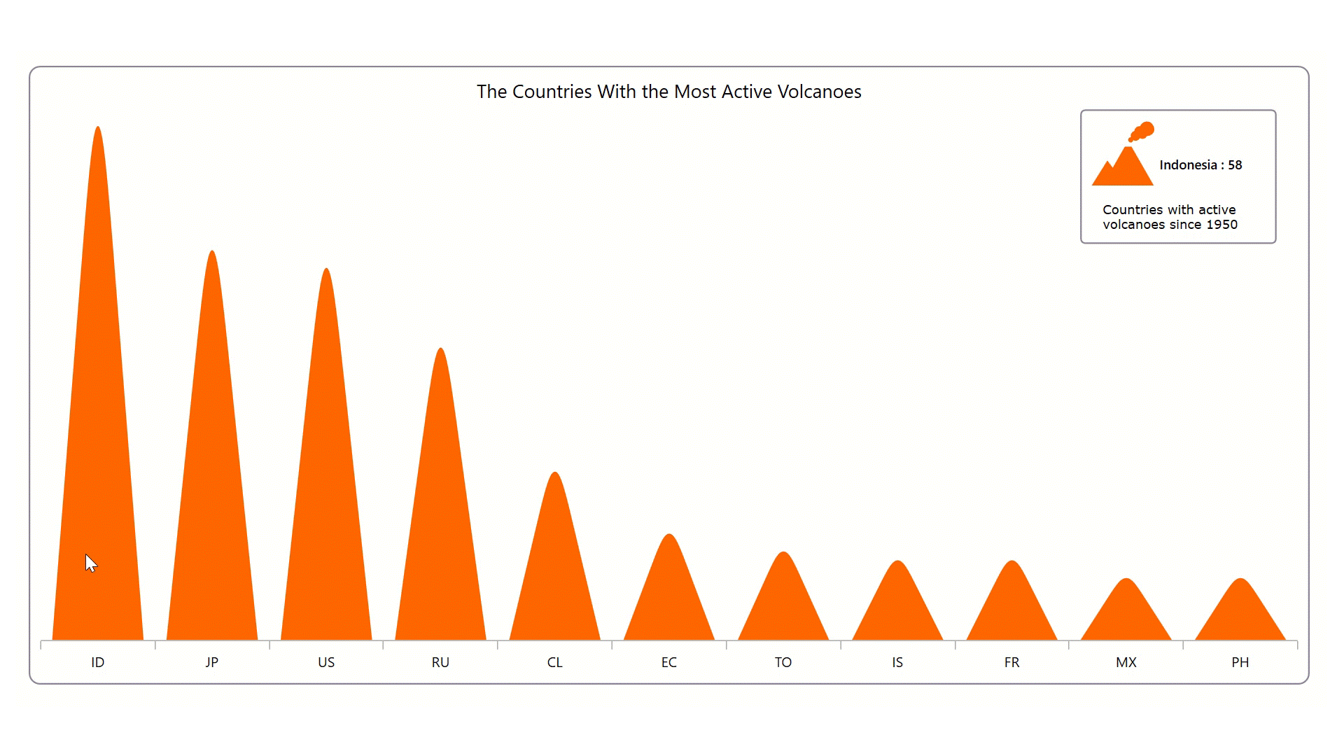
The chart we aim to construct will provide a captivating visual representation of these geological giants. The following image illustrates the chart that we intend to construct.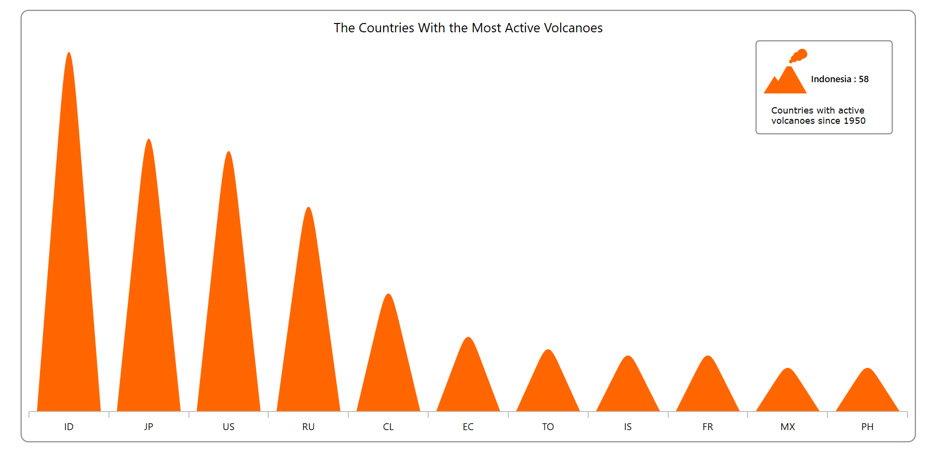
Let’s see the steps for creating this Syncfusion WPF column chart.
Step 1: Gathering the data on volcanoes
First, we gather data on the most active volcanoes from various countries.
Step 2: Organizing data for the chart
Let’s define the VolcanoesModel class with the Country and Count properties to store the volcano data for the chart.
Refer to the following code example.
public class VolcanoesModel
{
    public string Country { get; set; }
    public int Count { get; set; }

    public VolcanoesModel(string country, int count)
    {
        Country = country;
        Count = count;
    }
}
Next, we generate the data collection using the VolcanoesData class with the Data property, demonstrating the number of active volcanoes in different countries.
Refer to the following code example.
public class VolcanoesData : INotifyPropertyChanged
  {
      private List<VolcanoesModel>? data;
      public List<VolcanoesModel>? Data
      {
          get { return data; }
          set
          {
              data = value;
              NotifyPropertyChanged();
          }
      }

      public VolcanoesData()
      {
          Data = new List<VolcanoesModel>()
      {
          new VolcanoesModel ("ID", 58 ),
          new VolcanoesModel ("JP", 44 ),
          new VolcanoesModel ("US", 42 ),
          new VolcanoesModel ("RU", 33 ),
          new VolcanoesModel ("CL", 19 ),
          new VolcanoesModel ("EC", 12 ),
          new VolcanoesModel ("TO", 10 ),
          new VolcanoesModel ("IS", 9 ),
          new VolcanoesModel ("FR", 9 ),
          new VolcanoesModel ("MX", 7 ),
          new VolcanoesModel ("PH", 7 ),
      };

      }

      public event PropertyChangedEventHandler? PropertyChanged;

      public void NotifyPropertyChanged([CallerMemberName] String propertyName = "")
      {
          PropertyChanged?.Invoke(this, new PropertyChangedEventArgs(propertyName));
      }
  }
Step 3: Configuring the Syncfusion WPF Charts control
Now, let’s configure the Syncfusion WPF Charts control using this documentation.
<chart:SfChart>
 <chart:SfChart.PrimaryAxis>
  <chart:CategoryAxis/>
 </chart:SfChart.PrimaryAxis>

 <chart:SfChart.SecondaryAxis>
  <chart:NumericalAxis/>
 </chart:SfChart.SecondaryAxis>
</chart:SfChart>
Step 4: Bind the volcano data to the WPF column chart
We’ll use the Syncfusion WPF ColumnSeries to display detailed information about the most active volcanoes across the world.
Refer to the following code example.
<chart:ColumnSeries ItemsSource="{Binding Data}" XBindingPath="Country" YBindingPath="Count">
</chart:ColumnSeries>
In this, we bound the ItemSource property with the Data source. Then, we bound the XBindingPath and YbindingPath properties with the Country and Count properties, respectively.
Step 5: Customizing the chart appearance
We can customize the WPF column chart appearance to enhance the readability of the data.
Adding the chart title
We can significantly improve the readability of the plotted data by including a title in the chart, as shown in the following code example.
<chart:SfChart.Header>
 <TextBlock Text="The Countries With the Most Active Volcanoes" FontSize="18"/>
</chart:SfChart.Header>
Customizing the axis
Let’s customize the primary and secondary axes using the following properties:
- FontSize: Changes the axis label font size as desired.
- ShowGridLines: Customizes the visibility of gridlines.
- LabelPlacement: Positions the label.
- Visibility: Updates the visibility of the axis line.
Refer to the following code example.
<chart:SfChart.PrimaryAxis>
 <chart:CategoryAxis FontSize="13.5" ShowGridLines="False" LabelPlacement="BetweenTicks"/>
</chart:SfChart.PrimaryAxis>

<chart:SfChart.SecondaryAxis>
 <chart:NumericalAxis Visibility="Collapsed" ShowGridLines="False"/>
</chart:SfChart.SecondaryAxis>
Customizing the series
We can enhance our chart aesthetics by customizing the column shape and color.
Refer to the following code example.
<chart:SfChart.Resources>
 <DataTemplate x:Key="seriesTemplate">
  <Canvas>
   <Path Canvas.Left="{Binding RectX}" Canvas.Top="{Binding RectY}" Width="{Binding Width}" Height="{Binding Height}" Fill="{Binding Interior}" Stretch="Fill" Data="{StaticResource PathData}">
   </Path>
  </Canvas>
 </DataTemplate>
</chart:SfChart.Resources>

<chart:ColumnSeries CustomTemplate="{StaticResource seriesTemplate}" Interior="#FF6600">
</chart:ColumnSeries>
Incorporating interaction and a watermark
Let’s make our column chart more informative by incorporating the following features:
- The watermark feature allows us to add any view to the chart plot area, which helps us add relevant data.
- The selection feature helps us highlight a specific data point when tapping.
We add the volcano icon with informative text as a watermark and then enable segment selection. The watermark content will be shown with respect to the tapped segment while performing the selection.
Refer to the following code example.
<chart:ColumnSeries SegmentSelectionBrush="#6BFF6600" SelectedIndex="{Binding SelectedIndex, Mode=TwoWay}">
</chart:ColumnSeries>

<chart:SfChart.Behaviors>
 <chart:ChartSelectionBehavior EnableSegmentSelection="True"/>
</chart:SfChart.Behaviors>

<chart:SfChart.Watermark>
 <chart:Watermark Margin="0,30,20,0" HorizontalAlignment="Right">
  <chart:Watermark.Content>
   <StackPanel>
    <Border Padding="10" BorderThickness="1.5" CornerRadius="4" BorderBrush="#8d8794">
     <Grid>
      <Grid.ColumnDefinitions>
       <ColumnDefinition Width="Auto"/>
       <ColumnDefinition Width="Auto"/>
      </Grid.ColumnDefinitions>
      <Grid.RowDefinitions>
       <RowDefinition Height="Auto"/>
       <RowDefinition Height="Auto"/>
      </Grid.RowDefinitions>

      <Grid Grid.Row="0" Grid.Column="0">
       <Path Data="{StaticResource PathData1}" Fill="#FF6600"/>
       <Path Data="{StaticResource PathData2}" Fill="#FF6600"/>
       <Path Data="{StaticResource PathData3}" Fill="#FF6600"/>
      </Grid>

      <StackPanel Grid.Row="0" Grid.Column="1" Orientation="Horizontal" VerticalAlignment="Center" Margin="5,20,0,0" Width="100">
       <TextBlock Text="{Binding Country, Converter={StaticResource CountryCodeConverter}}" FontWeight="SemiBold" FontSize="12.5"/>
       <TextBlock Text="{Binding Count, StringFormat=' : {0}'}" FontWeight="SemiBold" FontSize="12.5"/>
      </StackPanel>

      <StackPanel Grid.Row="1" Grid.ColumnSpan="2" Orientation="Vertical" Margin="10,15,0,0">
       <TextBlock Text="Countries with active" FontFamily="Verdana"/>
       <TextBlock Text="volcanoes since 1950" FontFamily="Verdana"/>
      </StackPanel>

     </Grid>
    </Border>
   </StackPanel>
  </chart:Watermark.Content>
 </chart:Watermark>
</chart:SfChart.Watermark>
After that, we create the Country, Count, and SelectedIndex properties to store the volcano numbers for the different countries.
Refer to the following code example.
public class VolcanoesData : INotifyPropertyChanged
{
    private string country = "";
    public string Country
    {
        get { return country; }
        set
        {
            country = value;
            NotifyPropertyChanged();
        }
    }

    private int count;
    public int Count
    {
        get { return count; }
        set
        {
            count = value;
            NotifyPropertyChanged();
        }
    }

    private int selectedIndex;
    public int SelectedIndex
    {
        get { return selectedIndex; }
        set
        {
            selectedIndex = value;
            UpdateCountryAndCount();
        }
    }

    public VolcanoesData()
    {
        SelectedIndex = 1;
    }

    private void UpdateCountryAndCount()
    {
        if (SelectedIndex >= 0 && SelectedIndex < Data?.Count)
        {
            Country = Data[SelectedIndex].Country;
            Count = Data[SelectedIndex].Count;
        }
    }

    public event PropertyChangedEventHandler? PropertyChanged;

    public void NotifyPropertyChanged([CallerMemberName] String propertyName = "")
    {
        PropertyChanged?.Invoke(this, new PropertyChangedEventArgs(propertyName));
    }
}
After executing the previous code examples, the output will resemble the following GIF image.
GitHub reference
For more details, refer to the project on GitHub.
Conclusion
Thanks for reading! In this blog, we’ve seen how to visualize the data on countries with the most active volcanoes since 1950 using the Syncfusion WPF column chart. We encourage you to follow the steps outlined in this blog and share your feedback in the comments section below.
Current customers can download the new version of Essential Studio® from the License and Downloads page. If you are not yet a Syncfusion customer, you can try our 30-day free trial to check out our incredible features.
If you require assistance, please don’t hesitate to contact us via our support forum, support portal, or feedback portal. We are always eager to help you!


Related blogs
- Syncfusion Essential Studio® 2023 Volume 3 Is Here!
- Streamline Your WPF Development sith Syncfusion: Introducing the WPF Template Studio for Visual Studio
- Chart of the Week: Creating a Trend Line Using WPF Charts to Visualize Rapid Heating in North American Oceans
- Chart of the Week: Creating a WPF Doughnut Chart for the Top Rice-Exporting Countries
 No spam, just valuable updates.