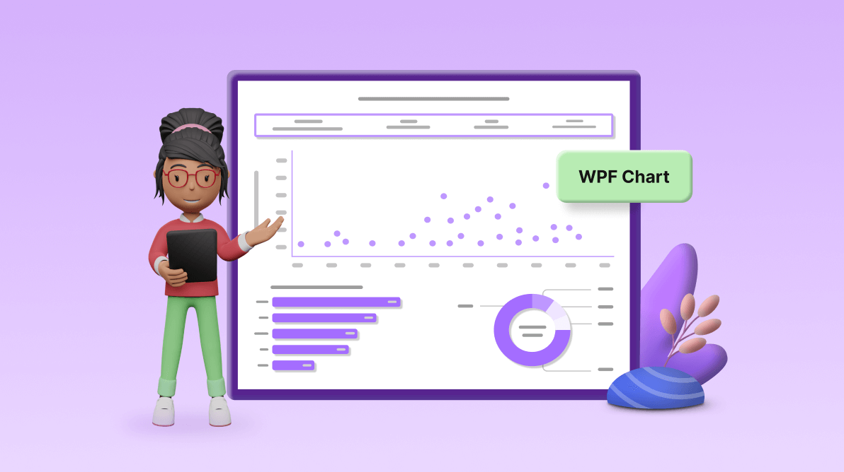
TLDR: Learn to create a chart dashboard to visualize the world’s top billionaires’ data using the user-friendly and highly customizable features of the Syncfusion WPF Charts control.
Welcome to the latest installment of our Chart of the Week series!
In today’s session, we’ll guide you through crafting a comprehensive chart dashboard using the Syncfusion WPF Charts control. Our focus is on visualizing the 2023 billionaires list, providing the top five industries they work in and their countries of origin.
Our dashboard will feature three chart types:
- Scatter chart: Provides a snapshot of each billionaire’s name, net worth, age, and country of origin.
- Bar chart: Highlights the top five industries billionaires made their money in and the number of billionaires in those industries.
- Doughnut chart: This shows the top five countries with the most billionaires in 2023.
The following is the chart we will construct.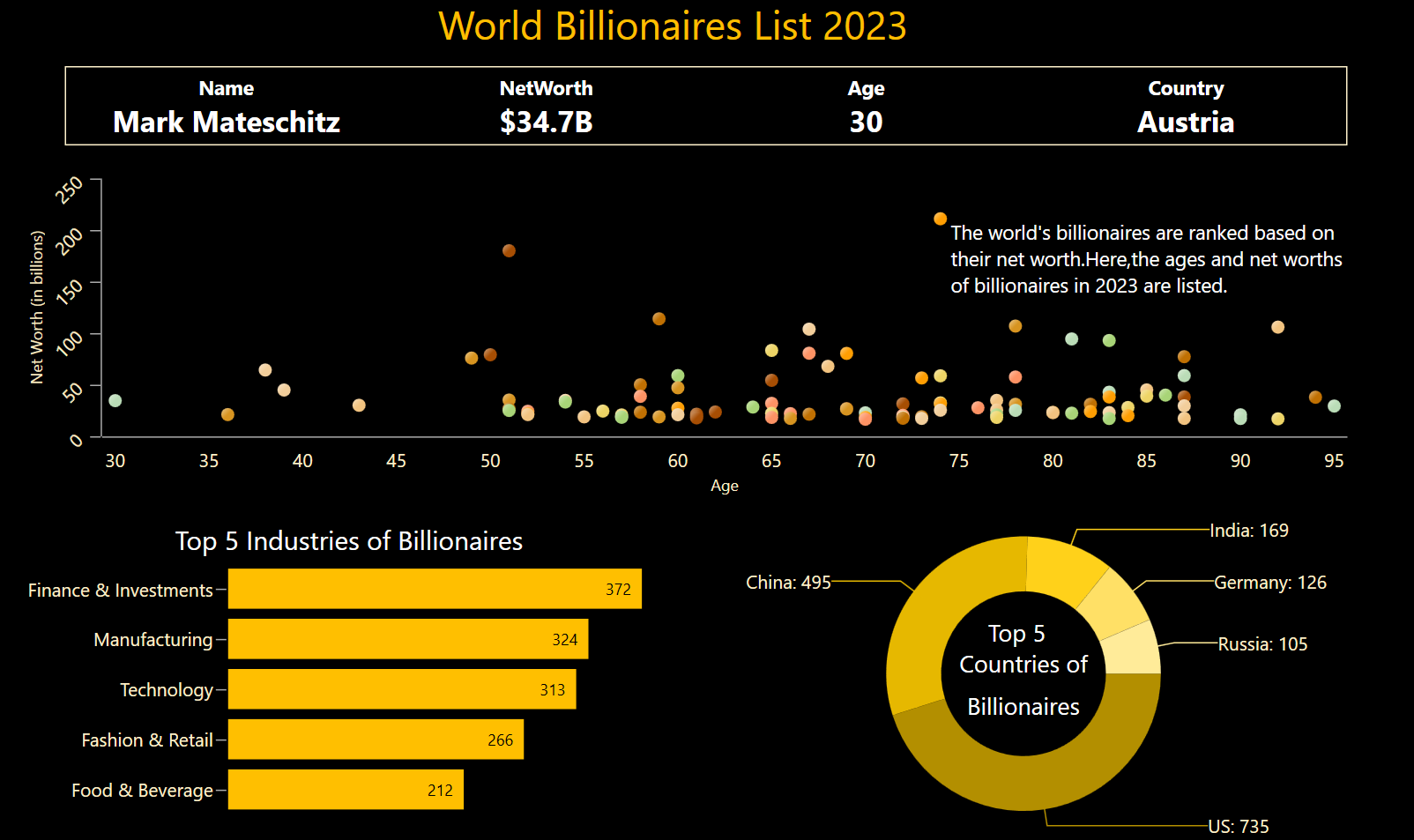
So, without further ado, let’s start building!
Step 1: Collecting data
First, gather data from the 2023 billionaires list. Using this data, prepare a CSV file in Excel and save it in .csv format. Gather the top 5 billionaire industries and the top 5 countries with the most billionaire citizens’ data from 2023 Forbes articles.
Step 2: Organizing data for the chart
Create a Model class that includes properties for storing information about the billionaires’ names, net worths, countries, ages, and industry names, as well as the number of billionaires and their countries.
Refer to the following code example.
 public class Model
 {
     public string BillionaireName { get; set; }
     public double BillionaireNetWorth { get; set; }
     public string BillionaireCountry { get; set; }
     public double BillionaireAge { get; set; }
     public string Category { get; set; }
     public string Country { get; set; }
     public double CategoryBillionaireCount { get; set; }
     public double CountryBillionaireCount { get; set; }

     public Model(string category, double categoryBillionaireCount, string country, double countryBillionaireCount)
     {
         Category = category;
         CategoryBillionaireCount = categoryBillionaireCount;
         Country = country;
         CountryBillionaireCount = countryBillionaireCount;
     }

     public Model(string name,double networth,double age,string country)
     {
         BillionaireName = name;
         BillionaireNetWorth = networth;
         BillionaireAge = age;
         BillionaireCountry = country;

     }
}
Next, generate the Billionaires collection using the ViewModel class and its BillionairesList observable collection property. Assign the CSV data to the BillionairesList data collection using the ReadCSVFile method, which stores it in the BillionairesList property.
Refer to the following code example.
public class ViewModel
 {
     // Stores 2023 billionaires’ data.
     ObservableCollection<Model> billionairesList;
     public ObservableCollection<Model> BillionairesList
     {
         get { return billionairesList; }
         set { billionairesList = value; }
     }

     // Stores the top 5 industries and countries for billionaires data.
     public ObservableCollection<Model> BillionaryCategoryandCountry { get; set; }

     public ViewModel()
     {
         BillionairesList = new ObservableCollection<Model>();
         //Reads the CSV file and stores the data in the BillionairesList.
         ReadCSVFile();

         BillionaryCategoryandCountry = new ObservableCollection<Model>()
         {
             new Model("Finance & Investments",372,"US",735),
             new Model("Manufacturing",324,"China",495),
             new Model("Technology",313,"India",169),
             new Model("Fashion & Retail",266,"Germany",126),
             new Model("Food & Beverage",212,"Russia",105),
         };
     }

     private void ReadCSVFile()
     {
         Assembly executingAssembly = typeof(App).GetTypeInfo().Assembly;
         Stream inputStream = executingAssembly.GetManifestResourceStream("ChartDashboardUI.Resource.dataset.csv");
         string line;
         ObservableCollection<string> lines = new ObservableCollection<string>();
         if(inputStream != null)
         {
             using StreamReader reader = new StreamReader(inputStream);
             while ((line = reader.ReadLine()) != null)
             {
                 lines.Add(line);
             }
             lines.RemoveAt(0);
             foreach (var items in lines)
             {
                string[] data = items.Split(',');
                double networth = Convert.ToDouble(data[2]);
                double age = Convert.ToDouble(data[3]);
                 BillionairesList.Add(new Model(data[1], networth,age, data[4]));
             }
         }
     }
}
Step 3: Layout definition
Let’s define the layout using a Grid to place our elements.
<Grid Background="Black" >
 <Grid.RowDefinitions>
  <RowDefinition Height="20"/>
  <RowDefinition Height="50"/>
  <RowDefinition Height="*"/>
  <RowDefinition Height="*"/>
 </Grid.RowDefinitions>
 <Grid.ColumnDefinitions>
  <ColumnDefinition Width="Auto"/>
  <ColumnDefinition Width="Auto"/>
 </Grid.ColumnDefinitions>
…
</Grid>
Step 4: Configuring the Syncfusion WPF Charts control
Let’s configure the Syncfusion WPF Charts control using this documentation.
<!-- ######## World's billionaires list 2023 ########-->
 <chart:SfChart >
  <chart:SfChart.PrimaryAxis>
   <chart:CategoryAxis />
  </chart:SfChart.PrimaryAxis>
  <chart:SfChart.SecondaryAxis>
   <chart:NumericalAxis />
  </chart:SfChart.SecondaryAxis>
 </chart:SfChart>

<!--######## Top 5 billionaires categories industries chart ########-->
 <chart:SfChart>
  <chart:SfChart.PrimaryAxis>
   <chart:CategoryAxis />
  </chart:SfChart.PrimaryAxis>
  <chart:SfChart.SecondaryAxis>
   <chart:NumericalAxis />
  </chart:SfChart.SecondaryAxis>
 </chart:SfChart>

<!--######## Top 5 billionaires countries chart ########-->
 <chart:SfChart >
 </chart:SfChart>
Step 5: Binding data to the chart
Now, we’ll use Syncfusion series instances to visualize the chart dashboard.
In this blog, we use a scatter series to showcase the 2023 billionaires list, binding the billionaire’s age and net worth to XBindingPath and YBindingPath, respectively. We set the billionaire list collection to the ItemSource.
In the bar series, which showcases the top 5 industries for billionaires, we bind the XBindingPath and YbindingPath to industry names and the number of billionaires.
For the doughnut series, illustrating the top 5 countries for billionaires, we bind the country names and their numbers of billionaires to XBindingPath and YBindingPath, respectively.
Refer to this code example.
<Window.DataContext>
 <local:ViewModel x:Name="viewModel"/>
</Window.DataContext>

<!-- ######## World's billionaires list 2023 ########-->
<chart:SfChart >
 …
 <chart:ScatterSeries ItemsSource="{Binding BillionairesList}"
                      XBindingPath="BillionaireAge"
                      YBindingPath="BillionaireNetWorth"/>
</chart:SfChart>

<!--######## Top 5 billionaires categories industries chart ########-->
<chart:SfChart >
  …
 <chart:BarSeries ItemsSource="{Binding BillionaryCategoryandCountry}"
                  XBindingPath="Category"
                  YBindingPath="CategoryBillionaireCount" />
</chart:SfChart>

<!--######## Top 5 billionaires country countries chart ########-->
<chart:SfChart>
 …
 <chart:DoughnutSeries ItemsSource="{Binding BillionaryCategoryandCountry}"
                       XBindingPath="Country"
                       YBindingPath="CountryBillionaireCount"/>
</chart:SfChart>
Step 6: Customizing the chart appearance
Let’s enhance the visual appeal of the chart dashboard and its elements by adjusting various properties and styles.
Customizing the title
Let’s customize the chart title.
<!-- ######## World's billionaires list 2023 ########-->
<TextBlock  Grid.Row="0" Grid.ColumnSpan="2"
            Text="World's Billionaires List 2023"
            FontSize="30"
            Foreground="#ffbf00"
            HorizontalAlignment="Center"
            VerticalAlignment="Center"
            Margin="0,5,0,0"/>

<!--######## Top 5 billionaires categories industries chart ########-->
<chart:SfChart Grid.Row="3" Grid.Column="0" Margin="10,0,0,0">
 <chart:SfChart.Header>
  <TextBlock Text="Top 5 Categories Industries ofwith Billionaires Count"
             Foreground="White"
             FontSize="20"/>
 </chart:SfChart.Header>
</chart:SfChart>


<!--######## Top 5 billionaires country countries chart ########-->
<chart:SfChart Grid.Row="3" Grid.Column="1" Margin="10,0,0,0">
 <chart:DoughnutSeries>
  <chart:DoughnutSeries.CenterView>
   <ContentControl>
    <StackPanel Orientation="Vertical">
     <TextBlock  FontSize="18" Text="Top 5" VerticalAlignment="Center" Margin="0,0,5,0" HorizontalAlignment="Center" Foreground="White"/>
     <TextBlock  FontSize="18" Text="Countries with" VerticalAlignment="Center" Margin="0,0,0,8" HorizontalAlignment="Center" Foreground="White"/>
     <TextBlock  FontSize="18" Text="Billionaires" VerticalAlignment="Center" Margin="0,0,0,8" HorizontalAlignment="Center" Foreground="White"/>
    </StackPanel>
   </ContentControl>
  </chart:DoughnutSeries.CenterView>
 </chart:DoughnutSeries>
</chart:SfChart>
Customizing the chart axis
Let’s customize the primary and secondary axes using the HeaderStyle and LabelStyle properties.
Refer to the code example.
<!-- ######## World's billionaires list 2023 ########-->
 <chart:SfChart Grid.Row="2" Grid.ColumnSpan="2" Margin="10,10,0,0">
  <chart:SfChart.PrimaryAxis>
   <chart:NumericalAxis Header="Age" FontSize="14" TickLineSize="0" ShowGridLines="False" PlotOffset="10">
    <chart:NumericalAxis.LabelStyle>
     <chart:LabelStyle Foreground="#fff2cc"/>
    </chart:NumericalAxis.LabelStyle>
    <chart:NumericalAxis.HeaderStyle>
     <chart:LabelStyle Foreground="#fff2cc"/>
    </chart:NumericalAxis.HeaderStyle>
   </chart:NumericalAxis>
  </chart:SfChart.PrimaryAxis>
  <chart:SfChart.SecondaryAxis>
   <chart:NumericalAxis Header="Net Worth (in billions)" FontSize="14"
                        ShowGridLines="False"
                        LabelRotationAngle="-45">
    <chart:NumericalAxis.LabelStyle>
     <chart:LabelStyle Foreground="#fff2cc"/>
    </chart:NumericalAxis.LabelStyle>
    <chart:NumericalAxis.HeaderStyle>
     <chart:LabelStyle Foreground="#fff2cc"/>
    </chart:NumericalAxis.HeaderStyle>
   </chart:NumericalAxis>
  </chart:SfChart.SecondaryAxis>
 </chart:SfChart>


<!--######## Top 5 billionaires categories industries chart ########-->
 <chart:SfChart Grid.Row="3" Grid.Column="0" Margin="10,10,0,0">
  <chart:SfChart.Resources>
   <Style TargetType="Line" x:Key="axisLineStyle">
    <Setter Property="Stroke" Value="Black" />
   </Style>
  </chart:SfChart.Resources>

  <chart:SfChart.PrimaryAxis>
   <chart:CategoryAxis FontSize="14"
                       AxisLineStyle="{StaticResource axisLineStyle}"
                       ShowGridLines="False">
    <chart:CategoryAxis.LabelStyle>
     <chart:LabelStyle Foreground="#fff2cc"/>
    </chart:CategoryAxis.LabelStyle>
   </chart:CategoryAxis>
  </chart:SfChart.PrimaryAxis>
  <chart:SfChart.SecondaryAxis>
   <chart:NumericalAxis ShowGridLines="False"
                        AxisLineStyle="{StaticResource axisLineStyle}"
                        TickLineSize="0">
   </chart:NumericalAxis>
  </chart:SfChart.SecondaryAxis>
 </chart:SfChart>
Customizing the series and data label appearance
We’ll customize the color of the series using the Interior and ColorModel properties.
To customize the data labels, create a data template using the country name and number of billionaires and bind it to the LabelTemplate property.
Refer to the following code example.
<!-- ######## World's billionaires list 2023 ########-->
 <chart:SfChart Grid.Row="2" Grid.ColumnSpan="2" Margin="10,10,0,0">
  <chart:ScatterSeries ItemsSource="{Binding BillionairesList}"
                       XBindingPath="BillionaireAge"
                       YBindingPath="BillionaireNetWorth"
                       ScatterHeight="10" ScatterWidth="10"
                       Palette="SandyBeach"/>
 </chart:SfChart>

<!--######## Top 5 billionaires categories industries chart ########-->
 <chart:SfChart Grid.Row="3" Grid.Column="0" Margin="10,10,0,0">
  <chart:BarSeries ItemsSource="{Binding BillionaryCategoryandCountry}" XBindingPath="Category"
                   YBindingPath="CategoryNetWorth"
                   SortDirection="Ascending" SortBy="Y"
                   IsSortData="True"
                   Interior="#ffbf00">
   <chart:BarSeries.AdornmentsInfo>
    <chart:ChartAdornmentInfo ShowLabel="True" UseSeriesPalette="False"
                              LabelPosition="Inner" >
    </chart:ChartAdornmentInfo>
   </chart:BarSeries.AdornmentsInfo>
  </chart:BarSeries>
 </chart:SfChart>

<!--######## Top 5 billionaires countries chart ########-->
 <chart:SfChart Grid.Row="3" Grid.Column="1" Margin="10,0,0,0">
<!--Customize data labels-->
 <chart:SfChart.Resources>
  <DataTemplate x:Key="dataLabelTemplate">
   <StackPanel Orientation="Horizontal">
    <TextBlock Text="{Binding Item.Country}" Foreground="#fff2cc" FontSize="14"/>
    <TextBlock Text=“: " Foreground="#fff2cc" FontSize="14"/>
    <TextBlock Text="{Binding Item.CountryBillionaireCount}" Foreground="#fff2cc" FontSize="14"/>
   </StackPanel>
  </DataTemplate>
 </chart:SfChart.Resources>
 <chart:DoughnutSeries XBindingPath="Country"
                       ItemsSource="{Binding BillionaryCategoryandCountry}"
                       YBindingPath="CountryBillionaireCount"
                       LabelPosition="OutsideExtended"
                       Palette="Custom">
  <chart:DoughnutSeries.AdornmentsInfo>
   <chart:ChartAdornmentInfo ShowConnectorLine="True"
                             ShowLabel="True"
                             SegmentLabelContent="LabelContentPath"
                             LabelTemplate="{StaticResource dataLabelTemplate}"/>
   </chart:DoughnutSeries.AdornmentsInfo>
   <chart:DoughnutSeries.ColorModel>
    <chart:ChartColorModel>
     <chart:ChartColorModel.CustomBrushes>
      <SolidColorBrush Color=" #b38f00"/>
      <SolidColorBrush Color="#e6b800"/>
      <SolidColorBrush Color="#ffd11a"/>
      <SolidColorBrush Color="#ffe066"/>
      <SolidColorBrush Color="#ffeb99"/>
     </chart:ChartColorModel.CustomBrushes>
    </chart:ChartColorModel>
   </chart:DoughnutSeries.ColorModel>
  </chart:DoughnutSeries>
 </chart:SfChart>
Customizing the chart trackball appearance
Customize the series trackball appearance by using the TrackBallLabelTemplate property. Create a data template using the billionaires’ ages [ValueX] and net worths [ValueY] and then bind this template to the series using the LabelTemplate property.
<!-- ######## World's billionaires list 2023 ########-->
 <chart:SfChart Grid.Row="2" Grid.ColumnSpan="2" Margin="10,0,0,0">
  <chart:SfChart.Resources>
   <DataTemplate x:Key="trackballLabelTemplate">
    <Border CornerRadius="5"
            BorderThickness="1"
            Background=" #fff2cc" Margin="8">
     <StackPanel>
      <TextBlock Foreground="Black" FontWeight="Bold" Text="{Binding ValueX}"/>
      <TextBlock Foreground="Black" Text="{Binding ValueY, StringFormat={}${0}B}"/>
     </StackPanel>
    </Border>
   </DataTemplate>
  </chart:SfChart.Resources>
  <chart:ScatterSeries ItemsSource="{Binding BillionairesList}"
                       XBindingPath="BillionaireAge"
                       YBindingPath="BillionaireNetWorth"
                       TrackBallLabelTemplate="{StaticResource trackballLabelTemplate}"/>
 </chart:SfChart>
Customizing the chart using annotations
We can utilize TextAnnotation instances to provide additional context within a specific chart area, enabling precise positioning of text based on pixel values. To position the annotations accurately, set the CoordinateUnit property to Pixels and specify the pixel values in the X1 and Y1 properties of the Annotation object.
Refer to the following code example.
<!-- ######## World's billionaires list 2023 ########-->
 <chart:SfChart Grid.Row="2" Grid.ColumnSpan="2" Margin="10,0,0,0">
…
  <chart:SfChart.Annotations>
   <chart:TextAnnotation Text="The world's billionaires are ranked based on " FontSize="15" Foreground="White" CoordinateUnit="Pixel" X1="700" Y1="30"/>
<chart:TextAnnotation Text="their net worth. Here, the ages and net worths of " FontSize="15" Foreground="White"  CoordinateUnit="Pixel" X1="700" Y1="50" Margin="0,5,0,0"/>
   <chart:TextAnnotation Text="billionaires in 2023 are listed." Foreground="White" FontSize="15"  CoordinateUnit="Pixel" X1="700" Y1="70"/>
  </chart:SfChart.Annotations>
 </chart:SfChart>
Step 7: Adding interactivity support
We’ll enable interaction with the trackball feature and use PositionChanged events to retrieve the cursor’s data points dynamically. Then, we’ll bind these data points to a text block for real-time display.
Refer to the following code example.
XAML
<Border BorderBrush="#fff2cc" BorderThickness="1" Grid.Row="1" Grid.ColumnSpan="2" Margin="50,20,0,0">
 <Grid>
…
  <TextBlock Text="Name" Grid.Row="0" Grid.Column="0" FontSize="15" FontWeight="Bold" Foreground="White" Margin="0,5,0,0" HorizontalAlignment="Center"/>
  <TextBlock Text="NetWorth" Grid.Row="0" Grid.Column="1" FontSize="15" FontWeight="Bold" Foreground="White" HorizontalAlignment="Center"  Margin="0,5,0,0" />
  <TextBlock Text="Age" Grid.Row="0" Grid.Column="2" FontSize="15" FontWeight="Bold" Foreground="White" HorizontalAlignment="Center"  Margin="0,5,0,0" />
  <TextBlock Text="Country" Grid.Row="0" Grid.Column="3" FontSize="15" FontWeight="Bold" Foreground="White" HorizontalAlignment="Center"  Margin="0,5,0,0" />
  <TextBlock x:Name="billionaryName" Text="{Binding BillionairesList[0].BillionaireName}" FontWeight="Bold" FontSize="22" Grid.Row="1" Grid.Column="0" Foreground="White" HorizontalAlignment="Center"/>
  <TextBlock x:Name="netWorth" Text="{Binding BillionairesList[0].BillionaireNetWorth, StringFormat={}${0}B}" FontWeight="Bold" FontSize="22" Grid.Row="1" Grid.Column="1"  Foreground="White" HorizontalAlignment="Center"/>
  <TextBlock x:Name="age" Text="{Binding BillionairesList[0].BillionaireAge}" Grid.Row="1" Grid.Column="2" FontWeight="Bold" FontSize="22" Foreground="White" HorizontalAlignment="Center"/>
  <TextBlock x:Name="country" Text="{Binding BillionairesList[0].BillionaireCountry}" FontWeight="Bold" FontSize="22" Grid.Row="1" Grid.Column="3" Foreground="White" HorizontalAlignment="Center"/>
 </Grid>
</Border>
C#
private void ChartTrackBallBehavior_PositionChanged(object sender, Syncfusion.UI.Xaml.Charts.PositionChangedEventArgs e)
 {
            var currentDetails = e.CurrentPointInfos;

            foreach (var item in currentDetails)
            {
                var XValue = item.ValueX;

                var billionaire = viewModel.BillionairesList.FirstOrDefault(x => x.BillionaireAge.ToString() == XValue);
                if (billionaire != null)
                {
                    billionaryName.Text = billionaire.BillionaireName;
                    netWorth.Text = string.Format("${0}B", billionaire.BillionaireNetWorth);
                    age.Text = billionaire.BillionaireAge.ToString();
                    country.Text = billionaire.BillionaireCountry;
                }
            }
}
After executing the previous code examples, we’ll get an output like the following image.
GitHub reference
For more information, refer to the project on Github.
Conclusion
Thanks for reading! We’ve delved into utilizing Syncfusion WPF Charts to create a chart dashboard for visualizing billionaires, the top industries for them, and their countries in 2023. We encourage you to follow these steps and share your thoughts on the experience in the comment section below.
If you require assistance, please don’t hesitate to contact us via our support forum, support portal, or feedback portal. We are always happy to help you!