

Welcome to our Chart of the Week blog series!
Today, we’ll delve into the details of the United States’ six most profitable agricultural commodities according to the Leafly Cannabis Report using the Syncfusion WPF 3D Pie Chart control.
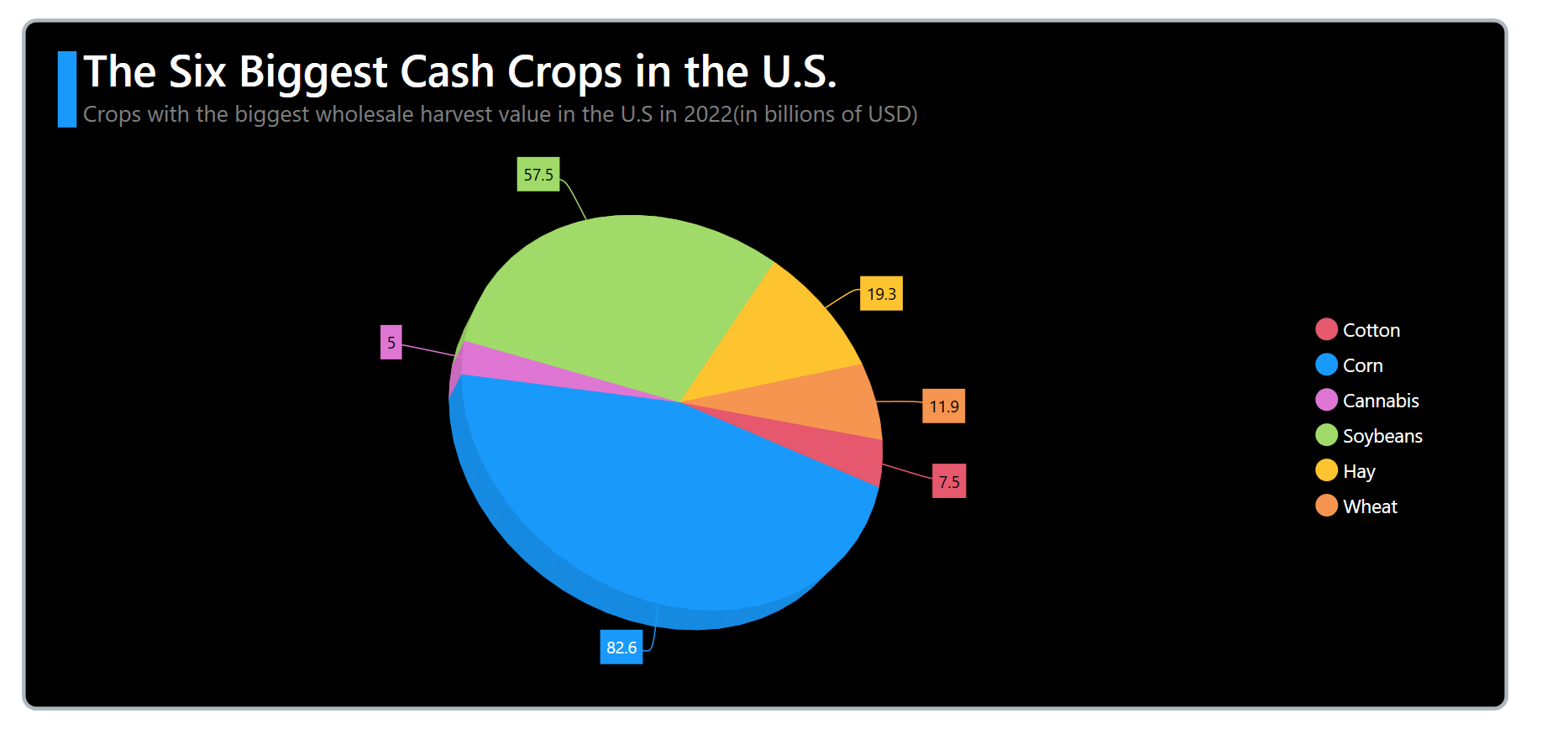
Agricultural commodities, or cash crops, are cultivated to sell and make a profit rather than for personal consumption. Several crops have a substantial economic impact on the U.S. economy due to their extensive cultivation and commercial value. Let’s take a closer look at six of these major cash crops according to the Leafly Cannabis Report:
- Corn: This versatile crop serves multiple purposes, including being used as animal feed, in ethanol production, and as an ingredient in various foods.
- Soybeans: These are a vital source of protein for animal feed and are also utilized in producing vegetable oil and industrial products.
- Hay: This is a primary feed source for livestock, supplying essential nutrients such as carbohydrates, proteins, and fiber. It becomes particularly important when fresh forage is scarce, such as in winter or during dry spells.
- Wheat: A staple in a healthy diet and a major export commodity. Wheat is used in various food products, including bread, pasta, and cereals.
- Cotton: This important fiber is used in the textile industry and is a significant oil and animal feed source.
- Cannabis: Also known as marijuana, this crop is commonly used for recreational and medicinal purposes.
In this blog, we’ll visualize the details of these cash crop harvests using the Syncfusion WPF 3D Pie Chart.
Step 1: Collect data about cash crops
First, we need to gather the cash crop data from the Leafly Crops Report. Specifically, we’ll examine the page number 4.
Step 2: Prepare data for the chart
Then, create a CashCropModel class with the properties Category and Value to store the information about cash crop harvest values in the U.S. for 2022.
Refer to the following code example.
public class CashCropModel
{
    public string Category { get; set; }
    public double Value { get; set; }

    public CashCropModel(string category, double value)
    {
        Category = category;
        Value = value;
    }
}
Next, configure the CashCropData class with the Data property to create a collection of harvest details for cash crops in the United States.
Refer to the following code example.
public class CashCropData
{
    public ObservableCollection<CashCropModel> Data { get; set; }

    public CashCropData()
    {
        this.Data = new ObservableCollection<CashCropModel>
        {
             new CashCropModel("Cotton", 7.5),
             new CashCropModel("Corn", 82.6),
             new CashCropModel("Cannabis", 5),
             new CashCropModel("Soybeans", 57.5),
             new CashCropModel("Hay", 19.3),
             new CashCropModel("Wheat", 11.9)
        };
    }
}
Step 3: Configuring the Syncfusion WPF 3D Chart
Configure the Syncfusion WPF 3D Chart control by following this documentation.
Refer to the following code example.
<chart:SfChart3D>
</chart:SfChart3D>
Step 4: Bind the data to the 3D Pie Chart
Now, we’ll create a Pie Chart to visualize the harvest values of cash crops.
<chart:SfChart3D>
 <chart:PieSeries3D ItemsSource="{Binding Data}" XBindingPath="Category" YBindingPath="Value"/>
</chart:SfChart3D>
In the code example, we’ve bound the ItemsSource, XBindingPath, and YBindingPath properties with the Data, Category, and Value properties, respectively.
Step 5: Customize the chart appearance
Let’s customize the appearance of our WPF 3D Pie Chart to make it more visually appealing and informative.
Customizing the chart angle, size, and series color
We can improve the chart’s size, angle, depth, and color using the Depth, Rotation, Tilt, CircleCoefficient, and Palette properties.
Refer to the following code example.
<chart:SfChart3D Depth="40" Rotation="-20" Tilt="-30">
 <chart:PieSeries3D CircleCoefficient="0.85" Palette="Custom">
  <chart:PieSeries3D.ColorModel>
    <chart:ChartColorModel>
     <chart:ChartColorModel.CustomBrushes>
      <SolidColorBrush Color="#E6586D"/>
      <SolidColorBrush Color="#199AFB"/>
      <SolidColorBrush Color="#DF76D3"/>
      <SolidColorBrush Color="#A0DB69"/>
      <SolidColorBrush Color="#FEC430"/>
      <SolidColorBrush Color="#F6954F"/>
     </chart:ChartColorModel.CustomBrushes>
    </chart:ChartColorModel>
  </chart:PieSeries3D.ColorModel>
 </chart:PieSeries3D>
</chart:SfChart3D>
Customizing the chart title
Adding a title to the chart can help users understand the data being visualized. Here’s how you can customize the chart title.
<chart:SfChart3D.Header>
 <Grid Margin="-300,3,0,10" x:Name="header">
  <Grid.ColumnDefinitions>
   <ColumnDefinition Width="20"/>
   <ColumnDefinition Width="*"/>
  </Grid.ColumnDefinitions>
  <StackPanel Orientation="Vertical" Margin="0,10,5,0" Background="#199AFB"/>
  <StackPanel Grid.Column="1" >
   <TextBlock Text="The Six Biggest Cash Crops in the U.S" FontSize="35" FontWeight="SemiBold" Foreground="White"/>
   <TextBlock Text="Crops with the biggest wholesale harvest value in the U.S in 2022(in billions of USD)" FontSize="18" Foreground="Gray"/>
  </StackPanel>
 </Grid>
</chart:SfChart3D.Header>
Customizing the chart legend
Refer to the following code to enable and customize the legend.
<chart:SfChart3D>
 <chart:SfChart3D.Legend>
  <chart:ChartLegend DockPosition="Right" Foreground="White" FontSize="15" IconWidth="18" IconHeight="18" ItemMargin="2"/>
 </chart:SfChart3D.Legend>
 <chart:PieSeries3D LegendIcon="Circle"/>
</chart:SfChart3D>
Adding data labels
We can enable and customize the chart data label elements, such as the label position, connector line, font size, and connector type.
<chart:SfChart3D>
 <chart:PieSeries3D ConnectorType="Bezier" LabelPosition="Outside">
  <chart:PieSeries3D.AdornmentsInfo>
   <chart:ChartAdornmentInfo3D ShowLabel="True" ShowConnectorLine="True" ConnectorHeight="40" FontSize="13"/>
  </chart:PieSeries3D.AdornmentsInfo>
 </chart:PieSeries3D>
</chart:SfChart3D>
Enabling the interactive features
The WPF 3D Pie Chart enables us to view data dynamically from the best possible angle using a mouse or touch device with the EnableRotation property.
Refer to the following code example.
<chart:SfChart3D EnableRotation="True">
</chart:SfChart3D>
After executing the previous code examples, the output will resemble the following image.
GitHub reference
For more details, refer to the project on GitHub.
Conclusion
Thanks for reading! In this blog, we have shown how to visualize the harvest details of cash crops in the U.S. using the Syncfusion WPF 3D Pie Chart. We encourage you to follow the steps outlined in this blog and share your valuable feedback in the comments section below.
If you require assistance, please don’t hesitate to contact us via our support forum, support portal, or feedback portal. We are always eager to help you!


Related blogs
- Chart of the Week: Creating a WPF Fast Line Chart for Cryptocurrency Trade Analysis
- Chart of the Week: Creating a WPF Column Chart for Countries with the Most Active Volcanoes
- Streamline Your WPF Development with Syncfusion: Introducing the WPF Template Studio for Visual Studio
- Chart of the Week: Creating a Trend Line Using WPF Charts to Visualize Rapid Heating in North American Oceans
 No spam, just valuable updates.