

Welcome to the Chart of the Week blog series!
Today, we’ll visualize the data on primary energy utility consumption in the United States using the Syncfusion WinUI Stacked Area Chart.
When we talk about primary energy utility consumption, we’re referring to the raw energy that various sectors of the economy consume. These sectors include residential, commercial, industrial, and transportation. The measurement of this consumption considers the raw energy sources used, such as fossil fuels (coal, natural gas, and petroleum), renewable sources (hydroelectric, solar, and wind), and nuclear energy.
In the past two decades, natural gas has become the primary source of electricity generation in the United States. This cleaner-burning fossil fuel generates fewer carbon dioxide (CO2) emissions per unit of energy. As concerns about climate change and air pollution grow, people view natural gas as a transitional fuel that can help reduce greenhouse gas emissions compared to more carbon-intensive fossil fuels.
Let’s examine the primary energy utility consumption in the United States over the past two decades using the Syncfusion WinUI Stacked Area Chart.
The following image shows the chart we’re going to build.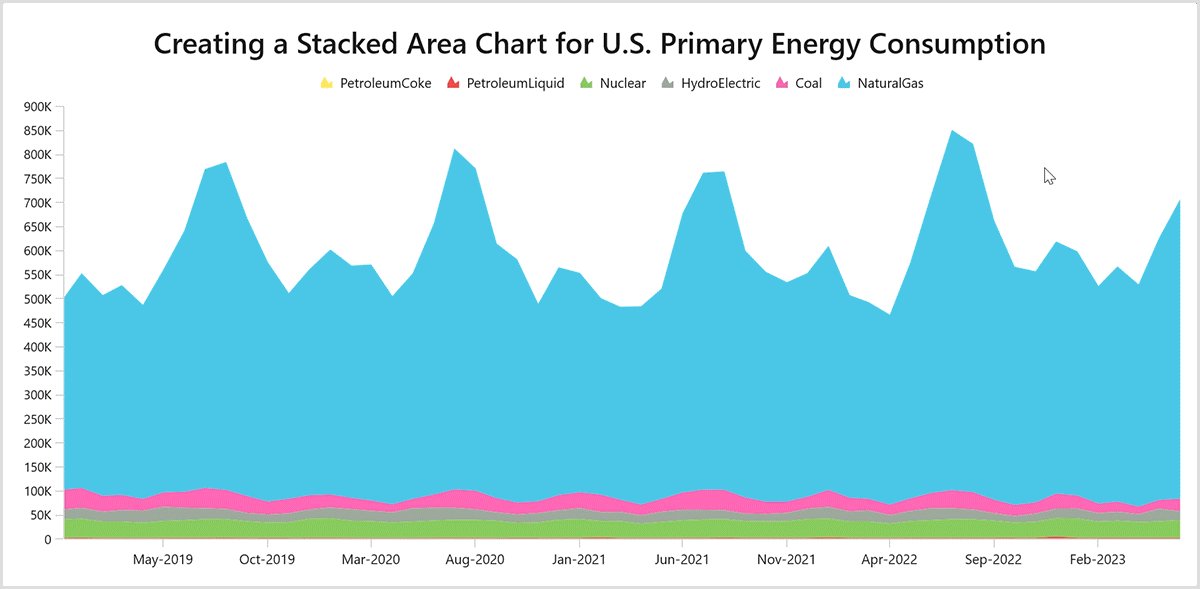
Step 1: Gather the data on primary energy utility consumption
First, we need to gather the data for primary energy utility consumption from the US Energy Information Administration. We can download the data in CSV format.
Step 2: Prepare the data for the Stacked Area Chart
Let’s create the EnergyUtilityProducts class with DateTime Month, Coal, PetroleumLiquid, PetroleumCoke, HydroElectric, Nuclear, and NaturalGas properties to store each month’s energy utility consumption details.
Refer to the following code example.
public class EnergyUtilityProducts
{
     public DateTime Month { get; set; }
     public double Coal { get; set; }
     public double PetroleumLiquid { get; set; }
     public double PetroleumCoke { get; set; }
     public double NaturalGas { get; set; }
     public double Nuclear { get; set; }
     public double HydroElectric { get; set; }
}
Now, create the class EnergyUtilityConsumption and add the necessary observable data collections using the CollectionOfData property. This collection will store data for the Coal, PetroleumLiquid, PetroleumCoke, HydroElectric, Nuclear, and NaturalGas properties by converting the CSV data to a collection of data points using the ReadCSV method.
public class EnergyUtilityConsumption
{
     public ObservableCollection<EnergyUtilityProducts> CollectionOfData { get; set; }

     public EnergyUtilityConsumption()
     {
         CollectionOfData = new ObservableCollection<EnergyUtilityProducts>();
         ReadCSV("US_Energy_Consumption.Resources.us_energy_consumption_data.csv");
     }


     private void ReadCSV(string resourceStream)
     {
         Assembly executingAssembly = typeof(App).GetTypeInfo().Assembly;
         Stream inputStream = executingAssembly.GetManifestResourceStream(resourceStream);

         string? line;
         List<string> lines = new List<string>();
         using StreamReader reader = new StreamReader(inputStream);
         while ((line = reader.ReadLine()) != null)
         {
                 lines.Add(line);
         }

         lines.RemoveAt(0);

         foreach(var dataPoint in lines)
         {
             string[] data = dataPoint.Split(',');
             DateTime date = DateTime.ParseExact(data[0], "MMM-yy", CultureInfo.InvariantCulture);
             CollectionOfData.Add(new EnergyUtilityProducts() { Month = date, Coal = Convert.ToDouble(data[1]), PetroleumLiquid = Convert.ToDouble(data[2]), PetroleumCoke = Convert.ToDouble(data[3]), NaturalGas = Convert.ToDouble(data[4]),Nuclear = Convert.ToDouble(data[5]), HydroElectric = Convert.ToDouble(data[6]) });

         }
     }
 }
Step 3: Initialize the WinUI Cartesian Chart control and its axis
Let’s initialize the WinUI Cartesian Chart using the user-friendly documentation and add the required axes using the XAxes and YAxes properties. We can add the DateTimeAxis to the XAxes and the NumericalAxis to the YAxes to visualize the energy utility consumption details over the last two decades.
Refer to the following code example.
<chart:SfCartesianChart x:Name="chart" >

 <chart:SfCartesianChart.XAxes>
  <chart:DateTimeAxis />
 </chart:SfCartesianChart.XAxes>

 <chart:SfCartesianChart.YAxes>
  <chart:NumericalAxis />
 </chart:SfCartesianChart.YAxes>

</chart:SfCartesianChart>
Step 4: Initialize the DataContext for the chart
Now, configure the EnergyUtilityConsumption class on the US_Energy_Consumption XAML page to bind its properties to the DataContext of the chart.
Refer to the following code example.
<chart:SfCartesianChart.DataContext>
 <local:EnergyUtilityConsumption/>
</chart:SfCartesianChart.DataContext>
Step 5: Initialize the chart header
We can add the title to the chart using the Header property to inform viewers what the data plotted in the SfCartesianChart is about.
We can also customize the header’s font size, font weight, and text using the FontSize, FontWeight, and Text properties, respectively.
Refer to the following code example.
<chart:SfCartesianChart.Header>
 <TextBlock Text="Creating a Stacked Area Chart for U.S. Primary Energy Consumption"  TextWrapping="Wrap" FontSize="30" FontWeight="Medium" Margin="2" />
</chart:SfCartesianChart.Header>
Step 6: Initialize the WinUI stacked area series
To visualize the energy utility consumption details, we’ll use the Syncfusion StackedAreaSeries instance.
Refer to the following code example.
<chart:StackedAreaSeries ItemsSource="{Binding CollectionOfData }"
                         XBindingPath="Month"  YBindingPath="PetroleumCoke">
</chart:StackedAreaSeries>

<chart:StackedAreaSeries ItemsSource="{Binding CollectionOfData}"
                         XBindingPath="Month" YBindingPath="PetroleumLiquid">
</chart:StackedAreaSeries>

<chart:StackedAreaSeries ItemsSource="{Binding CollectionOfData }"
                         XBindingPath="Month"  YBindingPath="Nuclear">
</chart:StackedAreaSeries>

<chart:StackedAreaSeries ItemsSource="{Binding CollectionOfData }"
                         XBindingPath="Month" YBindingPath="HydroElectric">
</chart:StackedAreaSeries>

<chart:StackedAreaSeries ItemsSource="{Binding CollectionOfData }"
                         XBindingPath="Month"  YBindingPath="Coal">
</chart:StackedAreaSeries>

<chart:StackedAreaSeries ItemsSource="{Binding CollectionOfData }"
                         XBindingPath="Month" YBindingPath="NaturalGas">
</chart:StackedAreaSeries>
In the previous code example, we’ve bound each series’s ItemSource property to the observable collection of CollectionOfData, and we’ve also bound the corresponding XBindingPath and YBindingPath properties.
Step 7: Customize the chart axis elements
We can customize the chart axis’s properties based on the chart’s visual appearance. For example, we can disable the major gridlines in the plot area and customize the style of the minor tick lines using the ShowMajorGridLines and MinorTickStyle properties, respectively.
Moreover, we can show the energy utility consumption data for a specific period of the year by using the ZoomFactor property, which determines the percentage of the visible range from the total range of the axis, and the ZoomPosition property, which specifies the position of the visible range within the total axis range.
We can also format the date-time value based on our requirements using the LabelFormat property by initializing the LabelStyle property.
Refer to the following code example.
<chart:SfCartesianChart.XAxes>
 <chart:DateTimeAxis ShowMajorGridLines="False" ZoomFactor="0.2"
                     ZoomPosition="0.9" MinorTickStyle="{StaticResource lineStyle}">
  <chart:DateTimeAxis.LabelStyle>
   <chart:LabelStyle LabelFormat="MMM-yyy"/>
  </chart:DateTimeAxis.LabelStyle>
 </chart:DateTimeAxis>
</chart:SfCartesianChart.XAxes>
We can customize the axis label property using the LabelTemplate property and set the axis interval using the Interval property.
Refer to the following code example.
<chart:SfCartesianChart.YAxes>
 <chart:NumericalAxis ShowMajorGridLines="False"  Interval="2000"
                      LabelTemplate="{StaticResource labelTemplate}"
                      MinorTickStyle="{StaticResource lineStyle}"/>
</chart:SfCartesianChart.YAxes>
Step 8: Customize the series appearance
Let’s customize the color of each series using the Fill property and label each series using the Name property.
To display the energy consumption amount while hovering over a particular data point, we’ll use the TooltipTemplate property and enable the EnableTooltip property.
Refer to the following code example.
<chart:StackedAreaSeries Fill="Black" Name="PetroleumCoke" Label="PetroleumCoke"
                         ItemsSource="{Binding PetroleumCoke}"
                         TooltipTemplate="{StaticResource toolTipTemplate5}"
                         EnableTooltip="True" XBindingPath="Month"
                         YBindingPath="PetroleumCoke">
</chart:StackedAreaSeries>


<chart:StackedAreaSeries Fill="#FFE55C" Name="PetroleumLiquid" EnableTooltip="True"
                         TooltipTemplate="{StaticResource toolTipTemplate4}"
                         ItemsSource="{Binding PetroleumLiquid}" Label="PetroleumLiquid"
                         XBindingPath="Month" YBindingPath="PetroleumLiquid"       >
</chart:StackedAreaSeries>

<chart:StackedAreaSeries Fill="#88CA5E" Name="Nuclear" Label="Nuclear"
                         ItemsSource="{Binding Nuclear}" EnableTooltip="True"
                         TooltipTemplate="{StaticResource toolTipTemplate3}" XBindingPath="Month"
                         YBindingPath="Nuclear">
</chart:StackedAreaSeries>

<chart:StackedAreaSeries Fill="#9CA89E" Name="HydroElectric" Label="HydroElectric"
                         TooltipTemplate="{StaticResource toolTipTemplate2}"
                         ItemsSource="{Binding HydroElectric}" EnableTooltip="True"
                         XBindingPath="Month" YBindingPath="HydroElectric">
</chart:StackedAreaSeries>

<chart:StackedAreaSeries Fill="#FF67b4" Name="Coal" Label="Coal"
                         TooltipTemplate="{StaticResource toolTipTemplate1}"
                         ItemsSource="{Binding Coal}" EnableTooltip="True" XBindingPath="Month"
                         YBindingPath="Coal"  AnimationDuration="0:03:30">
</chart:StackedAreaSeries>

<chart:StackedAreaSeries Fill="#32CBF1" Name="NaturalGas"  Label="NaturalGas"
                         TooltipTemplate="{StaticResource toolTipTemplate}"
                         ItemsSource="{Binding NaturalGas}" EnableTooltip="True"
                         XBindingPath="Month" YBindingPath="NaturalGas">
</chart:StackedAreaSeries>
Step 9: Configure the legend
Next, let’s set up the legend, which includes a list of data points in the chart. Each item in the legend helps you identify its corresponding series in the chart. By doing this, we can determine the Label for each series that will appear in the legend.
Refer to the following code example.
<chart:SfCartesianChart.Legend>
 <chart:ChartLegend/>
</chart:SfCartesianChart.Legend>
Step 10: Configure the tooltip behavior
Customize the TooltipBehavior in the chart by initializing the ChartTooltipBehavior class.
Using the Duration property, we can set how long the tooltip value needs to be displayed while hovering the pointer over the series, and we can animate the tooltip value using the EnableAnimation property.
Additionally, we can customize the appearance of the tooltip using the Style property in the ChartTooltipBehavior.
Refer to the following code example.
<chart:SfCartesianChart.TooltipBehavior>
 <chart:ChartTooltipBehavior Duration="10000" EnableAnimation="True"
                             Style="{StaticResource style}"/>
</chart:SfCartesianChart.TooltipBehavior>
Step 11: Configure the zoom and pan behavior
Zooming and panning features help us visualize a huge set of data points with ease. We can navigate the chart area while zoomed in by enabling panning using the EnablePanning property.
To prevent pinch and wheel-button zooming actions, we can disable them using the EnablePinchZooming and EnableMouseWheelZooming properties, respectively.
Refer to the following code example.
<chart:SfCartesianChart.ZoomPanBehavior>
 <chart:ChartZoomPanBehavior EnablePanning="True" EnableMouseWheelZooming="False" EnablePinchZooming="False" />
</chart:SfCartesianChart.ZoomPanBehavior>
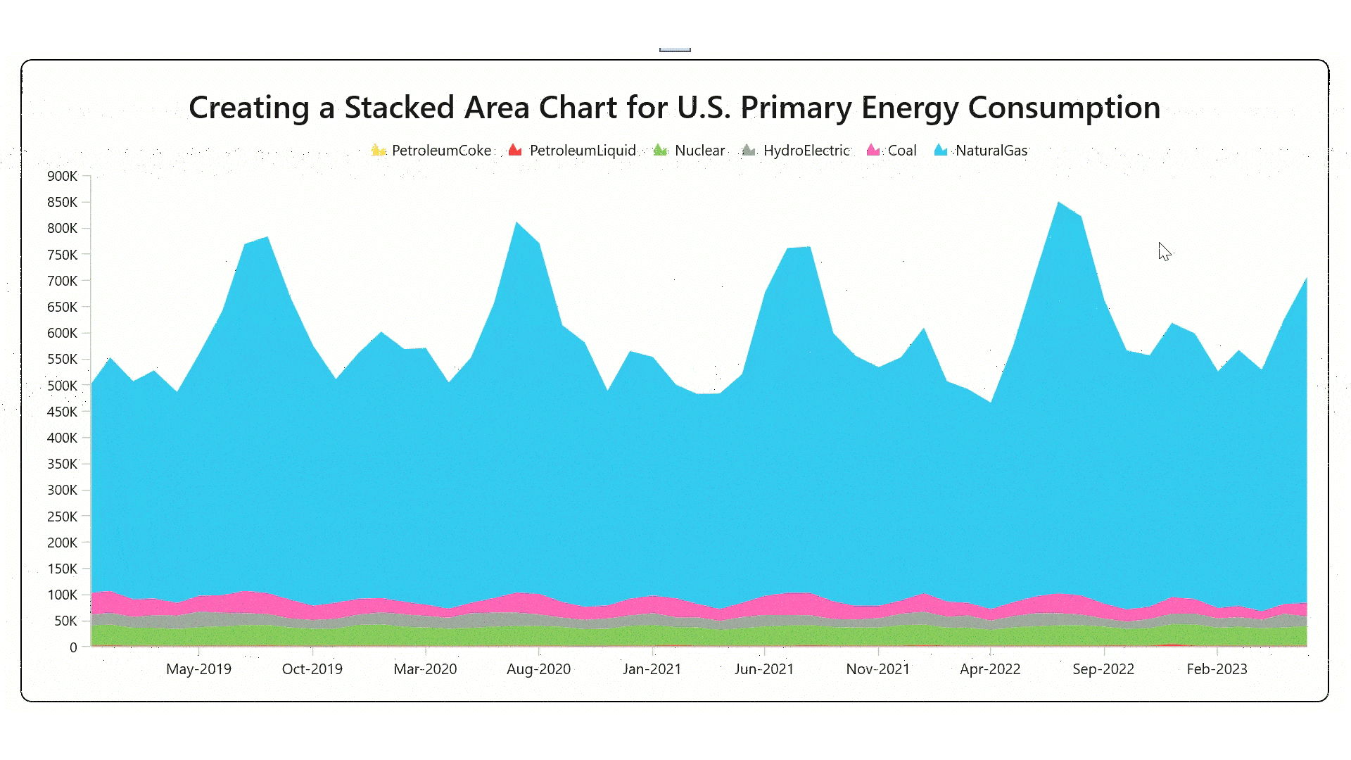
After executing all the previous code examples, we’ll get the output shown in the following image.
GitHub reference
For more details, refer to the GitHub demo.
Conclusion
Thanks for reading! In this blog, we’ve seen how to visualize the primary energy utility consumption in the United States using the Syncfusion WinUI Stacked Area Chart. Try the steps in this blog post and leave your feedback in the comments section below!
You can explore our WinUI Charts examples to learn more about the supported chart types and how easy it is to configure them for stunning visual effects.
The latest version of the WinUI Charts control is available for current customers from the License and Downloads page. If you are not yet a Syncfusion customer, try our 30-day free trial to check it out.
Also, you can contact us through our support forums, support portal, or feedback portal. We are always happy to assist you!
Related blogs
- Introducing the New WinUI Shimmer Control
- Unleashing the Power of Navigation and Filtering with WinUI Segmented Control
- Chart of the Week: Creating a WinUI Spline Area Chart for Top Google Investing Searches in 2022
- Chart of the Week: Creating a WinUI 100% Stacked Column Chart for Global Distribution of Cloud Provider Data Centers
 No spam, just valuable updates.