
 Jegan R
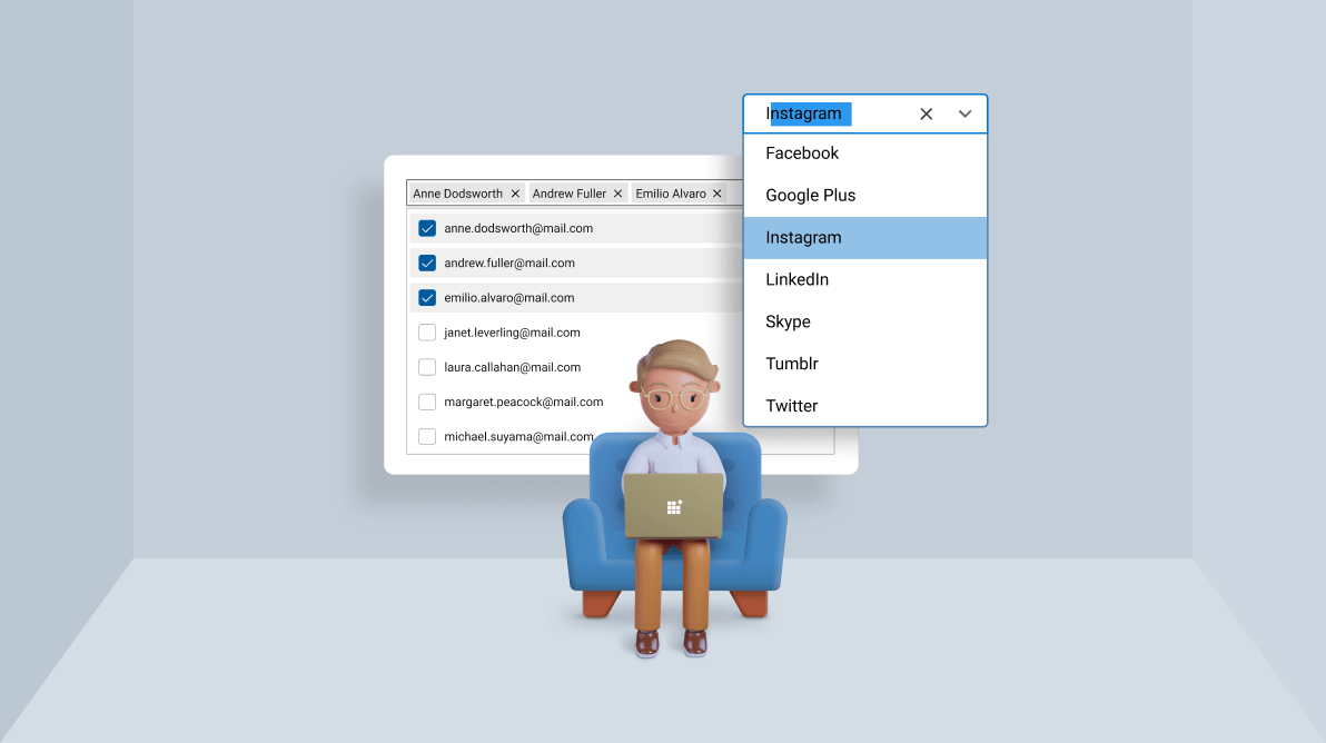
TL;DR: Use ComboBox for finite, static lists where dropdown clarity matters. Use AutoComplete for large or dynamic datasets where speed and relevance are critical. Both support filtering, editing, and multi-select. The right choice improves productivity, reduces errors, and scales better in enterprise workflows.
Choosing the right input control is a small UI decision. But the wrong choice can result in productivity losses, more errors, higher costs, and accessibility failures across enterprise workflows. Both ComboBox and AutoComplete controls let users select from a list, but address different needs.
Here’s a practical guide for developers and architects to identify when a dropdown control brings clarity and validation, versus when typed suggestions are essential for speed and relevance. This section provides clear criteria and enterprise-tested examples to help you standardize input controls across your applications.

ComboBox: Great, when the user just needs to pick from a set list
The ComboBox control is a list box that conserves space by displaying items in a pop-up list.
If there are only a few items (e.g., male or female), use a list box or radio button. When the list gets too large to display, use a ComboBox. For example, select a font from the list of supported fonts in a text editor.
When to use the ComboBox
- Items are static and represent the only available options.
- Use a ComboBox when you want a dropdown that lets the user select from a list by clicking the dropdown button.
- Where there is a limited number of items.
- Use a ComboBox when editing and filtering features are needed. Editing can be disabled while still allowing item selection.

Real-world use cases
A ComboBox lets users quickly choose or enter values, making it useful in industries like:
- Manufacturing ERP systems: Operators select machine states (Running, Idle, Maintenance) from a finite dropdown list to ensure standardized reporting.
- Healthcare apps: Appointment scheduling systems use a pre-defined list of medical specialties or departments to ensure accurate categorization.
- Online retail POS systems: Cashiers or customers select payment methods (Cash, Credit, Debit, Gift Card) from a static dropdown for quick transactions.

AutoComplete: When your data is huge, fast, or always changing
The AutoComplete control is a text box that suggests as users type. An example is a search engine, which shows suggestions based on popular searches.
When to use the AutoComplete
- When items are dynamic and change based on the user’s input.
- When you don’t need a dropdown button. When the user provides input, the list opens automatically with suggestions.
- When working with a large dataset, it is necessary to display suggestions based on logical matching rather than simple string comparison.

Real-world use cases
AutoComplete speeds up input by predicting text as users type, making it valuable across industries such as:
- E-commerce platforms: Customers type product names, and AutoComplete suggests items dynamically from thousands of stock keeping units.
- Travel and logistics: Users enter city names or airport codes, and it provides real-time suggestions from global datasets.
- CRM systems: Sales representatives type client names, and it suggests matches from a constantly updating customer database.
ComboBox vs AutoComplete: What’s really different?
AutoComplete’s main advantage over ComboBox is its ability to handle dynamic items. Here are other differences.
| ComboBox | AutoComplete |
| A minimal version of a list box. | A text box control that shows suggestions based on user input. |
| Example: Selecting a font in a text editor. | Example: Searching for a product during in online shopping. |
| Used when we want to choose items from a finite set of items. | Used when we want to choose items from a huge set of data or items which are decided at runtime. |
| Choose items by opening a dropdown and choosing them from a list. | No dropdown. Suggestions will be shown based on the user input. |
| When there are a huge number of items, the filtering feature shortens the list in the dropdown and makes it easier to select the required items. | It may or may not deal with a predefined set of items. As the user input changes, it will prepare a fresh set of suggestions. |
| Editing and filtering are optional features. | Editing and filtering are default features that cannot be turned off. |
Quick checklist for fast decisions
Follow these tips to choose between ComboBox and AutoComplete:
- Finite, stable lists and explicit dropdowns → ComboBox.
- Large/dynamic dataset, typed search, relevance ranking → Prefer AutoComplete.
- Multi-select required? Both can, but evaluate UI affordance for many selections.
- Performance sensitive? Prefer pagination, caching, and debounce.
Enterprise considerations
- Performance: AutoComplete needs efficient data handling, like debounce and caching.
- Scalability: ComboBox suits small sets; AutoComplete handles thousands of items.
- Accessibility: Dropdowns give clarity. AutoComplete boosts speed but needs solid ARIA support.
- Maintainability: Standardizing control usage across applications reduces training and support costs.
Frequently Asked Questions
ComboBox provides a dropdown list of predefined items, while AutoComplete suggests items dynamically as the user types.What is the main difference between a ComboBox and an AutoComplete control?
Use a ComboBox when the list of items is finite, static, and relatively small. AutoComplete is better suited for large or dynamic datasets.When should I use a ComboBox instead of AutoComplete?
Yes, ComboBox offers optional filtering and editing, while AutoComplete provides built-in filtering by default.Can both controls support filtering and editing?
Yes, both ComboBox and AutoComplete are available in Syncfusion’s Blazor, ASP.NET Core, ASP.NET MVC, Angular, JavaScript, React, UWP, Vue, WinUI, WinForms, .NET MAUI, and WPF platforms.Are these controls available across multiple platforms?
Absolutely, both controls support themes, UI customization, and styling options to match your application’s design.Can I customize the look and feel of these controls?
Yes, both ComboBox and AutoComplete support multiple-item selection, based on your application needs.Do these controls support multiple selection?
Get started with the right input control today
Thanks for reading! The right input control matches your data and workflow. A ComboBox is best for finite lists and dropdowns. AutoComplete is better for large, dynamic data that needs speed.
Both are in Syncfusion® Essential Studio, with full customization, accessibility, and enterprise features.
AutoComplete and ComboBox are on major platforms as in the table below. Try both and pick what fits your needs.
| Blazor | ASP.NET Core | ASP.NET MVC | Angular |
| JavaScript | React | UWP | Vue |
| WinUI | WinForms | .NET MAUI | WPF |
For existing customers, the newest version of Essential Studio is available for download from the license and downloads page. If you are not yet a customer, you can try our 30-day free trial to check out these new features.
For questions, you can contact us through our support forums, feedback portal, or the support portal. We are always happy to assist you!


 No spam, just valuable updates.