
 Saravanan G
The Syncfusion Blazor AutoComplete is a text box component that provides a list of suggestions to select from as the user types. It has several out-of-the-box features such as data binding, filtering, grouping, UI customization, and accessibility.
In this blog post, we will learn how to create a multicolumn AutoComplete component by customizing its template. You will also learn how to configure and bind the data in the Syncfusion Blazor AutoComplete component to make it display search results in multiple columns.
Purpose of the multicolumn data list
A standard Autocomplete search result will display a list of items in a single column. So, only a single piece of information about each item can be displayed in any instance.
Example: Displaying a list of product names.
But a multicolumn Autocomplete displays a list of search result items in multiple columns like in a data grid view. So, we can use it to display more information about items in a single list.
Example: Displaying a list of product names with their unit prices and the units in stock. We may also display more information, like units on order and discounts, with multicolumn data grid view support.
Let’s create a multicolumn AutoComplete component in the Blazor platform!
Prerequisites
- Visual Studio 2019
- .NET Core 3.0 or above
Create a Blazor WebAssembly application
In this example, we are going to display the following information regarding products:
- Product ID
- Name
- Unit price
- Units in stock
- Units on order
Step 1: Let’s create a Blazor WebAssembly app and create a new model class file inside the DataModel folder with the name Product.
public class Product
    {
        public int? ProductID { get; set; }
        public string ProductName { get; set; }
        public int? SupplierID { get; set; }
        public double? UnitPrice { get; set; }
        public int UnitsInStock { get; set; }
        public int UnitsOnOrder { get; set; }
    }
Step 2: After creating the model class, add the method GetProducts() to get the product data.
Add AutoComplete component and configure the multicolumn data grid view
Second, we add the Syncfusion Blazor AutoComplete component to the created Blazor WebAssembly app.
Step 1: Add the following code example in the index.razor file to create a simple AutoComplete component and bind its source to the product list.
<SfAutoComplete TValue="string" TItem="Product" DataSource="@_productsList" PopupHeight="400px" Placeholder="Select a Product">
       <AutoCompleteFieldSettings Value="ProductName"></AutoCompleteFieldSettings>
</SfAutoComplete>
Step 2: Next, get the data from the product service and assign it to the AutoComplete DataSource API with the OnInitialized method.
@code{
    private IEnumerable<Product> _productsList;

    protected override void OnInitialized()
    {
        _productsList = new Product().GetProducts();
    }
}
Step 3: Now, we need to display the pop-up list items in a multicolumn view to show more information when the user opens AutoComplete’s pop-up. To do so, use:
- The item template property to display the column data in table view.
- The header template property to display the column names.
Refer to the following code example.
<SfAutoComplete TValue="string" TItem="Product" PopupWidth="700px" DataSource="@_productsList" PopupHeight="400px" Placeholder="Select a Product">
               <AutoCompleteTemplates TItem="Product">
                  <HeaderTemplate>
                            <table><tr><th class="e-text-center">Product ID</th><th width="240px">Product Name</th><th>Unit Price</th><th>Units In Stock</th><th>Units On Order</th></tr></table>
                 </HeaderTemplate>
                 <ItemTemplate>
                   <table><tbody><tr><td class="e-text-center">@((context as Product).ProductID)</td><td width="240px">@((context as Product).ProductName)</td><td>@((context as Product).UnitPrice)</td><td>@((context as Product).UnitsInStock)</td><td>@((context as Product).UnitsOnOrder)</td></tr> </tbody></table>
                 </ItemTemplate>
            </AutoCompleteTemplates>
       <AutoCompleteFieldSettings Value="ProductName"></AutoCompleteFieldSettings>
</SfAutoComplete>
Step 4: The multicolumn style class is available inbuilt in the Syncfusion Blazor theme files. In the CssClass API, name the multicolumn root class e-multi-column.
<SfAutoComplete TValue="string" TItem="Product" PopupWidth="700px" DataSource="@_productsList" PopupHeight="400px" CssClass="e-multi-column" Placeholder="Select a Product">
<AutoCompleteFieldSettings Value="ProductName"></AutoCompleteFieldSettings>
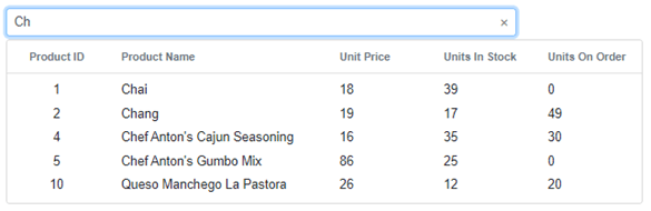
</SfAutoComplete>When executing the previous code example, we’ll get output like in the following screenshot. See how it displays the AutoComplete list item information in the multicolumn data grid view.
Display customized information in data grid
We can customize the alignment of the text displayed in each column using a built-in class. The following are the text alignment options available:
- e-text-center: Displays the text in the center of the column.
- e-text-right: Displays the text on the right side of the column.
- e-text-left: Displays the text on the left side of the column.
<AutoCompleteTemplates TItem="Product">
       <HeaderTemplate>
         <table><tr><th class="e-text-center">Product ID</th><th width="240px">Product Name</th><th>Unit Price</th><th>Units In Stock</th><th>Units On Order</th></tr></table>
        </HeaderTemplate>
         <ItemTemplate>
           <table><tbody><tr><td class="e-text-center">@((context as Product).ProductID)</td><td width="240px">@((context as Product).ProductName)</td><td>@((context as Product).UnitPrice)</td><td>@((context as Product).UnitsInStock)</td><td>@((context as Product).UnitsOnOrder)</td></tr> </tbody></table>
          </ItemTemplate>
</AutoCompleteTemplates>
GitHub reference
You can download the complete source code of this example from the GitHub repository.
Conclusion
Thanks for reading! I hope you can now add and display AutoComplete search result items in a multicolumn data grid view. You can easily customize the pop-up and list items using the template options. See more samples in this demo.
Feel free to have a look at our online examples and documentation to explore other available features.
Try our Blazor AutoComplete component by downloading a free 30-day trial or from our NuGet package.
If you have any questions, please let us know in the comments section below. You can also contact us through our support forum , Direct-Trac or feedback portal. We are always happy to assist you!


 No spam, just valuable updates.