
 Rajendran R
We are glad to inform you that our Essential Studio® 2022 Volume 2 release is available now!
This blog will summarize the new features and components available in the Syncfusion Blazor platform for this 2022 Volume 2 release.
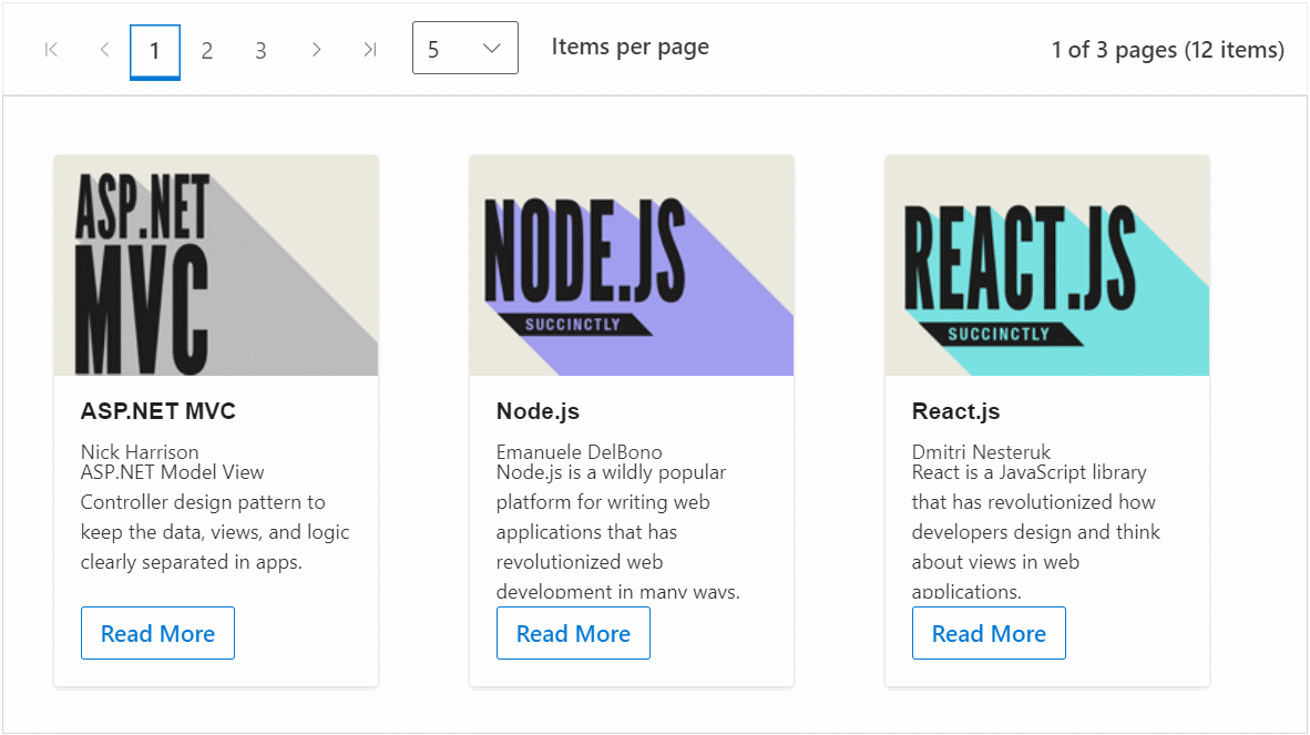
New Pager component
The new Blazor Pager component can be used to split a data set into multiple pages for a great user experience. Navigation can be achieved with built-in numeric elements, a dropdown, and buttons that can be customized with the help of rich APIs. The following are the key features of the new Pager component:
- Trendy look: The Pager component easily splits the data set into pages. You can then view them through an intuitive UI, which comes with industry-standard themes such as Material, Fabric, and Bootstrap.
- Pager dropdown: The dropdown shows different page sizes as a list from which to choose dynamically.
- Template support: You can customize the entire Pager component by rendering custom templates.
- Responsive layout: The Pager component acts intelligently and changes its UI responsively based on the provided dimensions. Its optimized design provides the best UI interaction in different devices.
- Keyboard support: Major features like page navigation, accessing pager dropdown, and navigating to first and last pages, can be performed using just keyboard commands without any mouse interaction.
- Accessibility: Built-in compliance with the WAI-ARIA specification achieved through attributes.
- Globalization: RTL rendering displays the text and layout of the component from right to left. This improves the user experience and accessibility for RTL languages like Hebrew, Arabic, and Persian.
Note: For more details, refer to the Blazor Pager component live demo and documentation.
Preview to production
The following Blazor components were developed to meet industry standards and are now marked as production-ready.
| Blazor component | Demo | Documentation |
| Blazor Diagram | Blazor Diagram demo | Blazor Diagram documentation |
| Blazor Carousel | Blazor Carousel demo | Blazor Carousel documentation |
End of support for .NET 5
Syncfusion’s Blazor components no longer support .NET 5 since Microsoft ended .NET 5 support in May of 2022. We will continue to support .NET 3.1 and .NET 6. We recommend that you upgrade to .NET 6 to take advantage of the new features and components in the latest release.
If you are unable to update to .NET 6, you may continue to use version 20.1 in your .NET 5 projects.
Scripts by component
Each component has only one script reference. There is no need to reference its dependent component scripts in an app as they are handled internally, and their dependency scripts are loaded automatically. Blazor component scripts are available in CDN with this release.
Note: Refer to individual control script reference documentation.
You can add a component script reference in several ways. Following is an example with the TextBox component script.
Reference scripts from NuGet
From Syncfusion.Blazor NuGet package.
<script src="_content/Syncfusion.Blazor/scripts/sf-textbox.min.js" type="text/javascript"></script>
From individual NuGet packages.
<script src="_content/Syncfusion.Blazor.Inputs/scripts/sf-textbox.min.js" type="text/javascript"></script>
Reference scripts from CDN.
<script src="https://cdn.syncfusion.com/blazor/20.2.36/sf-textbox.min.js" type="text/javascript"></script>
Enable or disable animation globally
You can now enable or disable animation globally by using the Animation property. By default, the animation works based on the individual component’s animation property value:
- GlobalAnimationMode.Enable: Enables animation in all the Syncfusion components that have support.
- GlobalAnimationMode.Disable: Disables animation in all our Syncfusion components.
services.AddSyncfusionBlazor(options => { options.Animation = GlobalAnimationMode.Disable; });Async variant of methods
The asynchronous methods have Async as their suffix, which was introduced in the 2020 Volume 4 release based on Microsoft’s suggested naming conventions. To avoid confusion with method naming, we removed the duplicated methods from our components.
For example, both methods ShowColumnsAsync and ShowColumns have the same functionality. So, we deprecated the ShowColumns method.
DataGrid
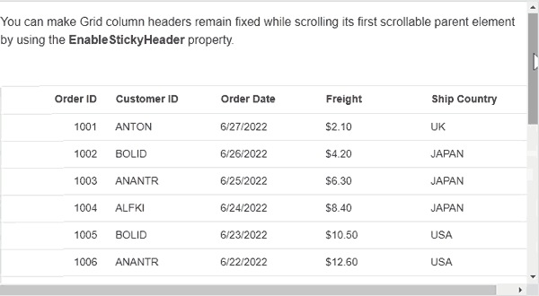
Sticky header
The most anticipated feature, sticky headers, is now available in the Blazor DataGrid component.
Feedback: Need to provide sticky header support to Grid.
A sticky header maintains the header in a fixed position when scrolling the content. You can enable sticky headers with the EnableStickyHeader property.
Note: For more details, refer to the Example of Sticky Header in Blazor DataGrid Component.
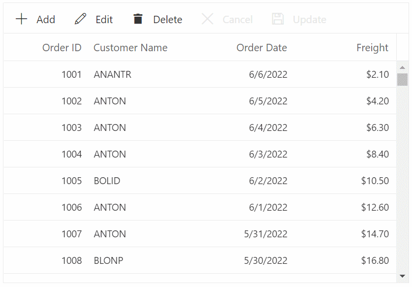
Inline editing with virtualization
Perform CRUD operations directly on rows in the current viewport when the row and column virtualization features are enabled.
Note: For more details, refer to the Example of Virtual Scrolling in Blazor DataGrid Component.
Other enhancements to DataGrid
- Accessibility: Improved web accessibility as per the current web standard.
- Adaptive rendering mode: Restrict the rendering of an adaptive layout based on the device by specifying the AdaptiveUIMode property value as Mobile or Desktop or Both.
Diagram
The Blazor Diagram component is now production-ready. The following features have been added to the Diagram component.
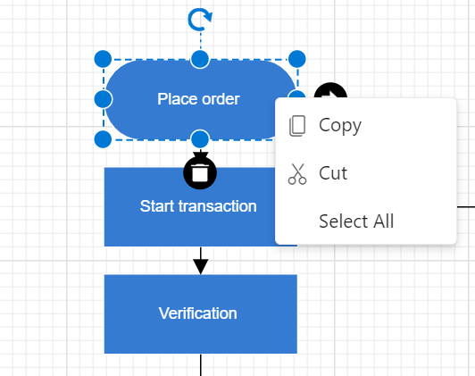
Context menu
This feature allows users to easily access frequently used operations. By default, cut, copy, paste, undo, redo, group, ungroup, and select all menu items are displayed on right-click. The menu items can be customized.
Note: For more details, refer to Flow Chart using Blazor Diagram Component Example.
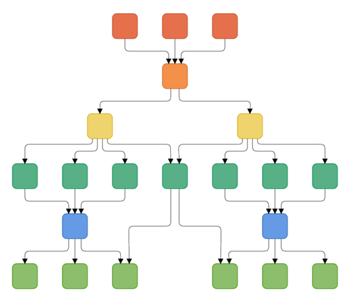
Complex hierarchical tree layout
A complex hierarchical tree layout arranges nodes in a tree-like structure, where the child node can have more than one parent. This layout is an extended version of the hierarchical tree layout.
Note: For more details, refer to Complex Hierarchical Tree Example using Blazor Diagram Component.
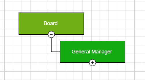
 Z-order
This feature allows users to control the stacking order (z-order) of the diagram elements such as nodes, connectors, and groups. Users can arrange the selected objects on the diagram page with z-order values by using the following features:
- Bring to front: Bring the selected object in front of all other objects.
- Bring forward: Bring the selected object forward one level so that it is hidden behind fewer objects.
- Send to back: Send the selected object behind all other objects.
- Send backward: Send the selected object back one level so that it is hidden behind more objects.
Note: For more details, refer to Example of Z-Order Commands in Blazor Diagram Component.
Expand and collapse
This feature allows users to show and hide child nodes in the parent-child relationship diagram either by user interaction on the nodes or programmatically.
Note: For more details, refer to Example of Expand And Collapse Nodes in Blazor Diagram Component.
 Reset zoom
This feature allows users to reset the current zoom value of the diagram page to 100% when the diagram is in zoom-in or zoom out state.
Take a look at the breaking changes for the Diagram component before upgrading to the newer version.
Also, check out the breaking changes in Blazor Diagram component in the 2022 Volume 2 release.
Word Processor (Document Editor)
The Blazor Word Processor component gains the following major features with the 2022 Volume 2 release.
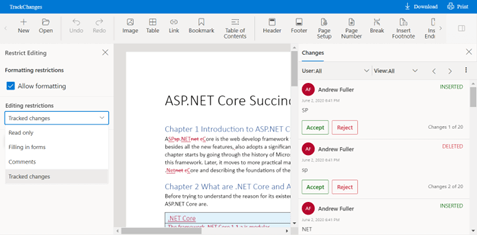
Track changes restrictions
This feature keeps users from accepting or rejecting the tracked changes while editing a Word document. All reviewers can view the document and do their corrections, but they cannot accept or reject any tracked changes in the document. Only the author can accept or reject the changes.
Note: For more details, refer to Example of Track Changes in Blazor Word Processor Component.
 Paragraph border
Add borders to the paragraphs in a Word document. Using borders, you can decorate paragraphs to set them apart from other paragraphs in the document.
Note: For more details, refer to Example of Paragraph Formatting in Blazor Word Processor Component.
 RTL text enhancements
The Syncfusion Word Processor includes the following enhancements to preserve RTL text in a Word document:
- Display RTL text in a bidirectional layout.
- Select and navigate bidirectionally.
- Insert the input RTL text in a bidirectional layout.
This gives users a Microsoft Word-like experience when working with RTL languages.
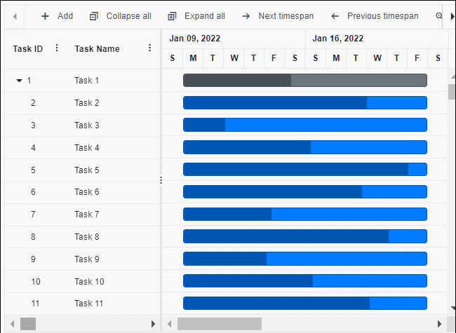
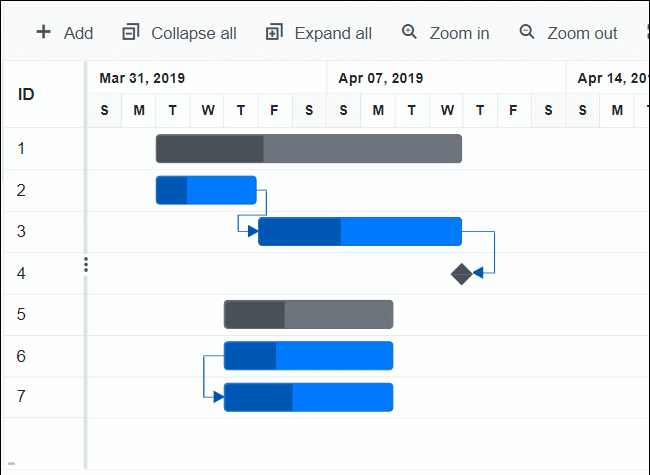
Gantt Chart
The new features included in the Blazor Gantt Chart are as follows.
Column virtualization
Render only the columns in the current viewport, while other column elements render dynamically on horizontal scrolling.
Note: Refer to Example of Virtual Scroll in Blazor Gantt Chart Component.
Touch interaction in the taskbar
Move or resize taskbars and map taskbar dependencies with touch interactions in predecessor and taskbar editing in the Gantt Chart component.
Note: Refer to Example of Editing in Blazor Gantt Chart Component.
Tooltip for taskbar
Show the tooltip with current date values when dragging or moving the taskbar in a Gantt chart. Users can easily identify the new date values while dragging.
Note: Refer to Example of Tooltip Template in Blazor Gantt Chart Component.
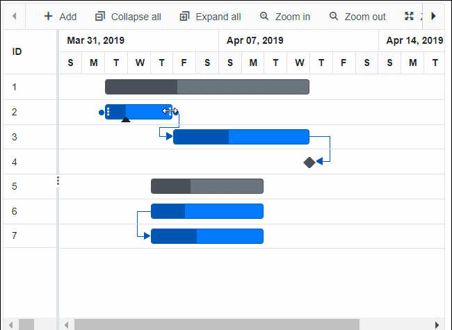
Observable collection
Bind ObservableCollection-type data to the Gantt Chart component. INotifyPropertyChanged support was added to all Gantt Chart operations.
Note: Refer to Example of Observable Collection in Blazor Gantt Chart Component.
Other enhancements
- TaskbarEditing event support to customize the taskbar editing.
- Vertically auto scroll when the predecessor connector point is dragged near the top or bottom of the visible Gantt chart pane.
- Horizontally auto scroll when the taskbar is dragged near the edge of the visible Gantt chart pane.
- Configure required predecessor types.
TreeGrid
Following are the new features included in the Blazor TreeGrid component.
Inline editing with virtualization
Perform CRUD operations on rows in the current viewport directly when row and column virtualization features are enabled.
Frozen columns with virtualization
When row and column virtualization features are enabled, you can freeze specific columns while scrolling through other columns.
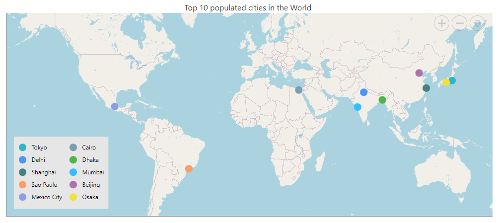
Maps
Extending geometry-type support
The Blazor Maps component now supports rendering GeoJSON files with MultiLineString, MultiPoint, and GeometryCollection geometry types:
- The geometry type MultiLineString represents an array of two or more geographic points.
- The geometry type MultiPoint represents an array of points that renders circle markers.
- The geometry type GeometryCollection is a special type that contains various geometries as members.
Legend support for online map providers
Legend support is provided for markers rendered over online map providers such as OSM, Bing, and Mapbox. Additionally, a legend for layers and markers on sublayers over online map providers is supported.
Other enhancements
- The Maps component exposes the GetMinMaxLatitudeLongitude method, which returns the minimum and maximum latitude and longitude values in the maps’ visible area.
- You can now render GeoJSON data with the LineString geometry type in Maps.
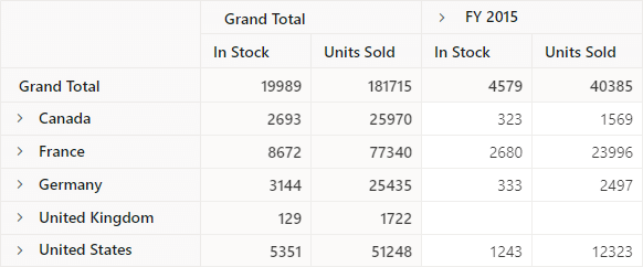
Pivot Table
The Blazor Pivot Table supports the following features in this 2022 Volume 2 release.
Display grand totals
A built-in option in the toolbar UI lets users show grand totals (summarized totals) either at the first or last position in the Pivot Table component’s row and column axes.
Note: Refer to Example of Toolbar in Blazor Pivot Table Component.
Events for toolbar UI actions
UI actions in the Pivot Table’s toolbar options can now be identified using the action begin and action complete events. The action failure event is triggered when a UI action does not achieve the desired result. Overall, these events help the app interact with users on a regular basis.
Carousel
The Blazor Carousel component was developed to meet industrial standards and is production-ready. You can enjoy the following features in the Blazor Carousel component in this 2022 Volume 2 release:
Pause on hover
Play or pause the slides when hovering the mouse pointer over a carousel element.
Custom animation
Define custom animations on the app end.
Query Builder UI
Complex data binding support
This feature allows users to create subfields for columns in the Blazor Query Builder by specifying either a complex data source or nested columns.
Note: Refer to the Example of Complex DataBinding in Blazor Query Builder Component.
Rich Text Editor
Insert text programmatically in the Markdown editor
Insert text programmatically in the Markdown editor at the current cursor position using the ExecuteCommandAsync public method of the Blazor Rich Text Editor.
Scheduler
Context menu improvement
The public method GetElementInfoAsync of the Blazor Scheduler gets the mouse target element information. This helps you display the context menu based on the current target.
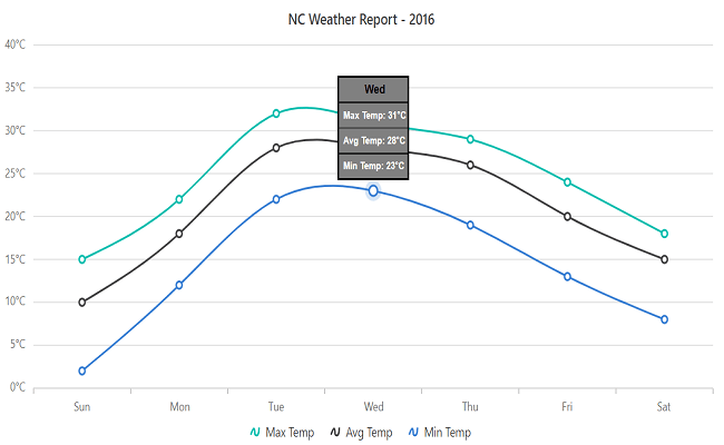
Charts
The Blazor Charts component delivers the following features.
Shared tooltip template
Template support for a shared tooltip in charts.
Mouse events
MouseMove, MouseClick, MouseUp, MouseDown events identify the mouse actions in the chart.
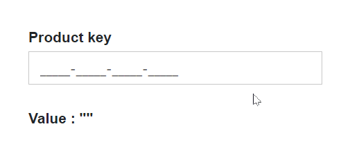
Input Mask
Include literals in values
The Blazor Input Mask component now provides the option to obtain a value with literal characters.
Note: Refer to the Example of Literals and Prompt in Blazor Input Mask Component.
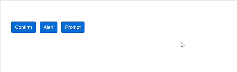
Dialog
Built-in dialog service
The Blazor Dialog component allows you to render and show confirm, alert, and prompt dialogs on demand by calling the public utility methods.
Note: Refer to the Example of Predefined Dialogs in Blazor Dialog Component.
Conclusion
Thanks for reading! In this blog post, we have seen the new, valuable features and enhancements included in our Blazor components for the 2022 Volume 2 release. You can check out the list of all the features in our release notes and What’s New pages. Try out these stunning new features and leave your feedback in the comments section below!
If you are not yet a Syncfusion customer, try our 30-day free trial to check out these features.
If you have questions, you can reach us through our support forums, support portal, or feedback portal. As always, we are happy to assist you!


 No spam, just valuable updates.