

The primary goal of maps is to provide a visual representation of the world or parts of it. Political maps show us the shapes of countries, the locations of states and cities, and the distance between them. You can plot and view important data such as population density, weather forecasts, geographical features, flight routes, and street views on them. Maps have become an indispensable tool for displaying information that we encounter daily.
The Syncfusion Blazor Maps control completely serves these purposes. Its rich feature set includes layers and sublayers, navigation lines, annotations, animations, and more. Users can view not only a geographical map, but also custom shapes such as a floorplan of a room or building, or a venue’s seating chart.
Note: The Syncfusion Blazor Maps control is implemented to read the input shapefile or URL and draw the right shape. Syncfusion does not support shape designing. For this purpose, we recommend using online map providers.
Let’s explore the features of the Blazor Maps control to visualize the world elegantly!
Input data sources
In our Blazor Maps control, there are two types of input data sources:
- Shapes.
- Online web map services.
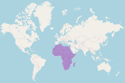
Shapes
Shapes can represent the world map, a specific country or region, or a custom shape such as a building. The shapes are prepared in a GeoJSON-like format and saved with the *.json file extension. You can upload the shapefiles to online storage, whose link can be set as the data source or as a local file in the application itself.
Note: Currently, we support only polygon and multipolygon geometric types for shapes. We also have plans to add support for linestring and point in the near future.
Online web services
The Syncfusion Blazor Maps control supports inheriting the following online web map services through their APIs:
Furthermore, we have implemented a URL template so that any online map service provider using the following template can be previewed and interacted with in our Maps control.
Sample template: https://<domain_name>/maps/basic/{z}/{x}/{y}.png
- ${x} indicates the tile image x-position.
- ${y} indicates the tile image y-position.
- ${z} represents the zoom factor (level).
Note: For more details, refer to the Easily Visualize Online Maps in a Blazor Application blog.
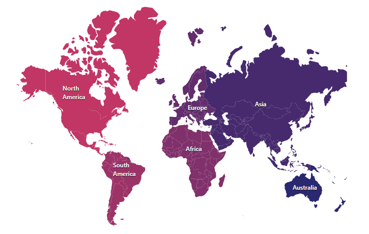
Layers and multiple layers
We can provide any of the previously listed input data sources to serve as the main layer in the Maps control. On top of the main layer, we can add any number of additional layers. This will result in a multilayer pattern.
A sublayer is a type of shapefile layer, i.e., GeoJSON-like format. It allows the loading of multiple shapefiles in a single map view. You can add a sublayer over the main layer to view a country’s cities, boundaries, roads, mountains, rivers, and coastlines. Add other map elements, such as markers, bubbles, color mapping, and legends, to the sublayer for better visualization.
Note: Refer to the Multi-layers in Blazor Maps and documentation.
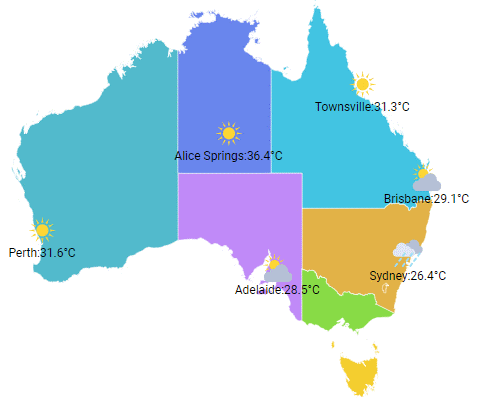
Data labels
Data labels provide users with information such as identification, notification, warning, environmental advice, or any other general information. In short, they are simple text displayed over the shapes. Data labels will smartly arrange themselves not to overlap using the smart labels option.
Note: Refer to the Example of Data Labels in Blazor Maps and documentation.
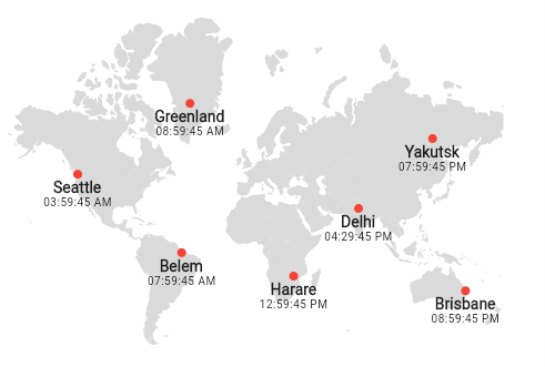
Markers
A marker is a visual representation that pinpoints a specific coordinate (location) on a map. A marker, by default, uses a standard shape such as a circle, rectangle, line, or balloon.
For a better user experience, we can customize markers to display images rather than predefined shapes.
Marker clustering
When there are a lot of markers that overlap, we can group the markers, a technique known as marker clustering. The number above the cluster indicates the count of overlapped markers in it. If we zoom in on any of the cluster locations, the number on the cluster will decrease, and the individual markers will be seen on the map.
Note: Refer to the Example of Markers in Blazor Maps and documentation.
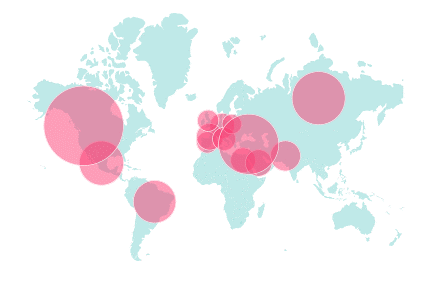
Bubbles
Bubbles are yet another visualization medium that summarizes your input data. The feature creates simple circles of varying sizes. They represent the appropriate numerical value from the input data within the map area. Use these bubbles to compare proportions across different locations on the map. The bigger the bubble, the larger the numeric value.
Note: Refer to the Example of Bubbles in Blazor Maps and documentation.
Navigation lines
Navigation lines are used to show paths between two or more locations, e.g., flight or sea routes, a route from the current location to a destination, and cycling routes.
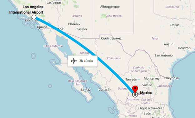
Note: Refer to the Example of Navigation Lines in Blazor Maps and documentation.
Annotations
Annotations are similar to data labels, but they are used to draw more attention to specific characteristics in certain locations on a map. They provide highlighting information about them. In a nutshell, they are specific overlays of information that inform the user without overcrowding the map with other information. Including annotations in maps is becoming increasingly popular.
In the Maps control, you can display annotations with text, images, or a combination of both formats. You can add any number of annotations to the map using x and y coordinates.
Note: Refer to the Example of Annotations in Blazor Maps and documentation.
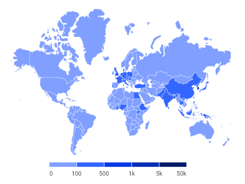
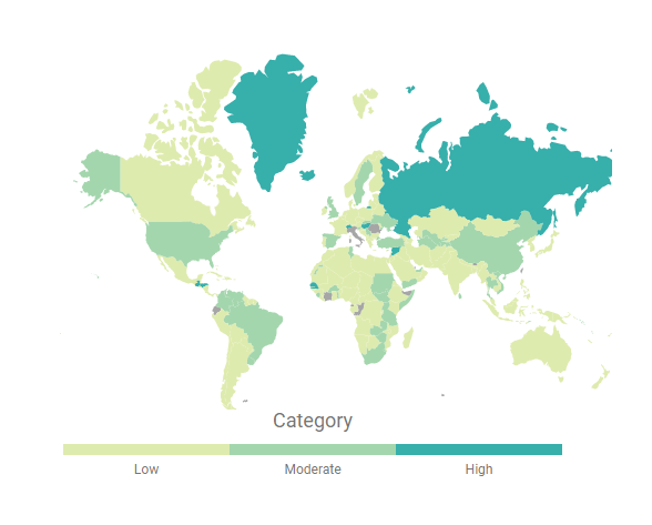
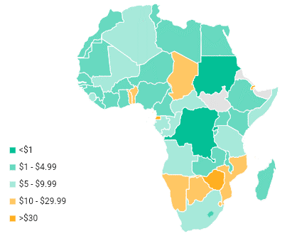
Color mapping
Color mapping is a technique of assigning different colors to different regions on a map. The assigned color palette is unique so that no two adjacent regions have the same color. On the other hand, we can set a single color to different regions or locations based on the numeric data value behind them and by adjusting the color’s opacity.
So, the color mapping in Blazor Maps is classified into range color mapping, equal color mapping, and desaturation color mapping. This feature is available not only for shapes but also for bubbles.
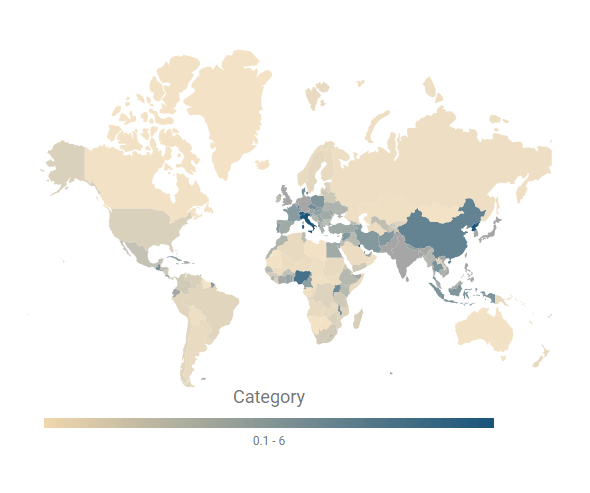
Note: Refer to the Example of Color Mapping in Blazor Maps and documentation.
Selection and highlighting
Users can hover over any shape and that shape will change to a distinct color to distinguish it from the other shapes. Similarly, we can select a specific shape via mouse click or touch interaction and it can also be highlighted using a different color.
The selection and highlight options also apply to markers and bubbles.
Refer to the following image. Here, Greenland is selected and highlighted and the mouse hovers over Canada (showing a tooltip).
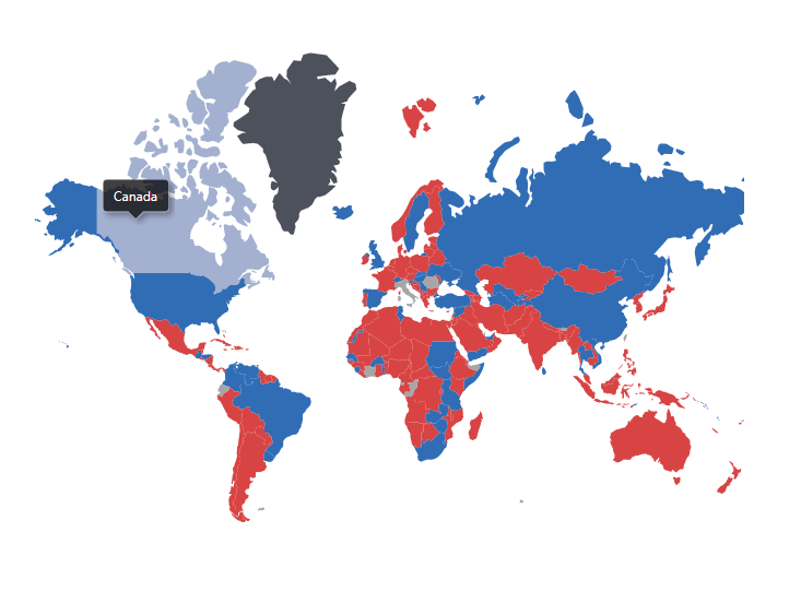 Note: Refer to the Example of Selection and Highlight in the Blazor Maps and documentation.
Zooming and panning
Zooming allows you to see the map in full depth, while panning allows you to move the zoomed map to view the entire map area.
To return the map to its original position, use the zoom-out and reset options. Zooming features include a zooming toolbar, single-click zoom, double-click zoom, mouse wheel zoom, selection zoom, and pinch zoom.
Note: Refer to the Example of Zooming and Panning in Blazor Maps and documentation.
Legends
In a map, there may be a large number of different symbols, and it is difficult for users to understand each one; this is where legends come in handy.
A legend is a glossary of the symbols used in a map. There are two types of legends supported in the Maps control: default and interactive. Marker and bubble definitions can also be displayed in legends.
Note: Refer to the Example of a Legend in Blazor Maps and documentation.
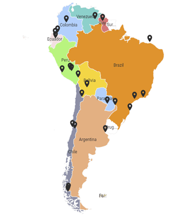
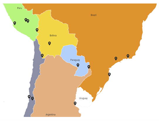
Drill down
You can view inner map layers by clicking a shape in the outer layer using the drill-down feature. For example, in a world map, you can see information about a specific country by clicking on that country. Then, the Blazor Maps control will display just that country by loading its shape via the drill-down feature.
Note: Refer to the Example of Drill Down in Blazor Maps and documentation.
GitHub reference
Check out the Blazor Maps component demos in our GitHub repository.
Conclusion
Thanks for reading! The Syncfusion Blazor Maps component also provides tooltips, printing, exporting, appearance customization, and more. Try out these features and elegantly visualize the world using our Blazor Maps control!
For existing customers, the newest version of our Blazor components is available for download from the License and Downloads page. If you are not yet a Syncfusion customer, you can try our 30-day free trial to check out the available features.
You can contact us with questions or comments through our support forums, support portal, or feedback portal. We are always happy to assist you!


 No spam, just valuable updates.