As an addition to our contribution to the Xamarin community, here comes the next major update of our Xamarin platform with new components, exciting features, and more! In this blog, we will walk through the new components and major features included in our 2019 Volume 2 release.
New components : Switch and StepProgressBar
We closely monitor the requirements of the Xamarin community and introduce new components in almost every release. As a part of this, we are adding two more components to our list of beautiful UI controls.
Switch
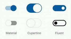
As the name suggests, the Switch control allows you to turn an item on and off and change its UI accordingly. Though this component is already available in Xamarin.Forms, we understood the need for more features in it. Therefore, we introduced a new Switch component with a rich set of features, such as multiple default styles (as shown in the following image), an intermediate state, orientation support, gradient design, RTL support, and the list goes on. To learn about all the features of our new Xamarin.Forms Switch component, refer to our recent blog post.
Different Switch Styles
StepProgressBar
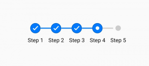
A StepProgressBar is usually seen in mobile applications used for ticket booking and online purchasing. It is useful in showing the completion of a multistep process in a small UI space, which is very important in mobile applications.
Knowing its usage in modern applications, we have added a new Xamarin.Forms StepProgressBar control in this release. The important features of the StepProgressBar include orientation support, multiple marker shapes, beautiful animation on step changes, and more. To learn about all the features available in this control, refer to our recent blog post.
StepProgressBar Control
Charts for WPF, waterfall series, and more!
We step into the Xamarin.Forms WPF platform with your favourite Syncfusion Charts control and all of its features. The new project configuration is pretty simple, and if you are already an existing charts user, that is all you will need to do. Everything will just work without making any changes.
We have also added a waterfall series to our ever-growing collection of chart types. To learn more about the other items included in this release, you can peruse our separate “What’s New blog about our Xamarin Charts“.
Support for more controls in Text Input Layout
Our Text Input Layout control now supports Autocomplete and ComboBox as its input control. Additionally, there is an option to have the editors of the DataForm control in the Text Input Layout design by making a few changes in your application.
To see more details about this feature, refer to the blog “Modernize Xamarin.Forms DataForm, Autocomplete, and ComboBox using Text Input Layout“. Even if you are new to the Text Input Layout, you will get a detailed picture of this beautiful little wizard once you read the blog.
Other release blogs
Here are some additional blogs about new controls and features in our 2019 Volume 2 release:
- Data template selector support for Autocomplete, ComboBox, Rotator and Picker
- Timeline view in Xamarin.Forms Scheduler
- Resource view in Xamarin.Forms Scheduler
- Stacked header and other features in Xamarin.Forms DataGrid
- Gradient background for Button and Chips in Xamarin.Forms
Conclusion
In this blog post, we have walked through some of the major updates in our 2019 Volume 2 release for Xamarin. Remember that this is just an overview and there are lot more features in store than what we have discussed here. Check out the What’s New and Release Notes pages to read about all the items included. You can also have a hands-on experience by checking out our samples available on GitHub.
If you have any questions or require clarifications about these features, please let us know in the comments section below. You can also contact us through our support forum, Direct-Trac, or feedback portal. As always, we are happy to assist you!


