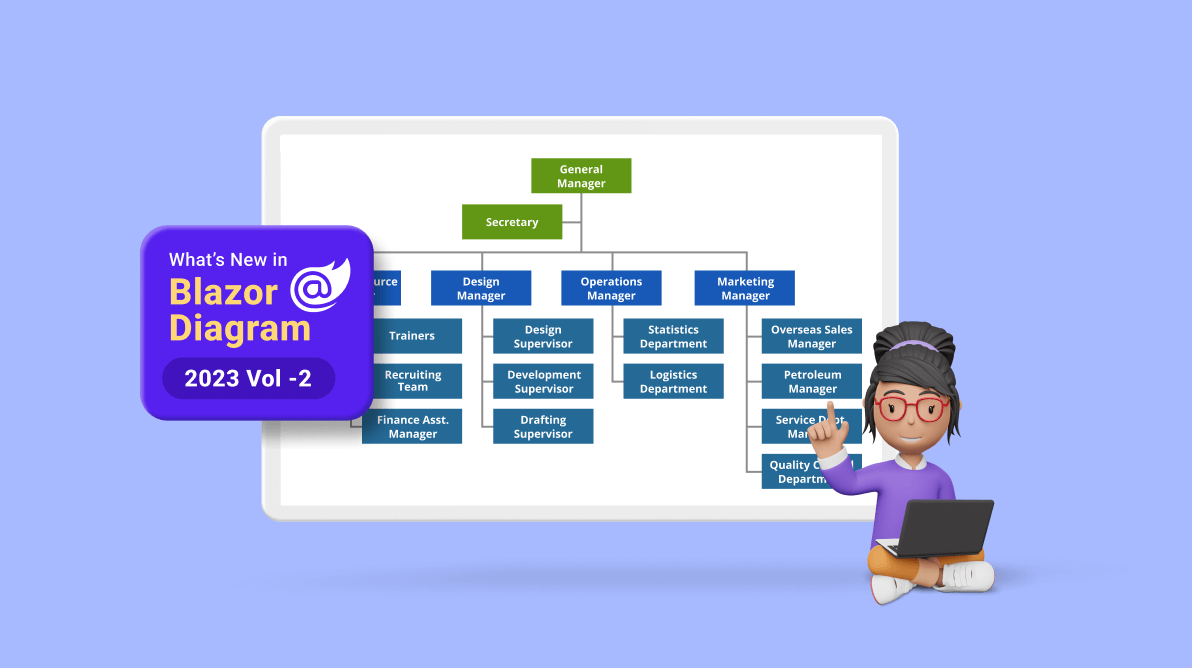
Syncfusion’s Blazor Diagram component continues to evolve, offering a powerful toolkit for visualizing, creating, and editing interactive diagrams. Whether designing flowcharts, organizational charts, mind maps, floor plans, or BPMN charts, this feature-rich library empowers you to bring your concepts to life programmatically and interactively.
In this blog, we’ll explore the exciting new features of the Blazor Diagram component, introduced in the 2023 Volume 2 release.
Freehand drawing
The new freehand drawing feature lets users create freeform curves (splines) directly on the diagram page. With this functionality, users can effortlessly sketch anything from simple drawings to elaborate artistic creations.
To utilize this feature, users need to access the DrawingObject property and select the Freehand connector type.
The following code example illustrates how to initialize the freehand drawing tool in the Blazor Diagram component.
@using Syncfusion.Blazor.Diagram
<input Type="button" value="Freehand" @onclick="Freehand" />
<SfDiagramComponent @ref="diagram" Nodes="@nodes" Height="600px">
    <SnapSettings Constraints="SnapConstraints.None"></SnapSettings>
</SfDiagramComponent>
@code
{
    //Reference the diagram.
    SfDiagramComponent diagram;
    //Define the diagram's nodes collection.
    public DiagramObjectCollection<Node> nodes;
    protected override void OnInitialized()
    {
        nodes = new DiagramObjectCollection<Node>();
        Node node = new Node()
        {
            ID = "group",
            OffsetX = 200,
            OffsetY = 200,
            Width = 100,
            Height = 100,
            Annotations = new DiagramObjectCollection<ShapeAnnotation>()
            {
                new ShapeAnnotation()
                {
                    Content = "Node",
                    Style = new TextStyle()
                    {
                        Color = "white",
                    }
                }
            },
            Style = new ShapeStyle() { Fill = "#6495ED", StrokeColor = "white" }
        };
        nodes.Add(node);
    }
    private void Freehand()
    {
        //Draw an object once and activate the draw once.
        diagram.InteractionController = DiagramInteractions.DrawOnce;
        //Initialize the drawing object to draw the freehand connector.
        diagram.DrawingObject = new Connector()
        {
            ID = "connector1",
            Type = ConnectorSegmentType.Freehand,
        };
    }
}
Note: Check out the drawing tools in the Blazor Diagram component GitHub demos for more details.
Auto-scroll support
The new auto-scroll feature automatically scrolls the diagram whenever a node or connector is moved beyond the diagram’s boundary. This way, it is always visible during dragging, resizing, and multiple-selection operations.
The auto-scroll feature is automatically triggered when any one of the following actions is done at the edges of a diagram:
- Node dragging and resizing.
- Connector dragging and end-thumb dragging.
- Rubber band selection.
You can enable or disable the auto-scroll behavior in the diagram using the EnableAutoScroll property. The default value for this property is false.
The following code example illustrates enabling the auto-scroll support for nodes in a diagram.
@using Syncfusion.Blazor.Diagram
<SfDiagramComponent Height="400px" Width="400px" Nodes="@nodes" Connectors="@connectors">
    @* Sets the ScrollSettings for the diagram *@
    <ScrollSettings EnableAutoScroll=true @bind-ScrollLimit="@scrollLimit">
    </ScrollSettings>
</SfDiagramComponent>
@code
{
    ScrollLimitMode scrollLimit { get; set; } = ScrollLimitMode.Infinity;
    //Defines diagram's node collection.
    DiagramObjectCollection<Node> nodes;
    //Defines diagram's connector collection.
    DiagramObjectCollection<Connector> connectors = new DiagramObjectCollection<Connector>();
    protected override void OnInitialized()
    {
        nodes = new DiagramObjectCollection<Node>();
        // A node is created and stored in the nodes collection.
        Node node = new Node()
            {
                ID = "node1",
                // Position of the node.
                OffsetX = 250,
                OffsetY = 250,
                // Size of the node.
                Width = 100,
                Height = 100,
                Style = new ShapeStyle()
                {
                    Fill = "#6495ED",
                    StrokeColor = "white"
                }
            };
        // Add node.
        nodes.Add(node);
        Connector Connector = new Connector()
            {
                ID = "connector1",
                // Set the source and target point of the connector.
                SourcePoint = new DiagramPoint() { X = 100, Y = 100 },
                TargetPoint = new DiagramPoint() { X = 100, Y = 200 },
                // Type of the connector segments.
                Type = ConnectorSegmentType.Straight,
                Style = new ShapeStyle()
                {
                    StrokeColor = "#6495ED",
                    StrokeWidth = 1
                },
            };
        connectors. Add(Connector);
    }
}
You can set limits for the auto-scrolling region using the ScrollLimit property of the ScrollSettings class. Please refer to the ScrollLimit page for more details.
The OnAutoScrollChange event is triggered when changes are detected to the scroll position, extent, or viewport size as a result of auto-scrolling for diagram elements. Please refer to the OnAutoScrollChange page for more details.
Note: For more details, refer to the Diagram auto-scrolling GitHub demos.
Tooltip support for symbols in the symbol palette
The symbol palette can show tooltips when the mouse hovers over any node or connector. We can customize the tooltip for each symbol in the symbol palette.
Default tooltip for symbols
By default, the symbol’s ID will be displayed as the tooltip for each symbol in the palette. The following image illustrates how the tooltip will be displayed when the mouse hovers over the symbols.
Custom tooltips for symbols
You can also provide custom tooltips for the symbols in the symbol palette. Refer to the following image.
Note: For more details, refer to the symbol palette tooltip GitHub demos and documentation.
Padding support for node group
Now, you can define the spacing between a group node’s edges and its children using the Padding property.
Note: For more details, refer to the padding support for group nodes GitHub demos and documentation.
Template support for fixed user handle
You can define a fixed user handle style at the tag level using a template in the FixedUserHandleTemplate property. You can define separate templates for each node and connector by differentiating them based on their ID property. A defined template will be rendered when the PathData properties of the fixeduserhandle are not defined. However, if both path data and template are defined, the path data will take precedence, and the template will not be rendered.
Note: For more details, refer to the fixed user handles GitHub demos and documentation.
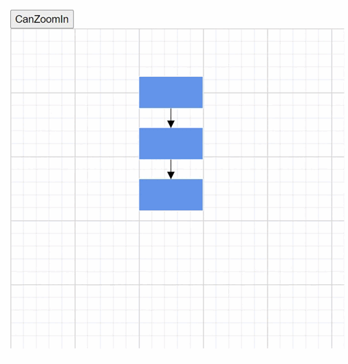
Support to enlarge smaller diagrams while calling the FitToPage command
The FitToPage command is used to bring an entire diagram (large diagram) into the viewport. You can customize the behavior of the FitToPage command by passing the FitOptions class as a parameter. The CanZoomIn property of the FitOptions class is used to enable or disable zooming to fit smaller content into a larger viewport.
Note: For more details, refer to the FitToPage command GitHub demos and documentation.
Conclusion
Thanks for reading! In this blog, we’ve seen the exciting new features added to the Syncfusion Blazor Diagram component for the 2023 Volume 2 release. Use them to create and visualize interactive diagrams and leave your feedback in the comments section below!
Check out our Release Notes and What’s New pages for other 2023 Volume 2 release updates.
The new version of Essential Studio is available for existing customers in the License and Downloads page. If you are not a Syncfusion customer, try our 30-day free trial to check out our available features.
You can also contact us through our support forum, support portal, or feedback portal. We are always happy to assist you!