
 Rajendran R
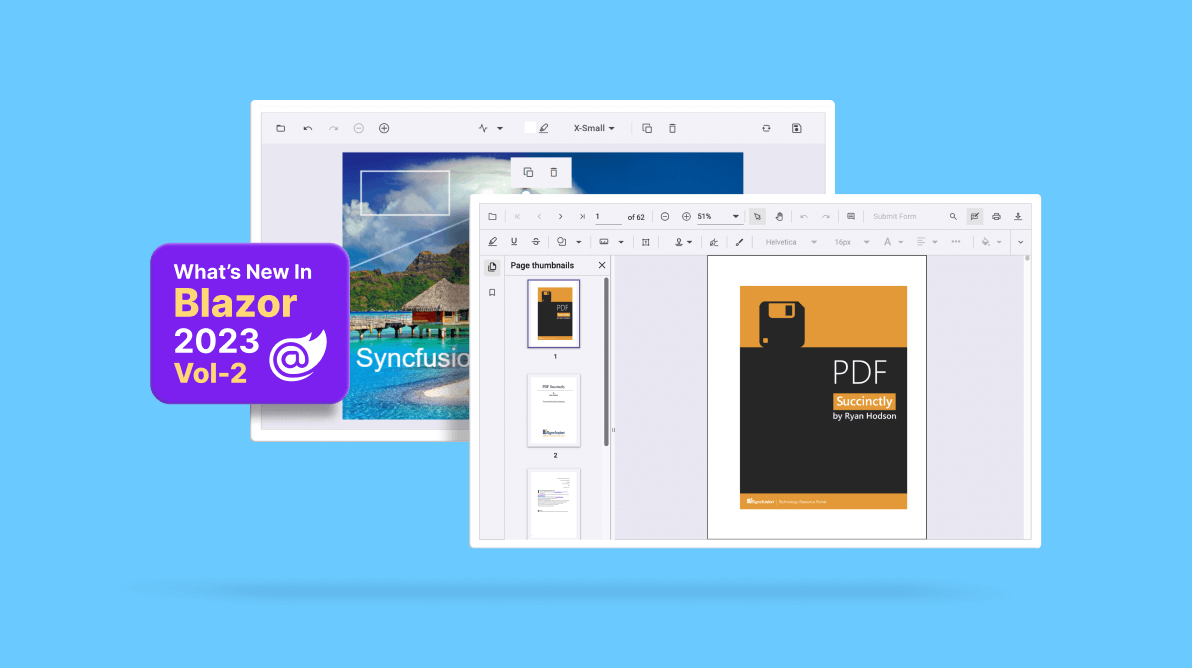
In this article, we’ll see the new components and features added in the Syncfusion Essential Studio® 2023 Volume 2 release for the Blazor platform.
New Blazor components
In this 2023 Volume 2 release, we have introduced the following new components:
- Image Editor
- Next-generation PDF Viewer
Image Editor (preview)
The new Blazor Image Editor was the most requested component in our feedback portal. It is a UI component for editing and enhancing images. With built-in support for cropping, rotating, flipping, zooming, and applying filters, this component makes it easy to fine-tune your edits to achieve the desired results. It also allows users to annotate images with shapes such as rectangles, ellipses, lines, text, and freehand drawings.
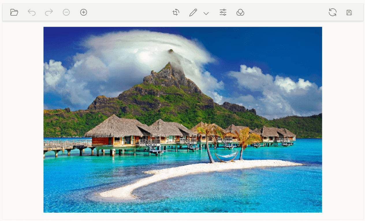
Note: For more details, refer to the Blazor Image Editor demo and documentation.
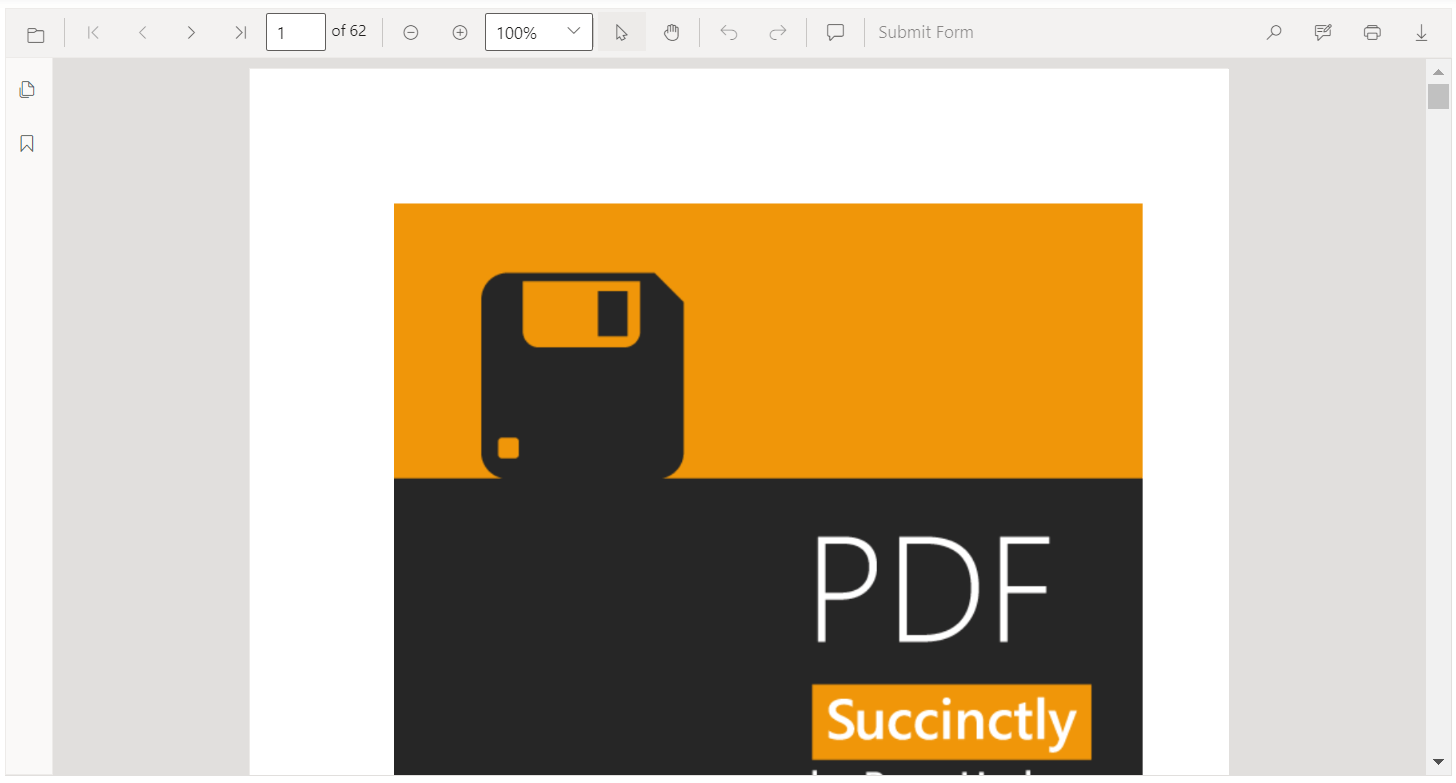
Next-generation PDF Viewer
The new Blazor PDF Viewer component allows users to view, edit, print, and download PDF files without the web service dependency in Blazor apps. It is designed to be fast and responsive and has the same feature set as the previous PDF Viewer. It is easy to use and can be integrated into Blazor Server and WASM apps with minimal effort.
Preview to production-ready components
The following Blazor components have been developed to meet industry standards and are now marked as production-ready:
Material 3 theme support
The Material 3 theme has been added to all Syncfusion Blazor UI components with light and dark variants to provide modern and visually appealing user interfaces.
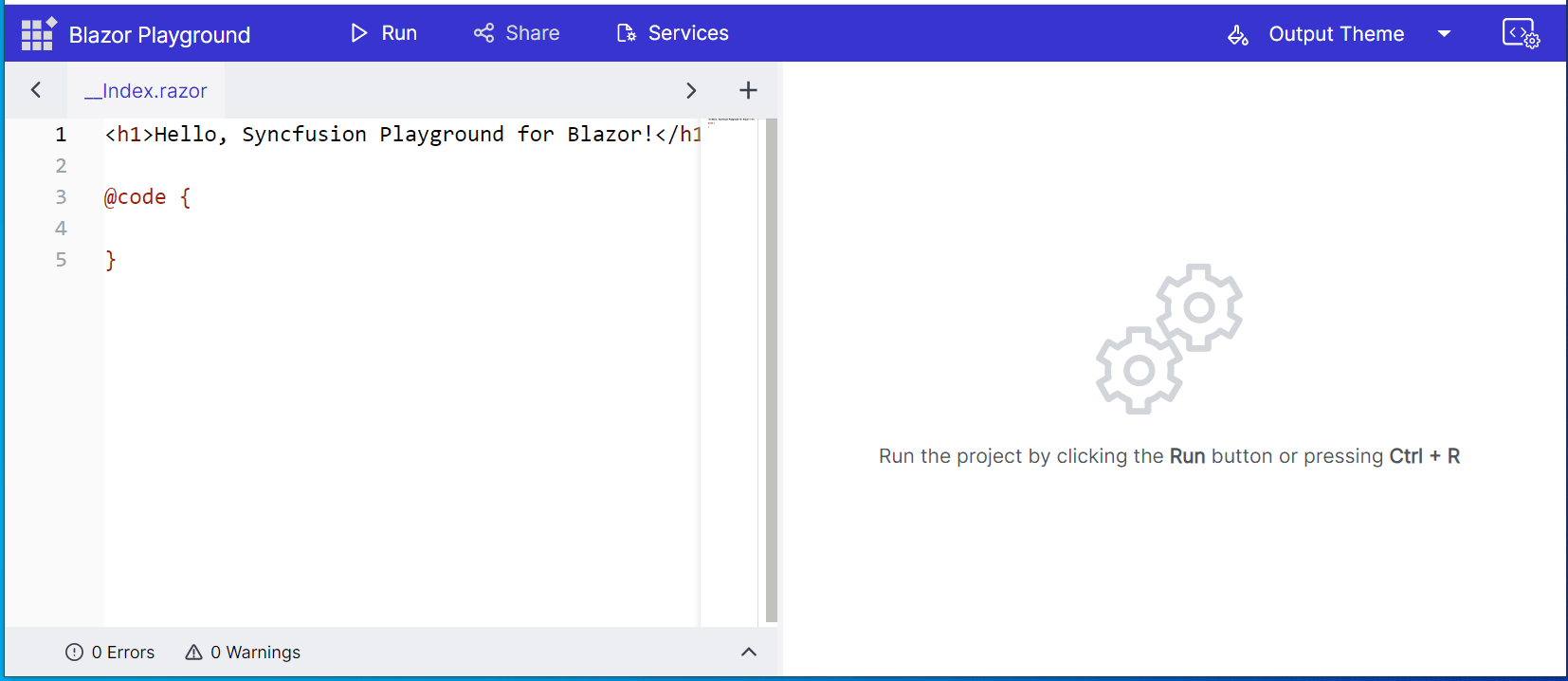
Syncfusion Blazor Playground App
Introducing the Syncfusion Blazor Playground, an online code editor that enables real-time writing, editing, compiling, and sharing of the Blazor code. Explore the full capabilities of Syncfusion Blazor components directly in your browser without the need for complex setups or installations.
Showcase samples
We have provided showcase samples for the following apps in the 2023 Volume 2 release:
- Loan Calculator
- Fitness Tracker
We’ll take a closer look at them.
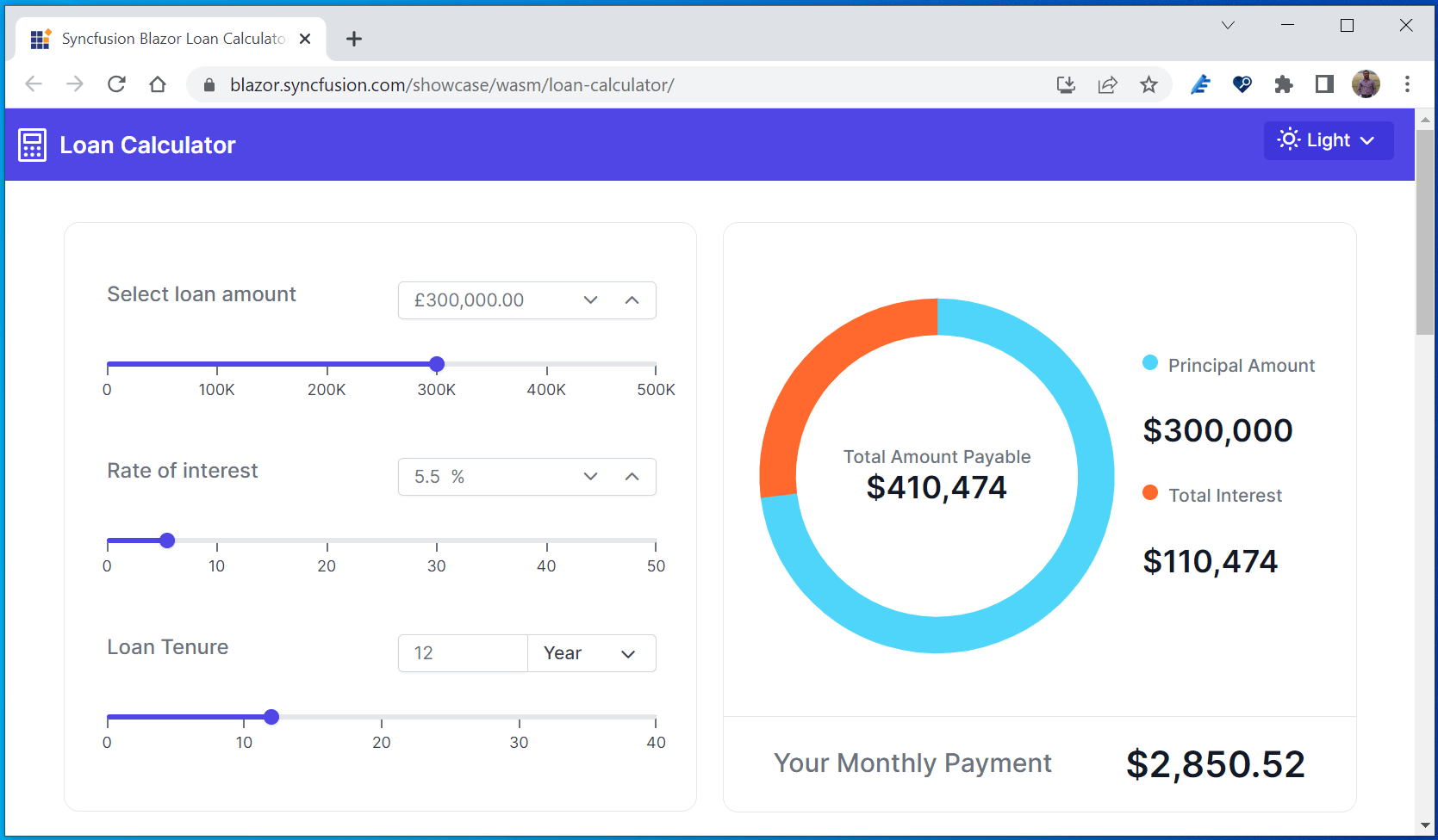
Loan Calculator
Introducing the new Blazor WASM Loan Calculator, a showcase web app that calculates loan payments, interest rates, and amortization schedules.
For more details, check out the Blazor Loan Calculator demo on our website and GitHub.
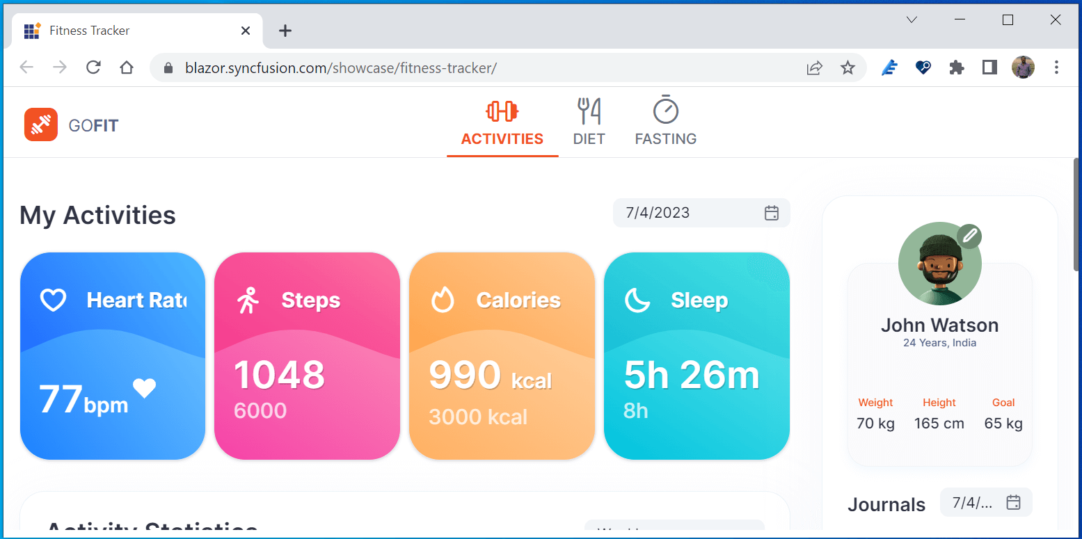
Fitness Tracker
The new Blazor Fitness Tracker is a showcase web app that tracks a user’s daily activities, diet plan, and fasting details.
For more details, check out the Blazor Fitness Tracker demo on our website and GitHub.
Signed assemblies
All Syncfusion Blazor component packages have been strongly signed for enhanced security and integrity.
WASM standalone sample browser
Check out the enhanced Blazor standalone WebAssembly sample browser to explore the functionality of our Syncfusion Blazor components directly.
What’s new in existing Syncfusion Blazor components
Let’s look at the new features added to the existing Blazor UI components.
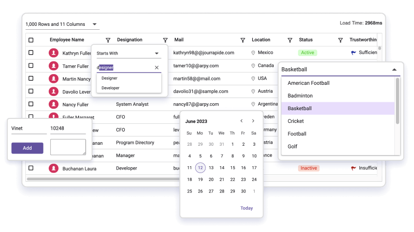
DataGrid
Performance improvements
In the Blazor DataGrid, we significantly improved the component’s interaction in Server and WebAssembly environments. Specifically, enhancements have been made in the paging, filtering, sorting, and grouping features.
Row drag and drop with a detailed template
Users can easily rearrange rows and the detail template row using the drag-and-drop functionality in Blazor DataGrid.
Note: For more details, refer to the Blazor DataGrid component demo.
Accessibility improvements
We have Improved the accessibility support for the DataGrid component to meet web accessibility standards.
Data annotation improvements
We’ve provided support for the following data annotation properties in their listed classes.
Data annotation class names | Added properties | Description |
DisplayFormat | NullDisplayText | Gets the text to be displayed when the property’s value is null. |
| ConvertEmptyStringToNull | Gets the value indicating whether empty string values should be converted to null in the UI. |
| HtmlEncode | If DisableHtmlEncode is set to false, it disables the encodes of the HTML of the header and content cells. |
| ApplyFormatInEditMode | Gets the value indicating whether the column format should be applied in edit mode. |
Display | Description | Gets the text to be displayed for the tooltip. |
| AutoGenerateFilter | If AllowFiltering is set to false, it disables a particular column’s filtering option and filter bar element. |
Note: For more details, refer to the Blazor DataGrid data annotation demo.
Charts
In the Blazor Charts component, we rolled out the following features.
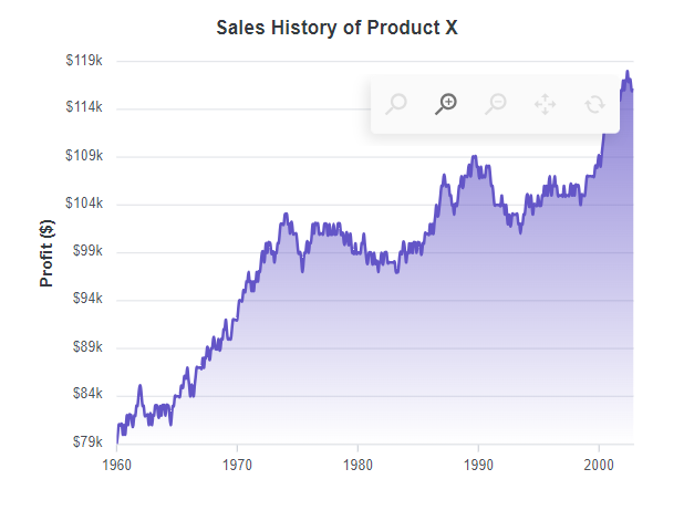
Range step area chart
We have added a new chart type called range step area to the Blazor Charts component. It is used to display the difference between minimum and maximum values over a certain time period.
Note: For more details, check the Blazor range step area chart’s demo.
Zooming and panning performance improvements
We improved the Charts zooming and panning performance both to handle more significant amounts of data and for when live updates are enabled in both server and WASM apps.
Note: See the Blazor Charts zooming and panning demos for more details.
Zoom toolbar
Display a zoom toolbar with zoom-in and zoom-out options for the Charts on initial loading.
Note: See the Blazor Zoom toolbar demo for more details.
Cross marker
Use a cross-shaped marker for data points in a chart.

Scheduler
Spanned events in timeline year view
Render spanned events as a single event instead of separate events in the timeline year view of the Scheduler component.
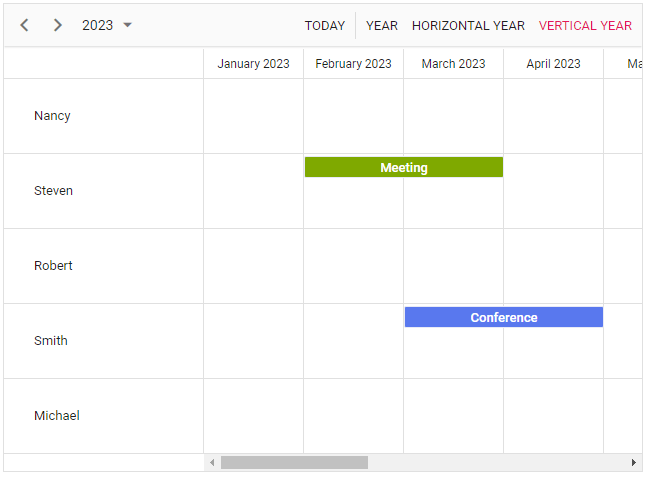
Note: See the Blazor Scheduler spanned events live demo here for more information.
Recurrence editor END type customization
Now, you can set end dates (until ends on or never) for the recurrence events in the Scheduler. You can see how to customize the end type option in the editor in this documentation.
Stock Chart with date-time category axis
The new date-time category axis in the Blazor Stock Chart displays business days. Render and configure the Stock Chart using the DateTimeCategory axis type to visualize stock data. To render a line series, use a Line series type.
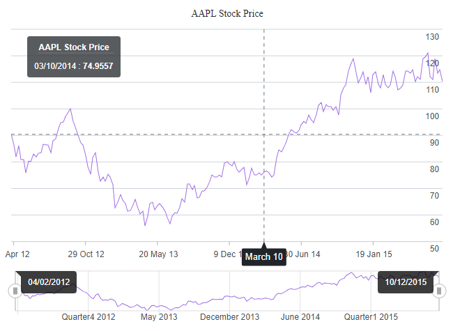
Note: See the Blazor Stock Chart with the date-time category axis’s live demo here.
TreeGrid
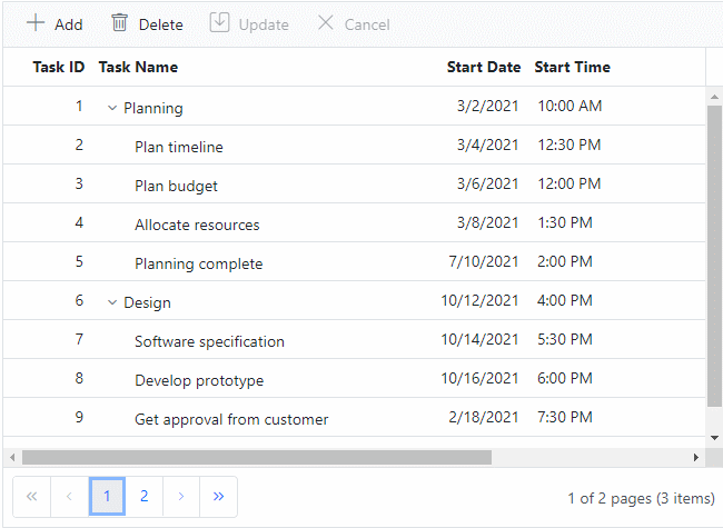
Row drag and drop with a detailed template
The Blazor TreeGrid now allows users to rearrange rows along with the detail template row using the drag-and-drop functionality.
DateOnly and TimeOnly values
These features allow users to bind and manage date and time-only values quickly. Users can perform various data operations such as sorting, filtering, searching, and CRUD (create, read, update, delete). To simplify things, built-in DatePicker and TimePicker editor components are rendered for editing and filtering purposes.
Note: For more details, check out the Blazor TreeGrid inline editing demo and column-type documentation.
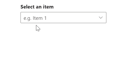
Dropdown components with virtual scrolling using the keyboard
The Blazor Dropdown List, ComboBox, and AutoComplete components support virtual scrolling through the keyboard keys. This provides an improved user experience when these components are rendered with large data sets. This feature allows users to navigate the list using their keyboard, making finding and selecting items faster and more efficient.
Keyboard key | Action |
Down arrow | Loads the next virtual list item if the last item of the current page is selected. |
Up arrow | Loads the previous virtual list item if the first item of the current page is selected. |
Page Down | Loads the next page and selects the last item in it. |
Page Up | Loads the previous page and selects the first item in it. |
Home | Loads the initial set of items and selects the first item in it. |
End | Loads the last set of items and selects the last item in it. |
Note: For more details, check out the Blazor Dropdown List virtualization demo.
Carousel
The new features added in the Blazor Carousel component are as follows.
Swipe and drag gestures
This feature allows users to change the slides in the Carousel using swipe or drag gestures, improving the usability and accessibility of the component on phones and tablets.
Note: For more details, go through this getting started documentation.
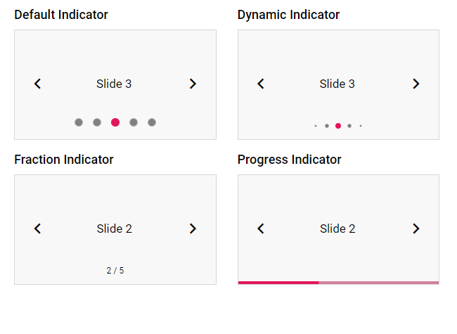
Indicator customization
Users can choose any of the following indicators using the IndicatorsType property.
- Default: The Carousel displays indicators with a bullet design.
- Dynamic: The Carousel applies dynamic animation to the indicators.
- Progress: The Carousel displays slides numerically as indicators.
- Fraction: The Carousel displays indicators like a progress bar.
Note: For more info, check out the live Blazor indicator-type demo here.
Blazor Diagram
We rolled out the following user-friendly features in the Blazor Diagram component .
Freehand drawing
Use freehand drawing to create freeform curves (splines) directly on the diagram page. With this feature, users can unleash their creativity by drawing anything from simple sketches to intricate works of art.

Note: For more details, check out the drawing tools in the Blazor Diagram component demo.
Additional auto-scroll support
This feature automatically scrolls a diagram whenever a connector or its endpoints are dragged beyond the boundary. This helps users create large dimensional drawings. The feature can be enabled or disabled using the EnableAutoScroll property in the ScrollSettings of the Blazor Diagram component.
Note: Check out the Blazor Diagram component scroll settings demo for more details.
Tooltip for symbols
There’s new tooltip support for symbols in the symbol palette. Now, users can conveniently provide additional information or descriptions for each symbol, improving the overall usability and clarity of the symbol palette.
Word Processor (document editor)
From the 2023 Volume 2 release onward, you can enjoy the following features in the Blazor Word Processor.
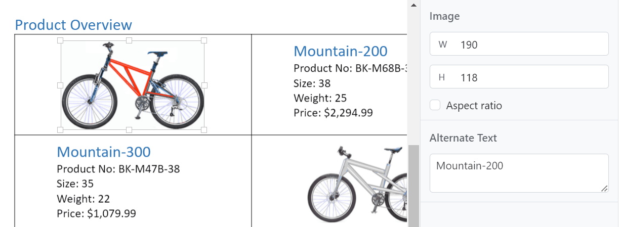
Alternate text for images
You can now add alternative text (alt text) for images in a text document. Alt text is important for accessibility because it enables all users to understand the content of a document. When someone who uses a screen reader or other assistive technology comes across an image in a document, they will hear the alt text describing the image. Without alt text, they will only know they’ve reached an image without knowing what the image shows.
Note: For more details, check out the Blazor Word Processor demo.
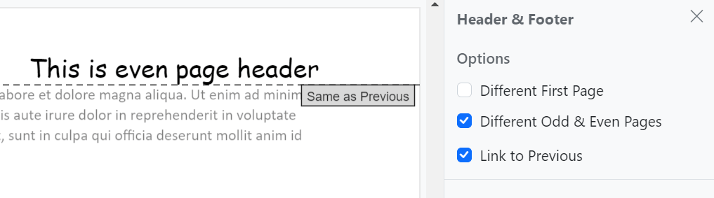
Link to previous header or footer
This feature allows users to link or unlink the header and footer of the previous section to the current section in a Word document. This can be useful if you want to create a consistent look across your document or if you want to create different headers and footers for each section in the document.
Note: For more details, check out the Blazor Word Processor headers and footers demo.
Character spacing and scaling
Character spacing and scaling are two different ways to customize the appearance of text in a Word document. Character spacing refers to the space between individual characters, while scaling refers to the characters’ size. You can increase the character spacing between the letters of a word to make it stand out. You can scale it up to make it easier to read or scale it down to save space.
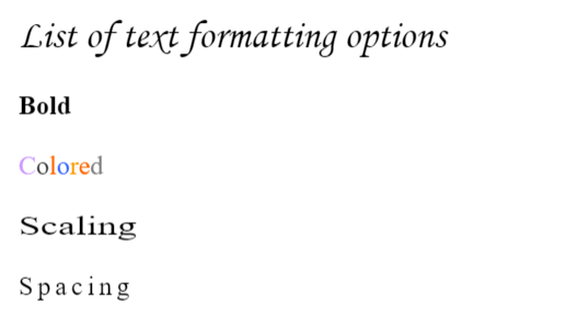
Note: For more details, check out the Blazor Word Processor character format demo.
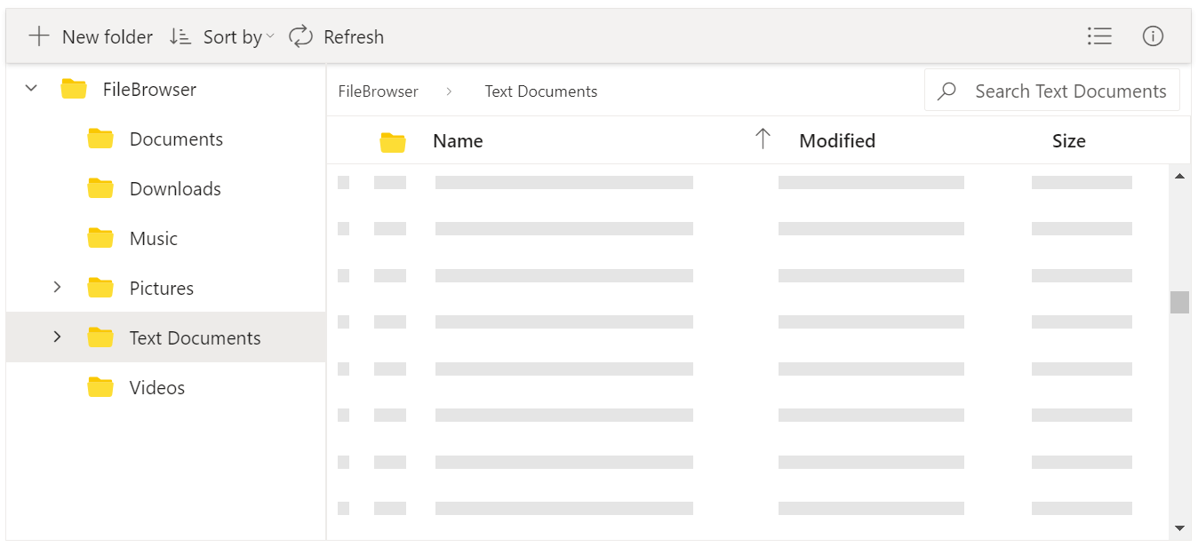
File Manager
The new features added to the Blazor File Manager are as follows.
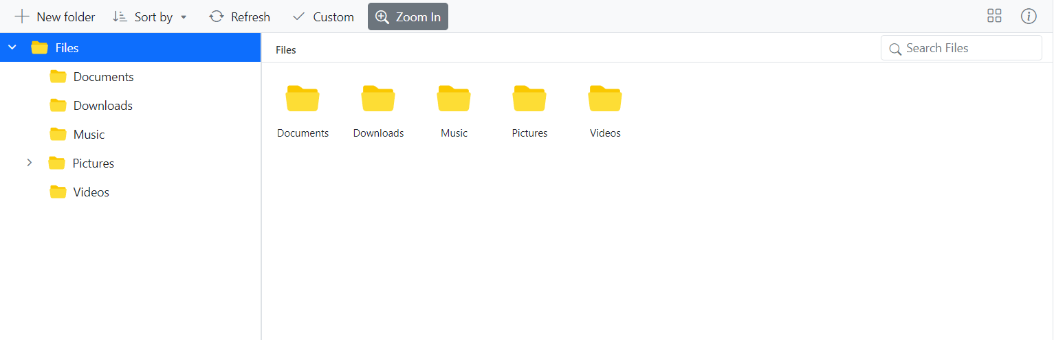
Virtual scrolling
The virtual scrolling feature supports UI virtualization for detailed, large-icon views in the Blazor File Manager control. This feature improves performance on the view port’s initial loading of files and folders. The remaining files and folders will be loaded dynamically when the user scrolls through them. Users can load a huge volume of files and folders without any performance issues. Scrolling can also be done with the keyboard.
You can enable this feature by setting the EnableVirtualization property to true.
Note: For more details, check out the virtual scrolling in the Blazor File Manager demo.
Toolbar customization
The File Manager allows users to customize the toolbar items directly with icons, text, and a tooltip. The ToolbarItems property and provided template support facilitate the customization of the items in the File Manager. You can now directly add custom toolbar items using the FileManagerCustomToolbarItems tag.
WASM performance enhancement
The PreventRender method in WASM avoids unnecessary re-rendering of the File Manager component. This method internally overrides the ShouldRender method of the File Manager to prevent unnecessary re-rendering.
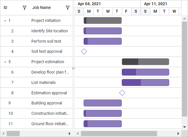
Gantt Chart
Resource view
The new resource view in the Blazor Gantt Chart is used to display the tasks that are hierarchically assigned to each resource. Resources are displayed as parents, and all the tasks assigned to each resource are displayed as its child records. This feature can be enabled by setting the ViewType to ResourceView.
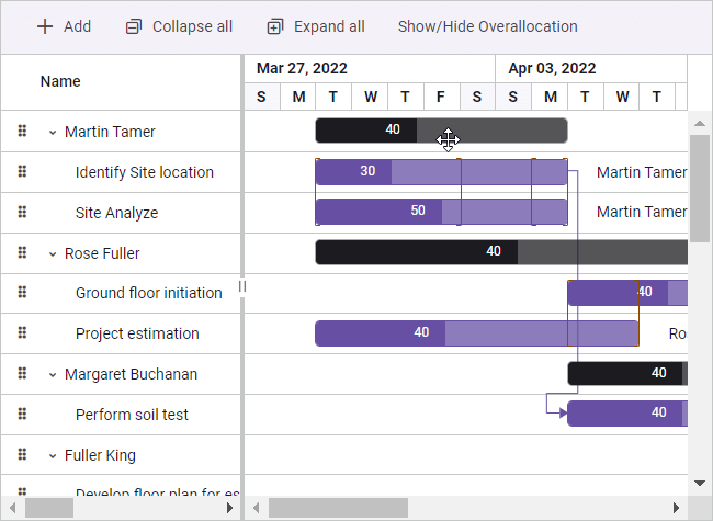
Note: For more details, check out the Blazor Gantt Chart resource view demo.
DateOnly and TimeOnly columns
These column types allow users to bind and manage date- and time-only values easily. Users can perform various data operations such as sorting, filtering, searching, and CRUD (create, read, update, delete). To simplify things, built-in DatePicker and TimePicker editor components are also rendered for editing and filtering purposes.
Note: For more details, check out the Blazor Gantt Chart column type documentation.
Conclusion
Thanks for reading! In this blog, we’ve seen the new features and components included in the Syncfusion Blazor suite for the 2023 Volume 2 release. Try out these user-friendly updates and give us feedback in the comments below.
Check out our Release Notes and What’s New pages to see the other available features in the 2023 Volume 2 release.
The new version of Essential Studio® is available for current customers on the License and Downloads page. If you are not a Syncfusion customer, try our 30-day free trial to check out our available features.
If you have any questions, you can reach us through our support forum, support portal, or feedback portal. We are always happy to assist you!


 No spam, just valuable updates.