
Syncfusion Blazor Charts is a well-crafted charting component for visualizing data. It contains a rich UI gallery of 50+ charts and graphs, ranging from line to financial, that cater to all charting scenarios.
In this blog, we’ll see the new features included for the Blazor Charts component in the 2023 Volume 2 release.
New Blazor Range Step Area Chart
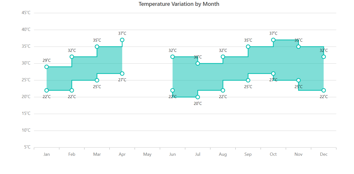
The new Blazor Range Step Area Chart is designed to display continuous data points as steps that fluctuate between high and low values over time intervals and across different categories. Unlike the traditional area charts, only the area between the high and low values in the range step area chart is filled with color, and a step line connects the data points.
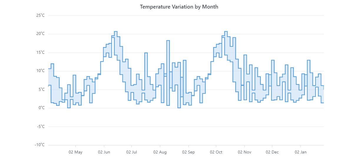
Why use a range step area chart?
The Blazor Range Step Area Chart is handy when you need to showcase the variation between minimum and maximum values in data sets, such as temperature or price fluctuations. It allows you to plot data emphasizing gradual changes.
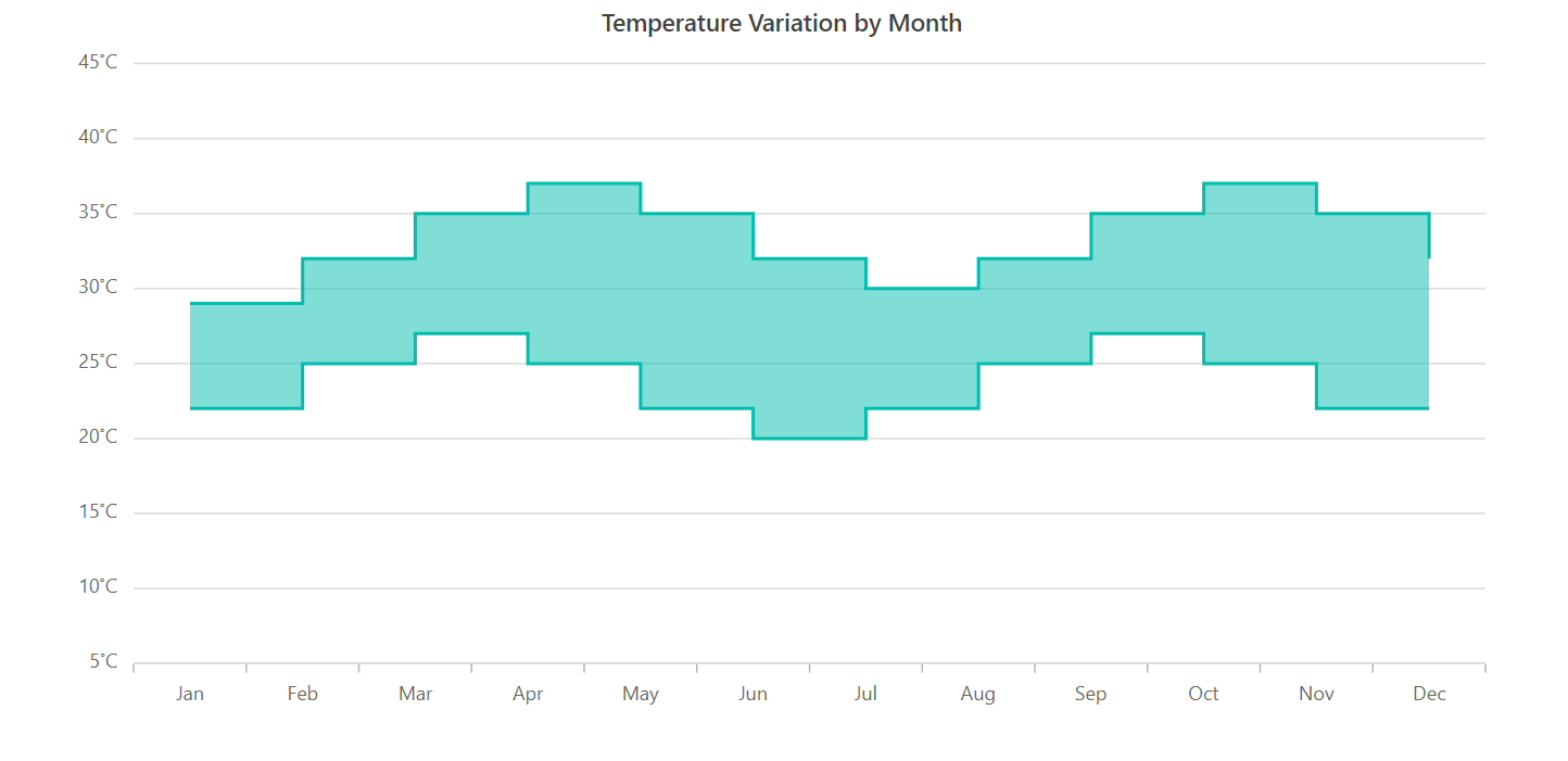
To utilize the Range Step Area Chart effectively, you need to provide the following values as input.
Value | Type | Description |
X | Int/Double/String/DateTime | Denotes the x-axis value of the data point. |
High | Int/Double | Denotes the high value in the data series. |
Low | Int/Double | Denotes the low value in the data series. |
Refer to the following code example. In it, we have used the Blazor Range Step Area Chart to visualize the temperature variation in a year.
<SfChart>
 <ChartPrimaryXAxis ValueType="Syncfusion.Blazor.Charts.ValueType.Category" />
 <ChartSeriesCollection>
  <ChartSeries DataSource="@WeatherReports" XName="X" High="High" Low="Low" Opacity="0.5" Type="ChartSeriesType.RangeStepArea">
  </ChartSeries>
 </ChartSeriesCollection>
</SfChart>

@code {
    public class ChartData
    {
        public string X { get; set; }
        public double Low { get; set; }
        public double High { get; set; }
    }

    public List<ChartData> WeatherReports = new List<ChartData>
    {
        new ChartData { X= "Jan", High= 29, Low= 22 },
        new ChartData { X= "Feb", High= 32, Low= 22 },
        new ChartData { X= "Mar", High= 35, Low= 25 },
        new ChartData { X= "Apr", High= 37, Low= 27 },
        new ChartData { X= "May", High= 35, Low= 25 },
        new ChartData { X= "Jun", High= 32, Low= 22 },
        new ChartData { X= "Jul", High= 30, Low= 20 },
        new ChartData { X= "Aug", High= 32, Low= 22 },
        new ChartData { X= "Sep", High= 35, Low= 25 },
        new ChartData { X= "Oct", High= 37, Low= 27 },
        new ChartData { X= "Nov", High= 35, Low= 25 },
        new ChartData { X= "Dec", High= 32, Low= 22 }
    };
}
Key features
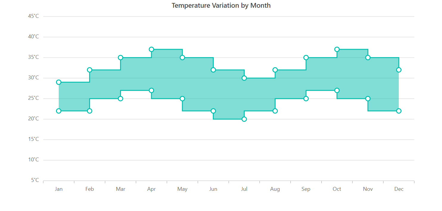
Markers
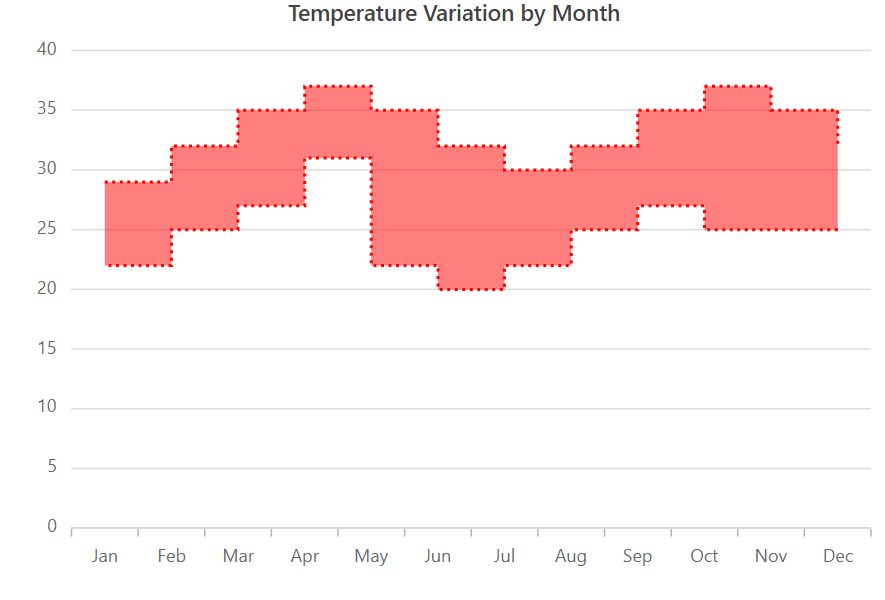
The Blazor Range Step Area Chart allows you to mark the data points with various built-in shapes, including circles, rectangles, ellipses, vertical lines, horizontal lines, diamonds, triangles, and pentagons. Moreover, you can use images to make the data points more visually appealing.
Refer to the following code example to enable the marker for a data series.
<SfChart>
 <ChartPrimaryXAxis ValueType="Syncfusion.Blazor.Charts.ValueType.Category" />
 <ChartSeriesCollection>
  <ChartSeries DataSource="@WeatherReports" XName="X" High="High" Low="Low" Opacity="0.5" Type="ChartSeriesType.RangeStepArea">
   <ChartMarker Visible=true Height="10" Width="10">
   </ChartMarker>
  </ChartSeries>
 </ChartSeriesCollection>
</SfChart>

@code {
    public class ChartData
    {
        public string X { get; set; }
        public double Low { get; set; }
        public double High { get; set; }
    }

    public List<ChartData> WeatherReports = new List<ChartData>
    {
        new ChartData { X= "Jan", High= 29, Low= 22 },
        new ChartData { X= "Feb", High= 32, Low= 22 },
        new ChartData { X= "Mar", High= 35, Low= 25 },
        new ChartData { X= "Apr", High= 37, Low= 27 },
        new ChartData { X= "May", High= 35, Low= 25 },
        new ChartData { X= "Jun", High= 32, Low= 22 },
        new ChartData { X= "Jul", High= 30, Low= 20 },
        new ChartData { X= "Aug", High= 32, Low= 22 },
        new ChartData { X= "Sep", High= 35, Low= 25 },
        new ChartData { X= "Oct", High= 37, Low= 27 },
        new ChartData { X= "Nov", High= 35, Low= 25 },
        new ChartData { X= "Dec", High= 32, Low= 22 }
    };
}
Data labels
Data labels enable you to display information about the data points within the chart. You can leverage HTML elements such as images, divs, and spans by adding templates to enhance the appearance of data labels. Additionally, data labels can be rotated to any desired angle.
Refer to the following code example to enable data labels in the chart.
<SfChart>
 <ChartPrimaryXAxis ValueType="Syncfusion.Blazor.Charts.ValueType.Category" />
 <ChartSeriesCollection>
  <ChartSeries DataSource="@WeatherReports" XName="X" High="High" Low="Low" Opacity="0.5" Type="ChartSeriesType.RangeStepArea">
   <ChartMarker Visible=true Height="10" Width="10">
    <ChartDataLabel Visible="true"></ChartDataLabel>
   </ChartMarker>
  </ChartSeries>
 </ChartSeriesCollection>
</SfChart>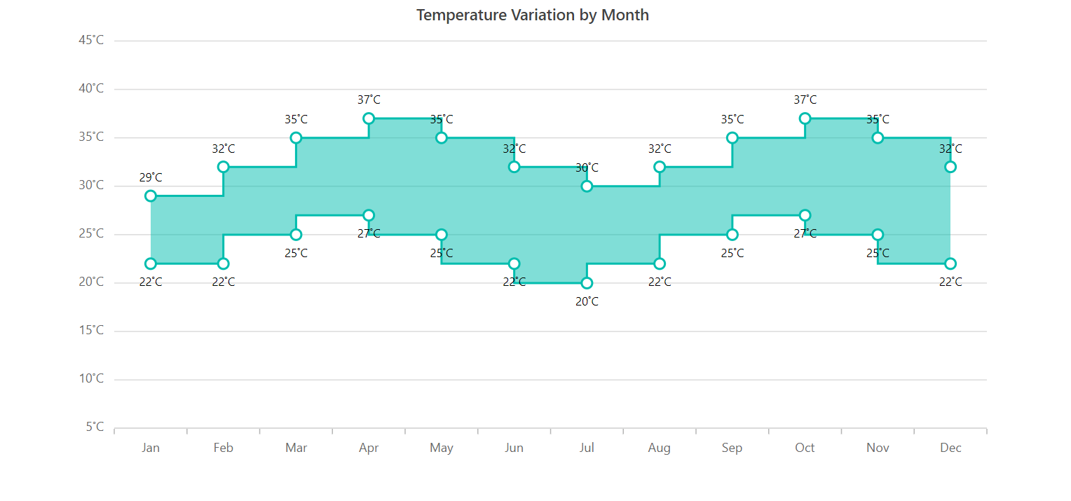
Empty points
When no data is available for specific dates or categories, you can elegantly handle them within the chart using empty data points.
<SfChart>
 <ChartPrimaryXAxis ValueType="Syncfusion.Blazor.Charts.ValueType.Category" />
 <ChartSeriesCollection>
  <ChartSeries DataSource="@WeatherReports" XName="X" High="High" Low="Low" Opacity="0.5" Type="ChartSeriesType.RangeStepArea">
   <ChartMarker Visible=true Height="10" Width="10">
    <ChartDataLabel Visible="true"></ChartDataLabel>
   </ChartMarker>
   <ChartSeriesBorder Width="2"></ChartSeriesBorder>
  </ChartSeries>
 </ChartSeriesCollection>
</SfChart>

@code {
    public class ChartData
    {
        public string X { get; set; }
        public Nullable<double> Low { get; set; }
        public Nullable<double> High { get; set; }
    }

    public List<ChartData> WeatherReports = new List<ChartData>
    {
        new ChartData { X= "Jan", High= 29, Low= 22 },
        new ChartData { X= "Feb", High= 32, Low= 22 },
        new ChartData { X= "Mar", High= 35, Low= 25 },
        new ChartData { X= "Apr", High= 37, Low= 27 },
        new ChartData { X= "May", High= null, Low= null },
        new ChartData { X= "Jun", High= 32, Low= 22 },
        new ChartData { X= "Jul", High= 30, Low= 20 },
        new ChartData { X= "Aug", High= 32, Low= 22 },
        new ChartData { X= "Sep", High= 35, Low= 25 },
        new ChartData { X= "Oct", High= 37, Low= 27 },
        new ChartData { X= "Nov", High= 35, Low= 25 },
        new ChartData { X= "Dec", High= 32, Low= 22 }
    };
}
Customization
The Blazor Range Step Area Chart provides built-in APIs for easy customization. You can tailor the appearance of the chart using the following properties:
- Fill—To change the color of the data series.
- Opacity—To control the transparency of the fill color.
- DashArray—To alter the pattern of dashes in the data series.
- ChartSeriesBorder—To modify the color and width of the chart series border.
Refer to the following code example.
<ChartSeriesCollection>
 <ChartSeries DataSource="@WeatherReports" XName="X" High="High" Low="Low" DashArray="2,3" Fill="red" Opacity="0.5" Type="ChartSeriesType.RangeStepArea">
  <ChartMarker Visible=true Height="10" Width="10">
  </ChartMarker>
  <ChartSeriesBorder Width="2"></ChartSeriesBorder>
 </ChartSeries>
</ChartSeriesCollection>
Other supported features
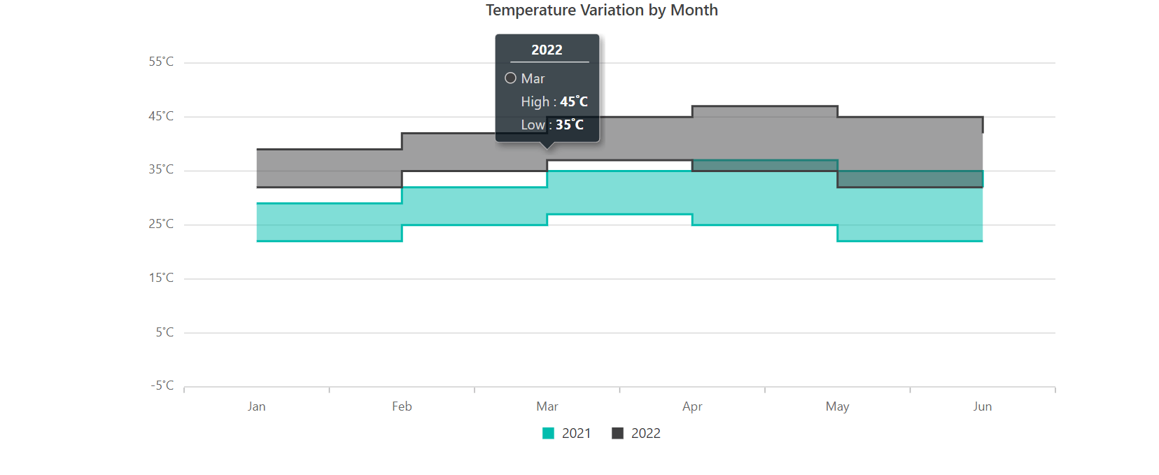
The Blazor Range Step Area Chart supports various other data visualization capabilities, including animation, multiple series, tooltips, legends, zooming, and panning.
Note: For more details, refer to the Range Step Area Chart documentation and live demos.
What’s new in existing charts?
Let’s see the new features added in the existing Blazor Chart types for the 2023 Volume 2 release!
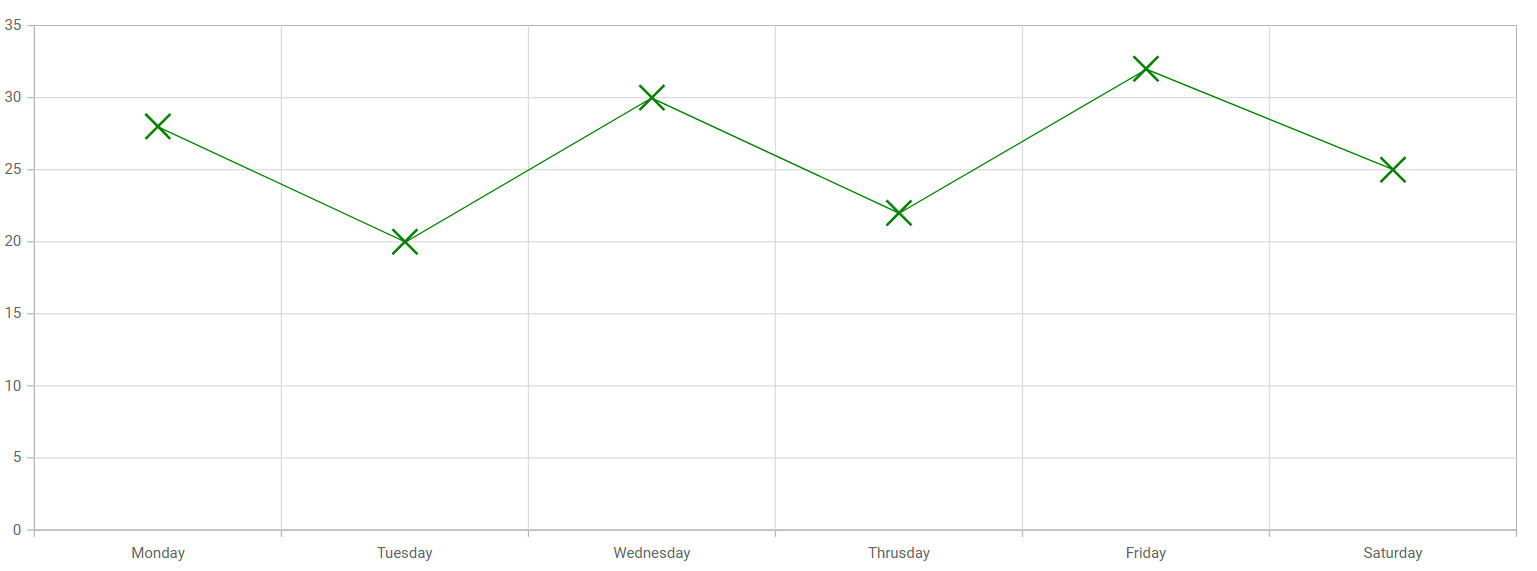
Cross marker
In this release, a new cross marker shape has been introduced. This shape is beneficial for highlighting data points and emphasizing essential values in charts.
To use it, first, we should enable markers for data points in our Blazor Charts. This can be done by setting the Visible property of the ChartMarker to true.
To render cross markers, we need to set the Shape property of the ChartMarker to ChartShape.Cross. This will transform the default marker shape into a cross shape.
Refer to the following code example.
@using Syncfusion.Blazor.Charts

<SfChart>
 <ChartSeriesCollection>
  <ChartSeries DataSource="@ConsumerReports" XName="X" YName="Y" Type="ChartSeriesType.Line">
   <ChartMarker Visible="true" Height="20" Width="20" Shape="ChartShape.Cross" />
   </ChartSeries>
  </ChartSeriesCollection>
</SfChart>

@code {
    public class ChartData
    {
        public string X { get; set; }
        public double Y { get; set; }
    }

    public List<ChartData> ConsumerReports = new List<ChartData>
    {
        new ChartData{ X= "Monday", Y= 28 },
        new ChartData{ X= "Tuesday", Y= 20 },
        new ChartData{ X= "Wednesday", Y= 30 },
        new ChartData{ X= "Thursday", Y= 22 },
        new ChartData{ X= "Friday", Y= 32 },
        new ChartData{ X= "Saturday", Y= 35 },
    };
}
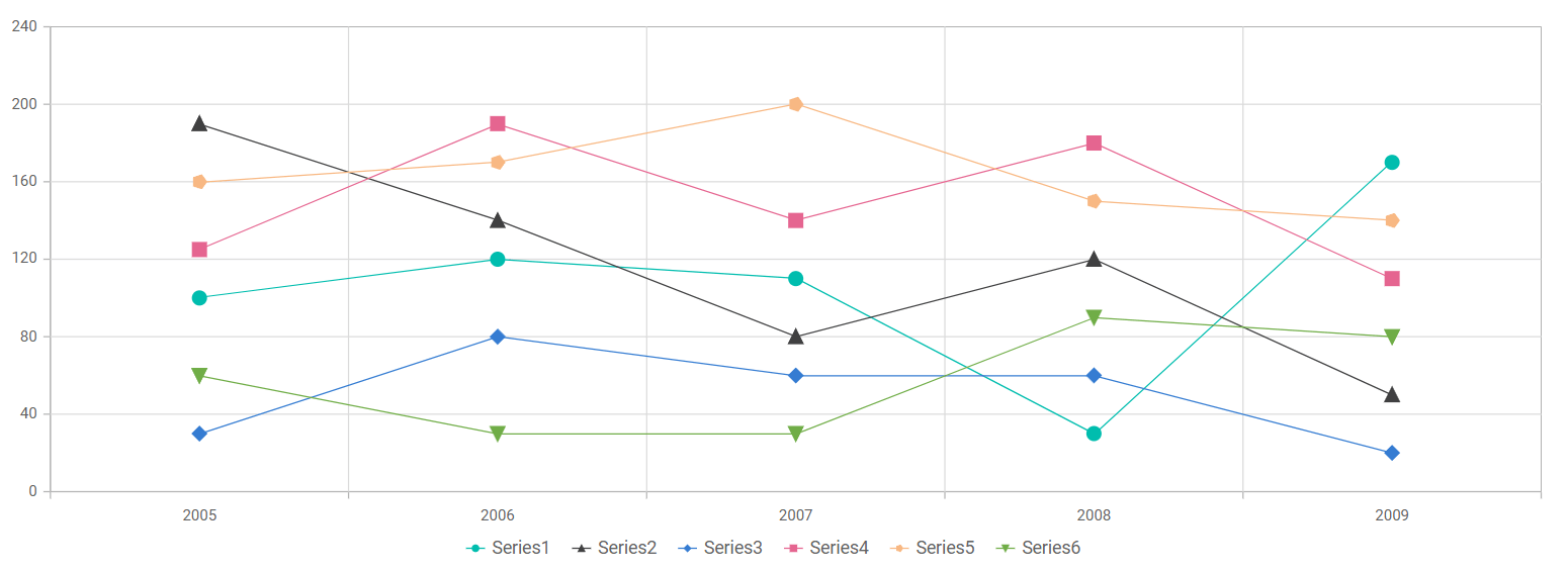
Auto marker shape
By default, when data markers are enabled in Blazor Charts, all series will be rendered with the same marker shape: a circle.
However, in this latest release, we introduced a new AutoMarker shape option. Now, the ChartMarker class’s Shape property is set to ChartShape.Auto by default when the marker is enabled. So, each series will automatically be rendered with a unique marker shape.
Refer to the following code example.
@using Syncfusion.Blazor.Charts

<SfChart ID="container">
    <ChartPrimaryXAxis ValueType="Syncfusion.Blazor.Charts.ValueType.DateTimeCategory" Format="yyyy"></ChartPrimaryXAxis>
    <ChartPrimaryYAxis Interval="40"></ChartPrimaryYAxis>
    <ChartSeriesCollection>
        <ChartSeries Name="Series1" DataSource="@ConsumerReports" XName="X" YName="Y1" Type="ChartSeriesType.Line">
            <ChartMarker Visible="true" Height="10" Width="10" IsFilled="true" />
        </ChartSeries>
        <ChartSeries Name="Series2" DataSource="@ConsumerReports" XName="X" YName="Y2" Type="ChartSeriesType.Line">
            <ChartMarker Visible="true" Height="10" Width="10" IsFilled="true" />
        </ChartSeries>
        <ChartSeries Name="Series3" DataSource="@ConsumerReports" XName="X" YName="Y3" Type="ChartSeriesType.Line">
            <ChartMarker Visible="true" Height="10" Width="10" IsFilled="true" />
        </ChartSeries>
        <ChartSeries Name="Series4" DataSource="@ConsumerReports" XName="X" YName="Y4" Type="ChartSeriesType.Line">
            <ChartMarker Visible="true" Height="10" Width="10" IsFilled="true" />
        </ChartSeries>
        <ChartSeries Name="Series5" DataSource="@ConsumerReports" XName="X" YName="Y5" Type="ChartSeriesType.Line">
            <ChartMarker Visible="true" Height="10" Width="10" IsFilled="true" />
        </ChartSeries>
        <ChartSeries Name="Series6" DataSource="@ConsumerReports" XName="X" YName="Y6" Type="ChartSeriesType.Line">
            <ChartMarker Visible="true" Height="10" Width="10" IsFilled="true" />
        </ChartSeries>
    </ChartSeriesCollection>
</SfChart>

@code {
    public class ChartData
    {
        public DateTime X { get; set; }
        public double Y { get; set; }
        public double Y1 { get; set; }
        public double Y2 { get; set; }
        public double Y3 { get; set; }
        public double Y4 { get; set; }
        public double Y5 { get; set; }
        public double Y6 { get; set; }
    }

    public List<ChartData> ConsumerReports = new List<ChartData>
    {
        new ChartData{ X= new DateTime(2005,01,01), Y1 = 100, Y2 = 190, Y3 = 30, Y4 = 125, Y5 = 160, Y6 = 60 },
        new ChartData{ X= new DateTime(2006,01,01), Y1 = 120, Y2 = 140, Y3 = 80, Y4 = 190, Y5 = 170, Y6 = 30 },
        new ChartData{ X= new DateTime(2007,01,01), Y1 = 110, Y2 = 80, Y3 = 60, Y4 = 140, Y5 = 200, Y6 = 30 },
        new ChartData{ X= new DateTime(2008,01,01), Y1 = 30, Y2 = 120, Y3 = 60, Y4 = 180, Y5 = 150, Y6 = 90 },
        new ChartData{ X= new DateTime(2009,01,01), Y1 = 170, Y2 = 50, Y3 = 20, Y4 = 110, Y5 = 140, Y6 = 80 },
}
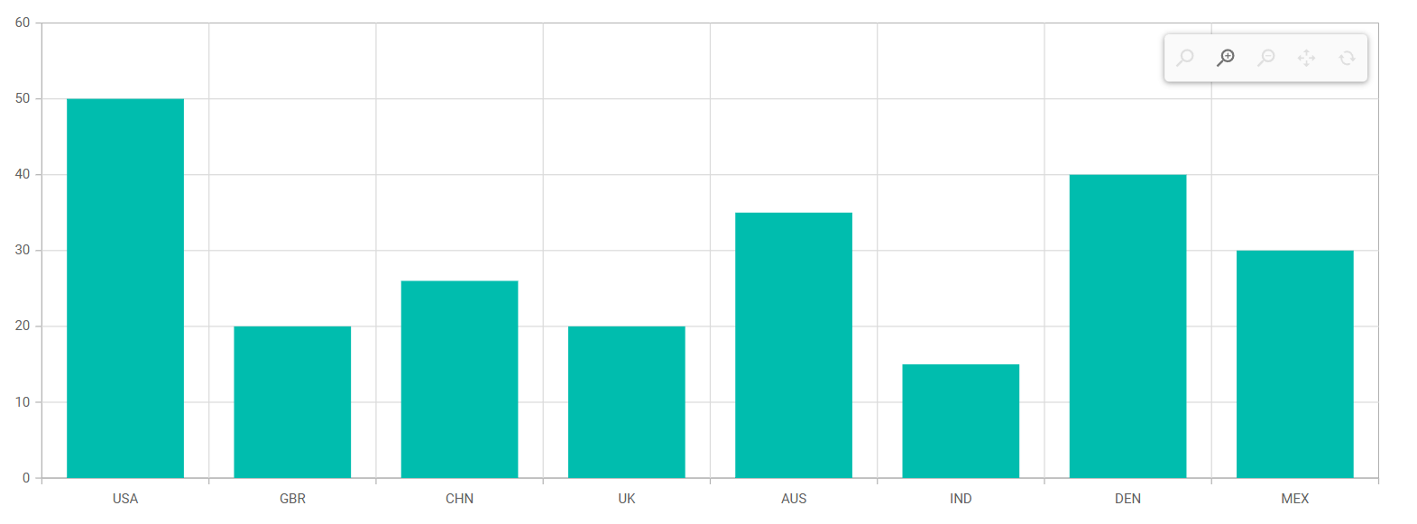
Zooming toolbar
The zooming toolbar in the Blazor Charts component provides users with intuitive controls to zoom in, zoom out, pan, and reset the chart. It enables users to interact with the chart and examine data more closely.
To enable this feature, set the ToolbarDisplayMode property to ToolbarMode.Always.
Refer to the following code example to display the zooming toolbar on initial loading of the chart.
@using Syncfusion.Blazor.Charts

<SfChart>
 <ChartPrimaryXAxis ValueType="Syncfusion.Blazor.Charts.ValueType.Category"></ChartPrimaryXAxis>
 <ChartPrimaryYAxis Interval="10"></ChartPrimaryYAxis>
  <ChartZoomSettings EnableSelectionZooming="true" EnableMouseWheelZooming="true" EnablePinchZooming="true" ToolbarDisplayMode="ToolbarMode.Always">
  </ChartZoomSettings>
  <ChartSeriesCollection>
   <ChartSeries DataSource="@SalesReports" XName="X" YName="YValue" Type="ChartSeriesType.Column"></ChartSeries>
  </ChartSeriesCollection>
</SfChart>

@code {

    public class ChartData1
    {
        public string X { get; set; }
        public double YValue { get; set; }
    }

    public List<ChartData1> SalesReports = new List<ChartData1>
    {
        new ChartData1 { X= "USA", YValue= 50 },
        new ChartData1 { X= "GBR", YValue= 20 },
        new ChartData1 { X= "CHN", YValue= 26 },
        new ChartData1 { X= "UK", YValue= 20 },
        new ChartData1 { X= "AUS", YValue= 35 },
        new ChartData1 { X= "IND", YValue= 15 },
        new ChartData1 { X= "DEN", YValue= 40 },
        new ChartData1 { X= "MEX", YValue= 30 },
    };
}
Conclusion
Thanks for reading! In this blog, we’ve seen the new features rolled out in the Blazor Charts component for the 2023 Volume 2 release. Check out the release’s other new features in our Release Notes and What’s New pages. Try them out to visualize your data elegantly and leave your feedback in the comments below!
You can download our free trial to try our Syncfusion Blazor components if you don’t have a license.
For questions, you can contact us through our support forum, support portal, or feedback portal. We are always happy to assist you!