
Syncfusion Angular Charts is a well-crafted charting component for visualizing data. It contains a rich UI gallery of 50+ charts and graphs, ranging from line to financial, that cater to all charting scenarios.
In this blog, we’ll see the new features included for the Angular Charts component in the Essential Studio® 2023 Volume 3 release.
Synchronized charts
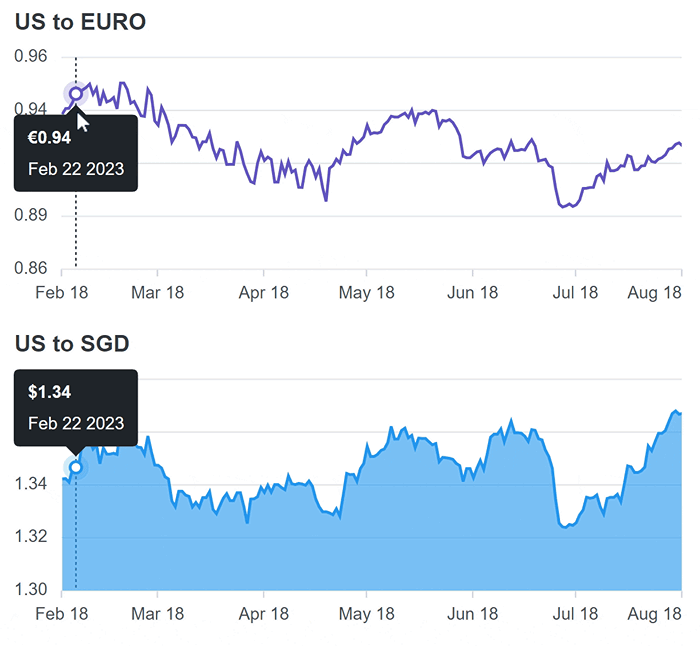
The new synchronization feature in Angular Charts allows multiple charts or graphs to work harmoniously together. When you interact with one chart by hovering over data points or selecting specific elements, the other connected charts respond in real-time.
Synchronized charts are like interconnected data visualizations that respond instantly to user interactions. For example, when you hover over one chart representing monthly sales, other related charts instantly update to display corresponding data, such as foot traffic and product category distribution, facilitating comprehensive data analysis.
Refer to the following code example.
<div class="control-section">
    <div class="col">
        <ejs-chart #chart1
                   [tooltip]="tooltip1"
                   [crosshair]="crosshair"
                   (zoomComplete)="zoomComplete($event)"
                   (chartMouseLeave)="chart1MouseLeave($event)"
                   (chartMouseMove)="chart1MouseMove($event)"
                   (chartMouseUp)="chart1MouseUp($event)">
            <e-series-collection>
                <e-series [dataSource]="dataSource"
                          type="Line"
                          xName="USD"
                          yName="EUR">
                </e-series>
            </e-series-collection>
        </ejs-chart>
    </div>

    <div class="col">
        <ejs-chart #chart2
                   [tooltip]="tooltip2"
                   [crosshair]="crosshair"
                   (zoomComplete)="zoomComplete($event)"
                   (chartMouseLeave)="chart2MouseLeave($event)"
                   (chartMouseMove)="chart2MouseMove($event)"
                   (chartMouseUp)="chart2MouseUp($event)">
            <e-series-collection>
                <e-series [dataSource]="dataSource"
                          type="Area"
                          xName="USD"
                          yName="SGD">
                </e-series>
            </e-series-collection>
        </ejs-chart>
    </div>
</div>

export class AppComponent {
  @ViewChild('chart1')
  public chart1: ChartComponent;

  @ViewChild('chart2')
  public chart2: ChartComponent;

  public charts: ChartComponent[] = [];
  ngAfterViewInit() {
    this.charts = [this.chart1, this.chart2];
  }
  public zoomFactor: number = 0;
  public zoomPosition: number = 0;
  public isZoom: boolean = false;

  public zoomSettings: Object = {
    enableMouseWheelZooming: true,
    enablePinchZooming: true,
    enableScrollbar: false,
    enableDeferredZooming: false,
    enablePan: true,
    mode: 'X',
    toolbarItems: ['Pan', 'Reset']
  };

  public zoomComplete(args: IZoomCompleteEventArgs): void {
    if (args.axis.name === 'primaryXAxis') {
      this.zoomFactor = args.currentZoomFactor;
      this.zoomPosition = args.currentZoomPosition;
      this.zoomCompleteFunction(args);
    }
  }
  public chart1MouseLeave(args: IMouseEventArgs): void {
    this.chart2.hideCrosshair();
    this.chart2.hideTooltip();
  }
  public chart1MouseMove(args: IMouseEventArgs): void {
      this.chart2.showTooltip(args.x, args.y);
      this.chart2.showCrosshair(args.x, args.y);
  }
  public chart1MouseUp(args: IMouseEventArgs): void {
      this.chart2.hideCrosshair();
      this.chart2.hideTooltip();
  }
  public chart2MouseLeave(args: IMouseEventArgs): void {
    this.chart1.hideCrosshair();
    this.chart1.hideTooltip();
  }
  public chart2MouseMove(args: IMouseEventArgs): void {
      this.chart1.showTooltip(args.x, args.y);
      this.chart1.showCrosshair(args.x, args.y);
    }
  }
  public chart2MouseUp(args: IMouseEventArgs): void {
      this.chart1.hideCrosshair();
      this.chart1.hideTooltip();
  }

  public zoomCompleteFunction(args): void {
    for (let i: number = 0; i < this.charts.length; i++) {
        this.charts[i].primaryXAxis.zoomFactor = this.zoomFactor;
        this.charts[i].primaryXAxis.zoomPosition = this.zoomPosition;
        this.charts[i].zoomModule.isZoomed =
          args.axis.series[0].chart.zoomModule.isZoomed;
        this.charts[i].zoomModule.isPanning =
          args.axis.series[0].chart.zoomModule.isPanning;
    }
  }
}
You can check out the demo for synchronized charts for more information.
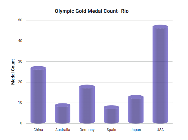
Cylindrical chart
The new Angular cylindrical chart is a column or bar chart representing data using cylindrical shapes instead of rectangular columns. Using cylindrical shapes can enhance the visual appeal of your data presentation, making it more engaging and aesthetically pleasing.
Refer to the following code example.
<e-series-collection>
    <e-series [dataSource]='data'
              columnFacet='Cylinder'
              type='Column'
              xName='x'
              yName='y'
              columnSpacing=0.1>
    </e-series>
</e-series-collection>

export class AppComponent {
    public data: Object[] = [
        { x: 'China', y: 26 },
        { x: 'Australia', y: 8},
        { x: 'Germany', y: 17},
        { x: 'Spain', y: 7},
        { x: 'Japan', y: 12 },
        { x: 'USA', y: 46 }
    ];
}
You can check out the demo for cyclindrical chart for more details.
Excel export
The new Excel export feature lets users export charts, stock charts, and accumulation chart data to XLSX and CSV formats.
XLSX is a structured, proprietary format well suited for complex Excel documents containing multiple sheets, formatting, and formulas. On the other hand, CSV is a simpler, plain text format designed for storing tabular data in a human-readable form that is widely compatible across various applications.
Refer to the following code example for exporting chart data to XLSX format.
<ejs-chart #chart id='chart-container' [primaryXAxis]='primaryXAxis' [primaryYAxis]='primaryYAxis'>
    <e-series-collection>
        <e-series [dataSource]='data' type='Column' xName='x' yName='y'>
        </e-series>
    </e-series-collection>
</ejs-chart>

<button ej-button id='print' (click)='export()'>Export</button>

export class AppComponent {

    @ViewChild('chart')
    public chart?: ChartComponent;
    export() {
        this.chart?.exportModule.export('XLSX', 'Chart');
    }
}
Refer to the following code example for exporting chart data to CSV format.
<ejs-chart #chart id='chart-container' [primaryXAxis]='primaryXAxis' [primaryYAxis]='primaryYAxis'>
    <e-series-collection>
        <e-series [dataSource]='data' type='Column' xName='x' yName='y'></e-series>
    </e-series-collection>
</ejs-chart>

<button ej-button id='print' (click)='export()'>Export</button>

export class AppComponent {

    @ViewChild('chart')
    public chart?: ChartComponent;
    export() {
        this.chart?.exportModule.export('CSV', 'Chart');
    }
}
You can check out the demo for exporting charts for more details.
Export chart to multiple pages
The enhanced PDF export feature allows you to export charts from a webpage into multiple pages within a PDF document, simplifying the presentation and sharing of multiple visualizations in an organized format.
Refer to the following code example to export a chart to multiple pages.
<ejs-chart #chart id='chart-container1' [primaryXAxis]='primaryXAxis1' [primaryYAxis]='primaryYAxis1' [title]='title1'>
</ejs-chart>

<ejs-chart #chart1 id='chart-container2' [primaryXAxis]='primaryXAxis2' [primaryYAxis]='primaryYAxis2' [title]='title2'>
</ejs-chart>

<ejs-accumulationchart #chart2 id="chart-container3" [legendSettings]='legendSettings' [tooltip]='tooltip'>
</ejs-accumulationchart>

<button ej-button id='print' (click)='export()'>Export</button>

export class AppComponent {

    @ViewChild('chart')
    public chart?: ChartComponent;

    @ViewChild('chart1')
    public chart1?: ChartComponent;

    @ViewChild('chart2')
    public chart2?: ChartComponent;

    export() {
        this.chart?.exportModule.export('PDF', 'Chart', null, [this. chart, this.chart1, this.chart2 as ChartComponent], null, null, true, undefined, undefined, true);
    }
}
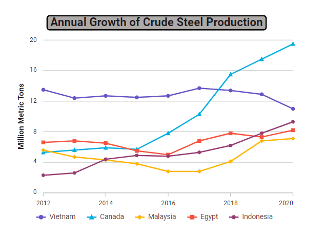
Title and subtitle Customization
You can customize the visual appearance of a chart’s title to match specific design preferences. By specifying background color, position, border style, and font size, you can precisely control how the title is presented within the chart. This customization enhances the title’s visual appeal and ensures seamless integration with the overall chart design.
<ejs-chart #chart [title]="title"[titleStyle]="titleStyle">
</ejs-chart>

export class AppComponent {

  public titleStyle: Object = {
    background: '#ADAAA8',
    position: 'Top',
    border: {
      color: 'black',
      width: 2,
      cornerRadius: 4
    },
    size: '14px'
  };
  public title: string = 'Annual Growth of Crude Steel Production';
}
Conclusion
Thanks for reading! This blog shows the new features rolled out in the Angular Charts component for the 2023 Volume 3 release. Check out the release’s other new features in the Release Notes and What’s New pages. See how elegantly they visualize your data and leave feedback in the comments below!
You can download our free trial to try our Syncfusion Angular components if you don’t have a license.
For questions, you can contact us through our support forum, support portal, or feedback portal. We are always happy to assist you!
 No spam, just valuable updates.