Common
A2UI (preview)
-
A2UI for Angular: A new framework for building agent-driven user interfaces using the A2UI v0.9 protocol. It enables AI agents to dynamically generate and render interactive EJ2 Angular components, including DataGrid, Chart, Scheduler, forms, and other UI elements, without manual component development.
-
The release includes support for 50+ component adapters, runtime message processing, data binding, surface rendering, and an AI-powered Composer Playground for designing, previewing, and generating A2UI surfaces. A2UI for Angular is currently available as a preview release.
New component
- The Form Builder component has been added to the Angular suite.
- The
Modern Rich Text Editorcomponent has been added to the web platforms. - The
Headless Editor libraryhas been added to build fully custom editor UIs. - The Form Renderer component has been added to the Angular suite.
Production-ready component
The following component has been developed to meet industry standards and is now marked as production-ready for Angular:
- Inline AI Assist: The Inline AI Assist is a versatile, integrated AI-powered assistant component for modern web applications that lets users prompt AI services and receive intelligent responses directly in the interface, with flexible display modes and extensive customization options.
Angular 22
The Angular component packages have been updated to Angular 22, delivering improved performance, faster builds, smaller bundles, and an enhanced development experience. Starting with Syncfusion® Essential JS 2 Angular version 35.1.37, Angular Compatibility Compiler (ngcc) support has been dropped. Syncfusion® Angular components now support Angular 20+, aligning with the latest Angular and LTS releases.
Form Builder (preview)
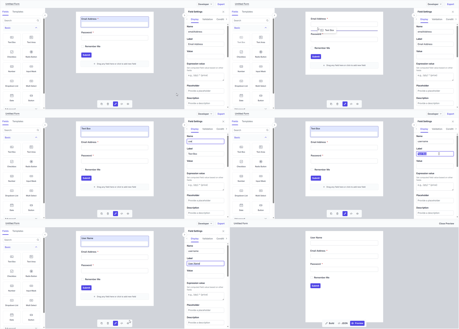
The Angular Form Builder is a lightweight component that allows you to design and generate dynamic forms with a simple drag-and-drop interface, without writing any code.
Key features
-
Drag-and-drop form design: Build forms quickly by dragging form fields from a rich field panel and dropping them onto the design area. Easily rearrange fields to suit your layout needs.
-
Wide range of built-in form components: Choose from 20+ built-in form components to cover all common data-entry scenarios: text box, dropdown list, combo box, multi-select, date picker, time picker, checkbox, radio button, slider, rating, signature, and file upload.
-
Custom components: Extend the Form Builder by registering your own custom components. Add specialized fields and business-specific inputs to your forms.
-
Form field configuration: Effortlessly define field names, labels, placeholders, validation rules, and other properties for each form component through a simple properties panel.
-
Conditional logic: Configure conditions to show or hide form fields dynamically based on the values of other fields.
-
Dependent dropdowns: Set up cascading dropdown lists, where the options in one dropdown depend on the selected value of another, enabling hierarchical data selection.
-
Expressions: Bind calculated values to form fields using expressions, allowing fields to update automatically based on changes in other fields.
-
Form preview: Preview a designed form at any time to see exactly how it will appear and behave at runtime before saving or publishing it.
-
JSON schema viewing: View the JSON schema generated for the drag-and-drop form. This makes it easy to understand, validate, and reuse the underlying form definition.
-
Save and load form data: Download the designed form as a JSON schema using the Export button, and load the saved JSON back into the Form Builder to restore the exact form layout at runtime.
-
Responsive rendering: Create forms that adapt seamlessly to any screen size, delivering an optimal user experience on desktops, tablets, and mobile devices.
Form Renderer (preview)
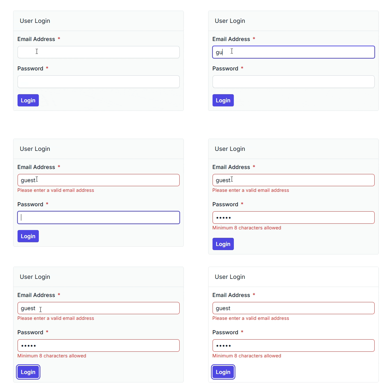
The Angular Form Renderer is a lightweight component that renders forms from a provided JSON form schema, enabling users to build dynamic forms without writing any code.
Key features
-
Schema-based form rendering: Render forms directly from a JSON form schema to deliver a consistent and structured form experience.
-
Built-in validations: Support standard validation rules to ensure accurate and complete data entry.
-
Custom validation: Apply custom validation rules to meet application-specific requirements.
-
Expressions: Bind calculated values to form fields using expressions, allowing fields to update automatically based on changes in other fields.
-
Conditional logic: Configure conditions to dynamically show or hide form fields based on the values of other fields.
-
Dependent dropdowns: Set up cascading dropdown lists, where the options in one dropdown depend on the selected value of another, enabling hierarchical data selection.
-
Template support for custom components: Render custom components using templates for more flexible, tailored form experiences.
-
Responsive rendering: Create forms that adapt seamlessly to any screen size, delivering an optimal user experience across desktops, tablets, and mobile devices.
3D Charts
Stacked column chart with smart data label
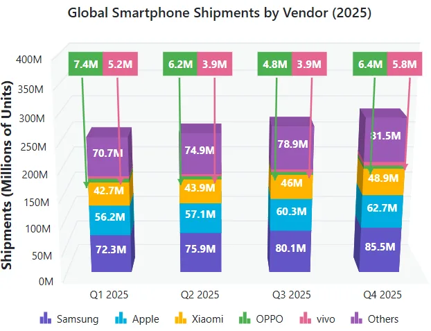
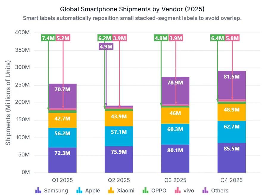
Automatic collision handling is now provided for data labels in stacked series, ensuring each label remains clearly readable. Overlapping data labels are detected and relocated to a readable area, while a visual connection from each relocated label to its original data point is maintained through a connector line.
AI AssistView
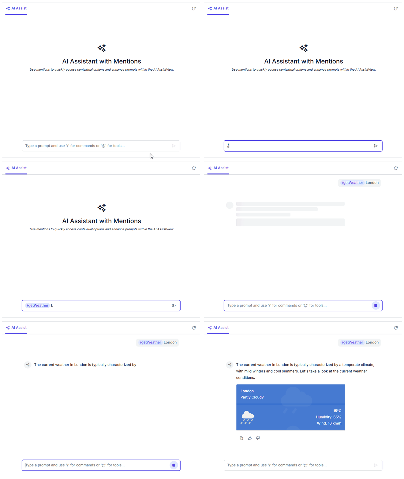
Animated response rendering
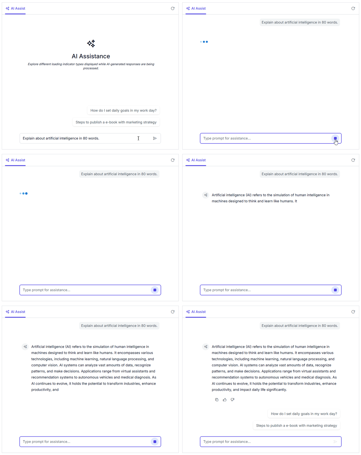
This feature enables animated rendering of AI responses in the conversation interface. By progressively displaying generated content with configurable animations, it creates a more engaging and natural conversational experience and helps users focus on newly generated information.
Mention
This feature lets users reference specific actions, entities, or application-defined directives directly in the prompt input area. Intelligent mention suggestions and contextual references simplify prompt composition, improve interaction accuracy, and enable more personalized and targeted AI conversations.
Telemetry
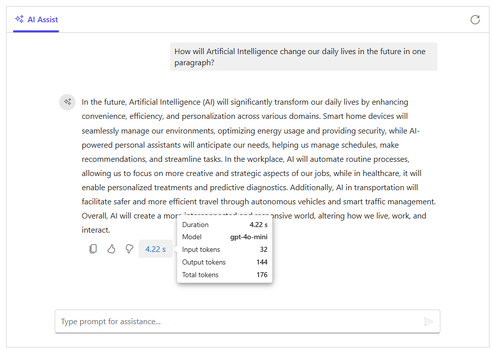
This feature provides built-in telemetry for tracking AI AssistView interactions and response activity. It captures key metrics such as request status, tool calls, response duration, streaming events, model details, and token usage.
Left-aligned footer toolbar actions
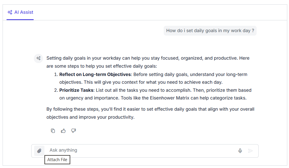
The AI AssistView now displays a footer toolbar on the left side of the conversation, making it easy for users to access action items such as attachments, shortcuts, settings, and custom commands.
Charts
Stacked column with smart data label
Automatic collision handling is now provided for data labels in stacked series, ensuring each label remains clearly readable. Overlapping data labels are detected and relocated to a readable area, while a visual connection from each relocated label to its original data point is maintained through a connector line.
WebMCP integration
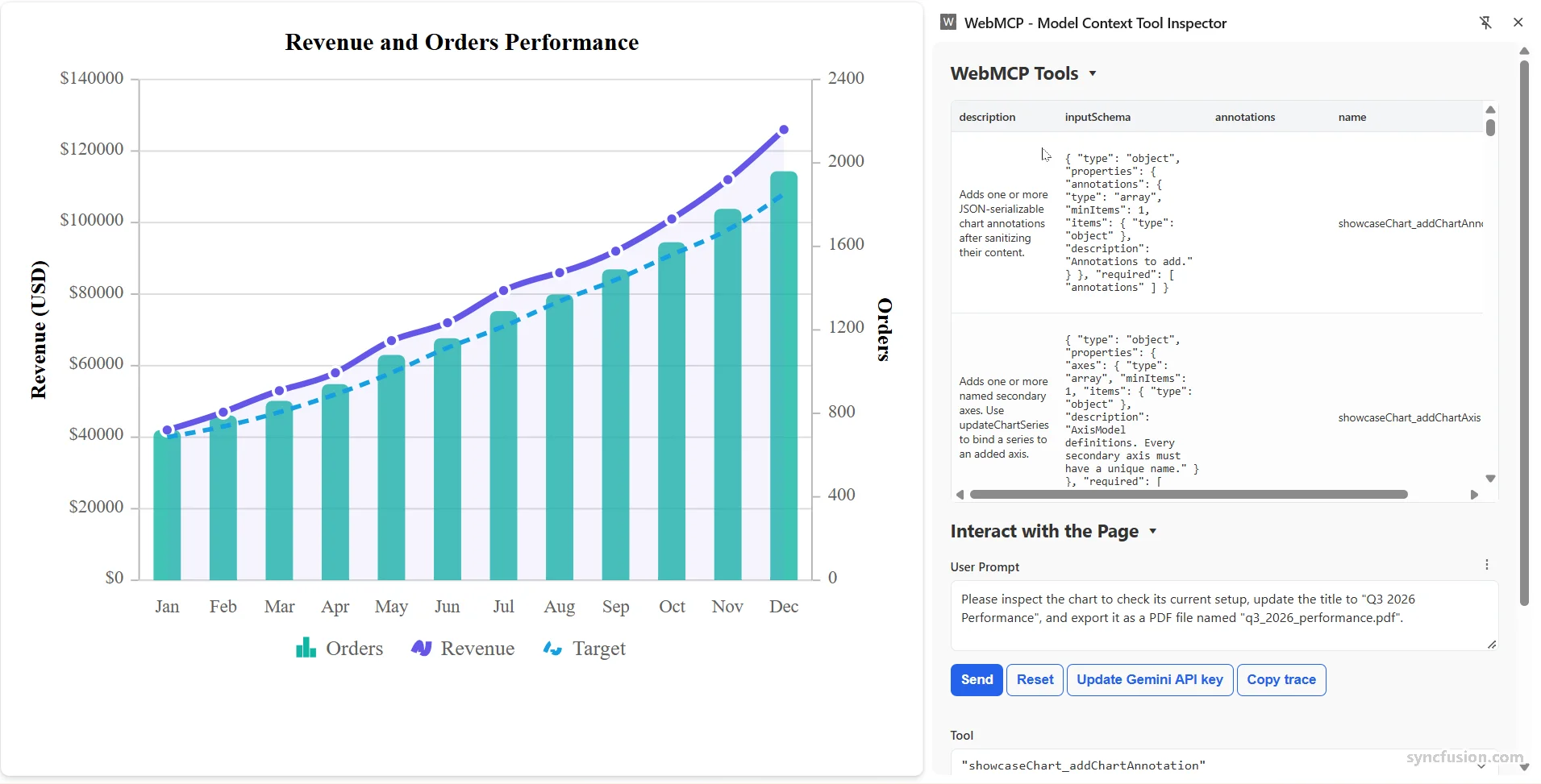
Charts supports the Web Model Context Protocol (WebMCP), enabling AI models and agents to interact with chart data and visual elements through built-in tools. Write operations require user confirmation, and the beforeWebMcpToolExecute event lets users inspect, modify, or cancel tool execution.
Dashboard Layout
Mobile panel height
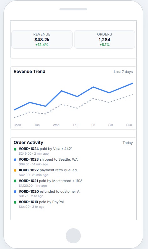
Panels can now be rendered with a custom height in mobile view, allowing them to be displayed more compactly and use the available screen space efficiently on smaller devices. Panels without a custom height continue to use the desktop size, ensuring backward compatibility.
File Manager
Prevent folders from opening during drag and drop
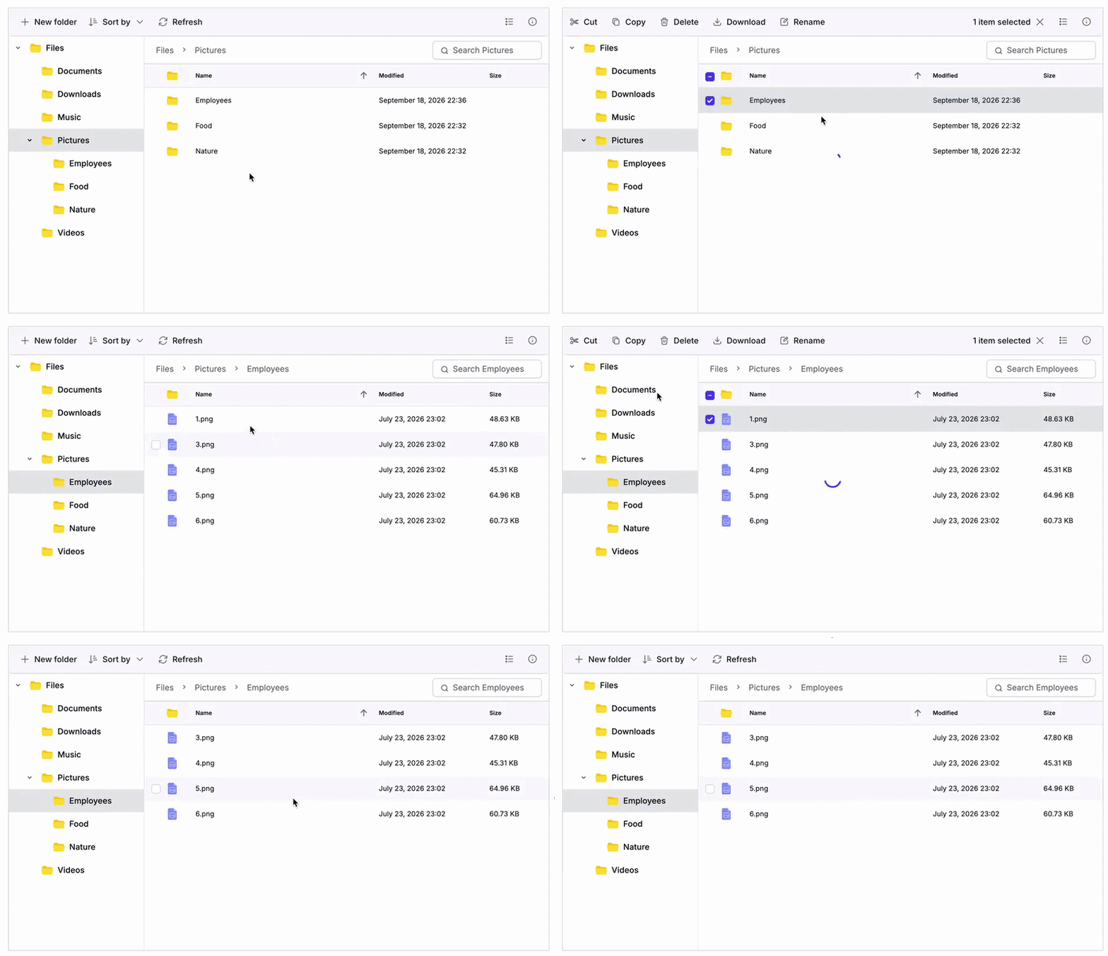
Users can control which interactions open a folder. Users can prevent folders from opening during drag-and-drop operations while still allowing them to open for other interactions, such as double-clicking, keyboard navigation, or context menu actions.
WebMCP integration
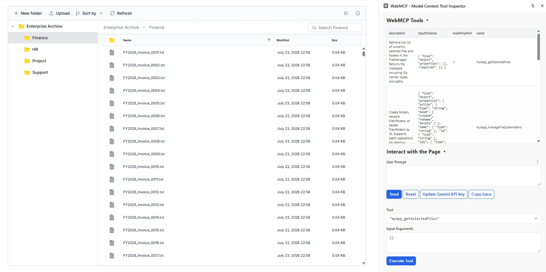
The File Manager supports the Web Model Context Protocol (WebMCP), enabling AI models and agents to interact with files and folders through built-in tools. Write operations require user confirmation, and the beforeWebMcpToolExecute event lets users inspect, modify, or cancel tool execution.
Gantt Chart
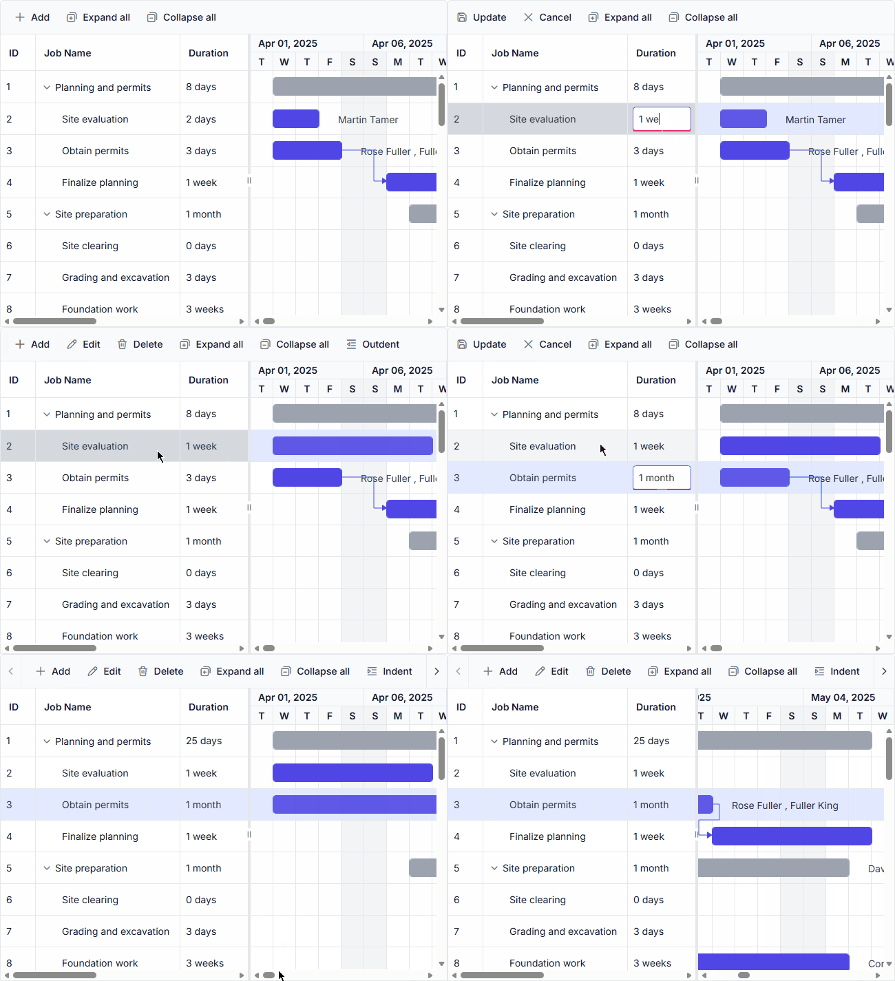
Week and month units
Schedule long-running tasks more naturally using week and month duration units. This makes it easier to plan and manage projects that span extended periods.

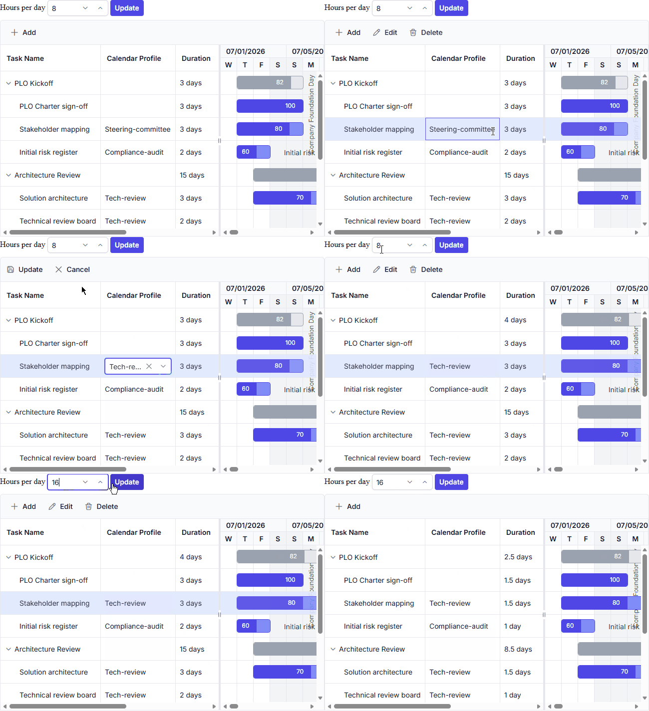
Task Calendar
Configure task-specific working days, holidays, and exceptions to meet unique scheduling requirements. This helps ensure more accurate task planning across different project scenarios.
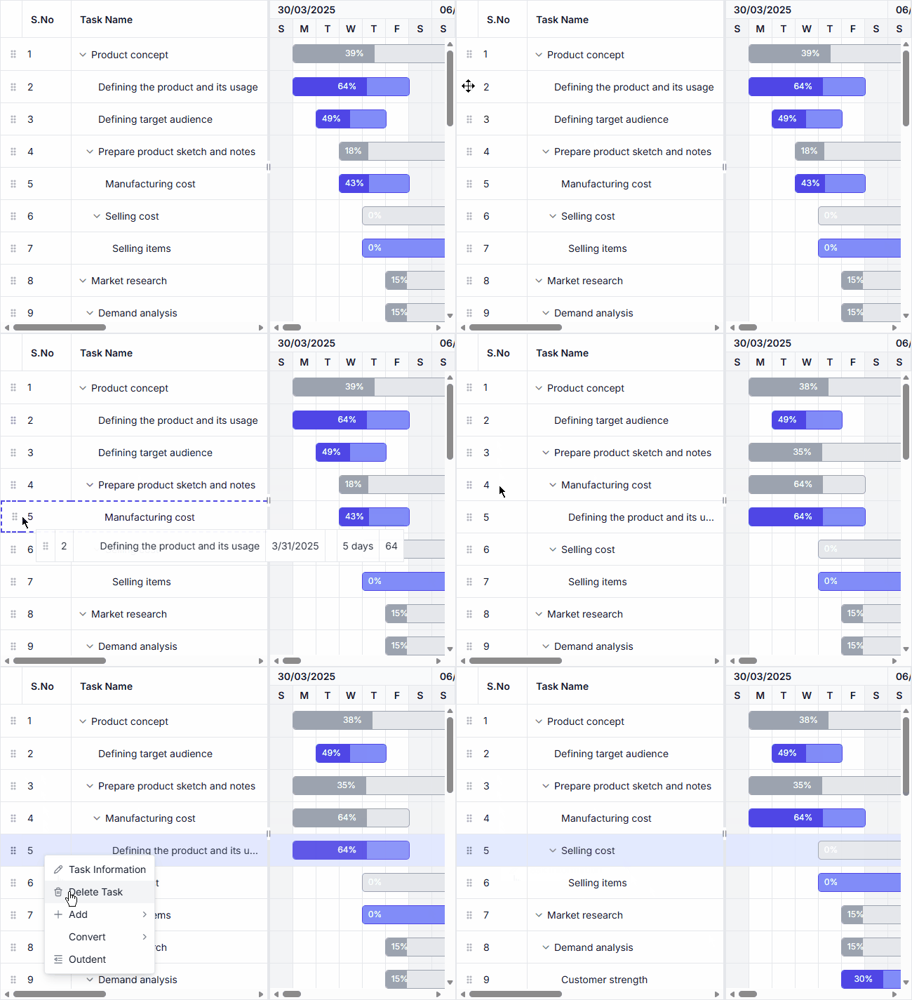
Serial number column
Automatically display sequential row numbers based on the current task order. The numbering updates dynamically during filtering, searching, editing, and row reordering operations.
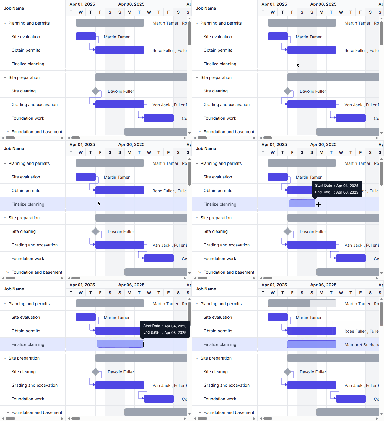
Drag-to-draw taskbar
Create and schedule unscheduled tasks directly in the timeline using intuitive drag interactions. This simplifies task creation and accelerates project planning workflows.
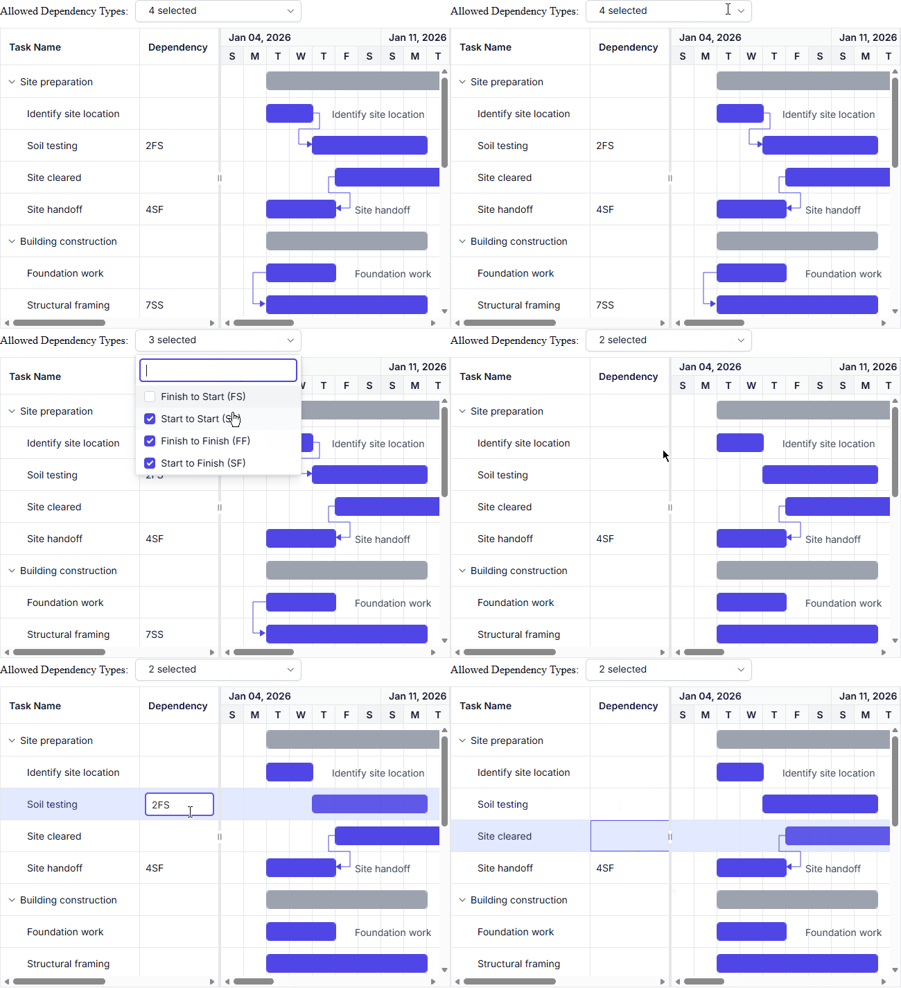
Allow specific dependency types
Restrict task relationships to selected dependency types to ensure consistent and controlled project scheduling.
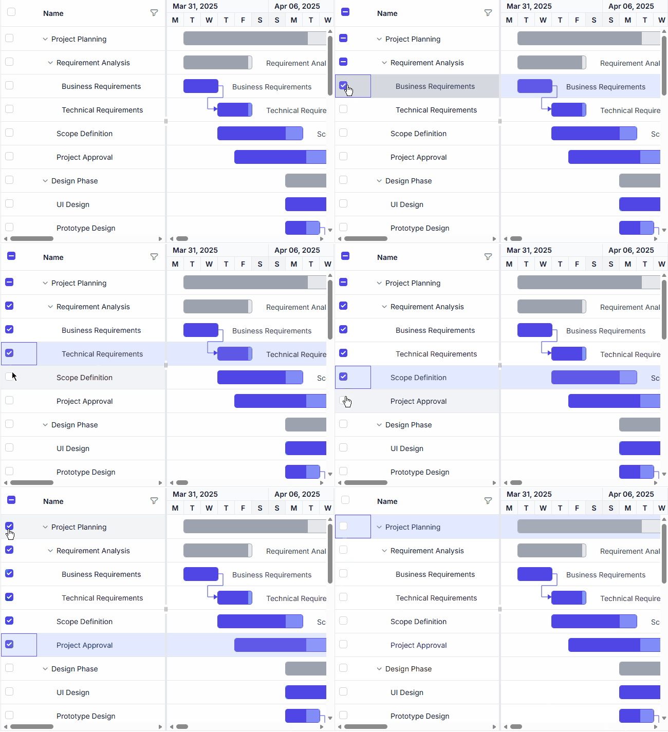
Hierarchy checkbox selection
Automatically synchronize checkbox selection between parent and child tasks for easier hierarchical task management.
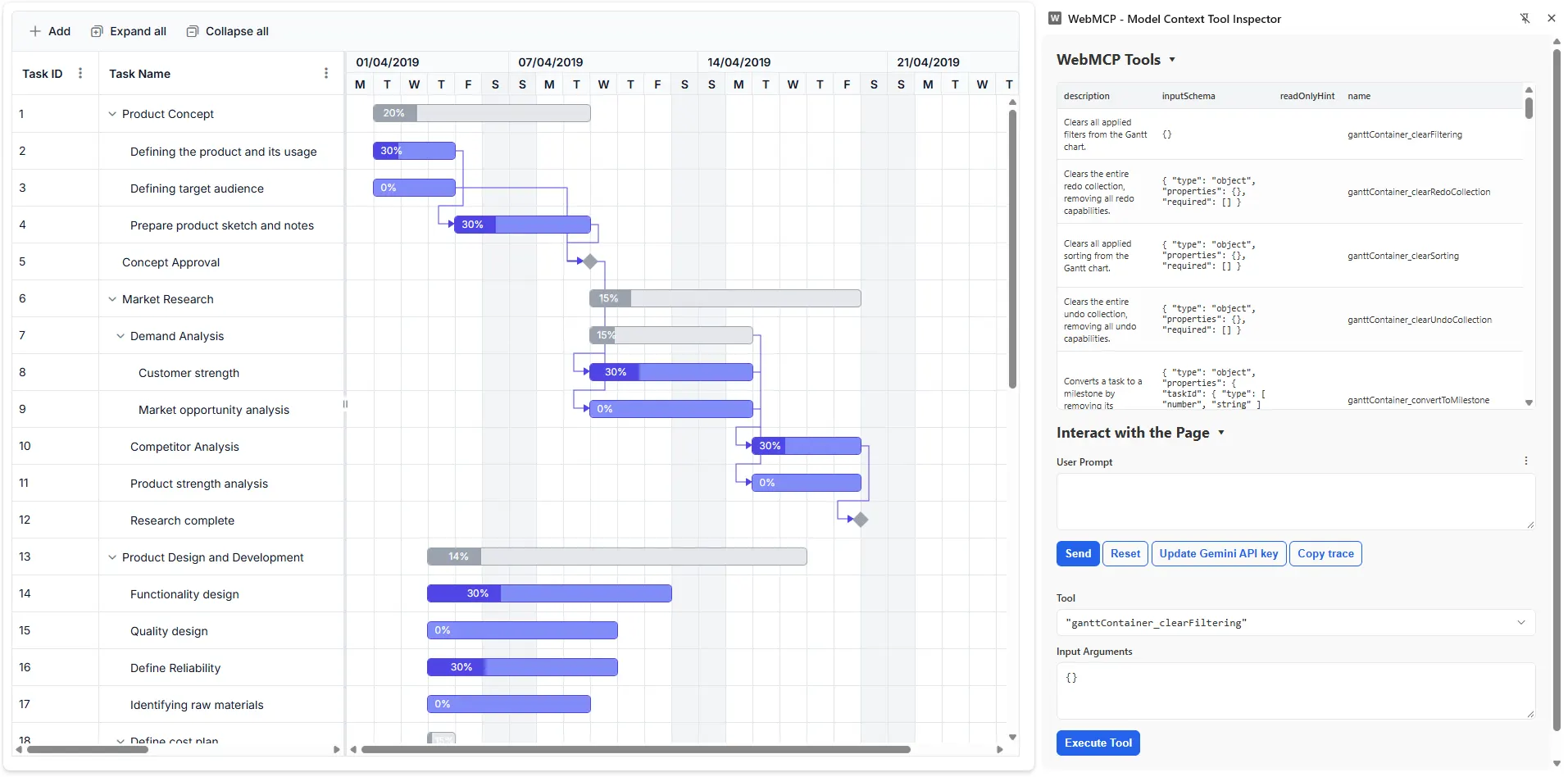
WebMCP tools
Enable AI agents and applications to access project and task information through integrated WebMCP tools. Developers can review and control tool actions before execution.
DataGrid
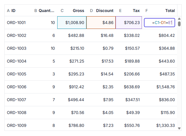
Formula cell
Perform spreadsheet-like calculations directly in grid cells using formulas. Formula cells automatically evaluate expressions and update results when their dependencies change, enabling dynamic data computation and analysis within the DataGrid.
Advanced filter
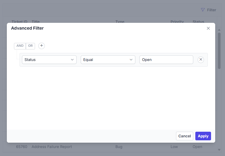
Build complex filtering conditions with an intuitive filtering interface. Advanced filtering supports multiple criteria, logical operators, and custom rules, making it easier to analyze and narrow down large datasets.
Row number
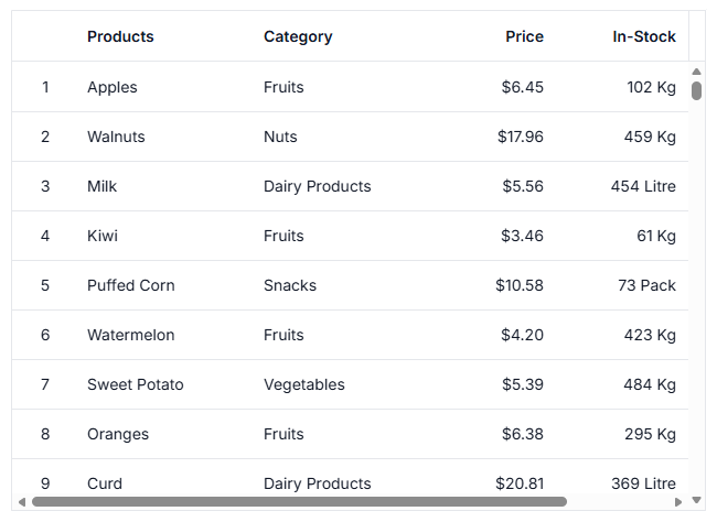
Display automatically generated row numbers to simplify record identification and navigation. Row numbers remain synchronized with sorting, filtering, and other grid operations.
WebMCP integration
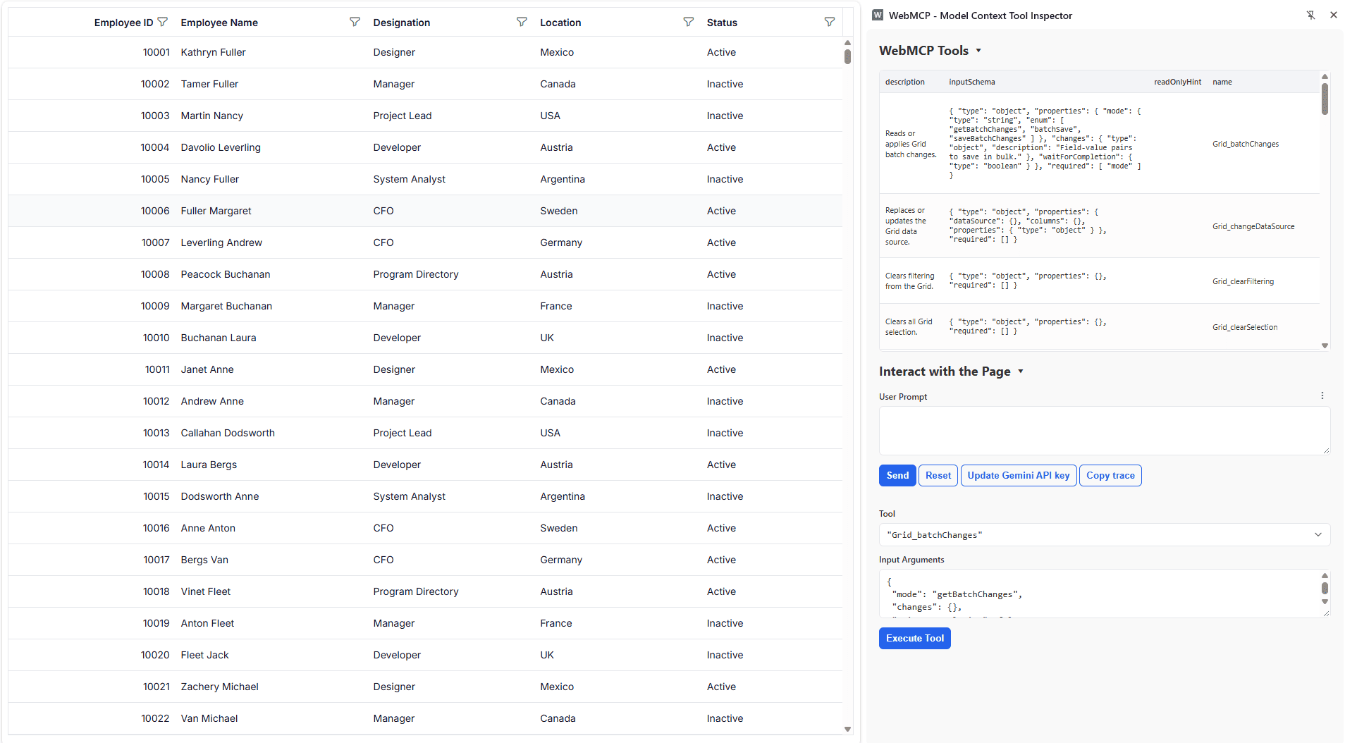
The Grid supports the Web Model Context Protocol (WebMCP), enabling AI models and agents to interact with Grid data through built-in tools. User interactions can be validated before execution, allowing requests to be reviewed, modified, or canceled while maintaining control over Grid operations.
Headless Editor Library (preview)
The Headless Editor Library is a new, framework-agnostic editing foundation built on ProseMirror to enable modern rich-text and structured editing experiences. It provides a modular architecture with a structured document model, extensible commands and extensions, schema management, selection handling, events, NodeViews, and reusable editing services.
Key features
- Headless editing foundation: Provides a UI-independent editing engine that integrates with various editor interfaces and application frameworks.
- ProseMirror-based editing: Uses ProseMirror as the underlying document model and editing engine for structured content, transactions, selections, and plugins.
- Extensible editor architecture: Provides an extension system for adding, configuring, and composing editor functionality without coupling features to a specific UI.
- Command framework: Introduces a centralized command system for content manipulation, formatting, selection, lists, and document transformations.
- Structured document model: Supports nodes, inline marks, blocks, nested content, and schema-based document structures for reliable content management.
- Rich content: Provides built-in support for headings, lists, links, images, tables, code blocks, callouts, and collapsible sections.
- Custom node view: Enables custom rendering and an interactive UI for complex document elements such as images, tables, and other structured content.
- Event system: Provides editor lifecycle, content, selection, focus, paste, delete, and file events to monitor and customize editor behavior.
- Schema management: Provides schema definition, validation, and migration capabilities to maintain structured, consistent editor content.
- File and upload handling: Provides reusable file handling and upload-state infrastructure for media and other file-based editing scenarios.
- Keyboard and selection: Provides configurable keyboard bindings and selection APIs for building customized editing interactions.
- Reusable editing foundation: Provides a common foundation for building different editor experiences, including rich-text and structured content editors.
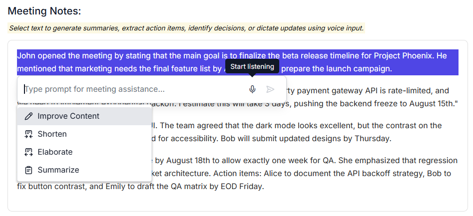
Inline AI Assist
Speech-to-text conversion in the input text area
The Angular Inline AI Assist component integrates speech-to-text conversion, enabling users to compose messages by voice. This accessibility feature expands input options and streamlines workflows for users who prefer voice interaction or require hands-free input.
Modern Rich Text Editor (preview)
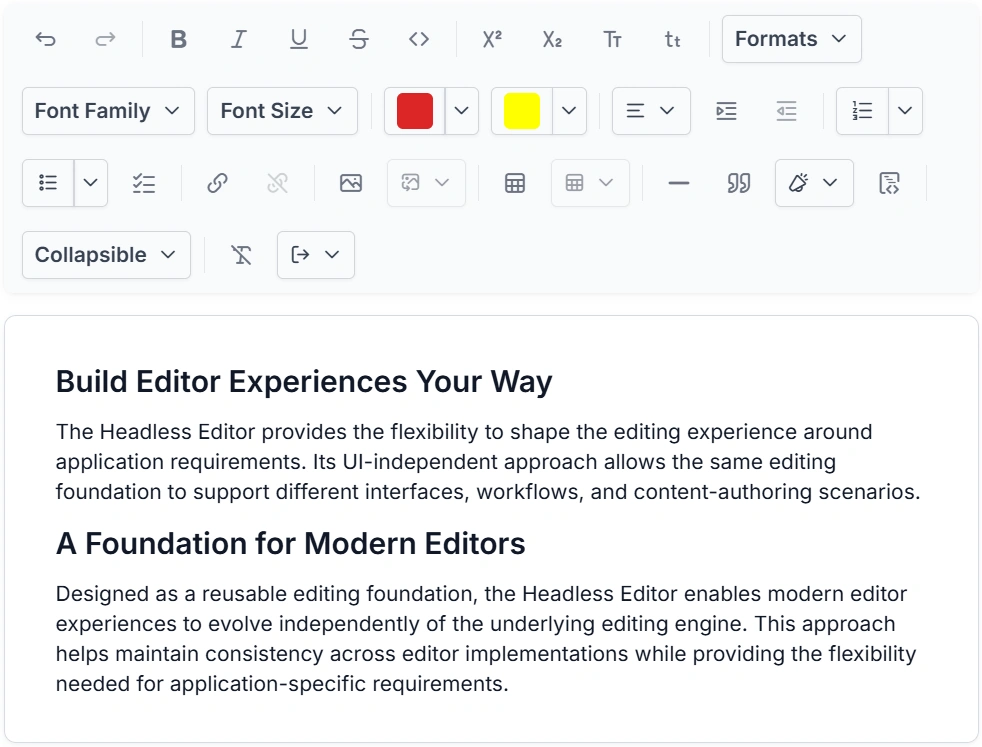
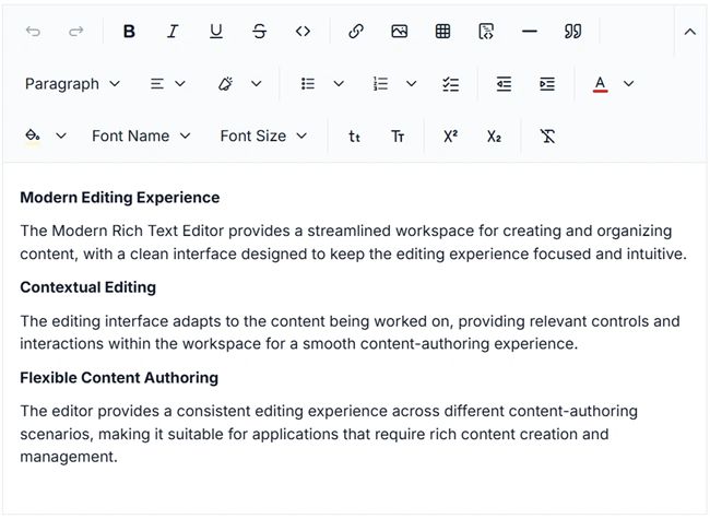
The Modern Rich Text Editor introduces a modern, extensible WYSIWYG editing experience built on the Headless Editor, with ProseMirror providing the underlying document model and editing engine. It is designed for applications such as document authoring, email composition, CMS platforms, blogs, knowledge bases, messaging, and business applications, offering a flexible foundation for creating and managing rich content.
Key features
- Rich text formatting: Apply common text styles such as bold, italic, underline, strikethrough, subscript, superscript, fonts, and colors.
- Block formatting: Format content using headings, paragraphs, block quotes, code blocks, callouts, horizontal rules, and collapsible sections.
- Lists: Create bulleted, numbered, and checklist lists with multiple styles and indentation support.
- Text alignment: Align content to the left, center, right, or justify.
- Automatic markdown formatting: Automatically apply rich text formatting when typing common Markdown syntax for headings, lists, emphasis, code, and other supported content.
- Link management: Insert, edit, open, copy, and remove links using contextual editing actions.
- Image editing: Insert, update, replace, and remove images with support for captions, alt text, alignment, wrapping, and dimensions.
- Table editing: Create and manage tables with row, column, header, cell formatting, alignment, and deletion options.
- Flexible toolbar: Configure automatic, expanded, multi-row, or scrollable toolbar layouts to suit different screen sizes and editing needs.
- Quick toolbars: Provide contextual actions for links, images, tables, and other selected content.
- Slash commands: Quickly find and execute editor actions by typing
/in the editing area. - Undo and redo: Manage editing history with configurable undo and redo behavior.
- Keyboard shortcuts: Configure custom keyboard shortcuts to support efficient editing workflows.
- Placeholder and read-only: Display placeholder text for empty content and restrict editing when read-only mode is enabled.
MultiSelect Dropdown
Summary tag template
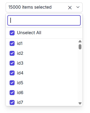
In checkbox mode, selected items can be displayed as formatted summary text in the input field when working with large datasets, instead of listing all selections individually.
Performance improvement with checkbox mode and virtualization
Checkbox mode with virtualization delivers substantial performance gains, especially for large data sources and preselected values.
| Scenario (25,000 preselected records in checkbox mode) | Compared to previous version |
|---|---|
| Initial rendering | 23x faster |
| Pop-up opening | 4x faster |
| Select/unselect all | 23x faster |
| Scroll to last item | 4x faster |
Rich Text Editor
WebMCP integration
The Rich Text Editor supports the Web Model Context Protocol (WebMCP), enabling AI models and agents to interact with editor content through built-in tools. Write operations require user confirmation, and the beforeWebMcpToolExecute event lets users inspect, modify, or cancel tool execution.
Scheduler
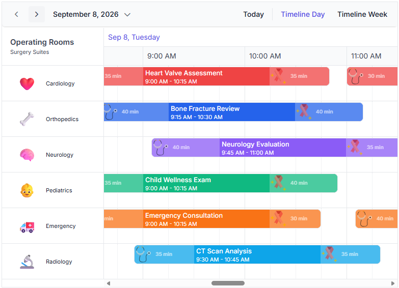
Event buffer
Users can display additional time before and after an event on the calendar timeline to improve visibility into activities surrounding an event, such as travel, preparation, or wrap-up, allowing users to plan their schedules more thoroughly.
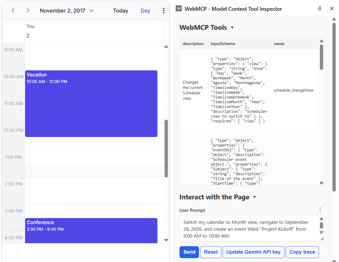
WebMCP integration
The Scheduler supports the Web Model Context Protocol (WebMCP), enabling AI models and agents to interact with schedules through built-in tools. Write operations require user confirmation, and the beforeWebMcpToolExecute event lets users inspect, modify, or cancel tool execution.
Stock Chart
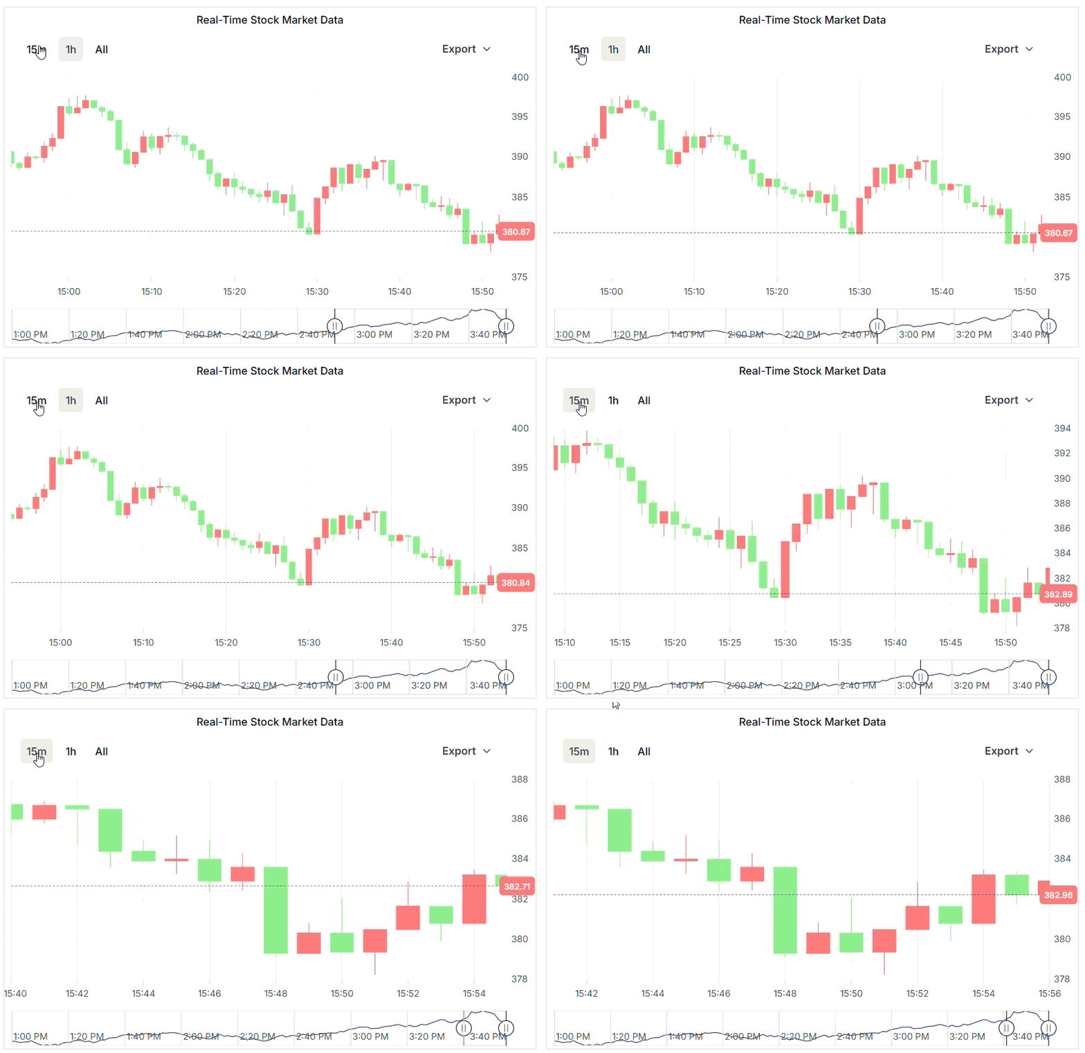
Real-time data visualization
Smooth real-time data visualization is now supported through dynamic data operations, historical data navigation, automatic navigator synchronization, axis animations, and navigator series animations. Continuous live data updates can be rendered without visual disruptions while preserving user interactions such as range selection, navigator movement, and zooming.
Improved Stock Chart rendering performance
Improved the initial rendering performance of the Stock Chart for large datasets over 500,000 data points. The initial load time has been reduced from approximately 20 seconds to 2.5–3 seconds, providing a faster and more responsive experience while rendering the complete dataset.
TreeGrid
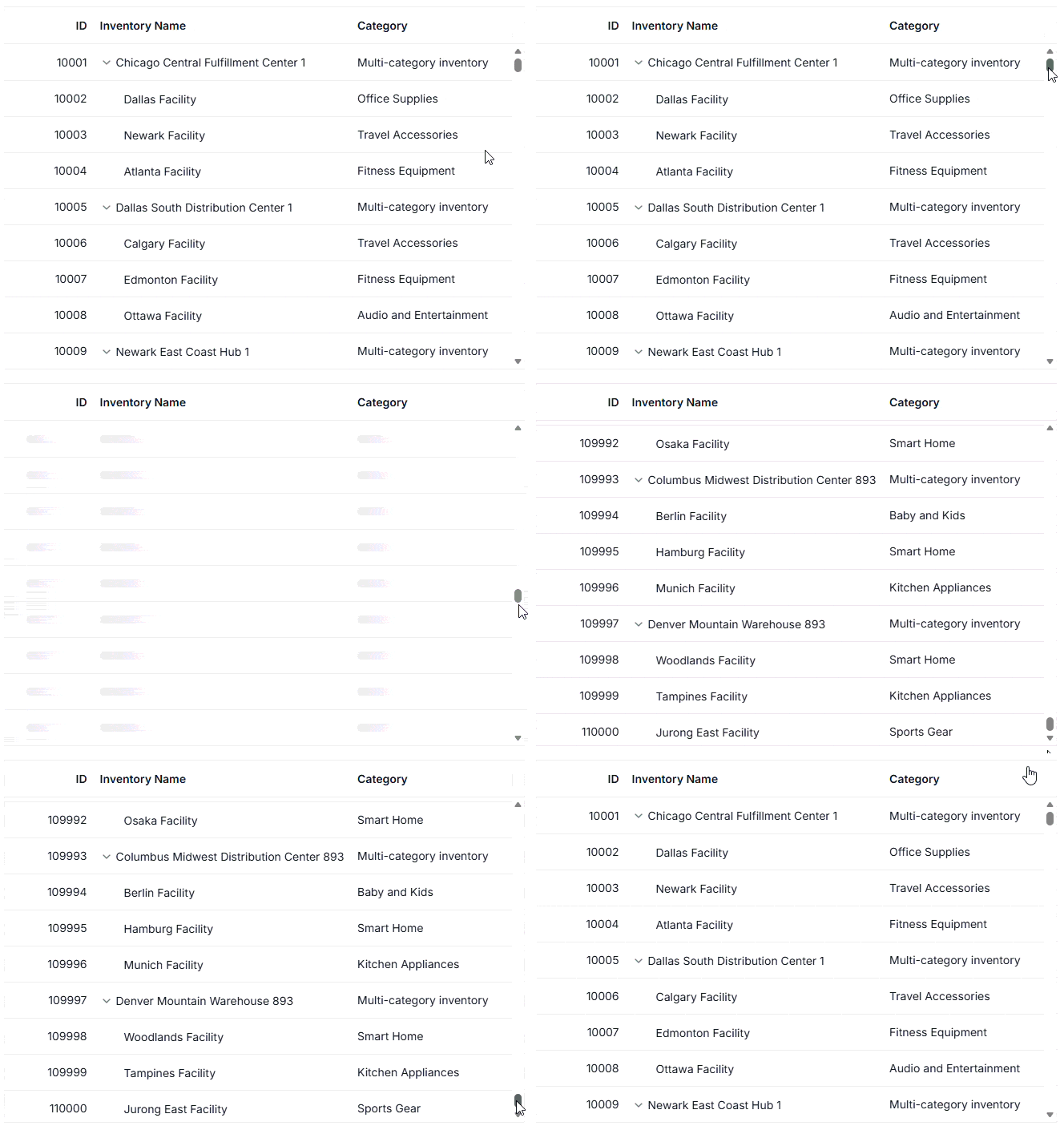
DOM virtualization
The Tree Grid efficiently handles large datasets by rendering only the visible rows using a buffer. This reduces memory usage and enables smooth scrolling.
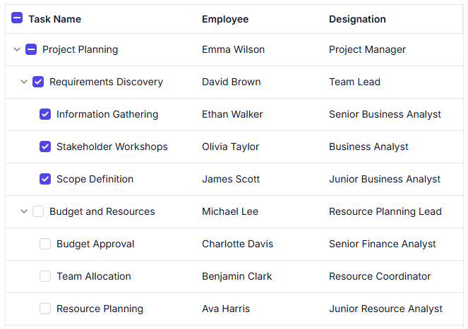
Hierarchy checkbox
Enhanced hierarchy checkbox selection with self, hierarchy, and filtered hierarchy modes, providing greater control over parent-child record selection behaviors in Tree Grid.
Tree View
Virtualization
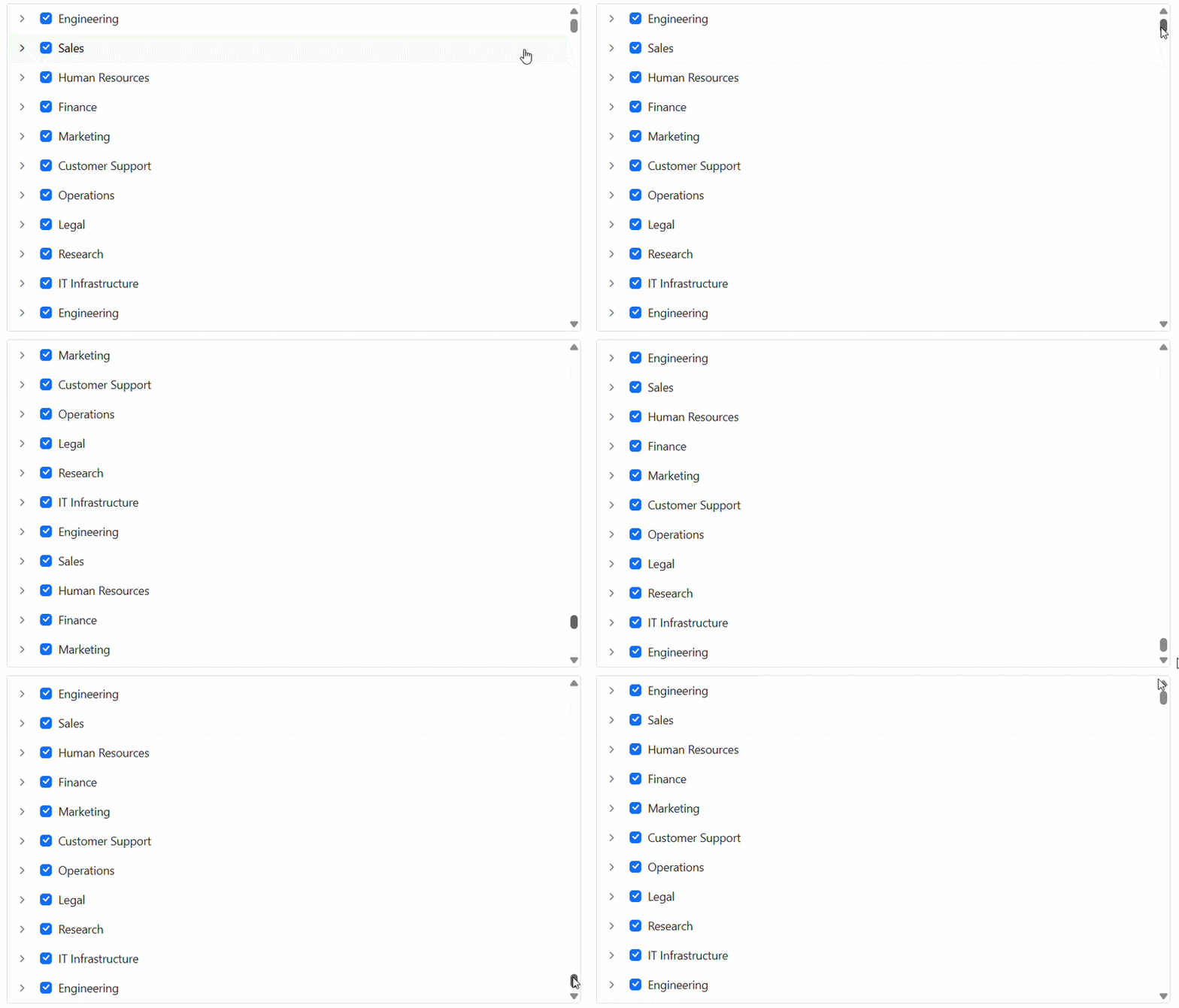
Load large hierarchical datasets smoothly with UI virtualization. Only the visible nodes are rendered, while the remaining items are loaded dynamically as the user scrolls within the Tree View container. This reduces memory consumption and ensures a fluid scrolling experience even with thousands of nodes.

Do you have a feature request? Post the details in the feedback portal.