
 Rajendran R
The Syncfusion Blazor library offers 80+ UI and data visualization components that are responsive and lightweight for building modern web apps.
This blog will highlight some of the most notable updates in the Syncfusion Blazor suite for the 2023 Volume 3 release.
.NET 8 support
Syncfusion Blazor components are now compatible with .NET version 8. This means that developers can now use the latest version of .NET with Syncfusion’s Blazor components.
In the upcoming 2023 Volume 4 release, Syncfusion will introduce its NuGet package, the full potential of .NET 8, including its latest features and enhancements. This ensures that developers can stay up-to-date and take advantage of the cutting-edge capabilities offered by both Syncfusion and .NET 8.
Showcase samples in Diagram component
In 2023 Volume 3, we’ve introduced new showcase samples that highlight the real-time use cases of our Blazor Diagram component. These samples have been meticulously designed for both Blazor Server and WebAssembly app environments. These showcase samples are a valuable resource for gaining insight into how our Blazor Diagram component can be effectively utilized in real-world scenarios.
Here’s a quick overview of the showcase samples.
Preview to production-ready components
The Blazor PDF Viewer component has been developed to meet industry standards and is now marked production-ready.
Performance enhancements
Our commitment to enhancing the performance of Syncfusion Blazor components remains unwavering. In the 2023 Volume 3 release, several components have received performance optimizations, ensuring a smoother and more efficient user experience.
PDF Viewer (Next-Gen)
The Blazor PDF Viewer (Next-Gen) component’s performance has been significantly improved. The initial loading performance has been boosted by 65% for large-sized documents in Blazor Server apps and by 35% in Blazor WASM apps. The comment panel rendering and interaction performance have also been improved, especially in the WebAssembly environment.
DataGrid
We have enhanced the performance of lazy loading while grouping the foreignkey column in the Blazor DataGrid.
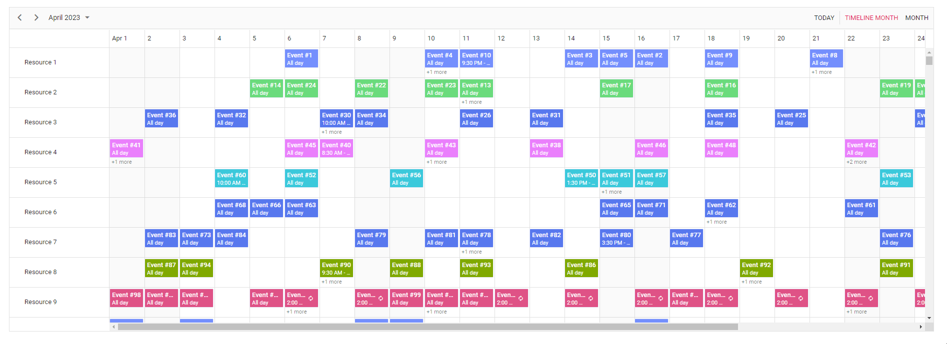
Schedule
On-demand data loading support in the Blazor Scheduler allows users to retrieve events from remote services for the current viewport alone and retrieve the remaining data on demand while scrolling.
Pivot Table
Single page mode allows only the current view page to be displayed during virtual scrolling operations when virtualization is enabled in the Blazor Pivot Table. It enhances the Pivot Table’s performance, especially in Blazor WASM apps, for UI actions like drill up or down, sorting, and filtering, which occur two times faster than in earlier versions.
TreeGrid
The initial rendering performance of the Blazor TreeGrid is up to 35% faster. This enhancement results in a quicker and more responsive loading experience for users.
Rich Text Editor
The new PreventRender method enhances the performance of the Blazor Rich Text Editor. It prevents the unnecessary rerendering of the component, especially in Blazor WASM apps.
DataGrid
The new features included in the Blazor DataGrid are as follows.
Infinite scrolling
Infinite scrolling is an advanced feature that enhances performance while loading large data sets. It employs a lazy-loading concept, where data is fetched and displayed dynamically as the scrollbar reaches the end of the scroller. This eliminates the need for traditional pagination, offering a seamless way to load extensive data sets into the DataGrid component.
With the introduction of InfiniteScrollSettings, you can fine-tune data loading when infinite scrolling is enabled. To enable this feature, simply set the EnableInfiniteScrolling property to true and specify the content height using the Height property.
Refer to the following code example.
<SfGrid DataSource="@GridData" Height="410" Width="auto" EnableInfiniteScrolling="true">
    …
</SfGrid>
Note: For more details, refer to the infinite scrolling in the Blazor DataGrid demo.
GraphQL adaptor
The GraphQL adaptor allows data retrieval and manipulation within the Blazor DataGrid. With this feature, users can effortlessly fetch data and perform a wide range of actions, including CRUD operations, filtering, searching, aggregations, grouping, paging, and sorting. The GraphQL adaptor simplifies data access and manipulation, resulting in a seamless and highly efficient user experience.
To get started, configure the SfDataManager component using the following settings. This configuration is essential for seamless integration with GraphQL services, enabling your app to use GraphQL for data operations.
<SfDataManager Url="https://yourUrl" GraphQLAdaptorOptions=@adaptorOptions Adaptor="Adaptors.GraphQLAdaptor"></SfDataManager>
Virtual scrolling with overscan count
The virtual scrolling with overscan count feature is designed to enhance the performance of the grid by prerendering additional rows both before and after the viewport. This strategic prerendering minimizes the need for frequent data fetch requests during vertical scrolling.
To implement overscan count in your app, simply set the OverscanCount property to your desired value, as in the following code.
<SfGrid DataSource="@GridData" Height="410" RowHeight="38" OverscanCount="5" EnableVirtualization="true" > ...... </SfGrid>
Note: For more details, refer to the example of the Virtual Mask Row in Blazor DataGrid.
New data types
In the Blazor DataGrid, we’ve included support for the following new data types within the enum ColumnType:
- Integer
- Long
- Double
- Decimal
You can easily utilize these data types by specifying them within the GridColumn configurations, like in the following code example.
<SfGrid DataSource="@Orders">
 <GridColumns>
  <GridColumn Type="ColumnType.Integer"></GridColumn>
  <GridColumn Type="ColumnType.Double"></GridColumn>
  <GridColumn Type="ColumnType.Long"></GridColumn>
  <GridColumn Type="ColumnType.Decimal"></GridColumn>
 </GridColumns>
</SfGrid>
Action Begin/Complete events
New events will trigger before and after every action. These new events significantly expand your ability to tailor and enhance your interactions within the grid.
For example:
- PageChanging: This event is triggered when a page change is initiated.
- PageChanged: This event is triggered after a page change has been completed.
Other enhancements
We’ve made some breaking changes in the DataGrid component and some minor improvements, too:
- Enhanced the performance of lazy loading while grouping the foreignkey column.
- Introduced new event support, which triggers when the column menu is rendered.
- Provided support for passing the EditedData property in the CommandClickEventArgs.
- Provided support for the ScrollIntoViewAsync method for selecting records by passing the row index parameter.
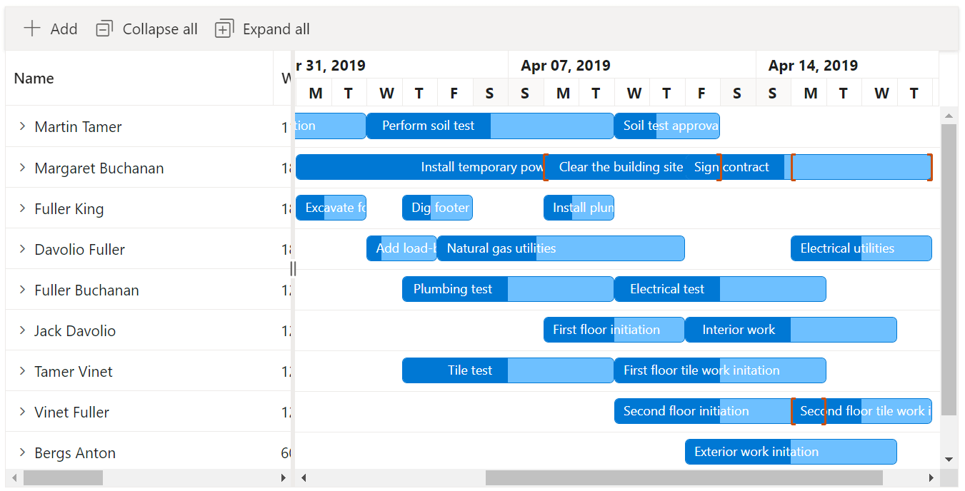
Gantt Chart
From the 2023 Volume 3 release onward, the Blazor Gantt Chart supports the following new features.
Multiple taskbars in the resource view
You can easily visualize multiple tasks assigned to each resource in a row, even when the records are in a collapsed state. With the display of multiple taskbars, users can quickly identify and analyze resource workloads and task assignments.
Refer to the following code example.
<SfGantt>
  …
  <GanttTaskbarSettings EnableMultiTaskbar="true" AllowTaskbarDragAndDrop="@taskbarUpdate">
  </GanttTaskbarSettings>
</SfGantt>
Note: For more details, refer to the multiple taskbars in the Blazor Gantt Chart resource view demo.
Clone elements for taskbar editing
The user interface for taskbar resizing and moving actions is now better in the Gantt Chart. Now, when users perform taskbar resizing or dragging, a cloned element will be displayed instead of updating the original taskbar element. This cloned element remains visible until the action is completed, providing users with a clear representation of the changes they are making.
Note: For more details, refer to the clone elements for taskbar editing in the Blazor Gantt Chart demo.
Pivot Table
The new features added in the Blazor Pivot Table are as follows.
Data label template in the pivot chart
With the addition of template support, users can now display pivot charts with customized data label content for each data point.
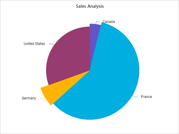
Custom radius support for pie chart series
Users can now render each series of a pie chart with a different radius.
Scheduler
The Blazor Scheduler now supports the following new features.
On-demand data loading (lazy loading)
On-demand data loading allows users to retrieve events from remote services for just the current view port and retrieves the remaining data on demand while scrolling, which improves the performance and usability of the Scheduler component.
Refer to the following code example.
<SfSchedule TValue="EventData" Width="100%" Height="700px">
 …
 <ScheduleViews>
   <ScheduleView Option="View.TimelineMonth" EnableLazyLoading="true" IsSelected="true"></ScheduleView>
   <ScheduleView Option="View.Month" EnableLazyLoading="true"></ScheduleView>
 </ScheduleViews>
</SfSchedule>
Note: For more details, refer to the on-demand loading in the Blazor Scheduler demo.
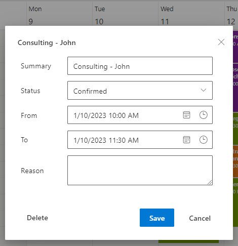
Editor window customization
Users can now customize the header and footer of the built-in editor window in the Scheduler. Refer to the following code example.
<SfSchedule>
 …
 <ScheduleTemplates>
   <EditorHeaderTemplate>
   </EditorHeaderTemplate>
   <EditorTemplate>
   </EditorTemplate>
 </ScheduleTemplates>
</SfSchedule>
Note: For more details, refer to customizing the built-in editor window in the Blazor Scheduler demo.
Image Editor
The Blazor Image Editor component adds the following user-friendly updates.
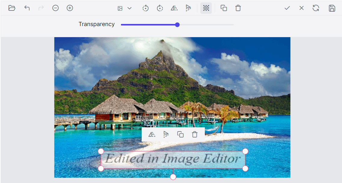
Image annotation
Users can insert and display multiple images in addition to the main image they are editing. These image annotations can be used for various purposes, such as adding logos, watermarks, or decorative elements to the image.
Note: For more details, refer to the image annotation in the Blazor Image Editor demo.
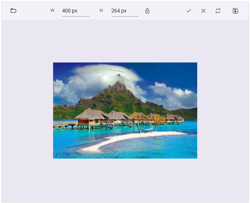
Resize full image
Users can adjust the dimensions of an image to suit their needs, such as printing, web display, or other purposes.
Note: For more details, refer to the resizing an image using Blazor Image Editor demo.
Frame support
Frames can enhance the visual appeal of an image. The Blazor Image Editor allows users to add decorative borders or frames around images.
Note: For more details, refer to the frame support in the Blazor Image Editor demo.
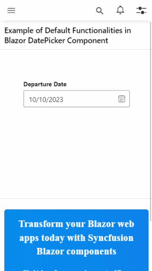
Full-view support in Calendar and Pickers
The adaptive view feature in our Blazor Calendar and Picker components is designed to enhance the mobile user experience when selecting dates and times. This feature is precious for apps that rely heavily on date and time selection.
To experience this feature, load any Blazor date or time picker samples on a mobile device.
When you set the FullScreen property to true, the picker’s pop-up will expand to occupy the entire screen. This feature is available across all theme layouts, ensuring a consistent and visually appealing user experience.
Refer to the following code example.
<SfDatePicker TValue="DateTime?" Placeholder="Choose a Date" FullScreen="true" ShowClearButton="true"></SfDatePicker>
Map
The Blazor Map component delivers the following new features in this Volume 3 release.
Polygon shape rendering
Users can draw and display appropriate polygon shapes over the main layer of the Blazor Maps component using their data sources.

Data label animation
An animated transition will occur on the initial rendering of data labels in Blazor Maps but not during dynamic updates.
Tooltip position in Stock Chart
The Blazor Stock Chart allows users to enable tooltips to move with the mouse. Refer to the following image.
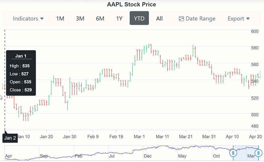
Note: For more details, refer to the tooltip positioning in the Blazor Stock Chart demo.
Label customization in the Heatmap chart
Users can now add custom elements like text, tables, and images to add more information to a Heatmap chart’s cells.
Table titles and descriptions in Word Processor
You can add or edit the title and description of a table in a Word document using the Blazor Word Processor. Explore our online demo for more details.
Conclusion
Thanks for reading! In this blog, we have seen the new features and components rolled out in the Syncfusion Blazor suite for the 2023 Volume 3 release. Try out these user-friendly updates and give us feedback in the comments below.
Also, check out our Release Notes and the What’s New pages to see the other available features in the 2023 Volume 3 release.
The new version is available for existing customers on the License and Downloads page. If you are not a Syncfusion customer, try our 30-day free trial to check out our controls’ features.
For questions, you can reach us through our support forum, support portal, or feedback portal. We are always happy to assist you!


 No spam, just valuable updates.