

The Syncfusion JavaScript Spreadsheet (HTML5 Excel viewer) is a feature-rich control for organizing and analyzing data in a tabular format. It provides all the common Excel features, including data binding, selection, editing, formatting, resizing, sorting, importing, and exporting Excel worksheets. In this blog post, we will look at the chart feature in the JavaScript Spreadsheet that helps users transform their data into an intuitive overview for better understanding. The Spreadsheet control also provides a built-in set of chart types, so you can select the best one to visualize your data.
Types of charts
Different scenarios require different types of charts. The types available in the JavaScript Spreadsheet control are:
- Column chart
- Clustered column
- Stacked column
- 100% stacked column
- Bar chart
- Clustered bar
- Stacked bar
- 100% stacked bar
- Area chart
- Area
- Stacked area
- 100% stacked area
- Line chart
- Line
- Stacked line
- 100% stacked line
- Pie/Doughnut chart
- Scatter chart
When to use which chart?
The following table lists the different chart types with their common use cases.
| Chart type | When to use |
| Column chart | To compare several items in a specific range of values and display the values in vertical columns. |
| Bar chart | To compare several items in a specific range of values and display the values in horizontal rows. |
| Area chart | To illustrate the magnitude of change between two or more data points. |
| Line chart | To visualize continuous data and show trends in the data over a period of time. |
| Pie/Doughnut chart | To represent the proportion or distribution of each item over a whole value. |
| Scatter chart | To show the relationship between two variables (x and y axes). |
Chart themes
The JavaScript Spreadsheet control provides the following vivid chart themes to elegantly visualize data:
- Material
- Fabric
- Bootstrap
- HighContrastLight
- MaterialDark
- FabricDark
- HighContrast
- BootstrapDark
- Bootstrap4
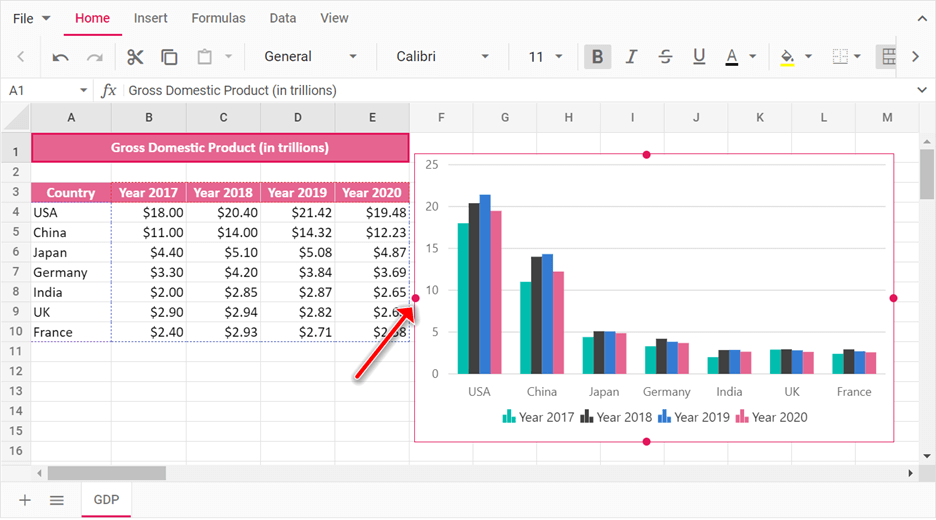
Move or resize a chart
With the JavaScript Spreadsheet control, you can easily move a chart to any location within the worksheet. Also, you can change the dimensions of the chart for a better fit. You can resize the chart by clicking and dragging the four handles as shown in the following screenshot.
Adding Chart in the Spreadsheet through code
In the JavaScript Spreadsheet control, you can add a chart through code by using the chart property in the cells object and the insertChart public method. Then, you pass the chart options with this method.
The following code example showcases how to add a chart to the JavaScript Spreadsheet control.
import { Spreadsheet, getFormatFromType } from '@syncfusion/ej2-spreadsheet';
import * as dataSource from './chart-data.json';

/**
 * Chart Sample
 */

    //Initialize the Spreadsheet component.
    let spreadsheet: Spreadsheet = new Spreadsheet({
        sheets: [
            {
                name: 'GDP',
                ranges: [{ dataSource:  (dataSource as any).GDPData , startCell: 'A3' }],
                rows: [
                    {
                        height: 30,
                        cells: [
                            {
                                value: 'Gross Domestic Product (in trillions)',
                                style: {
                                    backgroundColor: '#e56590', color: '#fff',
                                    fontWeight: 'bold', textAlign: 'center', verticalAlign: 'middle'
                                }
                            }
                        ]
                    },
                    {
                        cells: [
                            { index: 6, chart: [{ type: 'Column', range: 'A3:E10' }] }
                        ]
                    }
                ],
                columns: [
                    { width: 80 }, { width: 75 }, { width: 75 }, { width: 75 }, { width: 75 }
                ]
            }
        ],
        created: () => {
             // Formatting cells dynamically using the cellFormat method.
             spreadsheet.cellFormat({ backgroundColor: '#e56590', color: '#fff', fontWeight: 'bold', textAlign: 'center' }, 'A3:E3');
             // Applying currency format to the specified range.
             spreadsheet.numberFormat(getFormatFromType('Currency'), 'B4:E10');
             // Merging the cells from A1 to E1.
             spreadsheet.merge('A1:E1');
             // To insert a chart using method.
             // spreadsheet.insertChart([{ type:  'Column', range: 'A3:E10', isSeriesInRows: false }]);
        }
    });
    //Render the initialized Spreadsheet component.
    spreadsheet.appendTo('#spreadsheet');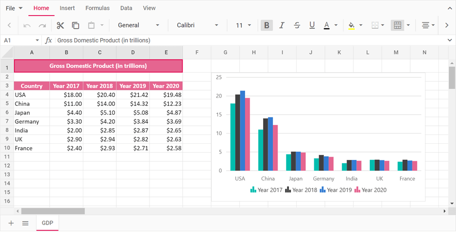
Resource
For more information, refer to the JavaScript Spreadsheet chart demo.
Conclusion
I hope you now have a better understanding of the chart feature in the Syncfusion JavaScript Spreadsheet control. In upcoming blogs, we will discuss the chart design tab options like chart elements and switching rows and columns. We’ll even discuss what you expect from a spreadsheet if you share your thoughts with us in the comments section below.
If you are already a Syncfusion user, you can download the Essential Studio® for JavaScript product setup to try out this control. Otherwise, you can download a free 30-day trial.
If you have any questions about these features, please contact us through our support forums, Direct-Trac, or feedback portal. We are always happy to assist you!
 No spam, just valuable updates.