
 Vijayakumar Mariappan
We are pleased to announce that the MAUI Sliders package has been updated in the 2022 Volume 1 release with a Range Selector control along with some new features in the existing Slider and Range Slider controls.
The .NET MAUI Range Selector is a highly interactive UI control for selecting a smaller range from a larger data set. It supports adding any type of control as its content. You can use this control for range navigation in your .NET MAUI applications.
In this blog, we will explore the features of the new .NET MAUI Range Selector and the steps to getting started with it.
Key features
The key elements of the .NET MAUI Range Selector control are:
Scales
Technically, the new .NET MAUI Range Selector is implemented as two different controls: Numeric Range Selector to handle numeric values and DateTime Range Selector to handle date-time values. Other than the underlying value-type difference, they share a common set of features and functionalities. The separation in implementation is just for improving performance.
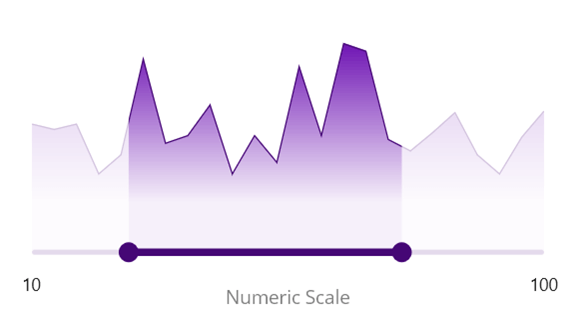
 You can customize the active and inactive scale size and color using the built-in APIs, and for the date-time scale, you can have a range in any unit from years to seconds.
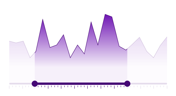
Ticks and labels
The .NET MAUI Range Selector supports both major and minor ticks. Use major ticks to visualize the intervals and minor ticks as dividers between the intervals. Typically, ticks will be rendered at the bottom of the scale, but you can also move them to the top of the scale by setting a negative value to the offset property.
Also, you can easily customize the active and inactive tick size and color using the built-in APIs.
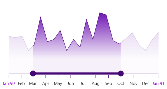
 Show labels at designated intervals, just like major ticks. Change the visual representation of the labels using the numeric and date-time formatting properties. You can even customize the active and inactive font size, text color, font attributes, and font family using the built-in APIs.
Also, using the built-in events, we can easily customize all the text to represent low, medium, and high values.
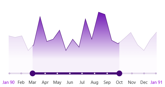
Dividers
Render dividers in each interval to show the ranges accurately. You can customize their color and size using the built-in APIs.
Tooltips
Use tooltips to clearly indicate the selected values. You can make tooltips always visible or only visible when the user interacts with them.
You can also customize the tooltip text and its color, font size, font attributes, and font family using the built-in APIs.
Regions
Render an overlay on the content to visualize the selected data clearly. You can customize its color and border using the built-in APIs.
Steps to getting started
Follow these steps to add the .NET MAUI Range Selector to your app and use its basic features.
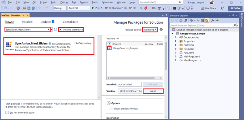
Step 1: Create an app with .NET MAUI
First, create a new .NET MAUI app in Visual Studio.
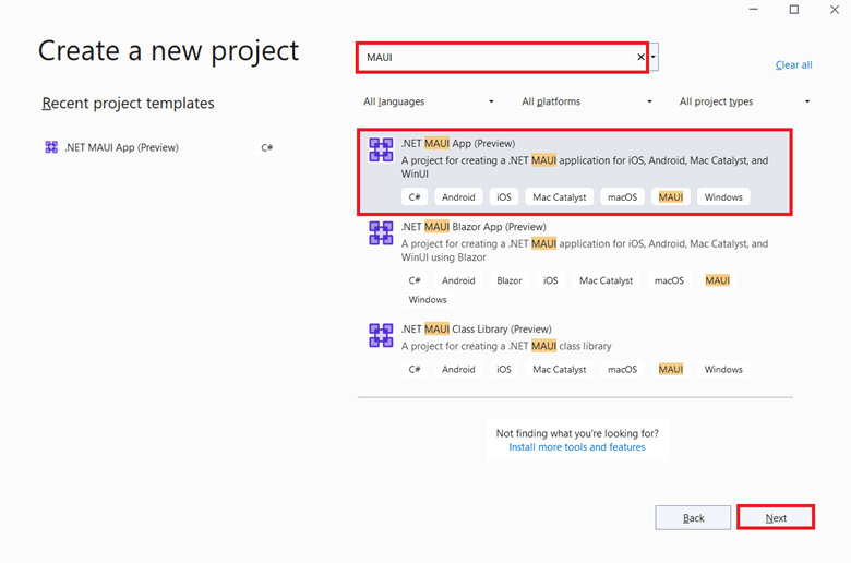
Step 2: Install the Sliders package
Open the NuGet Package Manager (Tools > NuGet Package Manager > Manage NuGet Packages for Solution). Select the nuget.org package source. In the Browse area, search for Syncfusion.Maui.Sliders and install it.
Refer to the following image.
Note: MAUI is still in preview mode, so the Syncfusion.Maui.Sliders package is tagged as preview. We have to select the Include Prerelease option to see the prerelease packages.
Step 3: Register the handler
The Syncfusion.Maui.Core NuGet package is a dependent package for all our Syncfusion .NET MAUI controls. In the MauiProgram.cs file, register the handler for the Syncfusion Core using the ConfigureSyncfusionCore() method.
Refer to the following code.
using Syncfusion.Maui.Core.Hosting;

namespace GettingStarted;

public static class MauiProgram
{
 public static MauiApp CreateMauiApp()
 {
  var builder = MauiApp.CreateBuilder();
  builder
    .UseMauiApp<App>()
    .ConfigureSyncfusionCore()
    .ConfigureFonts(fonts =>
    {
      fonts.AddFont("OpenSans-Regular.ttf", "OpenSansRegular");
    });

  return builder.Build();
 }
}
Step 4: Import the namespace
Import the Syncfusion.Maui.Sliders control namespace in your XAML or C# code.
XAML
xmlns:sliders="clr-namespace:Syncfusion.Maui.Sliders;assembly=Syncfusion.Maui.Sliders"
C#
using Syncfusion.Maui.Sliders;
Step 5: Initialize the Range Selector
The following code examples show how to initialize the numeric and date-time Range Selectors, respectively.
Numeric Range Selector
XAML
<ContentPage ...
xmlns:sliders="clr-namespace:Syncfusion.Maui.Sliders;assembly=Syncfusion.Maui.Sliders"
...>
   <sliders:SfRangeSelector />
</ContentPage>
C#
using Syncfusion.Maui.Sliders;

namespace GettingStarted;

public partial class MainPage : ContentPage
{
 public MainPage()
 {
   InitializeComponent();
   SfRangeSelector selector = new SfRangeSelector();
   Content = selector;
 }
}
DateTime Range Selector
We have to set the Minimum, Maximum, RangeStart, and RangeEnd properties like in the following code to use a DateTime Range Selector.
XAML
<ContentPage ...
xmlns:sliders="clr-namespace:Syncfusion.Maui.Sliders;assembly=Syncfusion.Maui.Sliders"
...>
   <sliders:SfDateTimeRangeSelector Minimum="1990-01-01"
                                    Maximum="1991-01-01"
                                    RangeStart="1990-03-01"
                                    RangeEnd="1990-09-01" />
</ContentPage>
C#
using Syncfusion.Maui.Sliders;

namespace GettingStarted;

public partial class MainPage : ContentPage
{
 public MainPage()
 {
  InitializeComponent();

  SfDateTimeRangeSelector selector = new SfDateTimeRangeSelector()
  {
     Minimum = new DateTime(1990, 01, 01),
     Maximum = new DateTime(1991, 01, 01),
     RangeStart = new DateTime(1990, 03, 01),
     RangeEnd = new DateTime(1990, 09, 01),
  };

  Content = selector;
 }
}
Step 6: Adding content to Range Selector
Here I’m going to add our .NET MAUI Charts component as content to the DateTime Range Selector. To do so, follow the same procedure described above for installing the Sliders package (Step 2) and install the Syncfusion.Maui.Charts package.
Initialize the view model for the chart
Now, let’s create a simple data source for the chart.
C#
public class Data
{
  public Data(DateTime x, double y)
  {
    X = x;
    Y = y;
  }

  public DateTime X { get; set; }

  public double Y { get; set; }
}

public class ChartViewModel
{
  public ChartViewModel()
  {
    Source = new ObservableCollection<Data>
    {
      new Data(new DateTime(1990, 01, 01), 415),
      new Data(new DateTime(1990, 01, 16), 408),
      new Data(new DateTime(1990, 02, 01), 415),
      new Data(new DateTime(1990, 02, 16), 350),
      new Data(new DateTime(1990, 03, 01), 375),
      new Data(new DateTime(1990, 03, 16), 500),
      new Data(new DateTime(1990, 04, 01), 390),
      new Data(new DateTime(1990, 04, 16), 400),
      new Data(new DateTime(1990, 05, 01), 440),
      new Data(new DateTime(1990, 05, 16), 350),
      new Data(new DateTime(1990, 06, 01), 400),
      new Data(new DateTime(1990, 06, 16), 365),
      new Data(new DateTime(1990, 07, 01), 490),
      new Data(new DateTime(1990, 07, 16), 400),
      new Data(new DateTime(1990, 08, 01), 520),
      new Data(new DateTime(1990, 08, 16), 510),
      new Data(new DateTime(1990, 09, 01), 395),
      new Data(new DateTime(1990, 09, 16), 380),
      new Data(new DateTime(1990, 10, 01), 404),
      new Data(new DateTime(1990, 10, 16), 430),
      new Data(new DateTime(1990, 11, 01), 375),
      new Data(new DateTime(1990, 11, 16), 350),
      new Data(new DateTime(1990, 12, 01), 398),
      new Data(new DateTime(1990, 12, 16), 432),
   };
 }

 public ObservableCollection<Data> Source { get; set; }
}
Set the ChartViewModel instance as the BindingContext of your page to bind the ChartViewModel properties to the chart. Then, populate the chart by setting the above data as an ItemsSource for the AreaSeries and specifying the XBindingPath and YBindingPath as X and Y, respectively (X and Y are the model property names).
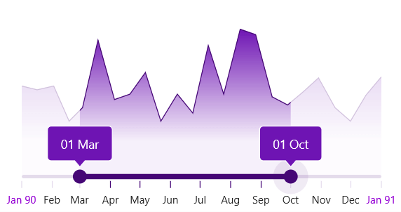
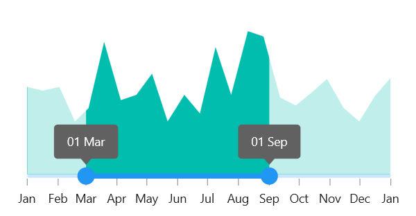
Now, set the interval as 1 month and enable the ticks, labels, and tooltip features to visualize the selected range clearly.
XAML
<ContentPage ...
    xmlns:sliders="clr-namespace:Syncfusion.Maui.Sliders;assembly=Syncfusion.Maui.Sliders"
    xmlns:charts="clr-namespace:Syncfusion.Maui.Charts;assembly=Syncfusion.Maui.Charts"
    xmlns:local="clr-namespace:GettingStarted"
 ...>

 <ContentPage.BindingContext>
   <local:ChartViewModel />
 </ContentPage.BindingContext>

 <sliders:SfDateTimeRangeSelector Minimum="1990-01-01"
                                 Maximum="1991-01-01"
                                 RangeStart="1990-03-01"
                                 RangeEnd="1990-09-01"
                                 Interval="1"
                                 IntervalType="Months"
                                 ShowTicks="True"
                                 ShowLabels="True"
                                 DateFormat="MMM">

  <sliders:SfDateTimeRangeSelector.Tooltip>
    <sliders:SliderTooltip ShowAlways="True"
                         DateFormat="dd MMM" />
  </sliders:SfDateTimeRangeSelector.Tooltip>

  <charts:SfCartesianChart>
   <charts:SfCartesianChart.XAxes>
     <charts:DateTimeAxis IsVisible="False"
                          ShowMajorGridLines="False" />
   </charts:SfCartesianChart.XAxes>

   <charts:SfCartesianChart.YAxes>
     <charts:NumericalAxis IsVisible="False"
                           ShowMajorGridLines="False"
                           Minimum=”250” />
   </charts:SfCartesianChart.YAxes>

   <charts:AreaSeries ItemsSource="{Binding Source}"
                      XBindingPath="X"
                      YBindingPath="Y" />
  </charts:SfCartesianChart>
 </sliders:SfDateTimeRangeSelector>

</ContentPage>
C#
using Syncfusion.Maui.Charts;
using Syncfusion.Maui.Sliders;

namespace GettingStarted;

public partial class ZoomingPage : ContentPage
{
 public ZoomingPage()
 {
   InitializeComponent();

   ChartViewModel viewModel = new ChartViewModel();

   SfDateTimeRangeSelector selector = new SfDateTimeRangeSelector()
   {
       Minimum = new DateTime(1990, 01, 01),
       Maximum = new DateTime(1991, 01, 01),
       RangeStart = new DateTime(1990, 03, 01),
       RangeEnd = new DateTime(1990, 09, 01),
       Interval = 1,
       IntervalType = SliderDateIntervalType.Months,
       ShowTicks = true,
       ShowLabels = true,
       DateFormat = "MMM",
       Tooltip = new SliderTooltip() { ShowAlways = true, DateFormat = "dd MMM" },
   };

   SfCartesianChart chart = new SfCartesianChart();
   chart.XAxes.Add(new DateTimeAxis()
   {
     IsVisible = false,
     ShowMajorGridLines = false
   });
   chart.YAxes.Add(new NumericalAxis()
   {
     IsVisible = false,
     ShowMajorGridLines = false,
     Minimum = 250,
   });

   AreaSeries series = new AreaSeries()
   {
     ItemsSource = viewModel,
     XBindingPath = "X",
     YBindingPath = "Y"
    };

   chart.Series.Add(series);

   Content = selector;
 }
}
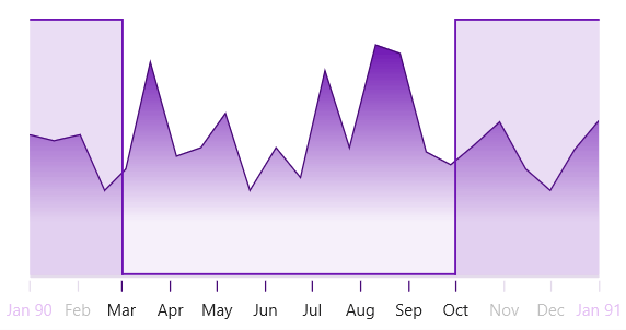
Step 7: Visualize the selected data in the Range Selector using a chart
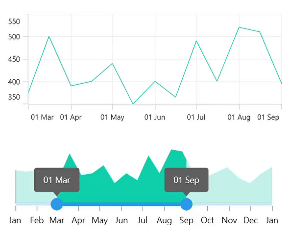
Now, I am going to add a LineSeries chart on top of the Range Selector to visualize the selected range in a more detailed manner. I bind the DateTime Range Selector’s RangeStart to Minimum and its RangeEnd to Maximum of the chart’s DateTimeAxis. Doing this will update the line chart based on the data we selected in the Range Selector.
Refer to the following code example.
<VerticalStackLayout>
 <charts:SfCartesianChart>
  <charts:SfCartesianChart.XAxes>
   <charts:DateTimeAxis Minimum="{Binding RangeStart, Source={x:Reference Selector}}"
                        Maximum="{Binding RangeEnd, Source={x:Reference Selector}}" />
  </charts:SfCartesianChart.XAxes>

  <charts:SfCartesianChart.YAxes>
    <charts:NumericalAxis />
  </charts:SfCartesianChart.YAxes>

  <charts:LineSeries ItemsSource="{Binding Source}"
                     XBindingPath="X"
                     YBindingPath="Y" />
 </charts:SfCartesianChart>

 <sliders:SfDateTimeRangeSelector>
   ...
 </sliders:SfDateTimeRangeSelector>
</VerticalStackLayout>
References
For more details, refer to the Getting Started with .NET MAUI Range Selector GitHub demo and documentation.
Conclusion
Thanks for reading! In this blog post, we explored the great features of our new .NET MAUI Range Selector available in the 2022 Volume 1 release. Try this wonderful control and share your feedback in the comments section below.
Also, you can contact us through our support forum, support portal, or feedback portal. As always, we are happy to assist you!


 No spam, just valuable updates.