
 Sheik Syed
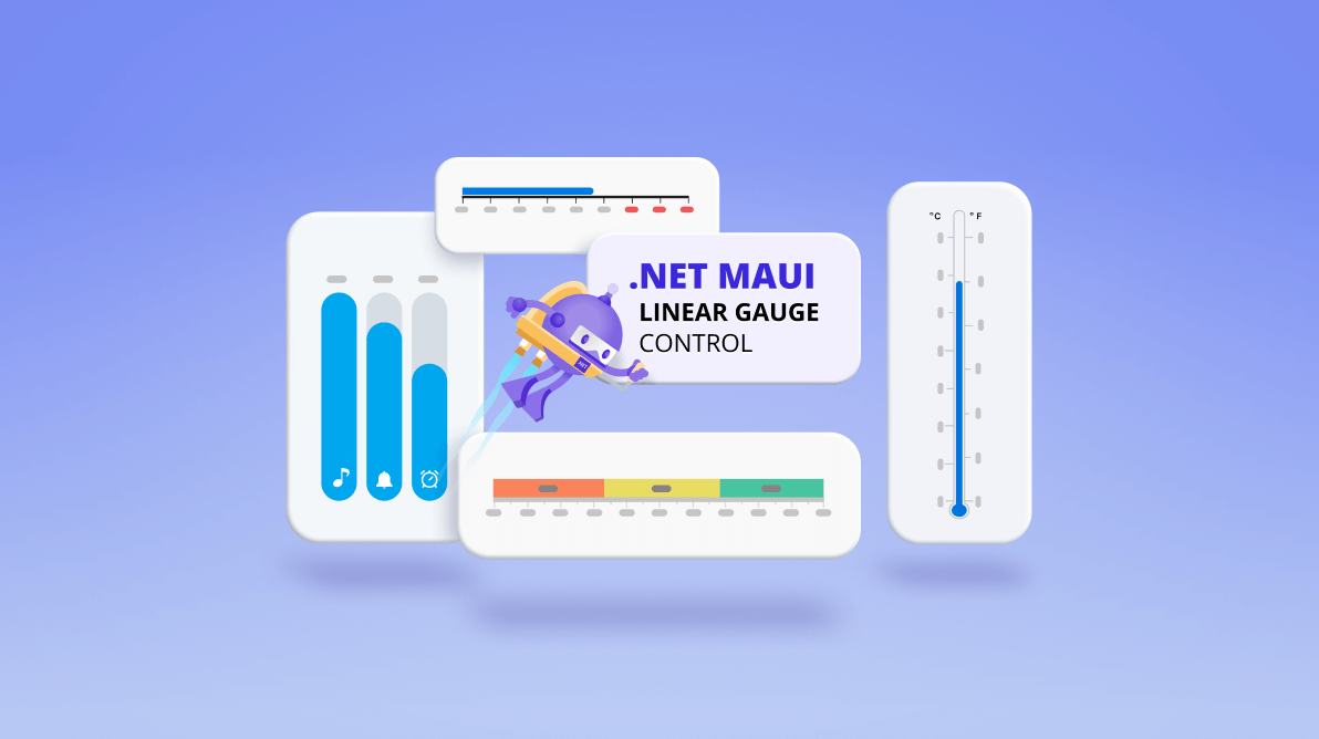
We at Syncfusion are glad to announce the inclusion of the new .NET MAUI Linear Gauge control in the 2022 Volume 1 release.
The .NET MAUI Linear Gauge is a multipurpose data visualization control. It shows numerical values on a linear scale in horizontal or vertical orientations. You can use this control to design a value indicator, linear progress bar, thermometer, bullet chart, ruler, and more.
The Linear Gauge control comes with the following, entirely customizable, features:
- Axis
- Range
- Bar pointer
- Shape marker pointer
- Content marker pointer
- Mirror gauge
- Animation
- Pointer interaction
Let’s explore these features.
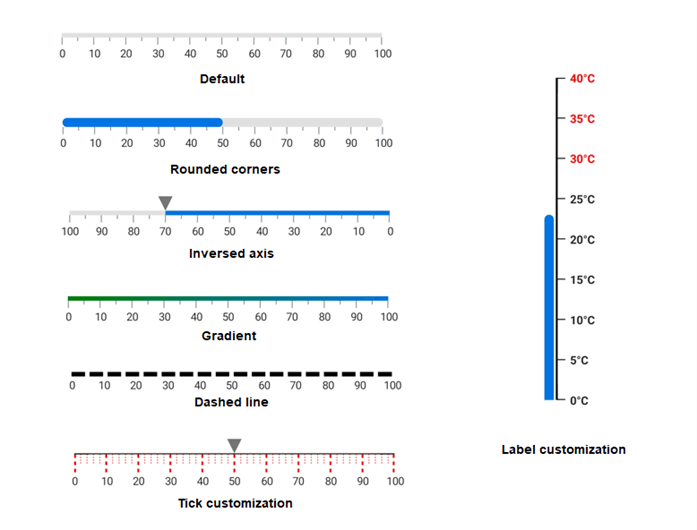
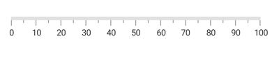
Linear axis
The Linear Gauge axis is a linear scale on which a set of values is plotted. It has three sub-elements: axis lines, ticks, and labels.
Axis line: A linear line with customizable thickness, color, corner radius, and edge corner styles. Its fill color can be either solid or a linear gradient.
Ticks: Set two types of tick marks, major and minor. Customize the tick line styles and positions.
Labels: Add numeric content to depict the values in the scale. Customize the label styles, positions, and value formats.
Refer to the following image.
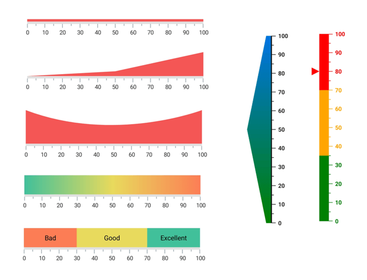
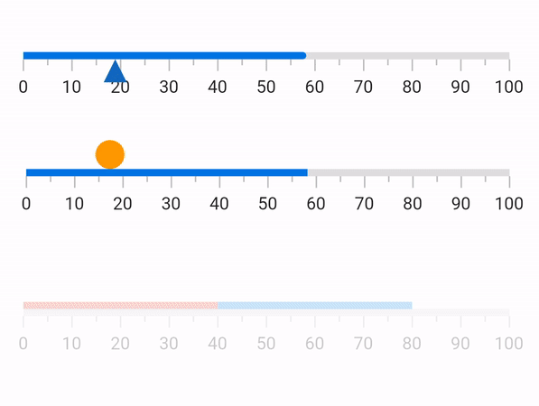
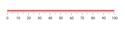
Linear range
The Linear Gauge range is a visual color element that helps you quickly visualize where the values fall on an axis. It denotes the selected range of values using the start and endpoints in an axis. We can add any number of ranges with different styles to a gauge and customize the range shape to be convex or concave. You can also choose whether the range should be flat or curved. Customize the range position, thickness, and color with a gradient.
Refer to the following image.
Bar pointer
A bar pointer is an accenting line that can be placed on a Linear Gauge to mark the current value in the axis. It always starts from the minimum value of the axis and ends at a specified value. We can customize the bar pointer’s thickness, color, corner styles, and bar position.
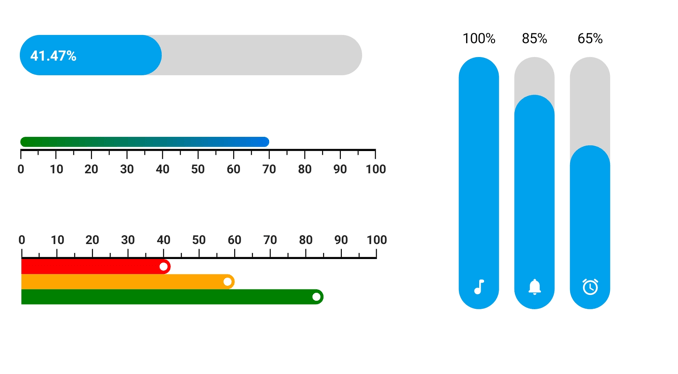
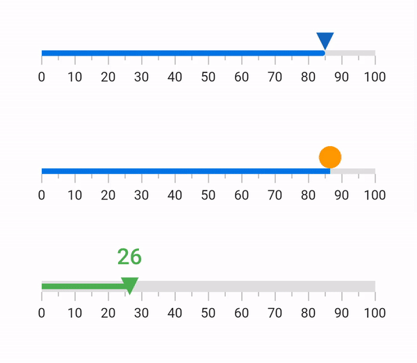
Marker pointer
Marker pointers indicate specific values on the axis. There are two types of marker pointers available: shape and content pointer.
Shape pointer
The shape marker pointer supports the following predefined shapes:
- Triangle
- Inverted triangle
- Circle
- Diamond
- Rectangle
We can easily customize the size, position, and color of the shape marker pointer.
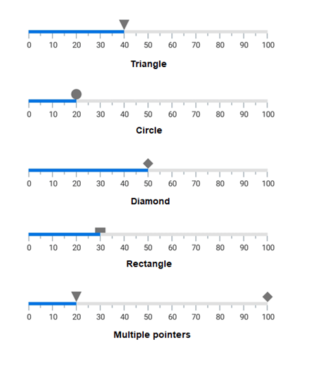
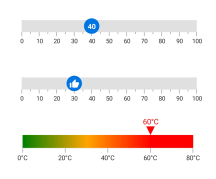
Content pointer
If the predefined shapes in the shape marker pointer do not meet your needs, use the content marker pointer. It enables you to use any content, like text or an image, as a marker pointer.
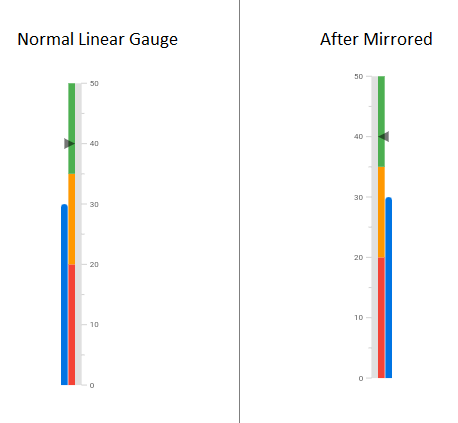
Mirror linear gauge
The Linear Gauge elements can be mirrored by just setting the IsMirrored property to true.
Pointer animation
You can animate the Linear Gauge elements in a visually appealing way when they are loading or when their values change. You can also use various pointer easing animations.
Pointer interaction
You can easily drag a bar or marker pointer from one value to another at run time.
Refer to the following GIF image.
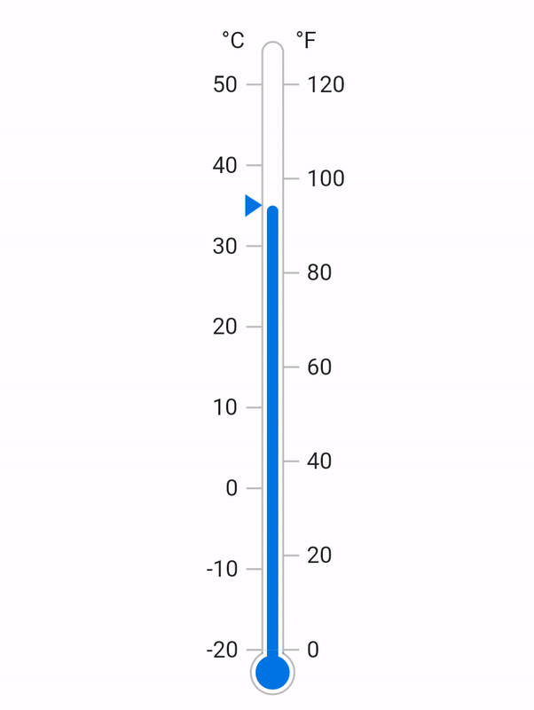
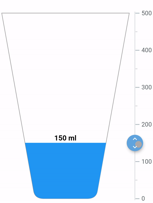
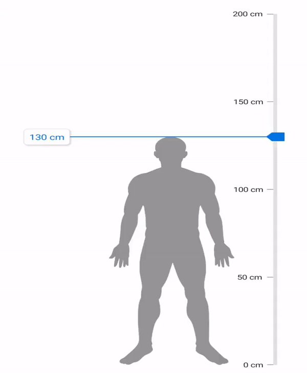
Real-time examples
Using the .NET MAUI Linear Gauge control, you can easily design a thermometer, water tracker, height calculator, ruler, value indicator, and more. The following are some examples.
Thermometer
 Water tracker
Height calculator
Add the .NET MAUI Linear Gauge to your application
Let’s see how to create a simple .NET MAUI app with our Linear Gauge control to demonstrate its basic usage.
Step 1: Create a .NET MAUI app.
First, create a new .NET MAUI app in Visual Studio.
Step 2: Install the NuGet packages.
The Syncfusion .NET MAUI controls are available in the NuGet Gallery. To add the SfLinearGauge control to your project, open the NuGet package manager in Visual Studio. Search for Syncfusion.Maui.Gauges and then install it.
Step 3: Handler registration.
The Syncfusion.Maui.Core NuGet package is a dependent package for all our Syncfusion .NET MAUI controls. In the MauiProgram.cs file, register the handler for Syncfusion Core using the ConfigureSyncfusionCore() method.
Refer to the following code.
public static MauiApp CreateMauiApp()
{
  var builder = MauiApp.CreateBuilder();
  builder
    .UseMauiApp<App>()
    .ConfigureSyncfusionCore()
    .ConfigureFonts(fonts =>
    {
      fonts.AddFont("OpenSans-Regular.ttf", "OpenSansRegular");
    });

  return builder.Build();
}
Step 4: Import the namespace.
Then, import the control namespace Syncfusion.Maui.Gauges in your XAML or C# code.
xmlns:gauge="clr-namespace:Syncfusion.Maui.Gauges;assembly=Syncfusion.Maui.Gauges"
Step 5: Initialize the Linear Gauge.
Now, initialize the SfLinearGauge control. The default axis range is 0 to 100.
<gauge:SfLinearGauge />
Step 6: Add a range to the Linear Gauge.
Ranges contain a list of range elements. Add any number of ranges inside the linear axis. You can specify the start value, end value, and background color for ranges using the StartValue, EndValue, and Fill properties like in the following code example.
<gauge:SfLinearGauge>
 <gauge:SfLinearGauge.Ranges>
  <gauge:LinearRange StartValue="0" EndValue="100"/>
 </gauge:SfLinearGauge.Ranges>
</gauge:SfLinearGauge>
Step 7: Add a pointer to the Linear Gauge.
Pointers contain a list of pointer elements. You can add different kinds of gauge pointers, such as a BarPointer, LinearShapePointer, or LinearContentPointer inside the scale and set the Value property to indicate the pointer value.
Refer to the following code example.
<gauge:SfLinearGauge>
 <gauge:SfLinearGauge.Ranges>
   <gauge:LinearRange StartValue="0" EndValue="100"/>
 </gauge:SfLinearGauge.Ranges>
 <gauge:SfLinearGauge.BarPointers>
   <gauge:BarPointer Value="50" />
 </gauge:SfLinearGauge.BarPointers>
 <gauge:SfLinearGauge.MarkerPointers>
  <gauge:LinearShapePointer Value="60" />
  <gauge:LinearContentPointer x:Name="contentPointer" OffsetY="-15" Value="60">
   <gauge:LinearContentPointer.Content>
     <Label Text="{Binding Value, Source={x:Reference contentPointer}}" />
   </gauge:LinearContentPointer.Content>
  </gauge:LinearContentPointer>
 </gauge:SfLinearGauge.MarkerPointers>
</gauge:SfLinearGauge>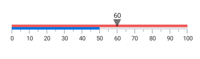
GitHub reference
For more details, refer to our .NET MAUI Linear Gauge Getting Started demo project.
Conclusion
Thanks for reading! I hope you enjoyed learning about the Syncfusion .NET MAUI Linear Gauge control and its features from the 2022 Volume 1 release. This control was developed with restructured APIs and the .NET MAUI graphics library, taking into consideration various use cases and performance aspects. For more details, check out the .NET MAUI Linear Gauge NuGet package and user guide.
If you need any specific feature in our .NET MAUI Linear Gauge, please let us know in the comments section below. You can also contact us through our support forums, support portal, or feedback portal. We are always happy to assist you!


 No spam, just valuable updates.