We are excited to announce that we are including a new In-Place Editor component in the Essential JS 2 suite in the 2018 Volume 4 release. The component provides the best way to quickly edit and instantly save, which is essential for form components such as the Drop-Down List, Date Picker, and Rich Text Edit.
In this blog post, we are going to have a look at the features and uses of the In-Place Editor.
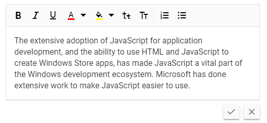
In-Place Editor as Pop-Up
What is the In-Place Editor?
The In-Place Editor is a dynamic text editor for editing values where they are displayed. It provides an easy way to edit the values of the page without redirecting to another page for editing. Users can simply see the edit view of the text by hovering and clicking on the text.
Where to use it
Here are some of common uses of the In-Place Editor component:
- Dynamically editing a few values on a page.
- Choosing a text value from a collection of different formats, such as in simple text, in a drop down, etc.
- When a rich text editor with inline editing capabilities is needed.
- Value editing without going to another page.
How does the In-Place Editor work?
Simply hovering over the editor invites the user to use it. The display text background color is highlighted with an edit icon, and a tooltip prompts the user to click the element to edit it. Once the user clicks on the text to be edited, it is transformed into an editable form containing a text field such as a string, drop-down, calendar, etc. Save and cancel buttons are also displayed. When the user edits the contents in the text field, the session will end with the save or cancel action. The edited text can then be sent to the server for saving and the form will go back to its display text state.
Inline editor and pop-up editor
The In-Place Editor can be used in either an inline or pop-up format.
Inline
With the inline format, you can edit the text in the page without separating the user from what they are going to edit. It only takes a few moments for the user to edit and then return to the display view.
Pop-up
With the pop-up format, once you click on the editable value, a small pop-up appears in which you can edit the fields. Also, you can easily position the pop-up to convenient sides of the value using built-in positions.
The following code sample shows how to initialize the In-Place Editor as an inline editor:
<ejs-inplaceeditor ref="editObj" id="inplace_editor" mode="Inline" type="Text"
value="Andrew" > </ejs-inplaceeditor>

Inline Editing
Quick edit and save
You can directly manipulate the field value and save it in the server instantly with a modified value. Here, we list the workflows of the save and cancel actions:
- Clicking the Save button triggers the save request and saves the value through an AJAX call to the database. Once the value is updated, the edited input field returns to the display view.
- Using AJAX techniques results in an asynchronous call to the server which does not need to refresh the page.
- Clicking the Cancel button triggers a return to the original view of the edited element without any changes.
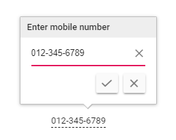
In-Place Editor with Save and Cancel Buttons
Let’s see how the edited value is processed and saved to the server.
What is sent to the server?
The modified data and related primary key will be sent to the server when the edited value is submitted:

Data Sent to the Server
Server configuration for saving
In the following code, you can see how the edited data will be processed and saved in the server:
[Route("api/[controller]")]
public class EditorController : Controller
{

     [AcceptVerbs("Post")]
     [HttpPost][Route("UpdateData")]
     public IEnumerable<SubmitModel> UpdateData([FromBody]SubmitModel value)
     {
         yield return value;
     }

     public class SubmitModel
     {
         public string Name { get; set; }
         public string PrimaryKey { get; set; }
         public string Value { get; set; }
     }
}
How to integrate with Drop-Down, Rich Text Edit, and Date Picker components
You can integrate the Drop-Down List, Rich Text Edit, Date Picker, and some other components with the In-Place Editor. You can choose these component options by simply setting the type property and configuring component-specific model properties.
For example, let’s see how to configure the In-Place Editor with a Drop-Down List component.
<ejs-inplaceeditor ref="dropObj" id="dropdownEle" mode="Inline" value="Canada"
type="DropDownList" :model="dropdownModel">  </ejs-inplaceeditor>


export default Vue.extend({
data: () => {
let dropdownData = ['Australia', 'Bermuda', 'Canada', 'Cameroon', 'Denmark'];
return {
multiValue: ['Canada', 'Bermuda'],
dropdownModel: {
dataSource: dropdownData,
placeholder: 'Find a countries'
}
});
By giving type the parameter value “DropDownList” and setting its data source through model configuration, you can use the Drop-Down List component with in-place editing enabled. Its data source can be built either from a JSON array or fetched from an external URL given in the url parameter.
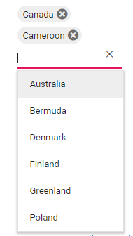
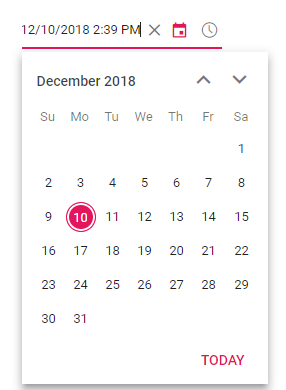
In-Place Editor Integrated with Drop-Down List
Customization
The In-Place Editor provides necessary customization options for providing an optimal user experience. Here are a few of them:
- Validation: Validate user actions with HTML5 form validations.
- Editing actions: Customize editing with events such as “click” and “double click”, and through the built-in edit icon.
- Save and cancel actions: You can modify the save and cancel actions with ‘on blur’ to ignore, cancel, or submit the modified value.
- Key configuration: Flexible key actions such as save on Enter, cancel on Escape, and Tab to focus.
- Template components: Integration with template components such as HTML5, checkbox, and more.
Conclusion
We hope that you will find the In-Place Editor component user-friendly and look forward to you trying it out in the 2018 Volume 4 release. You can find the 2018 Volume 4 Essential JS 2 install download link here. Also, you can check out the In-Place Editor source on GitHub, live demos in our sample browser, and customization features in our documentation.
The Vue In-Place Editor component is also available for React, Angular, ASP.NET Core, and MVC frameworks, built from their own TypeScript libraries.
If you wish to send us feedback or would like to ask any questions, please feel free to post in the comments section below, or contact us through our support forum or Direct-Trac.
If you like this post, we think you’ll also enjoy:
- [Blog Post] Introducing Syncfusion’s New Angular Chips Component
- [Blog Post] How to Integrate Syncfusion React Components into a Meteor Application
- [Ebook] Node.js Succinctly
- [Ebook] JavaScript Succinctly
- [Ebook] React.js Succinctly

Comments (3)
[…] Introducing Syncfusion’s New Vue In-place Editor Component for Web (Easwari S) […]
[…] Introducing Syncfusion’s New Vue In-place Editor Component for Web (Easwari S) […]
Syncfusion provides third-party UI components for React, Vue, Angular, JavaScript, Blazor, ASP.NET Web Forms, MVC, Core, WinForms, WPF, UWP and Xamarin.