
 Satheeskumar S
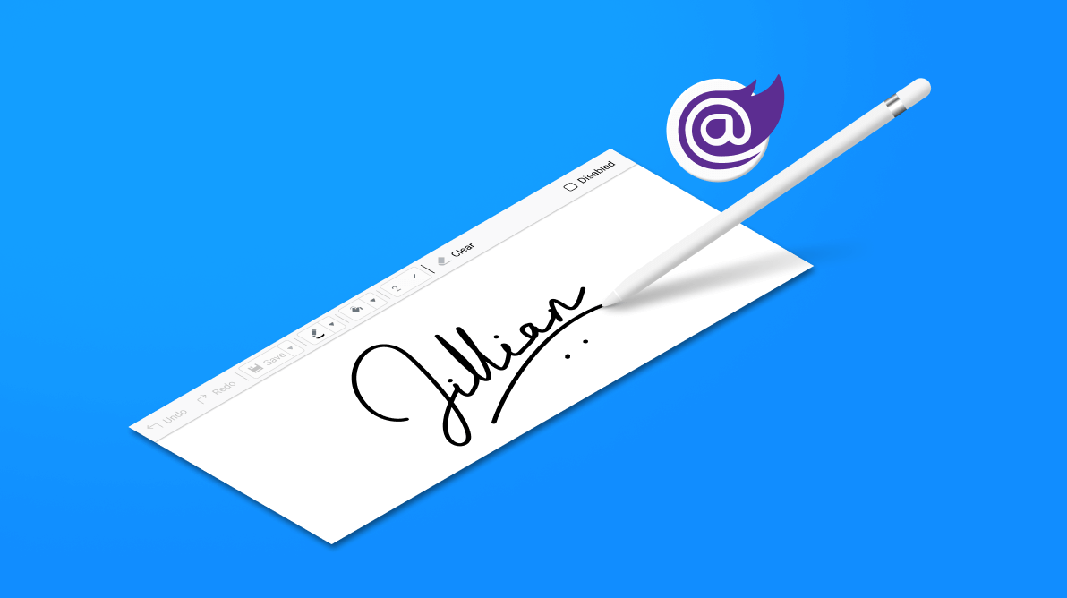
The Blazor Signature Pad component is a graphical interface that allows users to draw smooth signatures as vector outline strokes using variable-width Bezier curve interpolation. You can save signatures as images and vice versa. Also, you can use your finger, a pen, or mouse on desktop and mobile devices to draw your signature.
It supports all the common web standards and functionalities that our other Essential Blazor controls do: web accessibility, right-to-left rendering, keyboard interaction, modular architecture, and responsiveness, all the while being touch-friendly and sporting a lightweight UI.
Let’s explore the Blazor Signature Pad control, its UI design, and available features with code examples.
Use cases
The Blazor Signature Pad component is used to draw realistic and smooth signatures. The most common use case of the Signature Pad is a form within an app, online or off—anywhere you need to capture a signature.
Key features
Key features of the Blazor Signature Pad component are as follow:
- Customize the stroke and background.
- Save and load signatures.
- Draw signatures.
- Clear, undo, and redo signatures.
- Utilize keyboard accessibility and responsiveness.
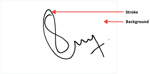
Customize the stroke and background
The stroke width or thickness is calculated based on the MinStrokeWidth, MaxStrokeWidth, Velocity, and drawing speed. We can also customize the stroke color, background color, and background image using the properties available in the Blazor Signature Pad.
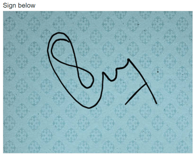
You can set the background image by either hosting the image in your local IIS or using an online image.
Refer to the following code example to load the Signature Pad with a background image:
@using Syncfusion.Blazor.Inputs

<div class=”control-section”>
 <div id=”signature-control”>
  <div class=’e-sign-heading’>
   <span id=”signdescription”>Sign below</span>
  </div>
  <div class=’e-sign-content’>
   <SfSignature BackgroundImage="http://localhost:6969/image/MySignature-1.png" style="width: 400px; height: 300px; background-repeat: no-repeat"></SfSignature>
  </div>
 </div>
</div>

<style>
  .e-sign-content,
  .e-sign-heading {
        width: 400px;
  }

  #signdescription {
        font-size: 14px;
        padding-bottom: 10px;
  }
</style>
Refer to the following image.
To view the hosted images, we have to enable the Directory Browsing option in IIS, which will create the web.config file inside the hosted folder. Include the following code in the web.config file to resolve the CORS issue.
<?xml version=”1.0” encoding=”UTF-8”?>
<configuration>
 <system.webServer>
  <directoryBrowse enabled=”true” />
  <httpProtocol>
   <customHeaders>
    <clear />
    <add name=”Access-Control-Allow-Origin” value=”*” />
   </customHeaders>
  </httpProtocol>
 </system.webServer>
</configuration>
Save and load signatures
In the Signature Pad component, you can draw a signature and save it in Base64, blob, and image formats using the SaveAsync method. This method accepts the file type and file name as parameters and can save the signature in PNG, JPEG, and SVG formats. You can also save the signature with a background color and image using the SaveWithBackground property.
The Blazor Signature Pad enables the users to load a pre-drawn signature as Base64 or a URL using the LoadAsync method. This method accepts the URL or Base 64, height, and width of the signature canvas as parameters. It also supports PNG, JPEG, and SVG image formats.
Refer to the following code example to load the pre-drawn signature in Base64 format.
@using Syncfusion.Blazor.Inputs
@using Syncfusion.Blazor.Buttons

<div class="control-section">
 <div id="signature-control">
  <div class='e-sign-heading'>
   <span id="signdescription">Sign below</span>
   <span class="e-btn-options">
    <SfButton IsPrimary="true" class="e-sign-load" @OnClick="OnLoadBase64">Reload</SfButton>
   </span>
  </div>
  <div class='e-sign-content'>
   <SfSignature @ref="signature" style="width: 400px; height: 300px;"></SfSignature>
  </div>
 </div>
</div>
@code{
 private SfSignature signature;
 private string sign;

 private async Task OnLoadBase64()
 {
   sign = await signature.GetSignatureAsync(); // Get signature as Base 64.
   await signature.ClearAsync();
   await signature.LoadAsync(sign, 400, 300); // Load signature as Base 64.
 }
}
<style>
 .e-sign-content,
 .e-sign-heading {
    width: 400px;
 }

 #signdescription {
    font-size: 14px;
    padding-bottom: 10px;
 }

 .e-btn-options {
    float: right;
    margin-bottom: 10px;
 }
</style>
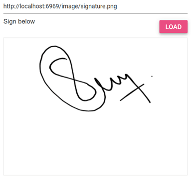
Now let’s learn how to load the pre-drawn signature as a URL. This can be done by either hosting the signature in your local IIS or using an online signature image.
@using Syncfusion.Blazor.Inputs
@using Syncfusion.Blazor.Buttons

<div class="control-section">
 <div id="signature-control">
  <div class='e-sign-heading'>
   <span>
    <SfTextBox @ref="text" Placeholder='Enter the hosted link'></SfTextBox>
   </span>
   <span class="e-btn-options">
    <SfButton IsPrimary="true" class="e-sign-load" @OnClick="OnLoad">Load</SfButton>
   </span>
   <span id="signdescription">Sign below</span>
  </div>
  <div class='e-sign-content'>
   <SfSignature @ref="signature" style="width: 400px; height: 300px;"></SfSignature>
  </div>
 </div>
</div>
@code{
 private SfSignature signature;
 private string sign;
 private SfTextBox text;
 private async Task OnLoad()
 {
   await signature.LoadAsync(text.Value, 400, 400); // To load the Signature as URL.
 }
}
<style>
 .e-sign-content,
 .e-sign-heading {
    width: 400px;
 }

 #signdescription {
    font-size: 14px;
    padding-bottom: 10px;
 }

 .e-btn-options {
    float: right;
    margin: 10px 0px 10px;
 }
</style>
Refer to the following image.
Type text as signature
You can easily transform any text into a signature using different font families and font sizes. To do so, use the DrawAsync method, which accepts the signature text, font family, and font size as parameters.
Refer to the following GIF image.

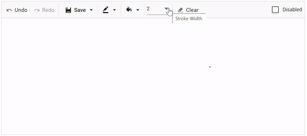
Clear, undo, and redo
We can clear the pre-drawn signature using the ClearAsync method, which will clear the entire canvas.
Performing undo and redo actions will undo the last action performed and revert the last undo action performed, respectively, in the Signature Pad component. These can be done by using the UndoAsync and RedoAsync methods.
These actions are handled by saving a snapshot whenever a change occurs in the canvas and maintaining its index value to navigate to when performing undo and redo actions. The index value will be decreased to load the previous action and perform an undo and increased to load the next action and perform a redo.
You can enable or disable the undo and redo buttons using the CanUndoAsync and CanRedoAsync methods. Also, you can easily enable or disable the Clear button using the IsEmptyAsync method.
Refer to the following GIF image.
Keyboard accessibility
Also, you can easily interact with the Blazor Signature Pad component using the following keyboard shortcuts:
- Ctrl+S: Save the signature in the default format (PNG).
- Ctrl+Z: Undo the previous action.
- Ctrl+Y: Redo the most recent undo action.
Responsiveness and touch-friendly UI
By default, the Blazor Signature Pad adapts well to all mobile devices based on the screen size. It is a touch-friendly control, so users can easily use their finger, pen, or mouse on both desktop and mobile devices to draw signatures.
References
For more details, refer to our Getting Started with Blazor Signature Pad Component documentation and demos.
Conclusion
Thanks for reading! We hope you enjoyed this quick introduction to the design and features of our Blazor Signature Pad component. Along with what we’ve seen in this blog, the Signature Pad also supports built-in themes like Material, Bootstrap, and more.
The Signature Pad is available in our Angular, Blazor, React, Vue, JavaScript, ASP.NET (Core and MVC) platforms. Try them out and enjoy hassle-free signing!
If you have any questions, please let us know in the comments section below. You can also contact us through our support forums, support portal, or feedback portal. We are always happy to assist you!


 No spam, just valuable updates.