
 Piramanayagam Ramakrishnan
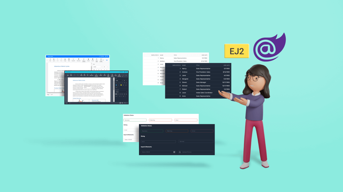
Themes are an essential part of an application. They help us design our apps with colors, styles, icons, and more.
Right now, the Tailwind CSS theme is one of the trending CSS frameworks used in developing modern web applications. It contains predefined CSS helper classes to develop an app with less CSS.
Our Syncfusion Essential JS 2 and Blazor platforms provide the Tailwind CSS theme in both dark and light modes. Check out our online demos to view the appearance of the Syncfusion components in Tailwind CSS themes.
Let’s see how to use this theme in your web applications by looking at code examples.
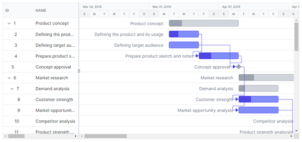
Tailwind CSS themes
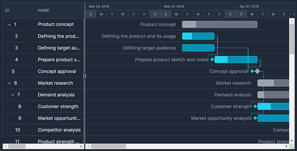
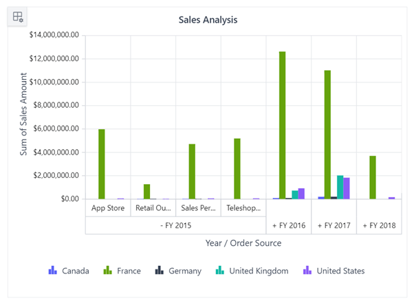
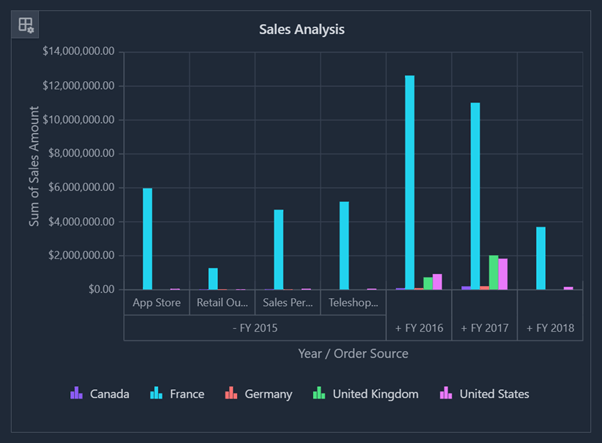
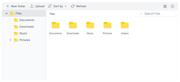
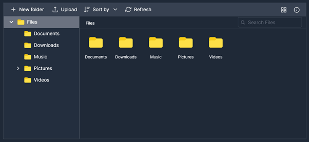
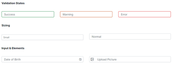
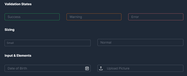
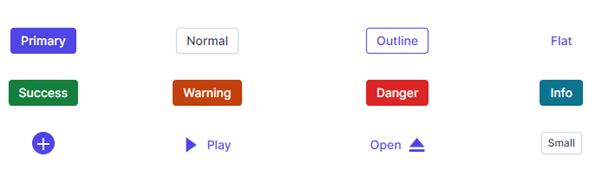
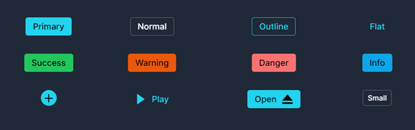
Here is how some of our frequently used components (DataGrid, Gantt Chart, Pivot Table, File Manager, Inputs, and Button components) appear with the Tailwind CSS theme.
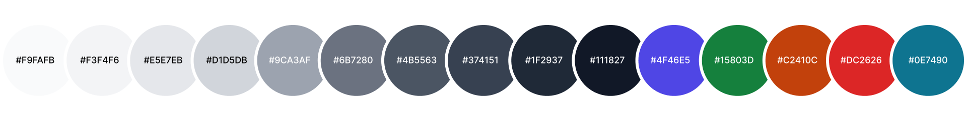
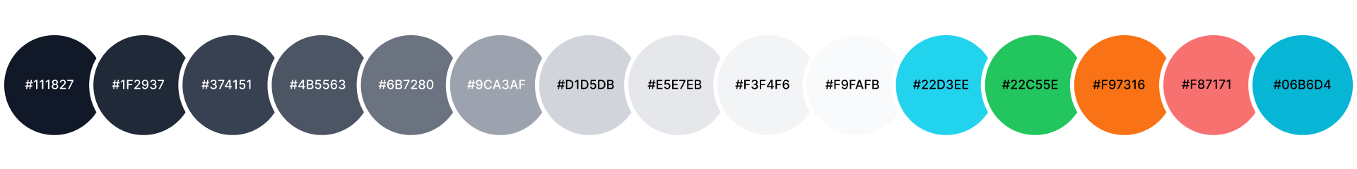
Color variables
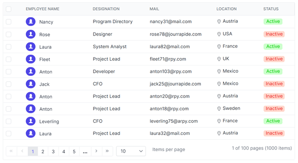
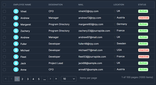
Syncfusion’s Tailwind CSS theme uses indigo as the primary color and the rest of the colors are selected based on it.
Refer to the following screenshots. We have listed the common color variables used in the Syncfusion Tailwind CSS themes for all UI components.
Blazor components
If you want to try out the Tailwind CSS theme in your Blazor application, then you can use either CDN or static assets like NuGet packages.
Refer to the following code examples to use the Tailwind CSS themes using CDN.
Light theme
<head>
    ....
    ....
    <link href="https://cdn.syncfusion.com/blazor/19.2.55/styles/tailwind.css" rel="stylesheet" />
</head>
Dark theme
<head>
    ....
    ....
    <link href=" https://cdn.syncfusion.com/blazor/19.2.55/styles/tailwind-dark.css" rel="stylesheet" />
</head>
The Syncfusion Blazor themes are available as static web assets in Syncfusion.Blazor and Syncfusion.Blazor.Themes NuGet packages.
Add the following reference link inside the <head> element of the ~/Pages/_Host.cshtml file for the Blazor server app or the ~/wwwroot/index.html file for the Blazor WebAssembly app.
- If you are using individual NuGet packages in your application, then use the following reference link.
Light theme
<head>
    ....
    ....
    <link href="_content/Syncfusion.Blazor.Themes/tailwind.css" rel="stylesheet" />
</head>
Dark theme
<head>
    ....
    ....
    <link href="_content/Syncfusion.Blazor.Themes/tailwind-dark.css" rel="stylesheet" />
</head>- If you are using Blazor NuGet package in your application, then use the following reference link.
Light theme
<head>
    ....
    ....
    <link href="_content/Syncfusion.Blazor/styles/tailwind.css" rel="stylesheet" />
</head>
Dark theme
<head>
    ....
    ....
    <link href="_content/Syncfusion.Blazor/styles/tailwind-dark.css" rel="stylesheet" />
</head>
Note: For more details, refer to the Themes in Syncfusion Blazor Components documentation.
Essential JS 2 components
For the Essential JS 2 suite, the themes are available in the individual and combined CSS files. You can get the combined CSS file from the @syncfusion/ej2 npm package and individual CSS files within the same control repository’s style folder.
The ej2 npm packages have both the CSS and SCSS files for all controls.
Refer to the following code examples.
Light theme
@import "./node_modules/@syncfusion/ej2/tailwind.css";
Dark theme
@import "./node_modules/@syncfusion/ej2/tailwind-dark.css";
All controls SCSS
@import "ej2/<theme_name>.scss";
Note: For more details, refer to Theming in Essential JS 2 Components documentation.
Custom resource generator
You can generate a selective control script (JavaScript ES5) and styles by using the custom resource generator (CRG). It allows you to download the Tailwind CSS and Tailwind CSS dark themes from CRG.
Note: For more details, refer to the Custom Resource Generator demo.
Reference
Use the Tailwind CSS light and dark themes in our Blazor, JavaScript, Angular, React, Vue, JavaScript (ES5), ASP.NET Core, and ASP.NET MVC platforms.
Conclusion
Thanks for reading! In this blog post, we have discussed the Tailwind CSS theme in our Syncfusion Essential JS 2 and Blazor components and how to use them in your application. We will keep on providing new, standard themes.
For existing customers, the new version of Essential Studio® is available for download from the License and Downloads page. If you are not yet a Syncfusion customer, you can try our 30-day free trial to check out our available features.
You can contact us through our support forum or Direct-Trac. We are always happy to assist you!

If you liked this blog post, we think you’ll also like the following articles:
 No spam, just valuable updates.