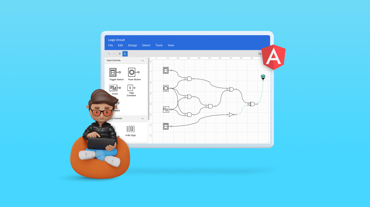
Welcome to our exploration of digital logic circuit design. In the complex world of digital logic systems, well-designed circuit diagrams are key to simplification and optimization. They offer a clear visual guide, enable effective communication, and provide detailed steps for building superior digital logic circuits. The process can be intricate and time-consuming, but it becomes significantly more manageable with the right tools and user interface. One such tool is the Syncfusion Angular Diagram Library, a versatile control that facilitates the quick and easy creation of high-quality logic circuits.
This article will explore how the Angular Diagram control can be used to develop an interactive user interface for designing logic circuits. In other words, we will create a logical circuit designer.
Logic circuit diagram symbols
The logical circuit designer will provide a variety of universal logic gates, flip-flops, input controls, output controls, and other components to design logic circuit diagrams.
Logic gates
Logic gates are the basic symbols used for any digital circuit design. Logic gates perform a Boolean logic function with one or more inputs and produce a single output. The logical circuit designer will have universal logic gates, including buffer and tri-state buffer.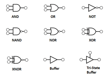
Flip-flops
The flip-flop is a circuit that has two stable states and can be used to store state information. The state can be changed by applying one or more control inputs and will have one or two outputs. It is the basic storage element in the digital circuit diagram. The logical circuit designer will have SR, D, JK, and T flip-flops.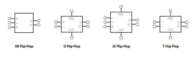
Input controls
Input controls can pass high (true) or low (false) signals to logic gates or flip-flops. The logical circuit designer will provide the following input controls to design the circuits.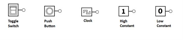
Output controls
Output controls can be connected to an output pin of a logic gate or flip-flop to display its output state. The logical circuit designer will provide a light bulb and 8-bit digit as output controls.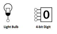
Prerequisites
Before you begin, ensure the following software is installed on your computer.
- Node version 16.14.0
Creating a diagram surface
Let’s create a diagram surface by following these steps.
Step #1: Create a folder and name it Logic Circuit Designer.
Step #2: Open your terminal or command prompt and run the following command to install the Create Angular App NPM package globally.
npm install -g @angular/cli@16.0.0
Step #3: Create a new Angular app, use the ng new command, and replace my-app with your desired app name. For example, if you want to create an app named “logic-circuit,” you use the following command.
ng new logic-circuit
Step #4: Navigate to your app directory. Change your working directory to the newly created app by using the following command.
cd logic-circuit
Step #5: Use the next command to start the development server and see your app in action.
ng serve
This will open your app in your default web browser at http://localhost:4200/.
Step #6: Then, open the package.json file and add the following necessary package dependencies.
"dependencies": {
    "@angular/animations": "^16.0.0",
    "@angular/common": "^16.0.0",
    "@angular/compiler": "^16.0.0",
    "@angular/core": "^16.0.0",
    "@angular/forms": "^16.0.0",
    "@angular/platform-browser": "^16.0.0",
    "@angular/platform-browser-dynamic": "^16.0.0",
    "@angular/router": "^16.0.0",
    "@syncfusion/ej2-angular-buttons": "^*",
    "@syncfusion/ej2-angular-diagrams": "*",
    "@syncfusion/ej2-angular-dropdowns": "^*",
    "@syncfusion/ej2-angular-inputs": "*",
    "@syncfusion/ej2-angular-navigations": "*",
    "@syncfusion/ej2-angular-popups": "^*",
    "@syncfusion/ej2-angular-splitbuttons": "*",
    "rxjs": "~7.8.0",
    "tslib": "^2.3.0",
    "zone.js": "~0.13.0"
  },
Step #7: Use the following command to install all dependent packages.
npm install
Step #8: Add the dependent scripts and style CDN reference links in the index.html file.
<head>
  <meta charset="utf-8">
  <title>Angular - Logic Circuit Designer</title>
  <base href="/">
  <meta name="viewport" content="width=device-width, initial-scale=1">
  <link rel="icon" type="image/x-icon" href="favicon.ico">
  <script src="https://cdn.syncfusion.com/ej2/syncfusion-helper.js" type ="text/javascript"></script>
  <link href="https://cdn.syncfusion.com/ej2/20.3.47/fluent.css" rel="stylesheet" />
  <link href="https://maxcdn.bootstrapcdn.com/bootstrap/3.3.7/css/bootstrap.min.css" rel="stylesheet">
  <link href="https://cdn.syncfusion.com/ej2/20.3.47/ej2-base/styles/fluent.css" rel="stylesheet">
  <link href="https://cdn.syncfusion.com/ej2/20.3.47/ej2-popups/styles/fluent.css" rel="stylesheet">
  <link href="https://cdn.syncfusion.com/ej2/20.3.47/ej2-splitbuttons/styles/fluent.css" rel="stylesheet">
  <link href="https://cdn.syncfusion.com/ej2/20.3.47/ej2-navigations/styles/fluent.css" rel="stylesheet">
  <link href="https://cdn.syncfusion.com/ej2/20.3.47/ej2-inputs/styles/fluent.css" rel="stylesheet">
  <link href="https://cdn.syncfusion.com/ej2/20.3.47/ej2-dropdowns/styles/fluent.css" rel="stylesheet">
  <link href="https://ej2.syncfusion.com/demos/src/diagram/styles/diagram-common.css" rel="stylesheet">
</head>
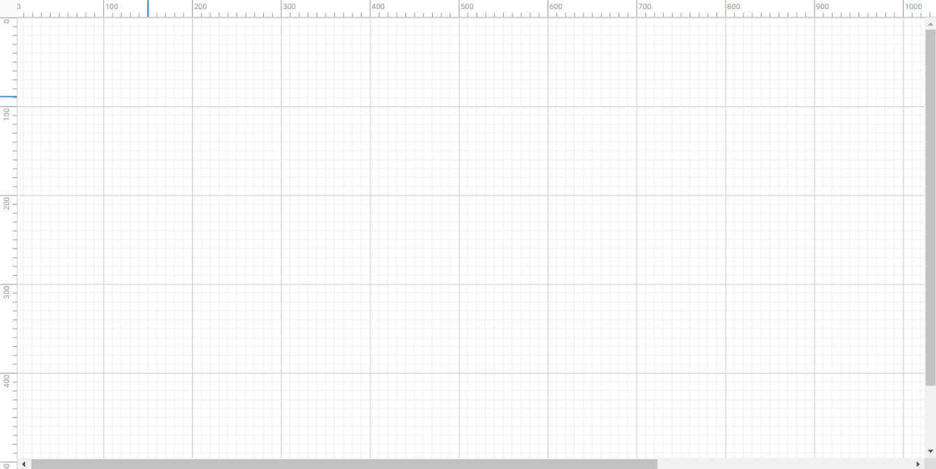
Step #9: To include the Diagram component in your app, import the DiagramComponent from the ej2-angular-diagrams package. The required arguments, such as the width, height, and collection of nodes and connectors, must be included in the app.component.html file.
Refer to the code example.
<div id="diagramContainerDiv" class="db-current-diagram-container">
   <ejs-diagram #diagram id="diagram"
            width="100%" height="100%"
            [nodes]="nodes" [connectors]="connectors"
            [getConnectorDefaults]='setConnectorDefaults'
            [getNodeDefaults]="getNodeDefaults"
            [rulerSettings]="rulerSettings"
            [pageSettings]="pageSettings"
            [scrollSettings]="scrollSettings"
            >
   </ejs-diagram>
</div >
The following image shows the initial diagramming page.
Note: For more details, refer to the Getting Started with Angular Diagram Control documentation.
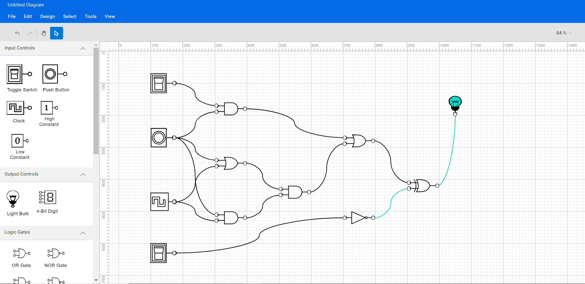
Creating reusable logic circuit diagram symbols
The Angular Diagram control provides a gallery of reusable nodes and connectors called SymbolPalettes. It displays a collection of palettes, each showing a set of nodes and connectors. We can drag and drop them onto the diagram canvas any number of times.
Follow these steps to create a diagram symbol palette with logic circuit shapes.
Step #1: Create an HTML div element that will act as the container for the diagram symbol palette.
Refer to the following code example.
<div class="db-palette-parent">
  <ejs-symbolpalette id="symbolpalette"
        width="100%" height="100%"
  >
  </ejs-symbolpalette>
</div>
Step #2: Initialize the Syncfusion Diagram symbol palette by passing the required arguments: the width, height, and collection of symbols to be included in the palette.
<div class="db-palette-parent">
  <ejs-symbolpalette id="symbolpalette"
          [expandMode]='palettes.expandMode' [palettes]='palettes.palettes'
          width="100%" height="100%"
          [symbolMargin]='palettes.symbolMargin'
          [getSymbolInfo]='palettes.getSymbolInfo'
        >
  </ejs-symbolpalette>
</div>
Step #3: Define the collection of symbols to be included in the palette, which can be customized according to your needs.
export class Palettes {
    public expandMode: ExpandMode = 'Multiple';
    public symbolPreview = { height: 50, width: 50 };
    public symbolMargin = { left: 10, right: 10, top: 10, bottom: 10 };
    public palettes = [
        { id: 'input', expanded: true, symbols: this.input(), title: 'Input Controls'},
        { id: 'output', expanded: true, symbols: this.output(), title: 'Output Controls' },
        { id: 'flow', expanded: true, symbols: this.gates(), title: 'Logic Gates' },
        { id: 'flipflop', expanded: true, symbols: this.flipflops(), title: 'Flip flops' },
        { id: 'other', expanded: true, symbols: this.other(), title: 'Other' },
    ];
    public getSymbolInfo(symbol: NodeModel): SymbolInfo {
        return {
            description: { text: (symbol as any).shape['shape'], overflow: 'Wrap', fontSize: 12, margin: { top: 10, left: 0, right: 0, bottom: 0 } }
        };
    }
    public setPaletteNodeDefaults(node: NodeModel): void {
        if (!(node.addInfo && (node.addInfo as any).type === 'CustomShapes') && (!node.children)) {
            if (node.id === 'Terminator' || node.id === 'Process') {
                node.width = 130;
                node.height = 65;
            }
            else {
                node.width = 50;
                node.height = 50;
            }
            node.ports = [
                { offset: { x: 0, y: 0.5 }, style: { fill: 'white' }, visibility: PortVisibility.Connect | PortVisibility.Hover, constraints: PortConstraints.Draw },
                { offset: { x: 0.5, y: 0 }, style: { fill: 'white' }, visibility: PortVisibility.Connect | PortVisibility.Hover, constraints: PortConstraints.Draw },
                { offset: { x: 1, y: 0.5 }, style: { fill: 'white' }, visibility: PortVisibility.Connect | PortVisibility.Hover, constraints: PortConstraints.Draw },
                { offset: { x: 0.5, y: 1 }, style: { fill: 'white' }, visibility: PortVisibility.Connect | PortVisibility.Hover, constraints: PortConstraints.Draw }
            ];
        }
    }
    output() {
        const output = [
           {
               id: 'FullPath',
               height: 40,
               width: 30,
               offsetX: 140,
               offsetY: 100,
               shape: { type: 'Path', data: BulbCompletePath },
               style: { strokeColor: 'black', fill: 'black' },
               constraints: NodeConstraints.Default & ~NodeConstraints.Select & ~NodeConstraints.InConnect,
           },

           {
               id: 'BlackPart',
               height: 8,
               width: 14,
               offsetX: 140,
               offsetY: 108,
               shape: { type: 'Path', data: BulbBlackPart },
               style: { strokeColor: 'black', fill: 'black' },
               constraints: NodeConstraints.Default & ~NodeConstraints.Select & ~NodeConstraints.InConnect,
           },

           {
               id: 'InnerBluePart',
               height: 10,
               width: 14,
               offsetX: 140,
               offsetY: 97,
               shape: { type: 'Path', data: BulbInnerBluePart },
               style: { strokeColor: 'black', fill: 'white' },
               constraints: NodeConstraints.Default & ~NodeConstraints.Select & ~NodeConstraints.InConnect,
               visible: false,
           },

           {
               id: 'OuterBluePart',
               height: 28,
               width: 32,
               offsetX: 140,
               offsetY: 90,
               shape: { type: 'Path', data: BulbOuterBluePart },
               style: { strokeColor: 'black', fill: 'white' },
               constraints: NodeConstraints.Default & ~NodeConstraints.Select & ~NodeConstraints.InConnect,
               visible: false,
           },

           {
               id: 'Bulb',
               children: ['FullPath', 'BlackPart', 'InnerBluePart', 'OuterBluePart'],
               shape: { shape: 'Light Bulb' },
               style: { fill: 'none', padding: '2' },
               constraints: NodeConstraints.Default & ~NodeConstraints.InConnect,
           },

           {
               id: '4-Bit Digit',
               shape: { type: 'Path', data: digitdata, shape: '4-Bit Digit' },
               style: { fill: '#000000', strokeWidth: 0 }, height: 55, width: 70,
               constraints: NodeConstraints.Default & ~NodeConstraints.InConnect,
           },
        ];
        return output;
    }
    input() {
        const input = [
           {
               id: 'SwOffOuter',
               height: 50,
               width: 65,
               offsetX: 140,
               offsetY: 100,
               shape: { type: 'Path', data: SwitchOffOuterRect },
               style: { strokeColor: 'black', strokeWidth: 2 },
               constraints: NodeConstraints.Default & ~ NodeConstraints.Select & ~NodeConstraints.InConnect,
           },
           {
               id: 'SwOffInner',
               height: 40,
               width: 30,
               offsetX: 127.5,
               offsetY: 100,
               shape: { type: 'Path', data: SwitchOffInnerRect },
               style: { strokeColor: 'black', strokeWidth: 2 },
               constraints: NodeConstraints.Default & ~NodeConstraints.Select & ~NodeConstraints.InConnect,
           },

           {
               id: 'SwOff',
               height: 25,
               width: 20,
               offsetX: 127.5,
               offsetY: 100,
               shape: { type: 'Path', data: SwitchoffButton },
               style: { strokeColor: 'black', strokeWidth: 2 },
               constraints:NodeConstraints.Default & ~NodeConstraints.Select & ~ NodeConstraints.InConnect,
           },

           {
               id: 'SwOn',
               height: 25,
               width: 20,
               offsetX: 127.5,
               offsetY: 100,
               shape: { type: 'Path', data: SWitchOnButton },
               style: { strokeColor: 'transparent', strokeWidth: 2, fill: 'transparent' },
               constraints:NodeConstraints.Default & ~NodeConstraints.Select & ~NodeConstraints.InConnect,
               visible: false,
           },


           {
               id: 'Toggle Switch',
               children: ['SwOffOuter', 'SwOffInner', 'SwOff', 'SwOn'],
               shape: { shape: 'Toggle Switch' },
               style: { fill: 'none' },
               constraints: NodeConstraints.Default & ~NodeConstraints.InConnect,
           },

           {
               id: 'PBOuterRect',
               height: 50,
               width: 65,
               offsetX: 140,
               offsetY: 100,
               shape: { type: 'Path', data: PushButtonOuterRect },
               style: { strokeColor: 'black', strokeWidth: 0, fill: 'black' },
               constraints: NodeConstraints.Default & ~NodeConstraints.Select & ~NodeConstraints.InConnect,
           },

           {
               id: 'PBOuterCircle',
               height: 27,
               width: 27,
               offsetX: 128,
               offsetY: 100,
               shape: { type: 'Path', data: PushButtonOuterCircle },
               style: { strokeColor: 'black', strokeWidth: 2, fill: 'white' },
               constraints: NodeConstraints.Default & ~NodeConstraints.Select & ~NodeConstraints.InConnect,
           },

           {
               id: 'PBInnerCircle',
               height: 20,
               width: 20,
               offsetX: 128,
               offsetY: 100,
               shape: { type: 'Path', data: PushButtonInnerCircle },
               style: { strokeColor: 'black', strokeWidth: 2, fill: 'white' },
               constraints: NodeConstraints.Default & ~NodeConstraints.Select & ~NodeConstraints.InConnect,
           },

           {
               id: 'PushButton',
               children: ['PBOuterRect', 'PBOuterCircle', 'PBInnerCircle'],
               shape: { shape: 'Push Button' },
               style: { fill: 'white' },
               constraints: NodeConstraints.Default & ~NodeConstraints.InConnect,
           },

           {
               id: 'CLKOuterRect',
               height: 35,
               width: 65,
               offsetX: 140,
               offsetY: 100,
               shape: { type: 'Path', data: ClockOuterRectangle },
               style: { strokeColor: 'black', strokeWidth: 2 },
               constraints: NodeConstraints.Default & ~NodeConstraints.Select & ~NodeConstraints.InConnect,
           },

           {
               id: 'CLKInnerPart',
               height: 20,
               width: 30,
               offsetX: 130,
               offsetY: 100,
               shape: { type: 'Path', data: ClockInnerPart },
               style: { strokeColor: 'black', strokeWidth: 2, fill: 'white' },
               constraints: NodeConstraints.Default & ~NodeConstraints.Select & ~NodeConstraints.InConnect,
           },

           {
               id: 'Clock',
               children: ['CLKOuterRect', 'CLKInnerPart'],
               shape: { shape: 'Clock' },
               style: { fill: 'none' },
               constraints: NodeConstraints.Default & ~NodeConstraints.InConnect,
           },

           {
               id: 'High Constant',
               shape: { shape: 'High Constant', type: 'Path', data: highconstantdata },
               style: { fill: '#000000', strokeWidth: 0 }, height: 55, width: 70,
               constraints: NodeConstraints.Default & ~NodeConstraints.InConnect,
           },

           {
               id: 'Low Constant',
               shape: { shape: 'Low Constant', type: 'Path', data: lowconstantdata },
               style: { fill: '#000000', strokeWidth: 0 }, height: 55, width: 70,
               constraints: NodeConstraints.Default & ~NodeConstraints.InConnect,
           },
        ];
        return input;
    }
    gates() {
        const gates = [
           {
               id: 'OR Gate', shape: { type: 'Path', data: orData, shape: 'OR Gate' }, style: { fill: '#000000', strokeWidth: 0 }, height: 45, width: 79,
               constraints: NodeConstraints.Default & ~NodeConstraints.InConnect,
           },
           {
               id: 'NOR Gate', shape: { type: 'Path', data: nordata, shape: 'NOR Gate' }, style: { fill: '#000000', strokeWidth: 0 }, height: 45, width: 79,
               constraints: NodeConstraints.Default & ~NodeConstraints.InConnect,
           },

           {
               id: 'AND Gate', shape: { type: 'Path', data: andData, shape: 'AND Gate' }, style: { fill: '#000000', strokeWidth: 0 }, height: 45, width: 79,
               constraints: NodeConstraints.Default & ~NodeConstraints.InConnect,
           },

           {
               id: 'NAND Gate', shape: { type: 'Path', data: nanddata, shape: 'NAND Gate' }, style: { fill: '#000000', strokeWidth: 0 }, height: 45, width: 79,
               constraints: NodeConstraints.Default & ~NodeConstraints.InConnect,
           },

           {
               id: 'Buffer Gate', shape: { type: 'Path', data: buffer, shape: 'Buffer' }, style: { fill: '#000000', strokeWidth: 0 },  height: 45, width: 79,
               constraints:NodeConstraints.Default & ~NodeConstraints.InConnect,
           },

           {
               id: 'Not Gate', shape: { type: 'Path', data: notData, shape: 'NOT Gate' }, style: { fill: '#000000', strokeWidth: 0 }, height: 45, width: 79,
               constraints: NodeConstraints.Default & ~NodeConstraints.InConnect,
           },

           {
               id: 'XOR Gate', shape: { type: 'Path', data: xorData, shape: 'XOR Gate' }, style: { fill: '#000000', strokeWidth: 0 }, height: 45, width: 79,
               constraints:NodeConstraints.Default & ~NodeConstraints.InConnect,
           },

           {
               id: 'XNOR Gate', shape: { type: 'Path', data: xnorData, shape: 'XNOR Gate' }, style: { fill: '#000000', strokeWidth: 0 }, height: 45, width: 79,
               constraints: NodeConstraints.Default & ~NodeConstraints.InConnect,
           },
        ];
        return gates;
    }
    flipflops() {
        const flipflops = [
           {
               id: 'JK Flip-Flop',
               shape: { shape: 'JK Flip-Flop', type: 'Path', data: jkflipflopdata },
               style: { fill: '#000000', strokeWidth: 0 }, height: 90, width: 70,
               constraints: NodeConstraints.Default & ~NodeConstraints.InConnect,
           },

           {
               id: 'D Flip-Flop',
               shape: { shape: 'D Flip-Flop', type: 'Path', data: dflipflop },
               style: { fill: '#000000', strokeWidth: 0 }, height: 90, width: 65,
               constraints: NodeConstraints.Default & ~NodeConstraints.InConnect,
           },

           {
               id: 'T Flip-Flop',
               shape: { shape: 'T Flip-Flop', type: 'Path', data: tflipflopdata },
               style: { fill: '#000000', strokeWidth: 0 }, height: 90, width: 65,
               constraints: NodeConstraints.Default & ~NodeConstraints.InConnect,
           },

           {
               id: 'SR Flip-Flop',
               shape: { shape: 'SR Flip-Flop', type: 'Path', data: srflipflopdata },
               style: { fill: '#000000', strokeWidth: 0 }, height: 78, width: 73,
               constraints: NodeConstraints.Default & ~ NodeConstraints.InConnect,
           },
        ];
        return flipflops;
    }
    other() {
       const other = [
           {
               id: 'Label',
               shape: { type: 'Text', content: 'Text' },
               style: { strokeColor: 'black', strokeWidth: 2, fill: 'black', color: 'white' },
               height: 50,
               width: 60,
               constraints: NodeConstraints.Default & ~(NodeConstraints.InConnect | NodeConstraints.OutConnect),
           },

           {
               id: 'Bus',
               shape: { type: 'Path', data: busdata, shape: 'Bus' },
               style: { fill: '#000000', strokeWidth: 0 },
               height: 45,
               width: 80,
               constraints: NodeConstraints.Default & ~NodeConstraints.InConnect,
           },

           {
               id: 'Pull Up',
               shape: { type: 'Path', data: pullupdata, shape: 'Pull Up' },
               style: { fill: '#000000', strokeWidth: 0 },
               height: 45,
               width: 73,
               constraints: NodeConstraints.Default & ~NodeConstraints.InConnect,
           },

           {
               id: 'Pull Down',
               shape: { type: 'Path', data: pulldowndata, shape: 'Pull Down' },
               style: { fill: '#000000', strokeWidth: 0 },
               height: 45,
               width: 73,
               constraints: NodeConstraints.Default & ~NodeConstraints.InConnect,
           },
       ];
       return other;
    }
}
The following image shows the symbol palette filled with logic circuit shapes.
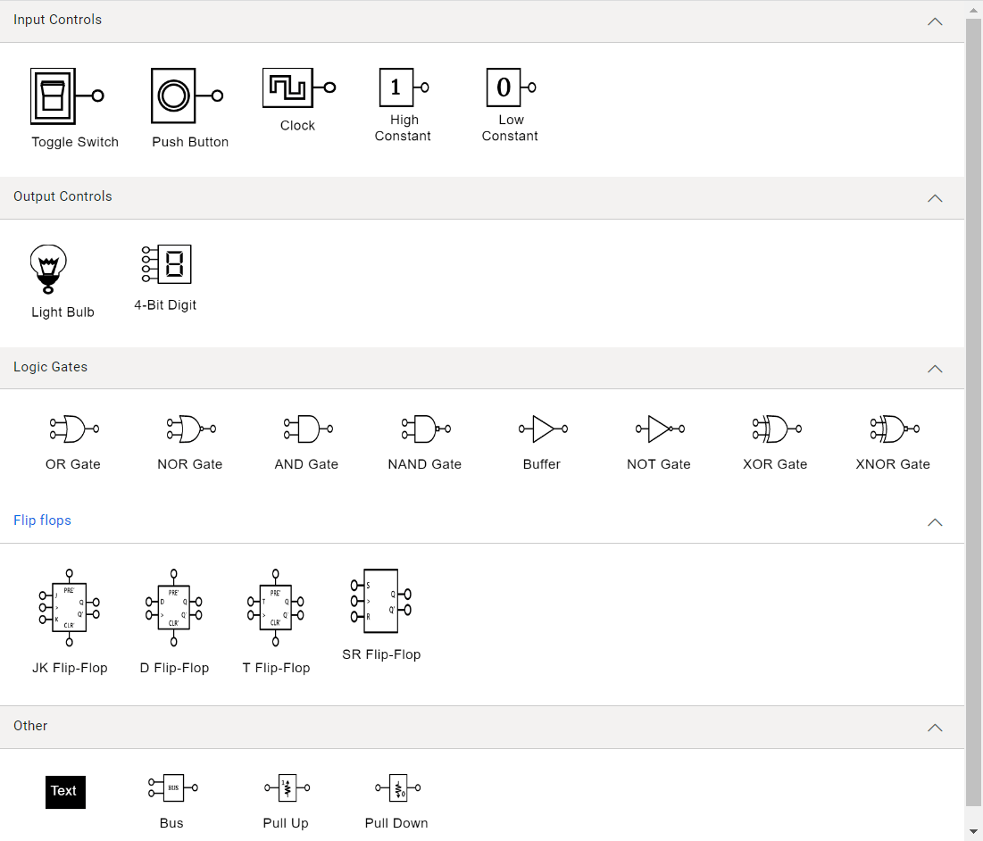
Note: Refer to the Symbol palette in Angular Diagram documentation for more info on adding symbols, grouping, and customizing the symbol palette appearance.
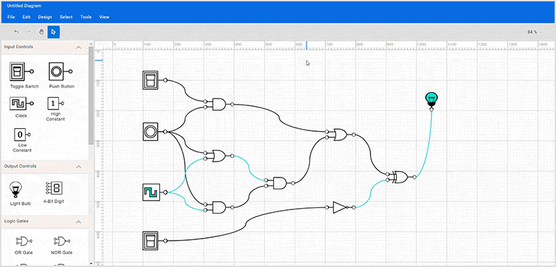
Create a digital logic circuit
Now, you can design a digital logic circuit diagram by adding shapes to the diagram surface and connecting them using connectors.
Step #1: Add logic circuit symbols to the editor
To add the logic circuit symbols in the editor, drag them from the symbol palette onto the diagramming canvas.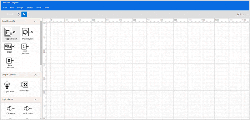
Step #2: Move the symbols
You can change the position of the dropped symbols by clicking a symbol and dragging it to the desired location on the diagram surface.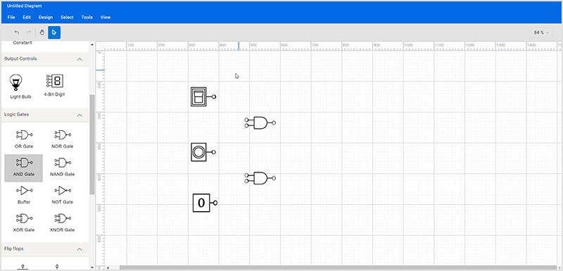
Step #3: Connect the symbols
Each diagram symbol has an input and output connection point (indicated by a small circle in the symbol) to connect the symbol with the desired input and output controls as per our design. Also, you can connect the output of one symbol as an input of another symbol.
You can create a connection by hovering your mouse over the connection point. You can see the animation to indicate the connection start/end. Click on it, start dragging the connection, and drop it on another symbol’s input connection point.
Note: Refer to the Create connectors through the connection points documentation for more details.
Step #4: Load and save the diagram
The Diagram control lets you save your current work and later load it back to the diagram canvas. The following image shows you can achieve this using the load and save functionalities.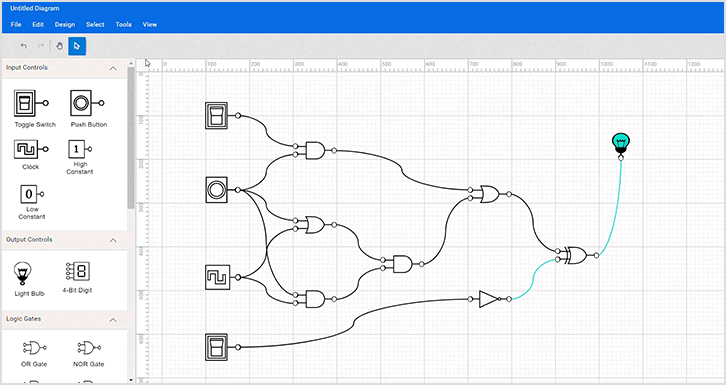
Step #5: Print and export diagram
You can export the created logical circuit diagram as an image or print it directly using the printer. You can do this using the exporting and printing functionalities of the Diagram control.
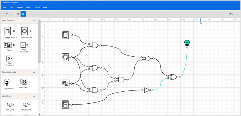
Step #6: Pan and zoom
You can zoom in or out of the diagram by holding the Ctrl + mouse wheel or the dropdown button at the top-right corner of the diagram design.
Refer to the following image.
When a large diagram is loaded, only a certain portion of the diagram is visible. The remaining portions are clipped. Clipped portions can be explored using the scrollbars or by panning the diagram. You can pan the diagram by selecting the panning tool in the toolbar or Tools->Pan and then clicking and holding the pointer in the diagram area.
GitHub reference
You can download this Angular logical circuit designer source project from this GitHub location.
Conclusion
Thanks for reading! In this blog, we’ve seen how to easily create a digital logical circuit diagram using the Syncfusion Angular Diagram Library. Similarly, you can create diagram creation apps like an organization chart creator, a flow chart creator, or a network diagram creator.
If you’re already a Syncfusion user, you can download the product setup from our website. Otherwise, you can download a free 30-day trial.
Please let us know in the comments section below if you have any questions. You can also contact us through our support forum, support portal, or feedback portal. We are always happy to assist you!