
 Manivannan Elangovan
Ratings help users express their opinions and provide valuable feedback. While the traditional star-based rating system is ubiquitous, there’s room for creative innovation in the world of user interface design. In this blog, we’ll explore how to design unique and engaging rating designs using the Syncfusion WinUI Rating control.
Syncfusion WinUI Rating control
Syncfusion offers a powerful and flexible Rating control for WinUI apps. With this, you have the freedom to design rating systems that go beyond traditional stars. Let’s look at some examples.
Hearts of love
Imagine you’re building a dating app, and you want users to express their feelings about potential matches. Instead of stars, why not use hearts?
With the Syncfusion WinUI Rating control, you can easily customize the symbols used for ratings. Hearts convey emotions in a way that stars can’t, adding a touch of romance to your app.
XAML
<Grid>
    <Grid.Resources>
        <ResourceDictionary>

            <DataTemplate x:Key="selectedPathTemplate">
                <Viewbox>
                    <Path Margin="2" Fill="#F44D57" Data="M16.2551 1.76462L16.2552 1.76479C16.6493 2.16617 16.9623 2.64325 17.1761 3.16901C17.3899 3.69479 17.5 4.25866 17.5 4.82833C17.5 5.39799 17.3899 5.96186 17.1761 6.48764C16.9623 7.0134 16.6493 7.49048 16.2552 7.89187L16.2551 7.89195L15.3424 8.82219L8.99977 15.2861L2.65718 8.82219L1.74439 7.89195C0.94868 7.08101 0.5 5.97917 0.5 4.82833C0.5 3.67748 0.94868 2.57564 1.74439 1.7647C2.53979 0.954092 3.61655 0.500469 4.73725 0.500469C5.85795 0.500469 6.9347 0.954092 7.7301 1.7647L8.64288 2.69495C8.73691 2.79077 8.86552 2.84476 8.99977 2.84476C9.13402 2.84476 9.26263 2.79077 9.35666 2.69495L10.2694 1.7647L10.2695 1.76462C10.6634 1.36307 11.1304 1.04504 11.6438 0.828245C12.1572 0.611455 12.7072 0.5 13.2623 0.5C13.8174 0.5 14.3674 0.611454 14.8807 0.828245C15.3941 1.04504 15.8612 1.36307 16.2551 1.76462Z"/>
                </Viewbox>
            </DataTemplate>

            <DataTemplate x:Key="unselectedPathTemplate">
                <Viewbox>
                    <Path Margin="2" Fill="#DCDCDC" Data="M16.612 1.41452C16.1722 0.966073 15.65 0.610337 15.0752 0.367629C14.5005 0.124922 13.8844 0 13.2623 0C12.6401 0 12.0241 0.124922 11.4493 0.367629C10.8746 0.610337 10.3524 0.966073 9.91255 1.41452L8.99977 2.34476L8.08699 1.41452C7.19858 0.509117 5.99364 0.0004693 4.73725 0.000469309C3.48085 0.000469319 2.27591 0.509117 1.38751 1.41452C0.499101 2.31992 9.36088e-09 3.5479 0 4.82833C-9.36088e-09 6.10875 0.499101 7.33674 1.38751 8.24214L2.30029 9.17238L8.99977 16L15.6992 9.17238L16.612 8.24214C17.0521 7.79391 17.4011 7.26171 17.6393 6.67596C17.8774 6.0902 18 5.46237 18 4.82833C18 4.19428 17.8774 3.56645 17.6393 2.9807C17.4011 2.39494 17.0521 1.86275 16.612 1.41452Z"/>
                </Viewbox>
            </DataTemplate>

            <local:PathDataTemplateSelector x:Key="pathTemplateSelector"
            SelectedTemplate="{StaticResource selectedPathTemplate}"
            UnselectedTemplate="{StaticResource unselectedPathTemplate}"/>

        </ResourceDictionary>
    </Grid.Resources>

    <syncfusion:SfRating Value="3" ItemsCount="5" ItemSize="50"
               ItemTemplateSelector="{StaticResource pathTemplateSelector}" />

</Grid>
C#
public class PathDataTemplateSelector : DataTemplateSelector
{
    public DataTemplate SelectedTemplate { get; set; }
    public DataTemplate UnselectedTemplate { get; set; }

    protected override DataTemplate SelectTemplateCore(object item, DependencyObject container)
    {
        SfRatingItem ratingItem = item as SfRatingItem;
        if (ratingItem == null)
            return null;
        if (ratingItem.IsSelected)
            return SelectedTemplate;
        return UnselectedTemplate;
    }
}
Thumbs Up or Down
For a content recommendation system, you might want users to rate items with a simple thumbs-up or thumbs-down gesture. The WinUI Rating control allows you to replace stars with custom symbols like thumbs pointing up and down, making it clear and intuitive for users.
XAML
<Grid>
    <Grid.Resources>
        <ResourceDictionary>
            <DataTemplate x:Key="selectedSymbolTemplate">
                <Viewbox>
                    <SymbolIcon Margin="2" Symbol="Like" Foreground="Green" />
                </Viewbox>
            </DataTemplate>
            <DataTemplate x:Key="unselectedSymbolTemplate">
                <Viewbox>
                    <SymbolIcon Margin="2" Symbol="Dislike" Foreground="Gray" />
                </Viewbox>
            </DataTemplate>

            <local:PathDataTemplateSelector x:Key="symbolTemplateSelector"
                                           SelectedTemplate="{StaticResource selectedSymbolTemplate}"
                                           UnselectedTemplate="{StaticResource unselectedSymbolTemplate}"/>
        </ResourceDictionary>
    </Grid.Resources>

    <syncfusion:SfRating Value="3" ItemsCount="5" ItemSize="50"
                         ItemTemplateSelector="{StaticResource symbolTemplateSelector}" />
</Grid>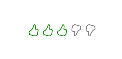
Foodie’s delight
In a restaurant review app, you can use emojis. This adds a playful and visually appealing touch to your app.
XAML
<Grid>
    <Grid.Resources>
        <ResourceDictionary>
            <DataTemplate x:Key="sadSelectedTemplate">
                <Grid Margin="3">
                    <Image Source="Assets/SadSelected.png"/>
                </Grid>
            </DataTemplate>
            <DataTemplate x:Key="sadUnselectedTemplate">
                <Grid Margin="3">
                    <Image Source="Assets/SadUnselected.png"/>
                </Grid>
            </DataTemplate>
            <DataTemplate x:Key="unhappySelectedTemplate">
                <Grid Margin="3">
                    <Image Source="Assets/UnhappySelected.png"/>
                </Grid>
            </DataTemplate>
            <DataTemplate x:Key="unhappyUnselectedTemplate">
                <Grid Margin="3">
                    <Image Source="Assets/UnhappyUnselected.png"/>
                </Grid>
            </DataTemplate>
            <DataTemplate x:Key="neutralSelectedTemplate">
                <Grid Margin="3">
                    <Image Source="Assets/NeutralSelected.png"/>
                </Grid>
            </DataTemplate>
            <DataTemplate x:Key="neutralUnselectedTemplate">
                <Grid Margin="3">
                    <Image Source="Assets/NeutralUnselected.png"/>
                </Grid>
            </DataTemplate>
            <DataTemplate x:Key="happySelectedTemplate">
                <Grid Margin="3">
                    <Image Source="Assets/HappySelected.png"/>
                </Grid>
            </DataTemplate>
            <DataTemplate x:Key="happyUnselectedTemplate">
                <Grid Margin="3">
                    <Image Source="Assets/HappyUnselected.png"/>
                </Grid>
            </DataTemplate>
            <DataTemplate x:Key="excitedSelectedTemplate">
                <Grid Margin="3">
                    <Image Source="Assets/ExcitedSelected.png"/>
                </Grid>
            </DataTemplate>
            <DataTemplate x:Key="excitedUnselectedTemplate">
                <Grid Margin="3">
                    <Image Source="Assets/ExcitedUnselected.png"/>
                </Grid>
            </DataTemplate>

            <local:ImageDataTemplateSelector x:Key="emojiTemplateSelector"
                                             SadTemplate="{StaticResource sadSelectedTemplate}"
                                             SadUnselectedTemplate="{StaticResource sadUnselectedTemplate}"
                                             UnhappyTemplate="{StaticResource unhappySelectedTemplate}"
                                             UnhappyUnselectedTemplate="{StaticResource unhappyUnselectedTemplate}"
                                             NeutralTemplate="{StaticResource neutralSelectedTemplate}"
                                             NeutralUnselectedTemplate="{StaticResource neutralUnselectedTemplate}"
                                             HappyTemplate="{StaticResource happySelectedTemplate}"
                                             HappyUnselectedTemplate="{StaticResource happyUnselectedTemplate}"
                                             ExcitedTemplate="{StaticResource excitedSelectedTemplate}"
                                             ExcitedUnselectedTemplate="{StaticResource excitedUnselectedTemplate}"/>

        </ResourceDictionary>
    </Grid.Resources>

    <syncfusion:SfRating Value="3" ItemsCount="5" ItemSize="40"
                        ItemTemplateSelector="{StaticResource emojiTemplateSelector}" />
</Grid>
C#
public class ImageDataTemplateSelector : DataTemplateSelector
{
     public DataTemplate SadTemplate { get; set; }
     public DataTemplate ExcitedTemplate { get; set; }
     public DataTemplate HappyTemplate { get; set; }
     public DataTemplate NeutralTemplate { get; set; }
     public DataTemplate UnhappyTemplate { get; set; }
     public DataTemplate SadUnselectedTemplate { get; set; }
     public DataTemplate ExcitedUnselectedTemplate { get; set; }
     public DataTemplate HappyUnselectedTemplate { get; set; }
     public DataTemplate NeutralUnselectedTemplate { get; set; }
     public DataTemplate UnhappyUnselectedTemplate { get; set; }

     protected override DataTemplate SelectTemplateCore(object item, DependencyObject container)
     {
         SfRating rating = container as SfRating;
         SfRatingItem ratingItem = item as SfRatingItem;
         if (ratingItem == null)
             return null;

         bool isSelected = ratingItem.IsSelected;
         double ratingValue = rating.Value - 1;

         if (rating.Items.IndexOf(ratingItem) == 0)
             return isSelected && ratingValue == 0 ? SadTemplate : SadUnselectedTemplate;
         if (rating.Items.IndexOf(ratingItem) == 1)
             return isSelected && ratingValue == 1 ? UnhappyTemplate : UnhappyUnselectedTemplate;
         if (rating.Items.IndexOf(ratingItem) == 2)
             return isSelected && ratingValue == 2 ? NeutralTemplate : NeutralUnselectedTemplate;
         if (rating.Items.IndexOf(ratingItem) == 3)
             return isSelected && ratingValue == 3 ? HappyTemplate : HappyUnselectedTemplate;
         if (rating.Items.IndexOf(ratingItem) == 4)
             return isSelected && ratingValue == 4 ? ExcitedTemplate : ExcitedUnselectedTemplate;

         return null;
     }
 }
With the Syncfusion WinUI Rating control, you can design rating controls that align with your app’s unique branding, style, and purpose. Whether you’re building a social networking app, a fitness tracker, or an e-commerce platform, a custom rating control can enhance user engagement.
Explore the creative possibilities of rating controls with the Syncfusion WinUI Rating control and elevate your app’s user experience to new heights.
Conclusion
Thanks for reading! This blog showcases how the Syncfusion WinUI Rating control can be used to design unique and engaging rating systems beyond traditional stars. Feel free to customize this content to match your specific app and audience.
The new version of Essential Studio® is available for existing customers from the License and Downloads page. If you are not a Syncfusion customer, try our 30-day free trial to check out our features.
For questions, you can contact us through our support forums, support portal, or feedback portal. We are always happy to assist you!
 No spam, just valuable updates.