

The Blazor Speed Dial component is an extended version of the Blazor Floating Action Button (FAB) component. It displays multiple, related action buttons when clicked. It appears on top of the other webpage content, like the Floating Action Button. The component is useful when performing more than one primary action on a webpage is required.
In this blog, you will learn about the key features of the new Syncfusion Blazor Speed Dial component and the procedure to get started using this component in a Blazor application.
Key features of Blazor Speed Dial
The key features of the component:
- Built-in support to place the control in different positions.
- Predefined styles for Speed Dial buttons.
- Linear and radial display mode support for action items.
- Icon and template customization.
- WAI-ARIA compliance and keyboard accessibility.
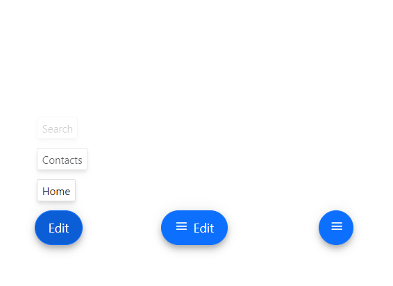
Built-in support to place the control in different positions
The Blazor Speed Dial component provides different built-in positions. If a target is not specified, Speed Dial is positioned based on the browser viewport.
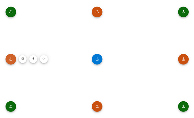
Note: For more information, refer to the Blazor Speed Dial Position demo.
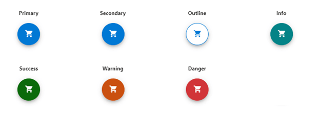
Predefined styles for Speed Dial button
Several predefined styles are available:
|
|
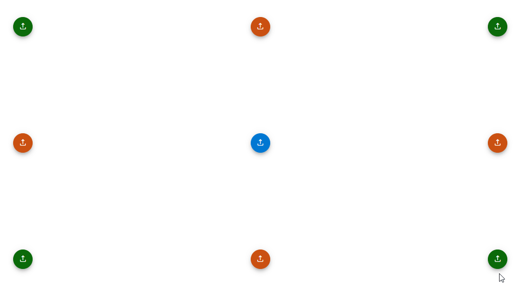
Linear and radial display modes for action items
The Blazor Speed Dial component supports linear and radial display modes for displaying the action items.
Linear
Action items are displayed in a list-like format, either horizontally or vertically, in linear mode. Based on the direction property, we can open the action items on the top, bottom, left, or right side of the main button. For auto positioning, the action items are displayed based on the position of the Speed Dial. Action items are shown as a horizontal list for the left and right sides and a vertical list at the top and bottom.
Radial
In radial mode, action items are displayed in a circular pattern like a radial menu. The start and end angles for radial arrangement are auto-calculated based on position when the start and end angles are not specified.
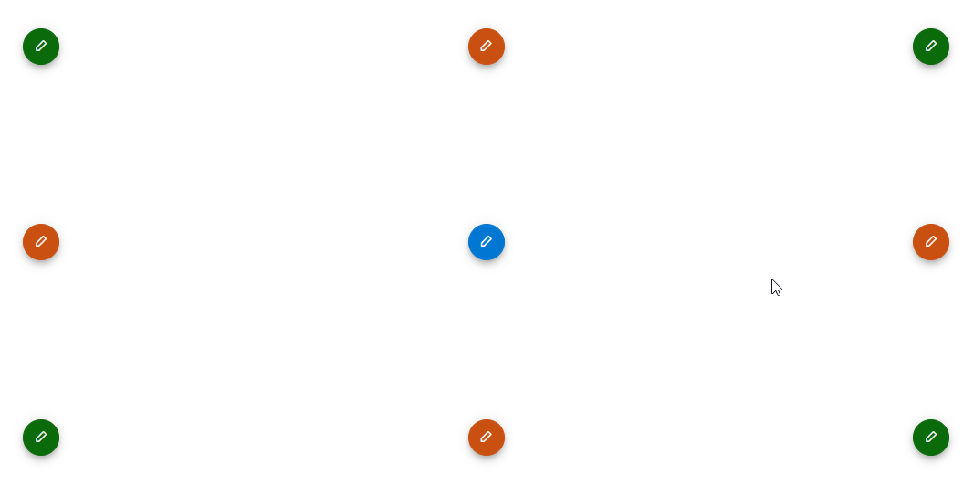
Note: For more details, refer to the Blazor Speed Dial Radial Menu demo.
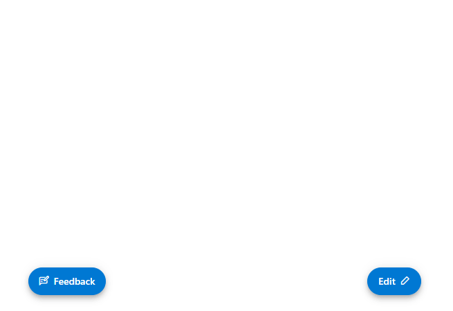
Icon and action items customization
You can easily customize the Speed Dial button and action buttons as:
- Text only.
- Icon with text.
- Icon only.
Note: For more details, refer to the Blazor Speed Dial Icon Customization demo.
Template customization
Customize the action buttons and the entire pop-up of the speed dial using templates.
Note: For more details, refer to Blazor Speed Dial Template Customization demo.
WAI-ARIA compliance and keyboard accessibility
We have designed the Speed Dial component based on WAI-ARIA specifications, applying WAI-ARIA roles, states, properties, and keyboard support for people who use assistive devices.
You can easily interact with the Blazor Speed Dial component using the following keyboard shortcuts, too.
| Key | Functionality |
| Arrow keys | Navigate among the action items. |
| Home | Navigate to the first action item. |
| End | Navigate to the last action item. |
| Enter | Opens and closes the action items. Triggers item click when an action item is focused. |
Getting started with Blazor Speed Dial component
Let’s see the steps to configure the Blazor Speed Dial component in Blazor Server and WebAssembly apps.
Step 1: Create Blazor Server or Blazor WebAssembly app
- Ensure all prerequisites needed to run the Blazor app are installed.
- Create a Blazor Server app or Blazor WebAssembly app using Visual Studio in one of the following:
Step 2: Add the Blazor Speed Dial NuGet reference.
Syncfusion Blazor components are available at NuGet Gallery. To use Syncfusion Blazor components in an application, add a reference to the corresponding package. Refer to NuGet packages for the available NuGet packages list with component details and the benefits of using individual NuGet packages.
To add the Blazor Speed Dial component to your app, open the NuGet package manager in Visual Studio (Tools → NuGet Package Manager → Manage NuGet Packages for Solution), and search for Syncfusion.Blazor.Buttons, and then install it.
Step 3: Register Syncfusion Blazor Service.
Open the ~/_Imports.razor file and import the Syncfusion.Blazor namespace. Then:
- For a Blazor Server app, register the Syncfusion Blazor Service in the ~/Program.cs file for .NET 6 & above and in the ~/Startup.cs file for .NET 5 and .NET 3.X projects.
- For a Blazor WASM app, open the ~/Program.cs file and register the Syncfusion Blazor Service in the client web app.
Blazor Server App (.NET 6)
using Microsoft.AspNetCore.Components;
using Microsoft.AspNetCore.Components.Web;
using Syncfusion.Blazor;

var builder = WebApplication.CreateBuilder(args);

// Add services to the container.
builder.Services.AddRazorPages();
builder.Services.AddServerSideBlazor();
builder.Services.AddSyncfusionBlazor();

var app = builder.Build();
....
Blazor Web Assembly App (.NET 6)
using Microsoft.AspNetCore.Components.Web;
using Microsoft.AspNetCore.Components.WebAssembly.Hosting;
using Syncfusion.Blazor;

var builder = WebAssemblyHostBuilder.CreateDefault(args);
builder.RootComponents.Add<App>("#app");
builder.RootComponents.Add<HeadOutlet>("head::after");

builder.Services.AddScoped(serviceProvider => new HttpClient { BaseAddress = new Uri(builder.HostEnvironment.BaseAddress) });

builder.Services.AddSyncfusionBlazor();
await builder.Build().RunAsync();
....
Step 4: Add style sheet and script references.
To add a theme to the app, open the NuGet package manager in Visual Studio (Tools → NuGet Package Manager → Manage NuGet Packages for Solution), and search for Syncfusion.Blazor.Themes, and then install it. Then, you can refer the theme style sheet from NuGet as follows:
- For a Blazor WASM app, reference scripts in the ~/wwwroot/index.html file.
- For a Blazor Server app, reference scripts in the ~/Pages/_Layout.cshtml file for a .NET 6 project and in the ~/Pages/_Host.cshtml file for a .NET 5 or .NET Core 3.X project.
<head>
    ...
    <link href="_content/Syncfusion.Blazor.Themes/bootstrap5.css" rel="stylesheet" />
    <!--Reference theme style sheet as below if you are using Syncfusion.Blazor Single NuGet-->
    <!--<link href="_content/Syncfusion.Blazor/styles/bootstrap5.css" rel="stylesheet" />-->
</head>
Step 5: Add script reference.
Check out this documentation to learn different ways to add script references in a Blazor application. In this getting started walk-through, the required scripts are referenced using Static Web Assets externally inside the <head>:
- For a Blazor WASM app, reference scripts in the ~/wwwroot/index.html file.
- For a Blazor Server app, reference scripts in the ~/Pages/_Layout.cshtml file for .NET 6 project and in ~/Pages/_Host.cshtml file for .NET 5 and .NET Core 3.X project.
<head>
    ....
    <link href="_content/Syncfusion.Blazor.Themes/bootstrap5.css" rel="stylesheet" />
    <script src="_content/Syncfusion.Blazor.Core/scripts/syncfusion-blazor.min.js" type="text/javascript"></script>
    <!--Use below script reference if you are using Syncfusion.Blazor Single NuGet-->
    <!--<script  src="_content/Syncfusion.Blazor/scripts/syncfusion-blazor.min.js"  type="text/javascript"></script>-->
</head>
Step 6: Add Blazor Speed Dial component.
Add the Syncfusion Blazor Speed Dial component in the Razor file with its items.
@using Syncfusion.Blazor.Buttons

<div id="target" style="min-height:200px; position:relative; width:300px; border:1px solid;">
    <SfSpeedDial Target="#target" OpenIconCss="e-icons e-edit" Position=FabPosition.BottomLeft ItemClicked="clicked" Mode=SpeedDialMode.Radial>
        <SpeedDialItems>
            <SpeedDialItem ID="cut" IconCss="e-icons e-cut" />
            <SpeedDialItem ID="copy" IconCss="e-icons e-copy" />
            <SpeedDialItem ID="paste" IconCss="e-icons e-paste" />
        </SpeedDialItems>
    </SfSpeedDial>
</div>

@code {
    private void clicked(SpeedDialItemEventArgs args)
    {
        switch(args.Item.ID) {
            case "cut":
                //Perform Cut action.
                break;
            case "copy":
                //Perform Copy action.
                break;
            case "paste":
                //Perform Paste action.
                break;
        }
    }
}
You can customize the Speed Dial position using the Position property and the Mode property to display the menu in linear order like a list or a radial menu in a circular pattern. Also, the Speed Dial control triggers the ItemClicked event with the SpeedDialItemEventArgs argument when an action item is clicked. You can use this event to perform the required action.

Conclusion
I hope you enjoyed learning about the new Syncfusion Blazor Speed Dial component and its features. This control is available in our 2022 Volume 3 release. Check out our Release Notes and What’s New pages to discover all the new updates in this release. Try them out and share your thoughts in the comments section below!
For current customers, the new version is available for download from the License and Downloads page. If you are not yet a Syncfusion customer, you can try our 30-day free trial to check out our newest features.
You can also contact us through our support forums, support portal, or feedback portal. We are always happy to assist you!

