
 Jagadeesan Pichaimuthu
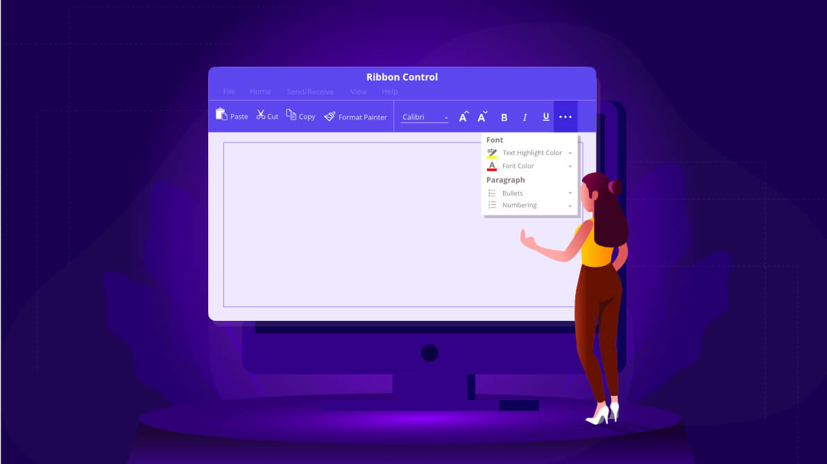
The WPF Ribbon control is now available with a new simplified layout. It was designed to display the most-used ribbon commands in a single-line interface, allowing more screen space for compact viewing of the content. For the best user experience, the other ribbon commands are located in the overflow menu. You can switch back and forth between the simplified and the normal layouts using the minimize button. This feature is available in our Essential Studio® 2020 Volume 2 release.
Why should you prefer this new layout?
- The ribbon items are shown in a single line, showing more vertical space.
- It allows users to choose ribbon items with less distraction than the normal layout.
- It shows the exact commands that the user wants, so it’s simple and straightforward to use.
In this blog, we will see the new simplified layout feature in the WPF Ribbon control and the steps to enable its custom features.
Let’s start exploring!
Setting up the simplified layout
Follow these steps to set up the simplified layout in the WPF Ribbon control:
Step 1: Enable the Ribbon button
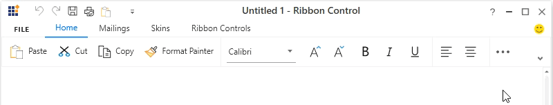
In order to load the Ribbon control, in either simplified or normal layout, the LayoutMode enumeration property is used. Also, the user can switch between simplified and normal layouts at runtime using the built-in minimize button located in the lower-right corner of the Ribbon control. To enable the minimize button, set the EnableSimplifiedLayoutMode Boolean property to True like in the following code.
<Grid>
     <syncfusion:Ribbon x:Name="ribbon" EnableSimplifiedLayoutMode="True" LayoutMode="Simplified" VerticalAlignment="Top">
     </syncfusion:Ribbon>
</Grid>
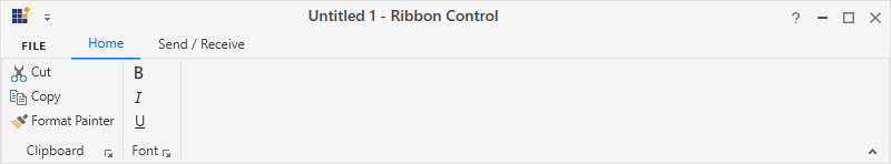
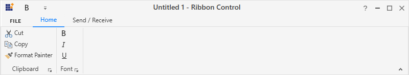
#Step 2: Set up items for different layouts
Moving ahead, the Ribbon items can be either set as the same among different layouts or can be made visible only in a particular layout using the SimplifiedLayoutSettings.DisplayMode attached property.
By default, the items will be displayed in both normal and simplified layouts. The DisplayMode is a flag of enumeration type that contains the following values:
- Normal—Items will be displayed in normal layout.
- Simplified—Items will be displayed in simplified layout.
- OverflowMenu—Items will be displayed inside the OverflowMenu when simplified layout is enabled.
The DisplayMode property also allows you to set the following combinations of values:
- Normal, Simplified—Items will be displayed in both normal and simplified layout.
- Normal, OverflowMenu—Items will be displayed in normal layout and in overflow menu during simplified layout.
- Simplified, OverflowMenu—Items will be displayed in simplified layout.
Note: In simplified layout, the size of Ribbon items (RibbonButton, RibbonDropDownButton, RibbonSplitButton, RibbonGallery, RibbonListBox, RibbonComboBox, RibbonTextBox, RibbonMenuItem, RibbonRadioButton, and RibbonCheckBox) will be adjusted and displayed in a single line. Ribbon also arranges the items properly in MDI applications, and model tab and context tab groups.
Meanwhile, it is not advisable to set properties such as the margin, width, and height of the Ribbon items when simplified layout is used. It might overlap the buttons in the Ribbon control. In the case of switching between normal and simplified layout, these properties can be set for the normal layout alone using triggers like in the following code example.
<syncfusion:RibbonButton Label="Copy" syncfusion:SimplifiedLayoutSettings.DisplayMode="Normal,Simplified"   SizeForm="Small" MediumIcon="/Resources/Copy_20.png" SmallIcon="/Resources/Copy16.png" >
    <syncfusion:RibbonButton.Style>
        <Style TargetType="syncfusion:RibbonButton" BasedOn="{StaticResource SyncfusionRibbonButtonStyle}">
            <Style.Triggers>
                <Trigger Property="syncfusion:SimplifiedLayoutSettings.LayoutMode" Value="Normal">
                    <Setter Property="Height" Value="48"/>
                    <Setter Property="Width" Value="48"/>
                    <Setter Property="Margin" Value="2"/>
                </Trigger>
            </Style.Triggers>
        </Style>
    </syncfusion:RibbonButton.Style>
</syncfusion:RibbonButton>
For normal layout mode, the images from the SmallIcon and LargeIcon properties are used inside the Ribbon items based on the size mode.
However, the simplified layout mode uses the 20×20 image size for the Ribbon items as standard. The image dimension can be obtained from the MediumIcon property. If the VectorImage property is used to display the image, the simplified layout will automatically resize it to 20×20 size.
The code in this GitHub location illustrates setting up a simplified layout: https://github.com/SyncfusionExamples/How-to-customize-the-simplified-layout-in-Ribbon/blob/master/Simplified%20layout%20sample/Window1.xaml.
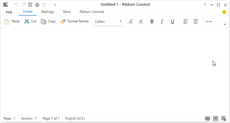
On executing the previous code example, we will get output like the following screenshots.
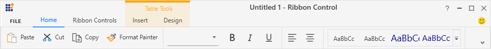
Step 3: Add a new RibbonTab or RibbonBar
The Ribbon control allows you to customize the ribbon and ribbon items through the QAT (quick-access toolbar) window, where users can add ribbon items to a new RibbonTab or RibbonBar. The newly added RibbonTab or RibbonBar will only be visible in the layout in which the items were added originally.
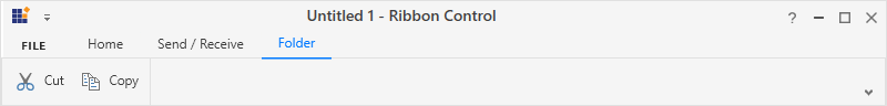
In the following example, the LayoutMode is set as Simplified and a new RibbonTab named Folder was created and added using the QAT window. This tab will now be visible only in the simplified layout and not in the normal layout, which is the standard behavior.
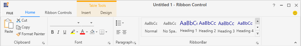
Step 4: Add new items to the QAT
The Ribbon also allows you to add items to the quick access toolbar (QAT) with the help of the QAT window or through the context menu shortcut. The items added to the normal or simplified layouts will always be visible even when switching between layouts.
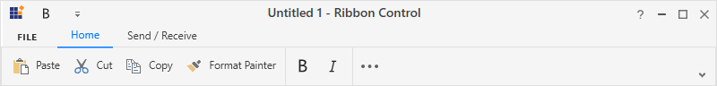
In the following example, the LayoutMode is set as Simplified and the Bold item was added to the QAT through the context menu. This item will now be constantly visible in both normal and simplified layouts.
Step 5: Resize the Ribbon control
While resizing the Ribbon, when the width of the window decreases and touches the last positioned item in the Ribbon, the appropriate item will be moved inside the overflow menu automatically. The same behavior will continue for each item when the window is resized continuously.
Refer to the following .gif image.
Step 6: Customize serialization and deserialization
The Ribbon has built-in serialization support to serialize and deserialize the entire Ribbon’s state and details about the layout. Users can save and load the Ribbon at any time while running the application, with simplified or normal layout.
GitHub sample: https://github.com/SyncfusionExamples/How-to-customize-the-simplified-layout-in-Ribbon
Conclusion
In this blog, I hope you got a clear idea of the newly introduced simplified layout and its custom features in the WPF Ribbon control. This feature is available in our Essential Studio® 2020 Volume 2 release. You can check out all the new features in our release notes and on the What’s New page.
If you are not yet a Syncfusion customer, you can try our 30-day free trial to check out our available features.
If you wish to send us feedback or would like to submit any questions, please feel free to post them in the comments section of this blog post. You can also contact us through our support forum, feedback portal, or Direct-Trac support system. We are always happy to assist you!


 No spam, just valuable updates.