
 Mohamed Samsudeen
In our previous release, we introduced a pair of slider widgets for Flutter that allow you to select a range of values, the Range Slider and Range Selector. In our 2020 Volume 2 release, we are adding a third one to the package, the Slider widget. You can find the beta version of the Syncfusion Flutter Slider package on pub.dev.
The Syncfusion Flutter Slider widget is written natively in Dart. It is a lightweight and highly interactive UI control that allows users to select a single value between a minimum and maximum.
How does it differ from the Range Slider and Range Selector?
The new Slider widget selects a single value, and includes support for both date-time and numeric values. The Range Slider and Range Selector widgets can only be used to select a range of values.
Note: Even though Flutter for web is still in beta, our new Slider supports web platforms in addition to the iOS and Android platforms like all of our Flutter widgets.
The following key features are available in this widget:
- Numeric and date scales
- Thumb with icon
- Labels
- Divisors
- Ticks
- Tooltips with different shapes
- Customization
Let’s briefly discuss the features of this new Slider widget in its initial release. Then, we’ll walk through the steps to add the widget to your application.
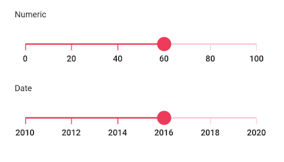
Numeric and date scales
This feature allows you to select numeric and date values. You can render precise intervals for both types of values.
Note: For date values, it is possible to render intervals spanning from years to seconds.
You can easily customize the formats of values, render specific intervals, and add prefixes and suffixes. You can also visualize the values as text.
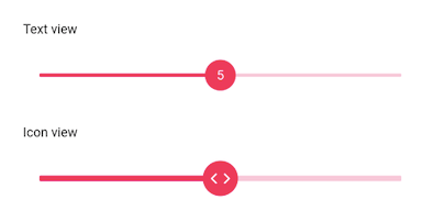
Thumb
This feature allows you to easily interact with the Slider to select a value. It is possible to customize the size, color, and shape of the thumb based on your requirements using the built-in APIs. It also accepts custom widgets like an icon or text as a child.
Divisors
This feature allows you to render divisors in each interval to present the values in an intuitive way. You can also easily customize the size, shape, and position of the divisors.
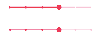
Ticks
This feature allows you to set values for two types of ticks on the scale.:
- Major ticks: Show the value intervals clearly.
- Minor ticks: Help users select a value between two intervals.
It is also possible to customize the positions of ticks.
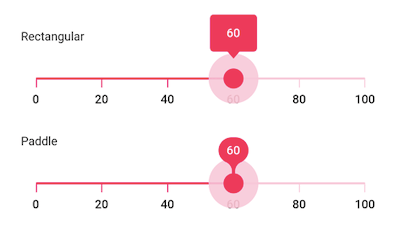
Tooltips
This feature allows you to clearly indicate the current value of the Slider while interacting with it. Two types of tooltip shapes are supported:
- Rectangular
- Paddle
You can select the type of tooltip based on the style of your application. It is also possible to customize the format, text, and visibility of tooltips using the built-in APIs.
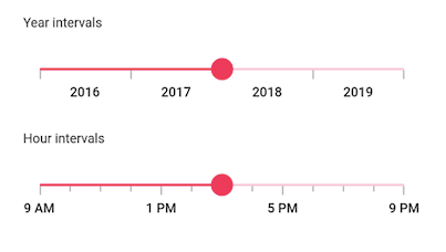
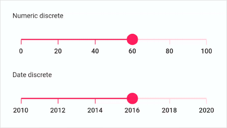
Discrete selection
This feature allows you to discretely select numeric and date values using the Slider. By default, the value is selected continuously. However, in some cases, the value selection has to be restricted for certain values as shown in the following image.
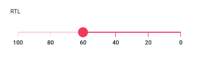
RTL
This feature allows you to arrange the scale values and move the thumb from right to left (RTL). This is helpful for users who are working in the right-to-left languages like Hebrew, Arabic, and others.
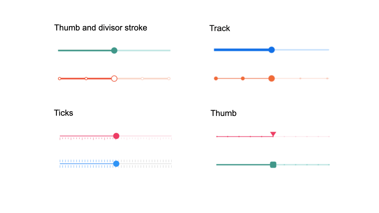
Customization
All the elements of the Slider can be customized using the following:
- Built-in, straightforward APIs.
- Override methods provided for every element.
The following image shows off some of the customizations that can be done in the Slider. You can customize the slider well beyond what is shown based on the requirements of your application.
How to add Flutter Slider to your application
This section explains how to add the Flutter Slider widget to your application and use its basic features.
Step 1: Add the dependency
Add the Syncfusion Flutter Sliders dependency to your pubspec.yaml file.
dependencies:
  syncfusion_flutter_sliders: ^18.2.0.44-beta
Step 2: Get the packages
Run the following command to get the required packages.
$ flutter pub get |
Step 3: Import the library
Now, import the library using the following code.
import 'package:syncfusion_flutter_sliders/sliders.dart';
Step 4: Add Slider to the widget tree
After importing the library, initialize the SfSlider as a child of any widget, such as the Center widget as shown in the following code example.
@override
Widget build(BuildContext context) {
    return MaterialApp(
        home: Scaffold(
            body: Center(
                child:SfSlider()
           )
       )
   );
}
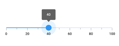
Step 5: Enable Slider elements
Enable the desired elements such as ticks, labels, and tooltips as in the following code example.
double _value = 40.0;

@override
Widget build(BuildContext context) {
  return Scaffold(
     appBar: AppBar(
       title: const Text('Syncfusion Flutter Slider'),
     ),
     body: SfSlider(
       min: 0.0,
       max: 100.0,
       value: _value,
       interval: 20,
       showTicks: true,
       showLabels: true,
       showTooltip: true,
       minorTicksPerInterval: 1,
       onChanged: (dynamic value){
         setState(() {
           _value = value;
         });
       },
     ),
   );
}
Handle value changes
During user interaction, when the value of the Slider is updated, the onChanged event will be called. The Slider then passes the new value to the callback, but it does not change its state until the parent widget rebuilds the Slider with the new value. This can be done using the setState method as shown in the previous code example.
Note: If the onChanged value is null, then the Slider will be disabled.
Conclusion
In this blog post, we discussed the new Syncfusion Flutter Slider and its features. This widget is available in the 2020 Volume 2 release. You can find the complete user guide here, and you can also check out our other samples in this GitHub location. Additionally, you can download and check out our demo app in Google Play and the App Store.
Also, if you need a new widget for the Flutter framework or new features in our existing widgets, including the Slider, please let us know in the comments section below.
You can also contact us through our support forum, Direct-Trac, or feedback portal. We are always happy to assist you!


 No spam, just valuable updates.