
 Mohamed Samsudeen
We are happy to announce the availability of the new Range Slider widget for Flutter in the 2020 Volume 1 release. You can find the beta version of the Syncfusion Flutter Range Slider package on pub.dev.
The Syncfusion Flutter Range Slider widget is written natively in Dart. It is a lightweight and highly interactive UI control that allows users to select a range of values. It has built-in support for both date-time and numeric ranges, ticks, labels, divisors, and tooltips.
Note: Even though Flutter for web is still in beta, the Range Slider supports web platforms in addition to the iOS and Android platforms.
Let’s now briefly cover the features of the Range Slider, and then walk through the steps to add the widget to your application. The following are the widget’s key features:
- Numeric and date scale
- Labels
- Divisors
- Ticks
- Tooltips
- Customization
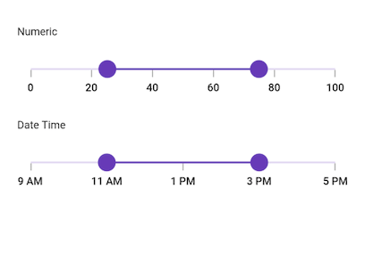
Numeric and date scale
This feature allows you to select numeric and date range values. You can render intervals with precision for both numeric and date ranges. For date ranges, it is possible to render intervals spanning from years to seconds.
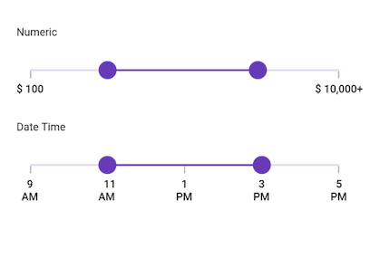
Labels
This feature allows you to easily customize the labels of the range selection. Built-in support for labels is provided based on numeric and date types. You can customize the format, render specific intervals, and add prefixes and suffixes. You can also visualize values as text, such as low, medium, and high.
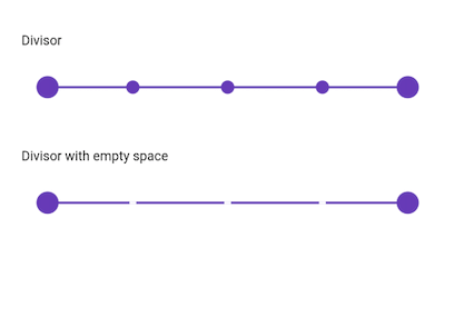
Divisors
This feature allows you to render divisors in each interval to show the range in an intuitive way. You can customize the size, shape, and position of the divisors easily.
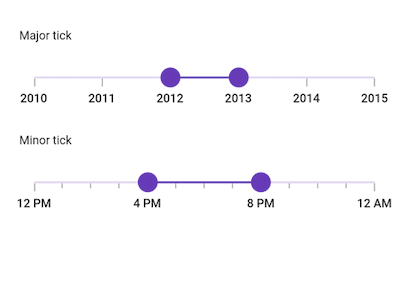
Ticks
This feature allows you to set values for both the major and minor ticks in the scale of the Range Selector. You can use major ticks to show the intervals clearly and minor ticks to help users select a value between two intervals easily. It is also possible to customize the positions of ticks.
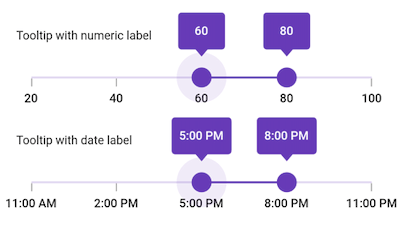
Tooltips
This tooltip feature allows you to clearly indicate the current value of the range selection during interaction. It is possible to customize the format, text, and visibility of tooltips using the built-in APIs.
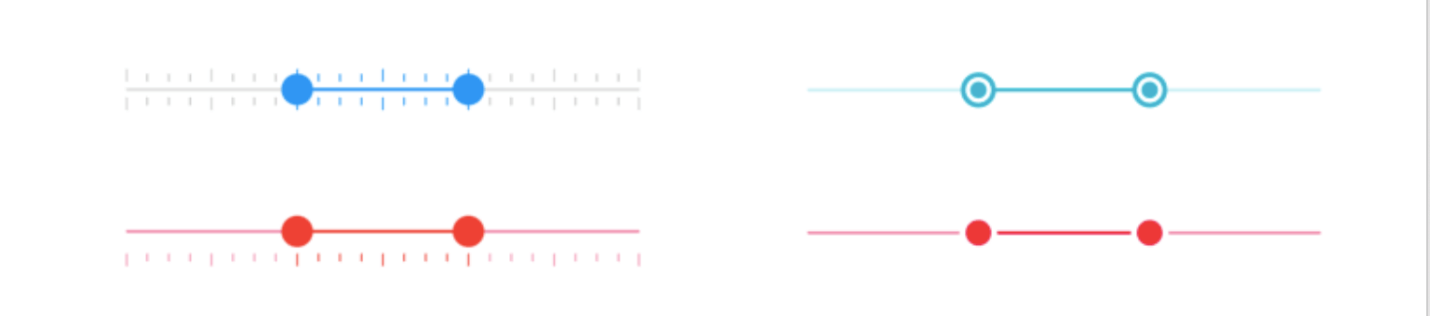
Customization
This feature allows you to fully customize the elements of the Range Slider using the provided APIs. In the following image, we have created a custom drawing for thumbs and ticks. However, it is possible to customize all the elements if desired.
How to add Flutter Range Slider to your application
This section explains how to add the Flutter Range Slider widget to your application and use its basic features.
Step 1: Add dependency
Add the Syncfusion Flutter Sliders dependency to your pubspec.yaml file.
dependencies:
  syncfusion_flutter_sliders: ^18.1.42-beta
Step 2: Get the packages
Run the following commands to get the required packages.
dependencies:
  $ flutter pub get
Step 3: Import the library
Now, import the library using the following code.
import 'package:syncfusion_flutter_sliders/sliders.dart';
Step 4: Add Range Slider to the widget tree
After importing the library, initialize SfRangeSlider as a child of any widget, such as the Center widget.
@override
Widget build(BuildContext context) {
    return MaterialApp(
        home: Scaffold(
            body: Center(
                child: SfRangeSlider()
           )
       )
   );
}
Step 5: Enable Range Slider elements
Enable the desired elements such as ticks, labels, and tooltips to show the selected range of values in the Range Slider.
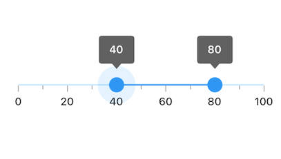
SfRangeValues _values = SfRangeValues(40.0, 80.0);

  @override
  Widget build(BuildContext context) {
    return Scaffold(
      appBar: AppBar(
        title: const Text('Syncfusion Flutter Range Slider'),
      ),
      body: Center(
        child: SfRangeSlider(
          min: 0.0,
          max: 100.0,
          values: _values,
          interval: 20,
          showTicks: true,
          showLabels: true,
          showTooltip: true,
          minorTicksPerInterval: 1,
          onChanged: (SfRangeValues values){
            setState(() {
              _values = values;
            });
          },
        ),
      ),
    );
  }
Handle value changes
During interaction, when the values of the Range Slider are updated, the onChanged event will be called. The Range Slider passes the new values to the callback, but it does not change its state until the parent widget rebuilds the Range Slider with the new values using the setState method as shown in the previous code example.
Note: If onChanged is set as null, then the Range Slider will be disabled.
What’s next
In our upcoming releases, we have plans to include the following features in the Range Slider:
- Accessibility
- Vertical slider
- Gradient support
- Different tooltip designs
- Auto interval support
- Deferred update
Conclusion
In this blog post, we walked through the new Syncfusion Flutter Range Slider and its features. This widget is available in the 2020 Volume 1 release. You can find the complete user guide here, and you can also check out our samples in this GitHub location. Additionally, you can download and check out our demo app in Google Play and the App Store.
Also, if you need a new widget for the Flutter framework or new features in our existing widgets, you can contact us through our support forum, Direct-Trac, or feedback portal. We are always happy to assist you!


 No spam, just valuable updates.
Comments (1)
Very informative post!! Thanks for sharing with us