
 Mohamed Samsudeen
In this previous post, we talked about one of our new widgets, the Range Slider, for selecting a range of values. At times, you may need to add another widget like Charts or an image as a child to it. So, here is another interesting widget that looks like the Range Slider, but has additional features: the Range Selector widget. This Range Selector widget is also available with our 2020 Volume 1 release.
The Syncfusion Flutter Range Selector is written natively in Dart. It is a lightweight and highly interactive UI widget that allows users to select a range of values from a larger data set. It has built-in support to select both date-time and numeric ranges. It also supports ticks, labels, divisors, and tooltips and, more importantly, allows you add to another widget as a child to it.
Note: Even though Flutter for web is still in beta, the Range Slider supports web platforms in addition to the iOS and Android platforms.
Let’s now briefly cover the features of the Range Selector, and then walk through the steps to add the widget to your application. The following are the widget’s key features:
- Numeric and date scales
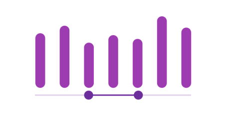
- Divisors
- Ticks
- Tooltips
- Built-in integration with Charts
Numeric and date scales
This feature allows you to select numeric and date ranges. You can render intervals with precision for both numeric and date ranges. For date ranges, render intervals spanning from years to seconds.
You can easily customize the labels of the range selection. Built-in support for labels is provided based on numeric and date types. You can customize the format, render specific intervals, and add prefixes and suffixes. You can also visualize values as text, like: Low, Medium, High.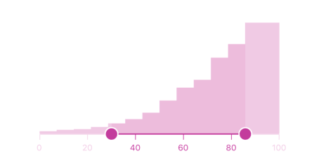
Divisors
Render divisors in each interval to show the ranges in an intuitive way. You can customize the size, shape, and position of the divisors easily.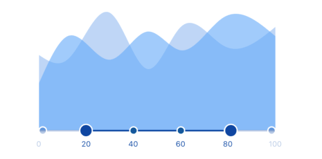
Ticks
Set both major and minor ticks in the scale of range selector. You can use major ticks to show the intervals clearly and minor ticks to help choose the values between two intervals easily. It is also possible to customize the positions of ticks.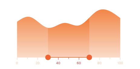
Tooltips
Use tooltips to indicate clearly the current selection of the range during interaction. You can customize the format, text, and visibility using the built-in APIs.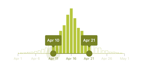
Built-in integration with Charts
Select a segment in the Range Selector to zoom a chart based on the selected range without any additional effort.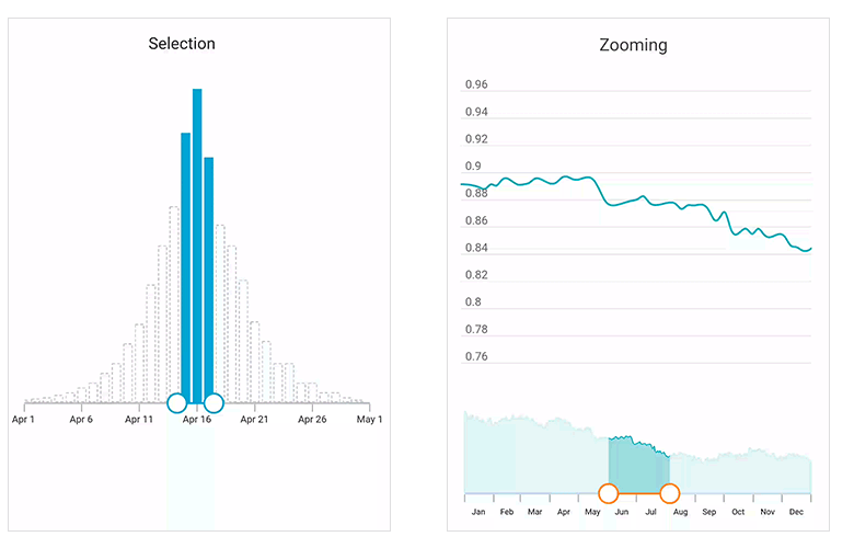
Add the Flutter Range Selector to your application
This section explains how to add the Flutter Range Selector widget to your application and use its basic features.
Step 1: Add dependency.
Add the Syncfusion Flutter Sliders dependency to your pubspec.yaml file.
dependencies:
  syncfusion_flutter_sliders: ^18.1.36-beta
Step 2: Get packages.
Run the following command to get the required packages.
dependencies:
  $ flutter pub get
Step 3: Import the library.
Now, import the library using the following code.
import 'package:syncfusion_flutter_sliders/sliders.dart';
Step 4: Add Range Selector to the widget tree.
After importing the library, initialize SfRangeSelector as a child of any widget, such as the Center widget.
@override
Widget build(BuildContext context) {
    return MaterialApp(
        home: Scaffold(
            body: Center(
                child: SfRangeSelector()
           )
       )
   );
}
Step 5: Enable Range Selector elements.
Enable the desired elements such as ticks, labels, and tooltips to show the selected range of values in the Range Selector. Also, add a child of any type inside the Range Selector. Here, the Charts widget is added as a child.
final double _min = 2.0;
final double _max = 10.0;
SfRangeValues _values = SfRangeValues(5.0, 8.0);

final List chartData = [
    Data(x:2.0, y: 2.2),
    Data(x:3.0, y: 3.4),
    Data(x:4.0, y: 2.8),
    Data(x:5.0, y: 1.6),
    Data(x:6.0, y: 2.3),
    Data(x:7.0, y: 2.5),
    Data(x:8.0, y: 2.9),
    Data(x:9.0, y: 3.8),
    Data(x:10.0, y: 3.7),
];

@override
Widget build(BuildContext context) {
  return MaterialApp(
      home: Scaffold(
          body: Center(
              child: SfRangeSelector(
                    min: _min,
                    max: _max,
                    interval: 1,
                    showLabels: true,
                    showTicks: true,
                    initialValues: _values,
                    child: Container(
                    height: 130,
                    child: SfCartesianChart(
                        margin: const EdgeInsets.all(0),
                        primaryXAxis: NumericAxis(minimum: _min,
                            maximum: _max,
                            isVisible: false,),
                        primaryYAxis: NumericAxis(isVisible: false),
                        plotAreaBorderWidth: 0,
                        series: <SplineAreaSeries<Data, double>>[
                            SplineAreaSeries<Data, double>(
                                color: Color.fromARGB(255, 126, 184, 253),
                                dataSource: chartData,
                                    xValueMapper: (Data sales, _) => sales.x,
                                    yValueMapper: (Data sales, _) => sales.y)
                            ],
                        ),
                   ),
              ),
          )
      )
  );
}
class Data {
  Data({this.x, this.y});
  final double x;
  final double y;
}
Handling value changes
The Range Selector widget maintains its state internally. The widget calls the onChanged callback with the new values when the values are updated.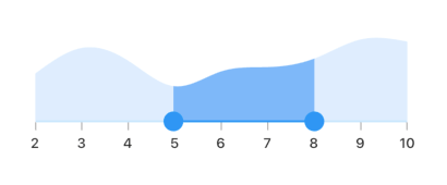
Handle selection and zooming with Charts
You can select the segments or zoom a chart based on the selected range in Range Selector by using the same instance of RangeController for SfRangeSelector and SfChart as shown in the following code snippet.
For selection
class _RangeSelectorPageState extends State
    with SingleTickerProviderStateMixin {
 final double _min = 2.0;
 final double _max = 10.0;
 RangeController _rangeController;

@override
void initState() {
  super.initState();
    _rangeController = RangeController(
    start: _values.start,
    end: _values.end);
}

@override
Widget build(BuildContext context) {
 return MaterialApp(
     home: Scaffold(
         body: Center(
                   .........
                   SfRangeSelector(
                   controller: _rangeController,
                   ......
                   SfCartesianChart(
                       series: <SplineAreaSeries<Data, double>>[
                           SplineAreaSeries<Data, double>(
                               selectionSettings: SelectionSettings(
                                   selectionController: _rangeController
                   ..........
          ),
     }
For zooming
class _RangeSelectorPageState extends State
    with SingleTickerProviderStateMixin {
 final double _min = 2.0;
 final double _max = 10.0;
 RangeController _rangeController;

@override
void initState() {
  super.initState();
    _rangeController = RangeController(
    start: _values.start,
    end: _values.end);
}

@override
Widget build(BuildContext context) {
 return MaterialApp(
     home: Scaffold(
         body: Center(
                   .........
                   SfRangeSelector(
                   controller: _rangeController,
                   ......
                   SfCartesianChart(
                       primaryXAxis: NumericAxis(
                           minimum: _min,
                           maximum: _max,
                           rangeController: _rangeController),
                   ..........
          ),
     }
What is coming next?
In our upcoming releases, we have plans to include more exciting features in the Range Selector. Some of the features you can expect are:
- Accessibility
- A vertical slider
- Gradient support
- Different tooltip designs
- Auto interval support
- Deferred updating
Conclusion
In this blog post, we walked through our new Syncfusion Flutter Range Selector and its features. You can try this widget and share your feedback in the comments section. This widget is available in our 2020 Volume 1 release.
You can find the complete user guide here and you can also check out our samples in this GitHub location. Additionally, you can check out our demo apps in Google Play Store, App Store, and our website.
Also, if you need a new widget for the Flutter framework or new features in our existing widgets, you can contact us through our support forum, Direct-Trac, or feedback portal. As always, we are happy to assist you!


 No spam, just valuable updates.