
 Moneeshram Dhanabal
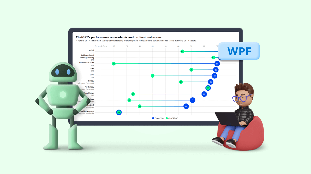
Welcome to our “Chart of the Week” blog series.
Today, we will visualize the performance of ChatGPT on academic and professional exams using the Syncfusion WPF Range Column Chart control. Please note that this control is supported only on desktops running Windows OS.
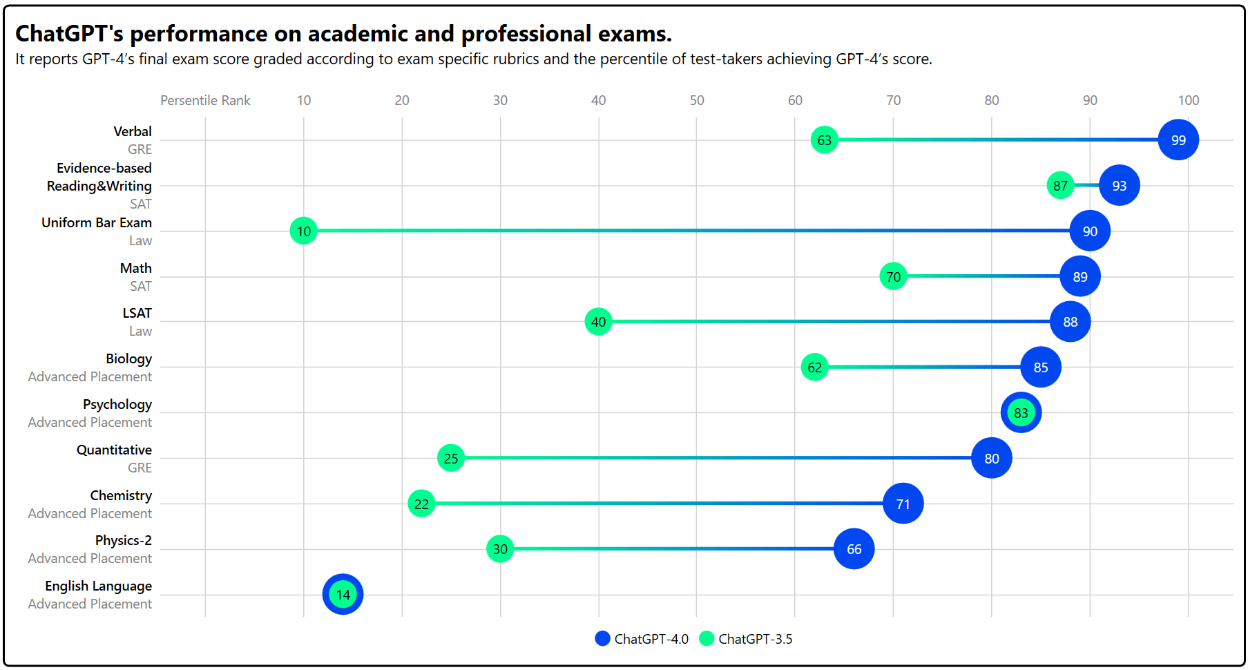
The ChatGPT-4 version was released in March 2023, which is significantly more capable than GPT-3.5, released in March 2022. OpenAI ChatGPT-4 demonstrates human-level performance on most professional and academic exams.
To assess the capabilities of ChatGPT, OpenAI has simulated test runs for various professional and academic exams, including SATs, the bar examination, and various advanced placement (AP) finals. Notably, it passed a simulated version of the Uniform Bar Examination, scoring in the top 10% of test takers.
Now, let’s explore how to use the Syncfusion WPF Range Column control to visualize ChatGPT’s performance on academic and professional exams.
Step 1: Gathering ChatGPT percentile data
Before creating a chart, we should gather the performance data from the ChatGPT-4.0 Technical Report.
Step 2: Preparing the data for the chart
To create a range column chart, we need to provide the percentile data in a specific format. To achieve this, we should create the Model class to hold data using the ExamType, Subject, ChatGPT_4, and ChatGPT_35 properties. And we use the ExamName property to combine exam type and subject in a single string to display them in chart axis labels.
Refer to the following code example.
public class Model
{
    private string _subject;
    private string _examType;
    private string _examName;

    public string ExamName
    {
        get { return _examName; }
    }

    public string Subject
    {
        get { return _subject; }
        set
        {
            _subject = value;
            _examName = _subject + "\n" + _examType;
        }
    }

    public string? ExamType
    {
        get { return _examType; }
        set
        {
            _examType = value;
            _examName = _subject + "\n" + _examType;
        }
    }

    public double ChatGPT_4 { get; set; }
    public double ChatGPT_35 { get; set; }
}
We then need to generate the collection of ChatGPT’s scores in the Model class along with its ChatGPT_4 and ChatGPT_35 properties. To do this, we should create an ObservableCollection of type Model in the ViewModel class and store the Model class objects with percentile scores from the reference PDF. Then, set the ViewModel class as the chart’s data context.
public class ViewModel
{
    public ObservableCollection<Model> Data { get; set; }

    public ViewModel()
    {

        Data = new ObservableCollection<Model>();
        Data.Add(new Model() { Subject = "Verbal", ExamType="GRE", ChatGPT_35 = 63, ChatGPT_4 = 99 });
        Data.Add(new Model() { Subject = "Evidence-based Reading & Writing", ExamType ="SAT", ChatGPT_35 = 87, ChatGPT_4 = 93 });
        Data.Add(new Model() { Subject = "Uniform Bar Exam", ExamType ="Law", ChatGPT_35 = 10, ChatGPT_4 = 90 });
        Data.Add(new Model() { Subject = "Math", ExamType ="SAT", ChatGPT_35 = 70, ChatGPT_4 = 89 });
        Data.Add(new Model() { Subject = "LSAT", ExamType ="Law", ChatGPT_35 = 40, ChatGPT_4 = 88 });
        Data.Add(new Model() { Subject = "Biology", ExamType ="Advanced Placement", ChatGPT_35 = 62, ChatGPT_4 = 85 });
        Data.Add(new Model() { Subject = "Psychology", ExamType ="Advanced Placement", ChatGPT_35 = 83, ChatGPT_4 = 83 });
        Data.Add(new Model() { Subject = "Quantitative", ExamType ="GRE", ChatGPT_35 = 25, ChatGPT_4 = 80 });
        Data.Add(new Model() { Subject = "Chemistry", ExamType ="Advanced Placement", ChatGPT_35 = 22, ChatGPT_4 = 71 });
        Data.Add(new Model() { Subject = "Physics-2", ExamType ="Advanced Placement", ChatGPT_35 = 30, ChatGPT_4 = 66 });
        Data.Add(new Model() { Subject = "English Language", ExamType ="Advanced Placement", ChatGPT_35 = 14, ChatGPT_4 = 14 });

        var list = Data;
    }
}
Step 3: Configuring the Syncfusion WPF Charts
Let’s configure the Syncfusion WPF Charts control using this documentation.
To visualize ChatGPT’s performance on each exam, we’ll use the RangeColumnSeries instance.
<sync:RangeColumnSeries ItemsSource="{Binding Data}" XBindingPath="ExamName" High="ChatGPT_4" Low="ChatGPT_35" IsTransposed="True" SegmentSpacing="0.9" VisibilityOnLegend="Collapsed">
 <sync:RangeColumnSeries.Interior>
  <LinearGradientBrush>
   <GradientStop Offset="0" Color="#00ff8f"/>
   <GradientStop Offset="1" Color="#0047F0"/>
  </LinearGradientBrush>
 </sync:RangeColumnSeries.Interior>
</sync:RangeColumnSeries>
In the above example, we’ve bound our chart’s ItemsSource property to the Data property containing both ChatGPT versions’ (4 and 3.5) percentile data. We have also specified the XBindingPath, High, and Low properties with the ExamName, ChatGPT_4, and ChatGPT_35 properties, respectively, which inform the chart about the data points to be utilized for the x- and y-axes, respectively.
Additionally, we have customized the chart design by adjusting the segment spacing, adding a gradient interior, and transposing the series.
Step 4: Customizing the chart appearance
We can customize the WPF Range Column Chart’s appearance by changing the axis style and adding custom data labels, titles, axis label templates, and more.
Refer to the following code example to customize the chart title and align its position.
<sync:SfChart Margin="5" HorizontalHeaderAlignment="Left">
 <sync:SfChart.Header>
  <StackPanel Orientation="Vertical">
   <TextBlock HorizontalAlignment="Left" Text="ChatGPT’s performance on academic and  professional exams." FontSize="22" FontWeight="Bold"/>
   <TextBlock Text="It reports GPT-4’s final exam score graded according to exam-specific rubrics and the percentile of test-takers achieving GPT-4’s score." HorizontalAlignment="Left" FontSize="15" />
  </StackPanel>
 </sync:SfChart.Header>
</sync:SfChart>
Let’s customize the x- and y-axes’ elements—like interval, text color, font size, grid line style, axis lines, tick lines, and more.
<sync:SfChart.Resources>
 <ResourceDictionary>
  <Style TargetType="Line" x:Key="lineStyle">
   <Setter Property="Stroke" Value="LightGray"/>
  </Style>
  <Style TargetType="Line" x:Key="axisStyle">
   <Setter Property="Stroke" Value="Transparent"/>
  </Style>
  <DataTemplate x:Key="AxisLabel">
   <StackPanel Orientation="Vertical" Width="130">
    <TextBlock Text="{Binding LabelContent}" FontSize="13"
               TextAlignment="Right"
               Loaded="TextBlock_Loaded" TextWrapping="Wrap"/>
   </StackPanel>
  </DataTemplate>
 </ResourceDictionary>
</sync:SfChart.Resources>

<sync:SfChart.PrimaryAxis>
 <sync:CategoryAxis IsInversed="True" MajorGridLineStyle="{StaticResource lineStyle}"
                    LabelTemplate="{StaticResource AxisLabel}"
                    AxisLineStyle="{StaticResource axisStyle}" TickLineSize="0">
 </sync:CategoryAxis>
</sync:SfChart.PrimaryAxis>

<sync:SfChart.SecondaryAxis>
 <sync:NumericalAxis OpposedPosition="True" Interval="10" PlotOffset="15"
                     LabelCreated="NumericalAxis_LabelCreated"
                     Minimum="0" Maximum="100" AxisLineStyle="{StaticResource axisStyle}"
                     TickLineSize="0" MajorGridLineStyle="{StaticResource lineStyle}" >
  <sync:NumericalAxis.LabelStyle>
   <sync:LabelStyle FontSize="13" Foreground="Gray"/>
  </sync:NumericalAxis.LabelStyle>
 </sync:NumericalAxis>
</sync:SfChart.SecondaryAxis>
In the previous code, we defined the transparent axis line style to hide the axis line using the chart resources dictionary. Then, we added a custom axis label template to customize the Category axis labels or any type of axes labels using the LabelTemplate property.
For multi-line wrapping of axis labels, I have added the Loaded event and different FontWeight and Foreground for each wrapped line using the following code example.
Private void TextBlock_Loaded(object sender, RoutedEventArgs e)
{
    var textBlock = sender as TextBlock;
    var text = textBlock.Text;
    var lines = text.Split(new[] { ‘\r’, ‘\n’ });

    if (lines.Length > 1)
    {
        var lastLine = lines[lines.Length – 1];
        var lastLineRun = new Run(lastLine) { Foreground=Brushes.Gray };
        var initialTexts = text.Substring(0, text.Length – lastLine.Length);
        var initialTextsRun = new Run(initialTexts) { FontWeight = FontWeights.Medium,
                                             Foreground=Brushes.Black };
        textBlock.Inlines.Clear();
        textBlock.Inlines.Add(initialTextsRun);
        textBlock.Inlines.Add(lastLineRun);
    }
}
Refer to the following code example to customize the numerical axis labels using the LabelCreated event.
private void NumericalAxis_LabelCreated(object sender, LabelCreatedEventArgs e)
{
    if (e.AxisLabel.LabelContent is string label && label == "0")
    {
        e.AxisLabel.LabelContent = "Persentile Rank";
    }
}
To customize the chart data labels, we’ll use the ChartAdornmentInfo and LabelTemplate properties. To display the data labels, enable the ShowLabel property and set the value of the SegmentLabelContent property as YValue. However, to show both high- and low-value data labels, we use two ScatterSeries and set the ShowLabel property value as True. To hide the data label border, set the UseSeriesPalette property as False.
<sync:ScatterSeries ItemsSource="{Binding Data}" XBindingPath="ExamName" Interior="#0047F0" ScatterHeight="40" YBindingPath="ChatGPT_4" IsTransposed="True" Label="ChatGPT-4.0"  ScatterWidth="40">
 <sync:ScatterSeries.AdornmentsInfo>
  <sync:ChartAdornmentInfo ShowLabel="True" SegmentLabelContent="YValue" FontSize="13" Foreground="White" UseSeriesPalette="False" />
 </sync:ScatterSeries.AdornmentsInfo>
</sync:ScatterSeries>

<sync:ScatterSeries ItemsSource="{Binding Data}" XBindingPath="ExamName" Interior="#00ff8f" YBindingPath="ChatGPT_35" IsTransposed="True" Label="ChatGPT-3.5" ScatterHeight="27" ScatterWidth="27">
 <sync:ScatterSeries.AdornmentsInfo>
  <sync:ChartAdornmentInfo ShowLabel="True" SegmentLabelContent="YValue" FontSize="13" UseSeriesPalette="False"/>
 </sync:ScatterSeries.AdornmentsInfo>
</sync:ScatterSeries>
To customize individual legend items of each series, you can use the IconWidth, IconHeight, and FontSize properties. Here, we are going to display only the high (ChatGPT 4) and low (ChatGPT 3.5) value data labels for the legends in each scatter series. To restrict the RangeColumnSeries legend, we’ve set its VisibilityOnLegend property as Collapsed.
<sync:SfChart.Legend>
 <sync:ChartLegend IconHeight="15" IconWidth="15" FontSize="13"/>
</sync:SfChart.Legend>

<sync:RangeColumnSeries ItemsSource="{Binding Data}" XBindingPath="ExamName"
    . . .
    VisibilityOnLegend="Collapsed">
    . . .
</sync:RangeColumnSeries>
After executing these code examples, we will see output like in the following image.
GitHub reference
For more details, refer to the demo on GitHub.
Conclusion
Thanks for reading! In this blog, we have seen how to use the Syncfusion WPF Range Column Chart to visualize ChatGPT’s performance on academic and professional exams. You can visualize other trends and changes over time in any data. We encourage you to try the steps discussed and share your thoughts in the comments below.
You can also contact us via our support forum, support portal, or feedback portal. We are always eager to help you!


 No spam, just valuable updates.