
 Sumankumar G
Syncfusion Essential JS 2, a comprehensive collection of UI controls for building modern web applications, has released its highly anticipated 2023 Volume 2 update. This release brings exciting new features and enhancements for various components.
We’ll explore them in this blog post!
Material 3 theme
To keep up with the latest design trends, Syncfusion Essential JS 2 now includes Material 3 theme support. This theme has both light and dark variants and has been applied to all UI controls. With the Material 3 theme, your web apps will look modern and visually appealing.
Production-ready components
The following components have been developed to meet industry standards and are now production-ready:
- Image Editor: With this control, users can effortlessly edit and manipulate images, enjoying a seamless editing experience. For more details, refer to its demos.
- Skeleton: Skeleton is designed to enhance the user experience by presenting placeholder content while the actual content is loaded. For more details, explore its demos.
Carousel component
The Carousel component has received significant enhancements in this release, making it more user-friendly. The new features include:
- Swipe and drag slides: Users can now change slides in the Carousel using swipe or drag gestures. This improvement enhances the usability of the component on mobile devices such as phones and tablets.
- Indicator customization: The Carousel now offers indicator customization options, such as dynamic, progressive, and fraction indicators. Users can choose the indicator style that best fits their app’s needs. For more details, try viewing our demos.
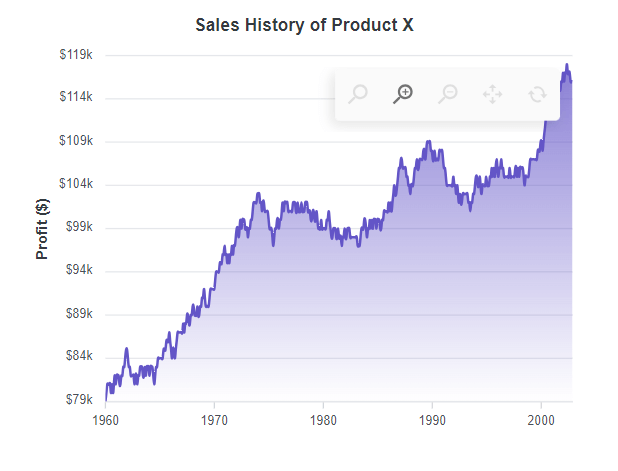
Charts
The Charts component has also received several new features and improvements:
- Title position: Users can now position the chart title to the left, right, or bottom, providing more flexibility in chart customization.
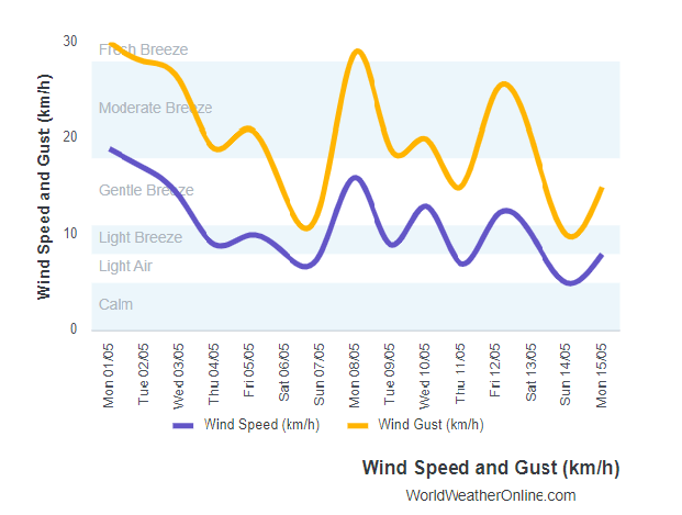
Customizing the Charts title position - Pareto line customization: The Pareto chart axis and the line can now be customized with options like marker, width, dash array, and color. This allows users to create visually appealing and informative Pareto charts. For more details, check out the demos.
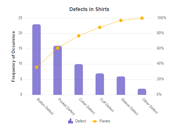
Pareto line customization in Charts component - Cross marker: The Charts component now supports a cross-shaped marker to highlight important data points. Thus, it’s easier for users to interpret the chart.

Cross marker in Charts component - Scroll bar customization: Users can customize the axis scroll bar by changing its color and height. Additionally, they can now disable zooming in the scrollbar, giving users more control over chart interactions.
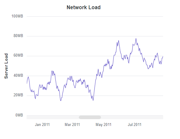
Scrollbar customization in Charts component - Zoom toolbar: Now, you can see a zoom toolbar with zoom-in and zoom-out options on the initial loading of the Charts component.
Zoom toolbar in the Charts component
Data manager persistence support
This feature improves the synchronization of the components bound through the data manager by persistently storing data processing within a single component. This helps maintain data consistency and integrity within the app.
Full-screen view in date selection components
The DatePicker, DateRangePicker, and DateTime Picker components have received full-screen view support for mobile devices.
Users can now view and select dates from a full-screen calendar interface on mobile devices. This enhancement improves the usability of apps that heavily rely on date selection, providing a more intuitive and immersive experience.
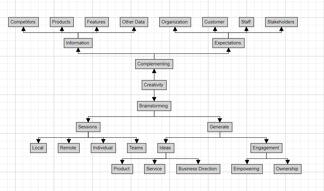
Vertical layout in Diagram component
The Diagram component now supports vertical orientation for mind maps. Users can create mind maps vertically and arrange the tree branches from top to bottom. This feature offers a new perspective for visualizing hierarchical data and enhances the flexibility of the Diagram component.
Word Processor
We have rolled out the following new features for the Word Processor component:
- Character spacing and scaling: Users can now customize the appearance of the text in a document by adjusting the character spacing and scaling. This feature allows users to increase or decrease the space between characters and scale the text size, making it easier to read and save space.
- Link to previous header or footer: Users can now link or unlink the header and footer of the previous section to the current section in a text document. This can be useful if you want to create a consistent look across your document or if you want to create different headers and footers for each section in the document.
- Alternate text for images: In text documents, users can now include alternative text (alt text) for images. Alt text is critical for ensuring accessibility, allowing visually impaired users to comprehend the document’s content.
By providing alt text, individuals utilizing screen readers or other assistive technologies can clearly understand the images within the document. For more details, explore the control’s demos.
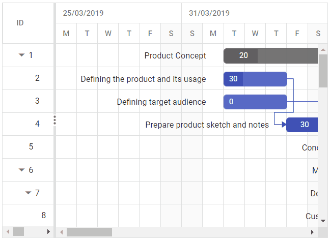
Improved taskbar editing in Gantt Chart
The Gantt Chart component has received a significant user interface enhancement related to taskbar resizing and moving. When you resize or move a taskbar by dragging it, a virtual element will be displayed until the toolbar is dropped. This improvement gives users a visual representation of the changes they make to the toolbar, allowing for more precise editing and an enhanced overall user experience. For more details, refer to the control demos.
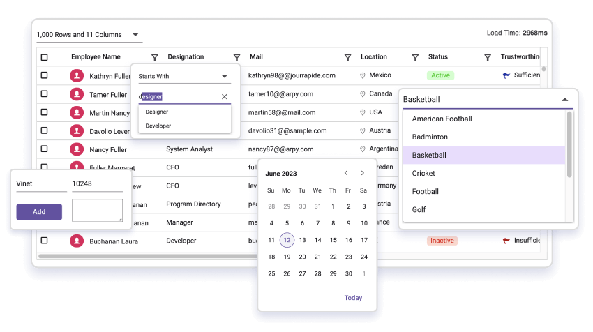
DataGrid
The new features added to the DataGrid component are as follows:
- Preserve expand or collapse state: This feature helps maintain the current expand or collapse state of the grouped rows even when manipulating the grid’s data. Only the affected rows are refreshed by implementing the partial row refresh, reducing unnecessary data processing and improving the overall grid performance.
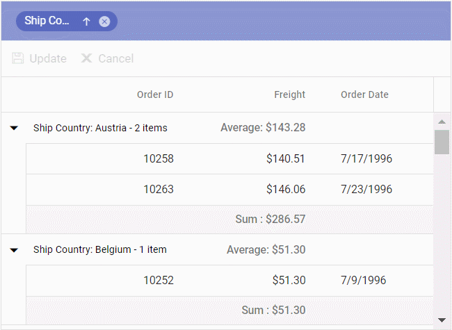
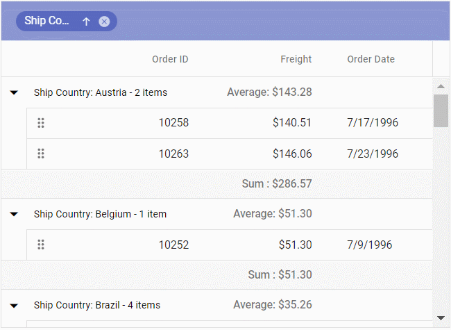
Preserving the expand or collapse state of grouped rows in the DataGrid component - Row drag and drop with grouping: Users can now rearrange rows organized into groups using the drag-and-drop functionality. This enhancement provides a seamless way to reorder rows within grouped sections of a grid.
Dragging and dropping grouped rows in DataGrid - Responsive pager: The pager component in the DataGrid is now responsive. As the user adjusts the browser window size, the pager dynamically adjusts its display to ensure an optimal viewing experience. The page numbers may appear or disappear based on the available space, providing a responsive and user-friendly interface.
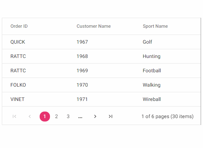
Responsive pager in DataGrid component
Image Editor
The Image Editor component has received the following new exciting updates:
- Quick access toolbar support: While selecting annotations like rectangles, ellipses, lines, arrows, text, or freehand drawings, a toolbar with quick-access options will be displayed. Using it, you can easily clone, delete, or edit text annotations.
- Path support: You can create, modify, and manipulate custom shapes within an image using paths. Paths are editable curves with anchor points connected by control handles, providing precise control over object boundaries.
- Arrow support: Users can now draw and customize arrows with precision. Create, modify, and customize arrows according to user preferences. Arrows effectively highlight objects or draw attention to specific details, making the image more impactful and engaging.
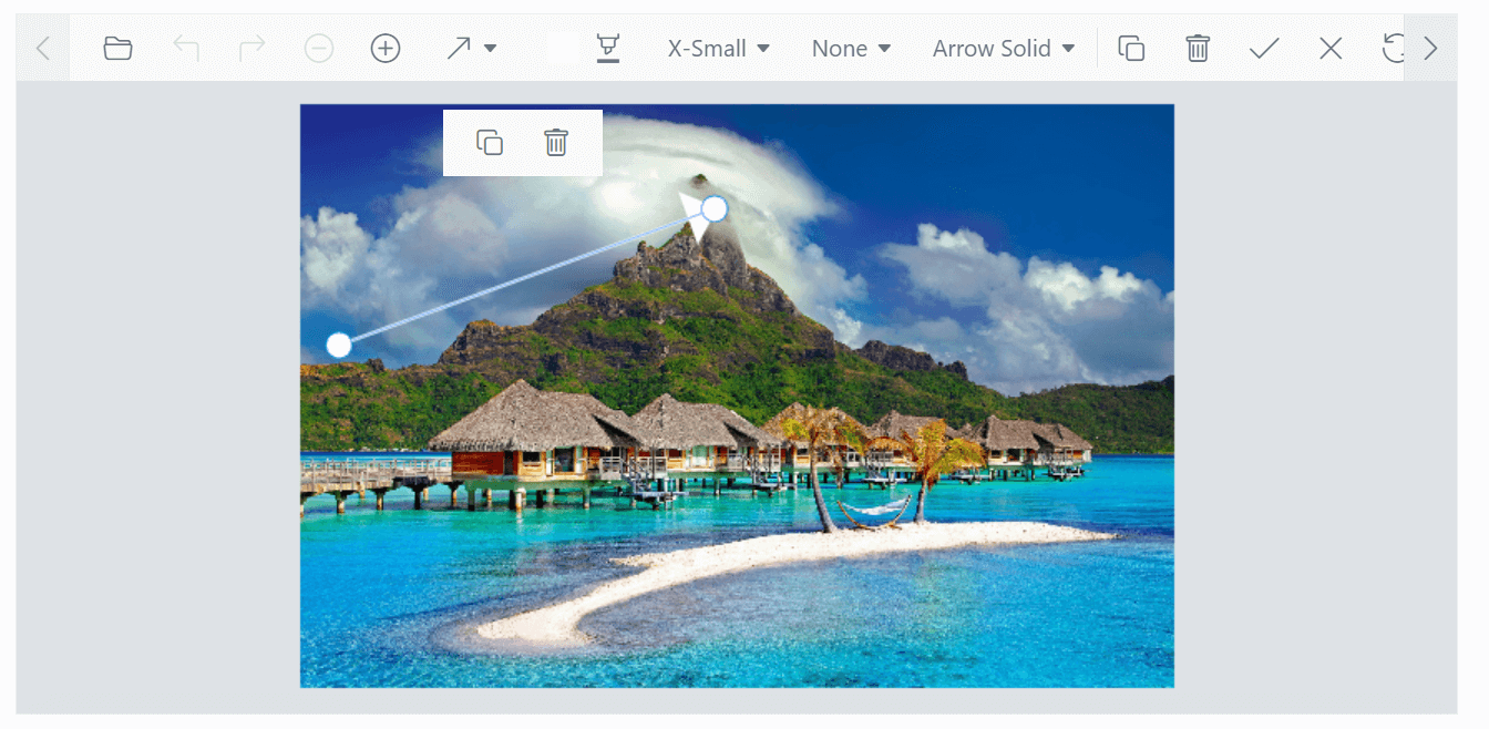
Enhancements in the Image Editor component
Virtual scrolling in Kanban
The virtual scrolling support in the Kanban component includes dynamic loading for on-demand data retrieval, smooth scrolling animations, adaptive rendering for different devices, customization options for scroll behavior and appearance, accessibility improvements for screen readers, and overall performance optimizations. These updates significantly enhance the usability, speed, and accessibility of the Kanban board, enabling users to navigate through large amounts of data effortlessly. For more details, refer to the component demos.

Server-side Excel export in Pivot Table
In addition to the server-side engine support, the Pivot Table now supports server-side export. This new feature allows users to export pivot table data to Excel or CSV files directly from the server. Thus, productivity is enhanced by eliminating the need for client-side data processing.
Rich Text Editor
The Rich Text Editor component now includes two handy features to enhance text formatting and content expression:
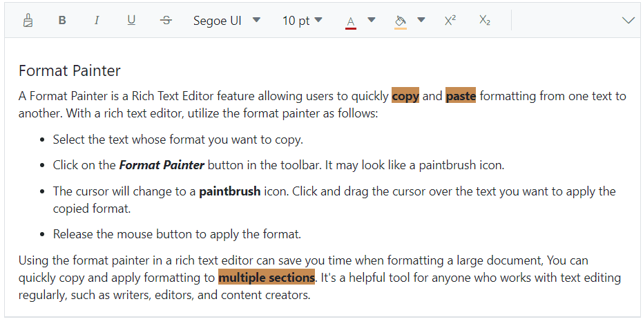
- Format painter: The format painter tool allows users to copy and apply formatting to different text sections quickly. Users can transfer font styles, colors, and other formatting attributes to other areas with a single click, saving valuable time and streamlining the workflow. For more details, refer to the control demos.
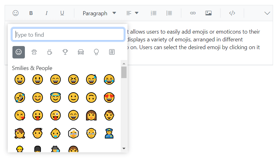
Format Painter in Rich Text Editor - Emoji picker: Users can now easily insert emoji into their content using the emoji picker in the Rich Text Editor. With a wide range of emoji available, users can browse or search for the desired emoji and insert it into their text with a simple click. Additionally, users can instantly access the emoji picker by pressing the colon (:) key in the editor, making the process even more convenient. For more details, find the demos here.
Emoji picker in Rich Text Editor
Recurrence editor customization in Scheduler
The Scheduler component now allows users to set end dates for recurring events. Users can choose until, ends on, or never options for the end date for recurring events.
Reversible Range Slider
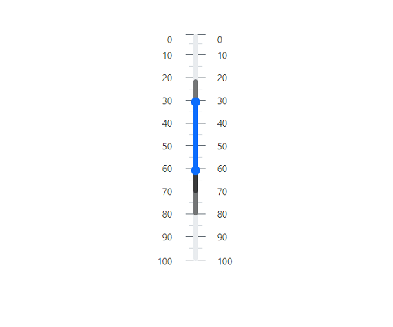
The Range Slider now supports displaying the slide range in reverse order, e.g., from 100 to 1. This feature enables users to set a maximum value that is less than the minimum value, expanding the flexibility of the Range Slider. This feature is available for all range and numeric sliders.
Improved tooltip positioning in Stock Chart
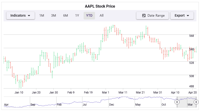
The Stock Chart component now lets you enable tooltips to move along with the mouse as it is being moved. This enhancement improves the user experience by ensuring the tooltip stays close to the mouse pointer, making it easier to view and analyze data in a chart.
Conclusion
Thanks for reading! In this article, we’ve highlighted the latest enhancements and additions in the Syncfusion Essential JS 2 platform for the 2023 Volume 2 release. We encourage you to try these user-friendly updates and provide your valuable feedback in the comments below.
To discover more about the features available in this release, please visit our Release Notes and What’s New pages.
You can access the new version of Essential Studio® from the License and Downloads page if you are an existing customer. For those who are not yet customers, we offer a 30-day free trial so you can experience the full range of available features.
For questions, you can contact us through our support forum, support portal, or feedback portal. We are always happy to assist you!
 No spam, just valuable updates.