Syncfusion is excited to announce several important enhancements in the autocomplete component for Xamarin.Forms for the release of Essential Studio® 2018 Volume 1! Here are the highlights of the added features.
Multiselection
The input field has been improved to address scenarios such as email address bars. You can select multiple items with token representation, or simply divide them with a delimiter. Customizable token representation allows users to remove an item with a close button. Users can divide the selected items with characters they choose, such as $ for dollar representation, or the traditional comma.
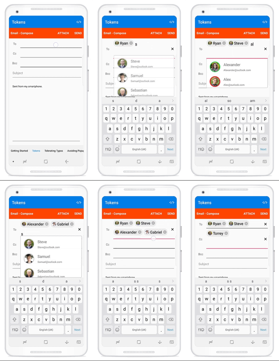
How to configure multiselection
Tokens
C#
this.autoComplete.MultiSelectMode = MultiSelectMode.Token;
this.autoComplete.TokenWrapMode = TokenWrapMode.Wrap;
Delimiter
C#
this.autoComplete.MultiSelectMode = MultiSelectMode.Delimiter;
this.autoComplete.TokenWrapMode = TokenWrapMode.Wrap;
Matching text highlight
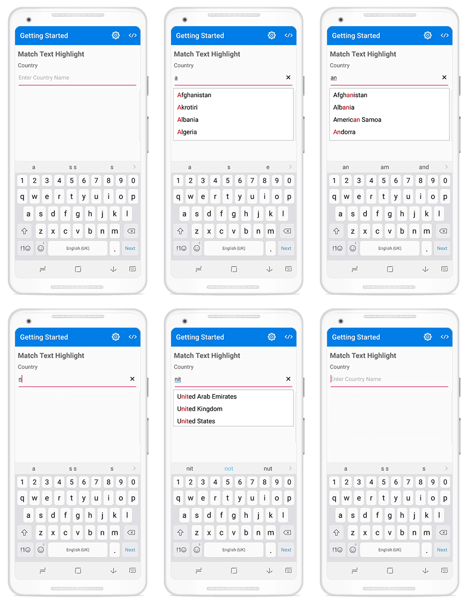
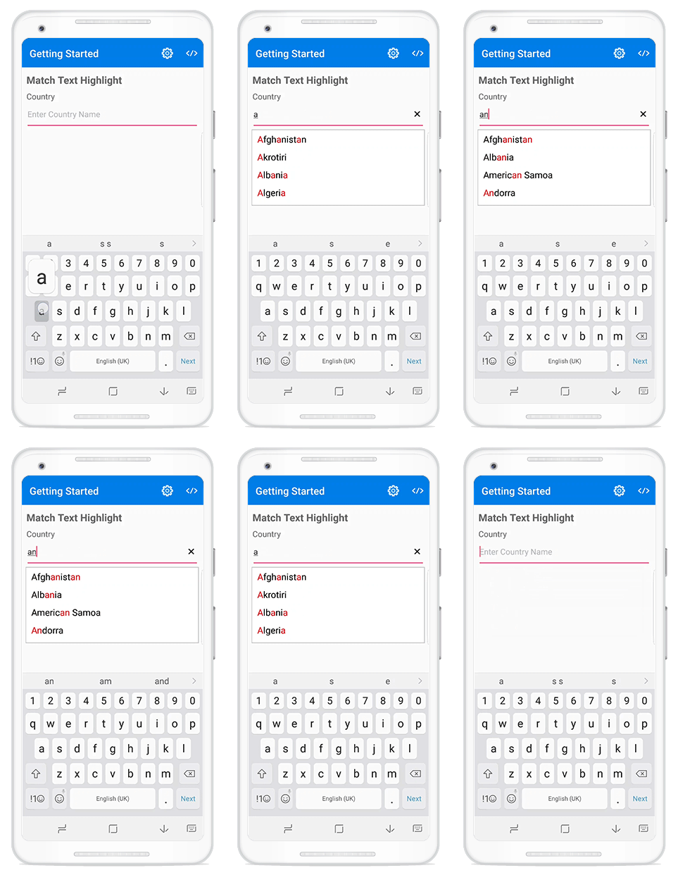
The autocomplete control can highlight the matching text in each filtered item. This option helps users detect how the items are filtered and provides more clarity to picking an item.
How to configure matching text highlight
For a single occurrence
C#
this.autoComplete.TextHighlightMode = TextHighlightMode.FirstOccurance;
this.autoComplete.HighlightTextColor = Color.Red;
For multiple occurrences in a “Contains” search
XAML
C#
this.autoComplete.TextHighlightMode = extHighlightMode.MultipleOccurance;
this.autoComplete.HighlightTextColor = Color.Red;
Diacritic sense
The autocomplete control does not stick with the keyboard. Therefore, you can populate items using languages that feature letters containing diacritic marks, and search for them with English characters from an en-US keyboard.
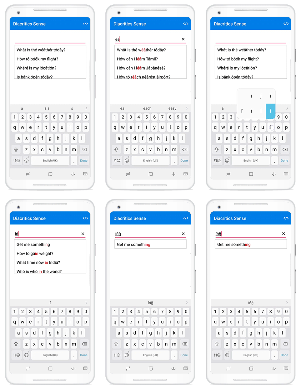
How to configure diacritic sense
this.autoComplete.IgnoreDiacritic = true;
Custom search
The autocomplete control has a provision to apply your search logic that suggests the items based on your search. This support will help you apply your own typo toleration functionality to the control.
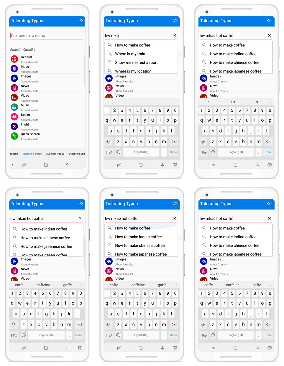
How to configure custom search
this.autoComplete.AutoCompleteMode = AutoCompleteMode.Custom;
C#
this.autoComplete.Filter = CustomSearch;
  public bool CustomSearch(object inputText, object currentItem)
      {
          if(currentItem.ToString().Contains("$"))
              return true; // It will filter the current item
          return false; // Ignores the current items
  }
Improved loading and searching performance
Now the autocomplete component can load and search through 100,000 items in less than a second.
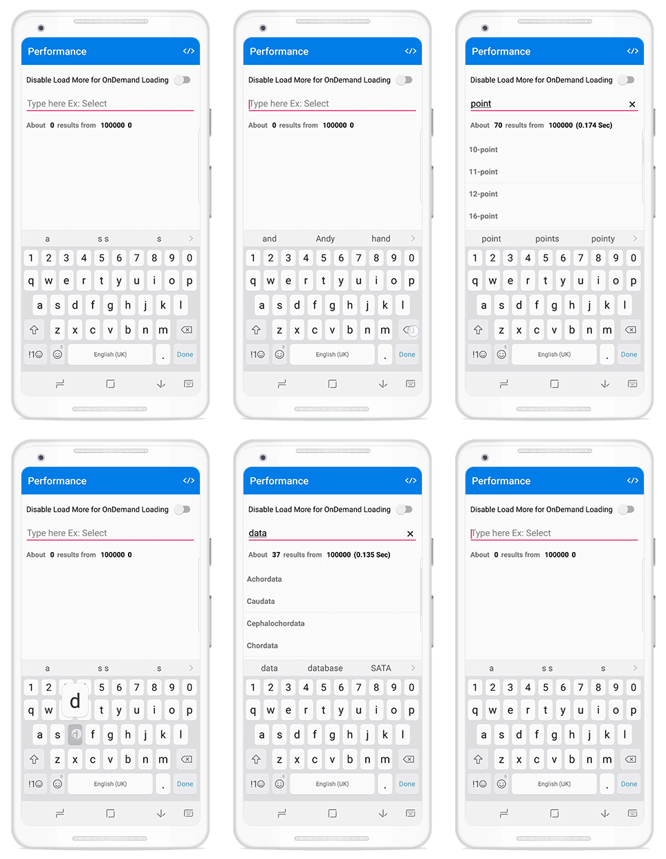
Load more
If the filtered items are numerous, there is no need to worry about populating all of them. Instead, they can be limited by using an option in the control, and more can be loaded if needed. This dynamic loading option results in increased performance.
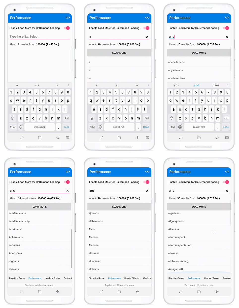
How to configure load more
this.autoComplete.MaximumSuggestion = 10;
Header and footer
Users can add header and footer views for the drop-down, so users can provide out-of-box options such as a button to search the unavailable content in another way, or add a new item at the application level.
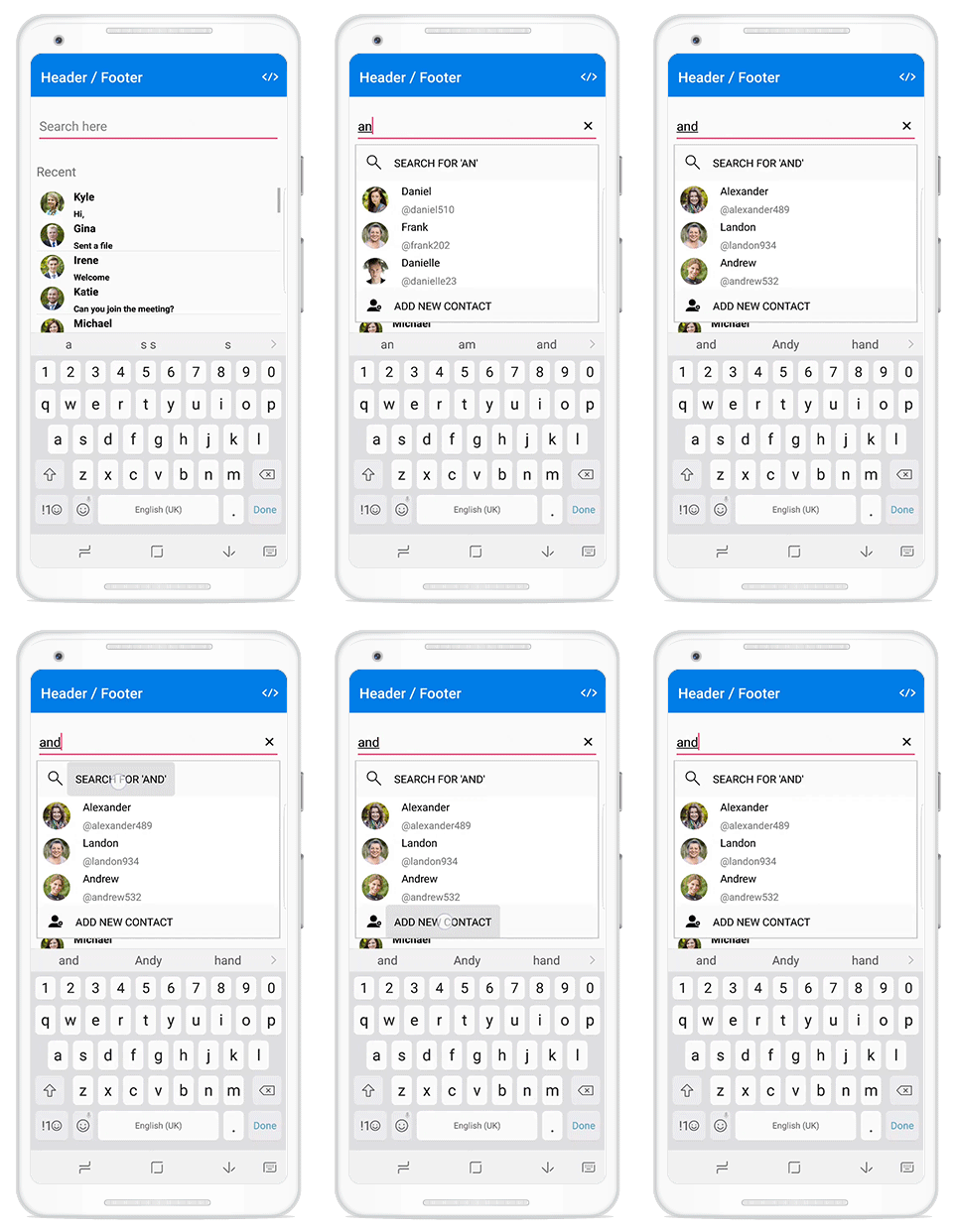
How to add header and footer
<autocomplete:SfAutoComplete>
	<autocomplete:SfAutoComplete.DropDownHeaderView>
		<Button Text="Search for"/> <!—Perform require searching logic on its click event -->
	</autocomplete:SfAutoComplete.DropDownHeaderView>
	<autocomplete:SfAutoComplete.DropDownFooterView>
	<Button Text="Add New Contact"/> <!—Perform adding new contact logic on its click event -->
	</autocomplete:SfAutoComplete.DropDownFooterView>
</autocomplete:SfAutoComplete>
C#
autoComplete.DropDownHeaderView = new Button() { Text = "Search for"};
autoComplete.DropDownFooterView = new Button() { Text = "Add New Contact"};
Avoid pop-up
APIs are available to avoid the pop-up and retrieve filtered suggestion items to help you arrange your design for any list or items control. Once the pop-up is avoided, the FilteredCollection property of the autocomplete component can filter the updated suggestion items that can then be bound with any items control.
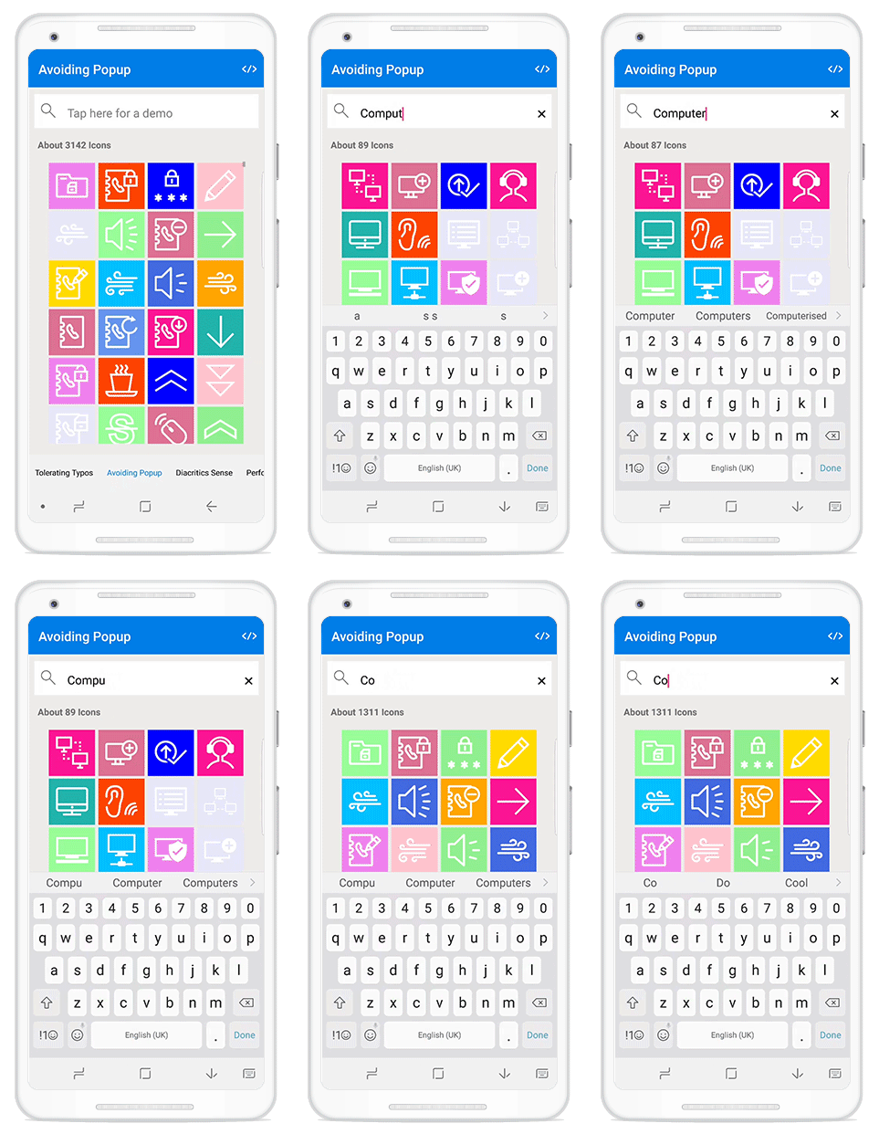
How to avoid popup
this.autoComplete.DropDownPlacement = DropDownPlacement.None;
How to bind suggestion items to an items control
ListView listView = new ListView();

listView.ItemsSource = this.autoComplete.FilteredCollection //Add this line in when text changes or whenever its required
Conclusion
Along with the mentioned major features, we have considered customer feedback and added several minor features, exposed all the customizable elements, and improved the stability of the autocomplete control. We expect to roll out the Volume 1 release by the middle of February. Leave us your valuable feedback or questions in the comments section below.
