
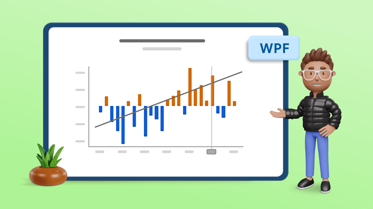
Welcome to the Chart of the Week blog series!
Today, we will create a trend line to visualize the temperature increase in North American oceans using Syncfusion WPF Charts.
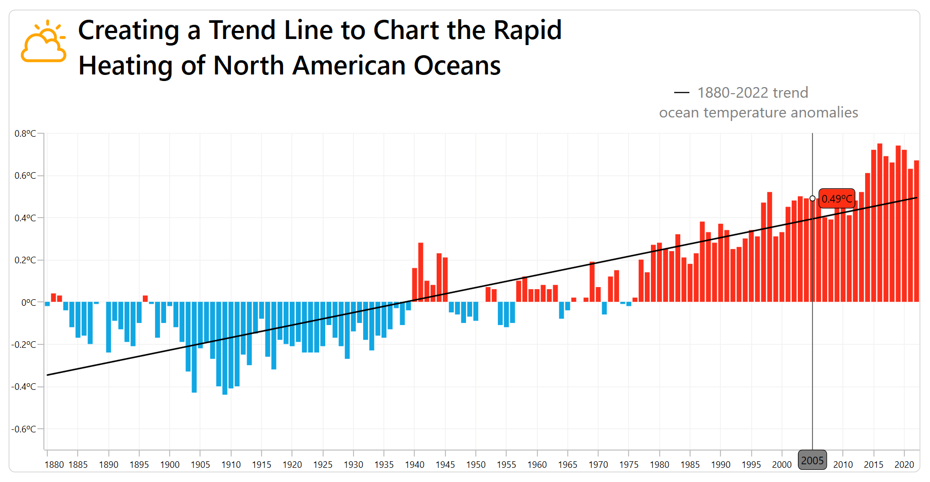
In 2022, the North American ocean temperature increased by 0.04 degrees Celsius compared to the previous year.
In this example, the trend line is drawn for the temperature data points on the chart. The resulting line is used to analyze whether the ocean temperature has generally cooled or heated up over previous decades and will be used to predict changes in the next decade. This prediction will aid in forecasting cyclone patterns.
The following image shows the charted data and its trend line.
Let’s see how to re-create this chart with a column chart using the Syncfusion WPF Charts control.
Step 1: Collecting data for ocean water temperature
First, we need to collect data on ocean water temperature in North America. For our demonstration, the data is acquired from the NOAA, and each data point contains two values: the year of the measurement and the temperature anomaly measurement in degrees Celsius. The data is provided in CSV format.
Step 2: Prepare the data for the trend line
Let’s define the YearlyTemperatureAnomaly class with Temperature and Year properties to store the yearly temperature anomalies.
Refer to the following code example.
public class YearlyTemperatureAnomaly
{
   public DateTime Year { get; set; }
   public double Temperature { get; set; }

   public YearlyTemperatureAnomaly(DateTime year,double temperature)
   {
      Year = year;
      Temperature = temperature;
   }
}
Next, generate a data collection in the GlobalTemperatureAnomalies class using the CollectionOfTemperature property. Convert the CSV data to a collection of data points using the ReadCSV method and store it in the CollectionOfTemperature property.
Refer to the following code example.
  public class GlobalTemperatureAnomalies
  {
      private ObservableCollection<YearlyTemperatureAnomaly> collection;
      public ObservableCollection<YearlyTemperatureAnomaly> CollectionOfTemperature
      {
          set { collection = value; }
          get { return collection; }
      }


      public GlobalTemperatureAnomalies()
      {
          CollectionOfTemperature = new ObservableCollection<YearlyTemperatureAnomaly>(ReadCSV("WaterWarming_HurricaneSeason.TemperatureAnomalies.csv"));
      }

      public IEnumerable<YearlyTemperatureAnomaly> ReadCSV(string fileName)
      {
          Assembly executingAssembly = typeof(App).GetTypeInfo().Assembly;
          Stream inputStream = executingAssembly.GetManifestResourceStream(fileName);
          List<string> lines = new List<string>();
          List<YearlyTemperatureAnomaly> collection = new List<YearlyTemperatureAnomaly>();

          if (inputStream != null)
          {
              string line;
              StreamReader reader = new StreamReader(inputStream);
              while ((line = reader.ReadLine()) != null)
              {
                  lines.Add(line);
              }
              lines.RemoveAt(0);

              foreach (var dataPoint in lines)
              {
                  string[] data = dataPoint.Split(',');
                  DateTime date = DateTime.ParseExact(data[0], "yyyy", CultureInfo.InvariantCulture);
                  collection.Add(new YearlyTemperatureAnomaly(date, Convert.ToDouble(data[1])));
              }

              return collection;
          }

          return collection;

      }
  }
Step 3: Configure the WPF Charts
Now, configure the Syncfusion WPF Charts control using this documentation.
<Chart:SfChart>
 <Chart:SfChart.PrimaryAxis>
  <Chart:DateTimeAxis>
  </Chart:DateTimeAxis>
 </Chart:SfChart.PrimaryAxis>

 <Chart:SfChart.SecondaryAxis>
  <Chart:NumericalAxis>
  </Chart:NumericalAxis>
 </Chart:SfChart.SecondaryAxis>
</Chart:SfChart>
Step 4: Initialize the chart data context
Then, configure the GlobalTemperatureAnomalies class to bind its properties to the WPF Charts DataContext.
<Chart:SfChart.DataContext>
 <local:GlobalTemperatureAnomalies/>
</Chart:SfChart.DataContext>
Step 5: Initialize the column series and trend line
To visualize the increase in ocean water temperature, we’ll use the Syncfusion WPF ColumnSeries instance.
<Chart:SfChart.Series>
 <chart:ColumnSeries XBindingPath="Year" YBindingPath="Temperature" ItemsSource="{Binding CollectionOfTemperature}">
 </Chart:ColumnSeries>
</Chart:SfChart.Series>
In the previous code example, we’ve bound the ItemsSource property with the temperature collection to view the data points in the column chart. We also bound the Year and Temperature properties to the XBindingPath and YBindingPath, respectively.
Now, configure the trend line on the column series to analyze and display the trend of the data graphically.
<Chart:SfChart.Series>
 <Chart:ColumnSeries XBindingPath="Year" YBindingPath="Temperature" ItemsSource="{Binding CollectionOfTemperature}">
  <Chart:ColumnSeries.Trendlines>
   <Chart:Trendline />
  </Chart:ColumnSeries.Trendlines>
 </Chart:ColumnSeries>
</Chart:SfChart.Series>
Step 6: Customize the trend line
We can customize the trend line using the Type, Foreground, Stroke, and StrokeThickness properties. We can also display the future and past trends using the Forecasting methods.
<Chart:ColumnSeries.Trendlines>
 <chart:Trendline Stroke="Black" StrokeThickness="2" Foreground="Black" Type="Linear"/>
</Chart:ColumnSeries.Trendlines>
Step 7: Customize the series points
We can customize the column chart appearance using the CustomTemplate property. In this example, we’ve used the TrackBallLabelTemplate property to display the YBindingPath value when hovering over the data points.
<chart:ColumnSeries TrackBallLabelTemplate="{StaticResource trackBallLabelTemplate}"
                    CustomTemplate="{StaticResource seriesTemplate}"
                    XBindingPath="Year" YBindingPath="Temperature"
                    ItemsSource="{Binding CollectionOfTemperature}">
</Chart:ColumnSeries>
Step 8: Customize the header of the chart
Use the Header property to customize the title of the chart and align it using the HorizontalHeaderAlignment and VerticalHeaderAlignment properties.
Refer to the following code example.
<Chart:SfChart.Header>
 <Grid Width="1000" HorizontalAlignment="Left" Margin="5,0,0,10" VerticalAlignment="Center">
  <Grid.ColumnDefinitions>
   <ColumnDefinition Width= "80"/>
   <ColumnDefinition Width="*"/>
  </Grid.ColumnDefinitions>
  <Grid.RowDefinitions>
   <RowDefinition/>
   <RowDefinition/>
  </Grid.RowDefinitions>
   <StackPanel Orientation= "Vertical" Background="Transparent" Margin="10">
    <Path Margin="0,0,0,0" Grid.RowSpan= "2"
          Data="{Binding PathData}" Stretch="Uniform"
          Fill="Orange" Width="60"
          Height="60" RenderTransformOrigin="0.5,0.5">
    </Path>
   </StackPanel>
   <StackPanel Margin="5,0,0,0"
               HorizontalAlignment="Left"
               Orientation="Vertical" Grid.Column="1">
     <TextBlock
              Text="Creating a Trend Line to Chart the Rapid"
              HorizontalAlignment="Left" TextWrapping="Wrap"
              FontSize="35" FontWeight="SemiBold" Foreground="Black"/>
     <TextBlock
              Text= "Heating of North American Oceans"
              HorizontalAlignment="Left" FontWeight="SemiBold"
              FontSize="35" Foreground="Black"/>

   </StackPanel>
   <StackPanel Margin="0,0,-350,0" Grid.Row= "1"
                Grid.Column="1" HorizontalAlignment="Right">
    <Canvas>
     <Path Stroke="Black" StrokeThickness="1.5">
      <Path.Data>
       <PathGeometry>
        <PathGeometry.Figures>
         <PathFigureCollection>
          <PathFigure StartPoint="20,15">
           <PathFigure.Segments>
            <PathSegmentCollection>
             <LineSegment Point= "40,15"/>
            </PathSegmentCollection>
           </PathFigure.Segments>
          </PathFigure>
         </PathFigureCollection>
        </PathGeometry.Figures>
       </PathGeometry>
      </Path.Data>
     </Path>
    </Canvas>
    <TextBlock Text="1880-2022 trend"
          TextAlignment="Left"  Margin="0,0,-100,0" Width="500"
          VerticalAlignment= "Bottom"
          FontSize="20" Foreground="Gray"/>
    <TextBlock
          Text= "ocean temperature anomalies" TextAlignment= "Left"
          VerticalAlignment="Bottom" FontSize="20"
          Width="500"  Foreground="Gray"/>
   </StackPanel>
 </Grid>
</Chart:SfChart.Header>
Step 9: Customize the chart axis elements
Let’s customize the ChartAxis based on our requirements. We’ll use the DateTimeAxis property to visualize the yearly data points.
Enable the ShowTrackBallInfo property to view the year data in the DateTimeAxis and customize the trackball label using TrackBallLabelTemplate.
Configure the IntervalType and Interval value and format the date time label using the LabelFormat property.
<Chart:SfChart.PrimaryAxis>
<Chart:DateTimeAxis
TrackBallLabelTemplate="{StaticResource xAxisTrackBallLabelTemplate}"
ShowTrackBallInfo="True" IntervalType="Years" Interval="5"
EdgeLabelsDrawingMode="Shift" LabelFormat="yyyy">
</Chart:DateTimeAxis>
</Chart:SfChart.PrimaryAxis>
< Chart:SfChart.SecondaryAxis>
<chart:NumericalAxis ShowTrackBallInfo="True" Minimum="-0.7"
LabelFormat="0.##ºC" Name="yaxis">
</Chart:NumericalAxis>
</Chart:SfChart.SecondaryAxis>After that, configure the LabelStyle of the axis labels using the FontSize and FontWidth properties.
<Chart:SfChart.PrimaryAxis>
 <Chart:DateTimeAxis >
  <Chart:DateTimeAxis.LabelStyle>
   <chart:LabelStyle FontSize="12" />
  </Chart:DateTimeAxis.LabelStyle>
 </Chart:DateTimeAxis>
</Chart:SfChart.PrimaryAxis>

<Chart:SfChart.SecondaryAxis>
 <Chart:NumericalAxis>
  <Chart:NumericalAxis.LabelStyle>
   <chart:LabelStyle FontSize="12" />
  </Chart:NumericalAxis.LabelStyle>
 </Chart:NumericalAxis>
</Chart:SfChart.SecondaryAxis>
Step 10: Configure the trackball behavior
The ChartTrackBallBehavior class allows users to track the data points when the cursor position changes. It helps users visualize each data point’s corresponding x- and y-values. We can also customize the trackball style using the ChartTrackBallStyle property.
Refer to the following code example.
<Chart:SfChart.Behaviors>
 <chart:ChartTrackBallBehavior ChartTrackBallStyle="{StaticResource trackballStyle}" ShowLine= "True" />
</Chart:SfChart.Behaviors>
After executing the previous code examples, we’ll get the output shown in the following image.
GitHub reference
For more details, refer to the GitHub demo.
Conclusion
Thanks for reading! In this blog, we’ve seen how to visualize the temperature increase in North American oceans using the Syncfusion WPF Charts control.
You can explore our WPF Charts examples to learn more about the supported chart types and how easy it is to configure them for stunning visual effects.
The latest version of the WPF Charts control is available for current customers from the License and Downloads page. If you are not yet a Syncfusion customer, try our 30-day free trial to check it out.
Also, you can contact us through our support forums, support portal, or feedback portal. We are always happy to assist you!


Related blogs
- Chart of the Week: Creating a WPF Multiple Fast Line Chart to Display COVID-19’s Impact On U.S. Unemployment
- Chart of the Week: Creating a WPF Range Column Chart to Visualize ChatGPT’s Performance in Competitive Exams
- Chart of the Week: Visualize the Transfer Spending and Earning Among Football League Clubs Using WPF Scatter Chart
- Visualize JSON Data Quickly Using WPF Charts
 No spam, just valuable updates.