
 Sridhar Narasimhan
Yes, you heard it right, our Blazor components are now production-ready with the 2019 Volume 4 release. Our components greatly evolved during the beta cycle and we would like to thank every person who patiently waited for this release, especially those who provided great feedback to help shape the current state of the components.
What’s really changed since the beta?
Native Blazor components
Our goal for the initial beta version was to produce a rich suite of Blazor components that provided a native development experience. In other words, the components would use JavaScript internally, but developers consuming the components could write all their code in C#—no writing JavaScript at all. The beta version was very well received by the community, but a lot of our customers let us know they would like to see the dependence on JavaScript reduced in the future.
We took this feedback seriously and decided to invest a lot of effort in this area. As a result, the public API of our components has very few changes in the final release, but the internals have been changed quite a bit. A lot of the functionally has been rewritten in C# and the dependence on JavaScript has been kept to a minimum without compromising on the end-user experience.
Please note that there is still some dependence on JavaScript, since it is currently not possible to write Blazor components completely in C# due to limitations in Blazor and WebAssembly. For example, it is still not possible to manipulate the DOM or handle Canvas elements using C#, so it would not be feasible to create a pure C# Blazor component today. It is very likely that the current JavaScript dependence in our components will further reduce over time as both Blazor and WebAssembly continue to evolve.
We believe that our control model uses the right mix of C# and JavaScript to deliver the best possible components for developing high-performance, real-world Blazor applications. Our controls completely support all the standard Blazor features (templates, pre-rendering, data validation, two-way data binding, generic data type support, HTML attributes, etc.).
In summary, we are confident that the final release of our Blazor components are as native as the underlying technologies permit, and as native as any other Blazor components on the market.
Template support
Templates are used for customizing a component’s look and feel. Syncfusion Blazor components can render HTML elements, Razor components, and Blazor components inside their own template for customization.
The templates used by our Blazor components are RenderFragment type. These templates are reusable components, giving you the flexibility to provide a user experience customized to your liking. Check out our Blazor Grid component, which has a column template, row template, and detail template for customization.
Pre-rendering
Pre-rendering is the process of static site generation, which compiles the elements of a webpage on the server and serves static HTML to the client. This helps improve SEO in a single-page application and loading times for websites.
Sever-side Blazor applications’ default rendering mode uses pre-rendering, and most of our Blazor components now support it.
Two-way data binding
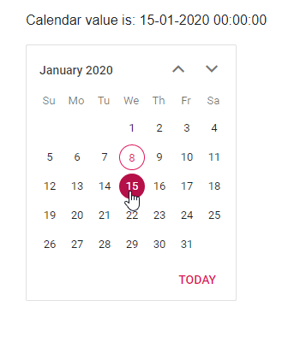
In Blazor, two-way binding can be achieved by using the @bind-Value attribute. It supports string, int, Enum, DateTime, and bool types. If the component value changes, it will affect all places where the variable for the bind-value attribute is bound. Syncfusion Blazor components now support two-way binding.
@using Syncfusion.EJ2.Blazor.Calendars

<p>Calendar value is: @DateValue</p>

<EjsCalendar TValue="DateTime?" @bind-Value="@DateValue"></EjsCalendar>

@code {
public DateTime? DateValue { get; set; } = DateTime.Now;

}
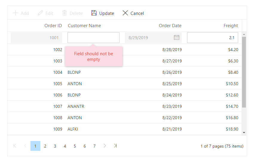
Generic components
Our Blazor components are now generically typed, plus you can define a type-safe data structure. For example, in the Data Grid component, you can define any business object as type parameter(TValue). Using this, the grid determines information such as column schema and validation.
@using Syncfusion.EJ2.Blazor.Grids
@using System.ComponentModel.DataAnnotations;

<EjsGrid TValue="Order" DataSource="@Orders" Height="315" AllowPaging="true" Toolbar="@(new List<string>() { "Add", "Edit", "Delete", "Update", "Cancel" })">
    <GridEditSettings AllowAdding="true" AllowEditing="true" AllowDeleting="true"></GridEditSettings>
    <GridColumns>
        <GridColumn Field=@nameof(Order.OrderID) TextAlign="TextAlign.Right" Width="120"></GridColumn>
        <GridColumn Field=@nameof(Order.CustomerID) Width="120"></GridColumn>
        <GridColumn Field=@nameof(Order.OrderDate) EditType="EditType.DatePickerEdit" Format="d" TextAlign="TextAlign.Right" Width="130" Type="ColumnType.Date"></GridColumn>
        <GridColumn Field=@nameof(Order.Freight) HeaderText="Freight" TextAlign="TextAlign.Right" Format="C2" Width="120"></GridColumn>
    </GridColumns>
</EjsGrid>

@code{
    public List<Order> Orders { get; set; }

    protected override void OnInitialized()
    {
        Orders = Enumerable.Range(1, 75).Select(x => new Order()
        {
            OrderID = 1000 + x,
            CustomerID = (new string[] { "ALFKI", "ANANTR", "ANTON", "BLONP", "BOLID" })[new Random().Next(5)],
            Freight = 2.1 * x,
            OrderDate = DateTime.Now.AddDays(-x),
        }).ToList();
    }

    public class Order
    {
        // Sets column as primary key
        [Key]
        // Sets header text to the column
        [Display(Name = "Order ID")]
        public int OrderID { get; set; }
        [Display(Name = "Customer Name")]
        // Sets column as required and error message to be displayed when empty
        [Required(ErrorMessage = "Field should not be empty")]
        public string CustomerID { get; set; }
        // Sets data type of column as Date
        [DataType(DataType.Date)]
        [Display(Name = "Order Date")]
        // Sets column as read only
        [Editable(false)]
        public DateTime? OrderDate { get; set; }
        [Display(Name = "Freight")]
        public double? Freight { get; set; }
    }
}
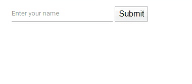
Validation
Syncfusion Blazor components support data annotation validations. To define the validation, we need a model with data annotations and the EditForm component on the Razor page. I have created ExampleModel with a string-type property called Name. It has data annotations for making it a required property and limiting its length to 10 or less.
using System.ComponentModel.DataAnnotations;

public class ExampleModel
{
    [Required]
    [StringLength(10, ErrorMessage = "Name is too long.")]
    public string Name { get; set; }
}
The EditForm model attribute is assigned with the instance exampleModel, which is created within the @code block. The DataAnnotationsValidator inside the EditForm is used to provide validation support based on data annotations. This EditForm validates Syncfusion TextBox, which is bound to Name property of exampleModel. When the validation fails, a ValidationMessage is used. We also have an event for submission success (OnValidSubmit).
<EditForm Model="@exampleModel" OnValidSubmit="@HandleValidSubmit">
    <DataAnnotationsValidator />
    <Syncfusion.EJ2.Blazor.Inputs.EjsTextBox id="name" @bind-Value="@exampleModel.Name"></Syncfusion.EJ2.Blazor.Inputs.EjsTextBox>
    <ValidationMessage For="()=>exampleModel.Name" />
    <button type="submit">Submit</button>
</EditForm>
@code {
    private ExampleModel exampleModel = new ExampleModel();

    private void HandleValidSubmit()
    {
        Console.WriteLine("OnValidSubmit");
    }
}
New components included
Bullet Chart
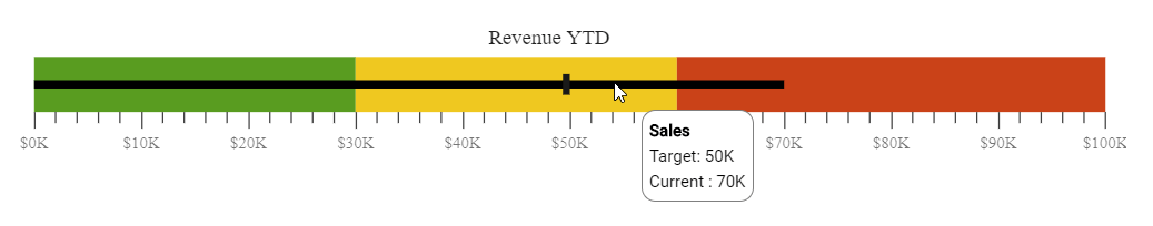
The Bullet Chart is a new Blazor component that is a variation of a bar chart, displaying one or more measures and comparing them to a target value. You can also display the measures in a qualitative range of performance, spanning poor, satisfactory, or good conditions. All elements are rendered using Scalable Vector Graphics (SVG).
- Data binding: Binds the data to the data source locally and remotely.
- Animation: The feature and the target bars will be animated when rendering.
- Tooltip: Supports tooltips for the feature and target bars.
- Orientation: Supports horizontal and vertical rendering.
- Flow direction: Supports right-to-left rendering.
- Multiple targets: Supports multiple targets.
- Data labels: Supports data labels to enhance the data.
Blazor Bullet Chart
Barcode Generator
The Syncfusion Barcode Generator control can be used to create and display industry-standard 1D barcodes, data matrix barcodes, and QR codes.
Key features
A wide range of barcode symbologies are supported: Code 39, Code 39 extended, Code 11, Codabar, Code 32, Code 93, Code 93 extended, Code 128, UPC-A, UPC-E, EAN-8, EAN-13, Data Matrix, and QR code.
The following options are provided in the control:
- Display barcodes with or without human-readable text.
- Customize the text position and its alignment.
- Customize the barcode height, width, background color, and foreground color.
- Render barcodes either as SVG or canvas graphics.

Blazor Barcode Generator
Project templates for Visual Studio and Visual Studio Code
We have provided project templates for creating Blazor projects with Syncfusion component settings preconfigured to enhance the experience of project creation in Visual Studio and Visual Studio Code. We have also provided Visual Studio scaffolding templates for the Grid, Chart, Scheduler, TreeGrid, RichTextEditor, Word Processor, and PDF Viewer components.
For more information, refer to the following:
- Visual Studio Code extension: https://ej2.syncfusion.com/blazor/documentation/visual-studio-code-integration/visual-studio-code-extensions/download-and-installation/
- Visual Studio extension: https://ej2.syncfusion.com/blazor/documentation/visual-studio-integration/visual-studio-extensions/download-and-installation/
What’s next?
We are constantly working to expand our Blazor component offering with unique and complex controls. Some that we’re working on include Spreadsheet, Kanban, DropDownTree, and Progress Bar components, and you can expect these in our upcoming releases. Also, we will closely monitor any improvements to Blazor and evolve our components accordingly.
Summary
Syncfusion offers more than 65 native Blazor components that can be used to create even the most demanding real-world Blazor applications. As of now, you can use our production-ready components in server-side Blazor and ASP.NET-hosted applications.
Blazor WebAssembly is still in preview, and we are making progress parallel to Microsoft. Our Blazor WebAssembly components will be production-ready by May 2020, as Microsoft, too, plans to launch it then.
Please check out the Syncfusion Blazor component details in the following links:
Samples link: https://blazor.syncfusion.com/
Documentation link: https://ej2.syncfusion.com/blazor/documentation/introduction/
If you are an existing Syncfusion user, you can download the latest version from the License and Downloads page and try the new features for yourself. If you aren’t our customer yet, you can try our 30-day free trial.
You can check out all the features available in the 2019 Volume 4 release in our release notes. Try these features and share your feedback in the comments below. You can also reach us through our support forum, Direct Trac, or feedback portal.


 No spam, just valuable updates.
Comments (9)
Excellent – thank you Sridhar!
Will the controls that we buy and use in a Blazor Server app be portable to a Blazor Client-side app come May 2020?
Yes, It will be a portable Blazor client-side app.
Hi, have a question regarding the previous comment, when you say native Blazor components and replacement of Javascript with C#, doesn’t it imply it’s client side? Or is this update only about Blazor server side? Thanks.
Sorry, I was not clear in my previous update. All the changes that we mentioned are applicable for the Blazor Client-side (WebAssembly) also and it is portable now and will work even with the current controls set. Since Blazor WebAssembly is not made as final yet, we also did not mark our controls final for Blazor WebAssembly. If there will be any changes needed before they mark as final with the new features, we will also implement and mark as final.
Hello !
How much of the existing Java Script Code in the current version of the Blazor componnts must still be ported to C# ?
We would like to let you know that our 40+ Blazor components are moved to native components that are already available from our Volume 3, 2020 release. However, the remaining 20+ components are planned to native approach and will be available in our upcoming main release – Volume 4, 2020 which is expected to be rolled out in the month of December 2020.
Hello Sridhar,
How good this Synfusion Blazor controls. Can we depend on this and create our manufacturing ERP software?
Hi Arif,
We have a full-solution using our Blazor components to create a native Blazor application. We have put in a lot of effort in the recent releases to ensure that all the components based on the native rendering environment. We have done some showcase samples based on a real-time application using our Blazor components such as Appointment Planner, Expense Tracker, Health Tracker, and more.
So, you can depend on these Syncfusion Blazor components for your ERP software development.
Regards,
Rajendran R