
 Leomaris Reyes
When developing fast, high-quality user interfaces, my top tip is to organize your scenario and analyze every element of your screen before writing any code. Doing so will save you time in the long run and ensure that you address every critical aspect of the UI.
In this blog, we’ll replicate a storage UI in a .NET MAUI app based on this Dribbble design.
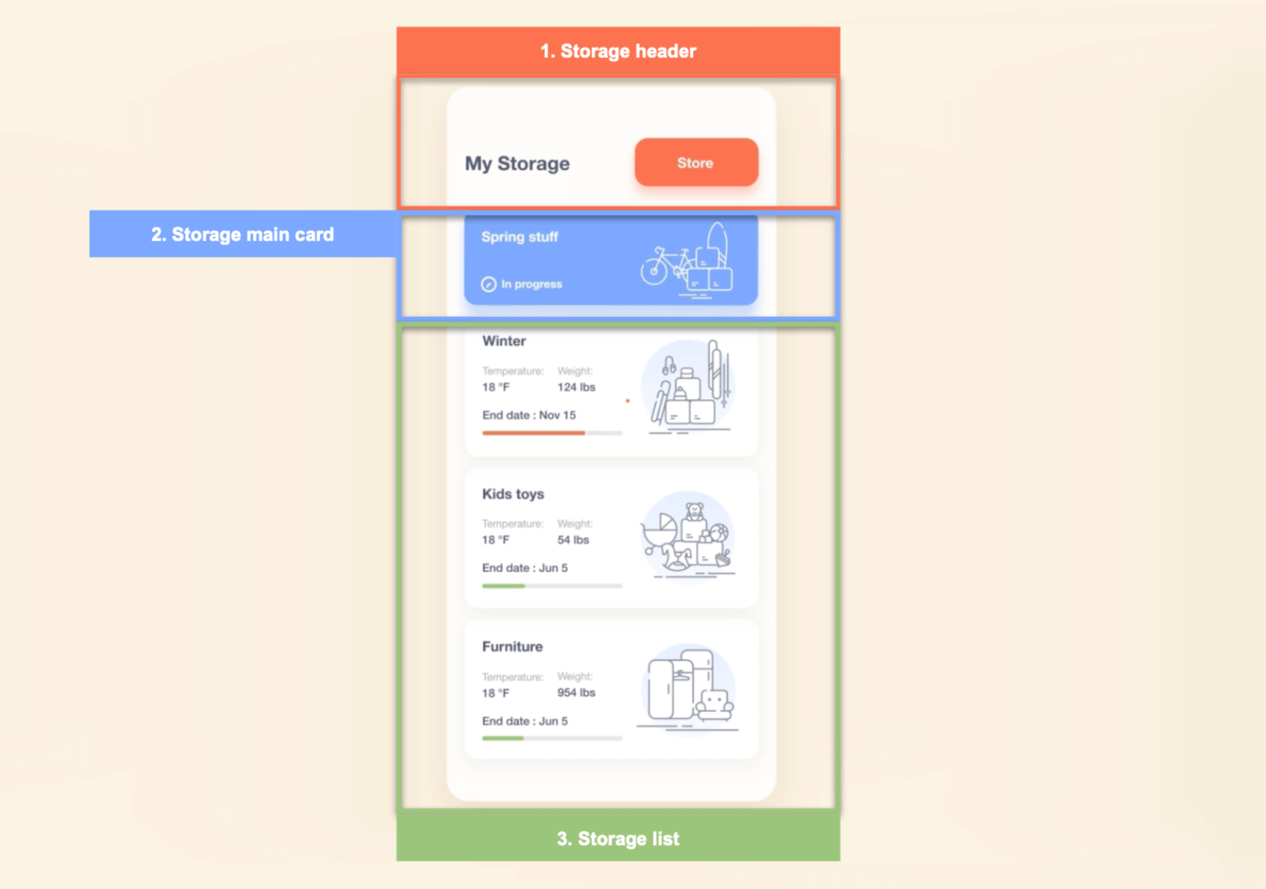
We’ll break down the creation of the UI into three steps, as illustrated by the following image.
Through the course of the process, we will learn to use:
- Dark and light modes to allow users to apply light and dark modes in the app.
- Syncfusion Linear ProgressBar and ListView components to design a progress indicator and storage list, respectively.
- Shadows to add shadows to the controls.
- Borders to add borders to the controls. We’ll also explore a scenario where Frames were previously necessary, but now we can achieve the same result with Borders!
Main layout
To get started, we’ll create a page named MainPage.xaml. This page will contain the main layout to organize the blocks defined in the previous image.
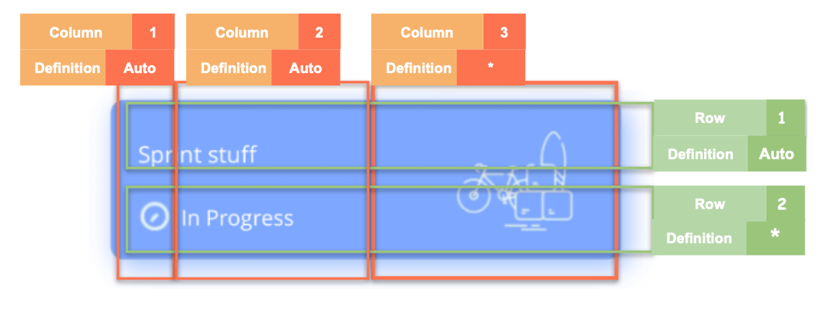
We’ll use the Grid as our main layout due to its high performance and adaptability to our UI needs. To set up a Grid, we need to determine the number of rows and columns needed and specify them within the Grid structure.
Let’s look at the rows and columns required to design our page.
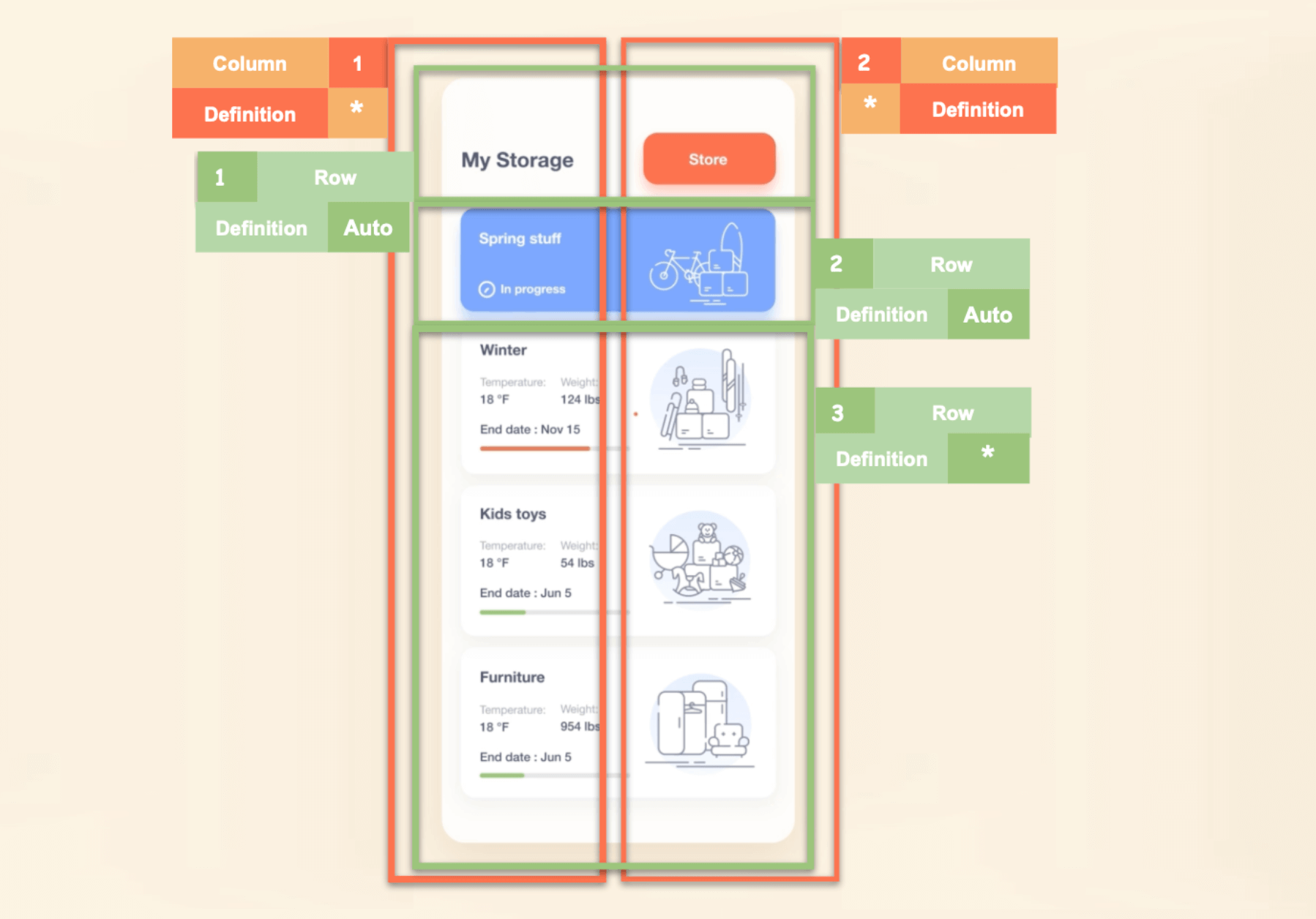 In the previous image, the vertical boxes indicate the columns, and the horizontal boxes indicate the rows. The markup indicates that the Grid should contain the following:
- Two columns: This is determined by identifying the largest number of visual elements on the same line. That number is two in this case: the title text and the store button. The image also specifies that both columns should be defined as proportional (*). This means that they will take up the same percentage of the screen.
- Three rows: The screen is divided into three rows, each with a specific purpose.
- Row 1: Includes the title and store button. We’ll set its definition to Auto since we only need to capture the block’s height.
- Row 2: Contains the blue primary card. We’ll set its definition to Auto since we only need to capture the card’s height.
- Row 3: This row contains a list of stored items. The difference with this row is that it will occupy all the remaining space, so its definition is proportional (*).
Refer to the following code example.
<!-- Main layout-->
<Grid RowDefinitions="Auto,Auto,*" ColumnDefinitions="*,*" Padding="25,30,25,0">
  <!-- Step 1: Add all the elements contained in the header -->
  <!-- Step 2: Add all the elements contained in the main card -->
  <!-- Step 3: Add all the elements contained in the storage list -->
</Grid>
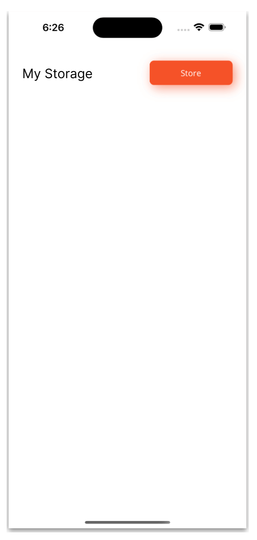
Step 1: Header
We have finished implementing the main layout, so let’s design the header in the UI.
 We will place all the code for the header in the code block of the main layout that reads <!– Step 1: Add all the elements contained in the header –>.
The code will include just two elements: the title (My Storage) and the Store button.
Let’s see how to do it!
Title
Refer to the following code example to design the title element.
<!-- Header -->
<Label Grid.Row="0" Grid.Column="0" Text="My Storage" VerticalTextAlignment="Center" FontSize="22" FontAttributes="Bold"/>


<!-- Add all the code explained in the following section here -->
Button
Refer to the following code example to design the Store button. In it, we’ve also applied a shadow effect using the <button.Shadow> tag.
<Button Grid.Row="0" Grid.Column="1" Text="Store" FontAttributes="Bold" FontSize="15" TextColor="White" WidthRequest="150" BackgroundColor="#f55228" HorizontalOptions="End">
   <button.Shadow>
      <Shadow Brush="#f55228"
              Offset="5,5"
              Opacity="0.6"/>
   </button.Shadow>
</Button>


<!-- Add all the code explained in the following section here -->
Note: For more information about shadows, you can refer to this article.
Step 2: Main card
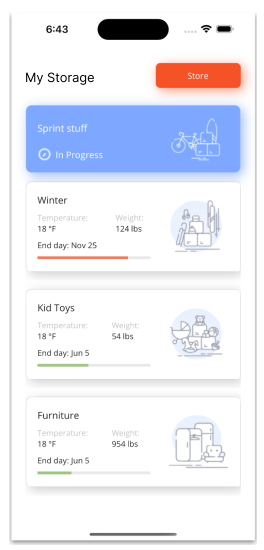
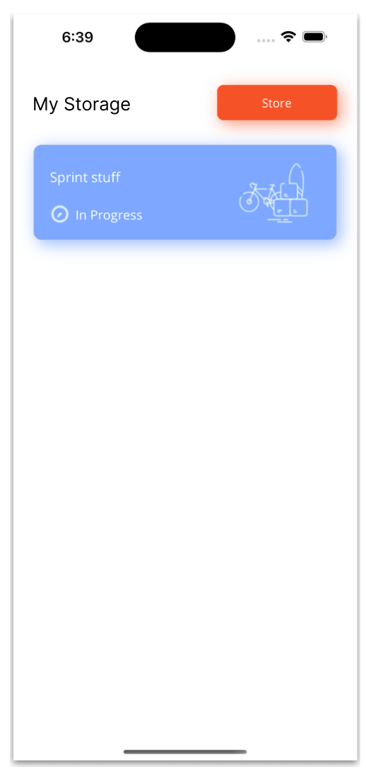 In this step, we’ll design the blue box shown in the previous screenshot with a title, clock icon, in-progress description, and image.
Blue box
To create the blue box, we’ll implement the Border control and use the CornerRadius property to replicate the round edges. This approach is an alternative to using the Frame control to create the card structure.
One advantage of using the Border control is that it allows for more flexibility in rounding the edges of the box.
Once the card is in place, we will add a shadow effect, similar to what we did with the header button in the previous step.
Also, we will add a Grid to organize the elements. This Grid will contain two rows and three columns, as shown in the following image.
 Refer to the following code example to achieve the block structure of the card.
<!-- Main card-->
<Border Grid.Row="1" Grid.Column="0" Grid.ColumnSpan="3" StrokeShape="RoundRectangle 10" Margin="0,30,0,0" HeightRequest="120" HorizontalOptions="Fill" BackgroundColor="#7ea8ff">
  <Grid RowDefinitions="*,*" ColumnDefinitions="Auto,Auto,*" Padding="20">
    <!-- Add the code for the card title, clock icon, progress description, and image here -->

  </Grid>
  <border.Shadow>
    <Shadow Brush="#7ea8ff"
            Offset="5,5"
            Opacity="0.8"/>
  </border.Shadow>
</Border>


<!-- The code for step three goes here -->
Finally, add a title, clock icon, progress description, and image to the card.
<!-- Title-->
<Label Grid.Row="0" Grid.Column="0" Grid.ColumnSpan="3" Text="Sprint stuff" TextColor="White" FontSize="17" VerticalTextAlignment="Center"/>


<!--  Clock icon and progress description -->
<Image Grid.Row="1" Grid.Column="0" Source="clock" Margin="0,0,7,0" VerticalOptions="End"/>
<Label Grid.Row="1" Grid.Column="1" Text="In Progress" TextColor="White" FontSize="16" VerticalTextAlignment="End"/>


<!--Image-->
<Image Grid.Row="0" Grid.Column="2" Grid.RowSpan="3" HorizontalOptions="End" Source="bike" Aspect="Fill" WidthRequest="110" HeightRequest="110"/>


<!-- Add all the code explained in the following step here -->
Step 3: Storage list
Now, we’re going to design the final block of the UI!
 To display the list with the set of storage cards, we will use the Syncfusion .NET MAUI ListView and add the progress indicators using the Syncfusion .NET MAUI Linear ProgressBar. To implement them in your project, follow these steps:
- Add the Syncfusion.Maui.ListView and Syncfusion.Maui.ProgressBar NuGet packages.


- In the MauiProgram.cs file, we need to register the handler for the Syncfusion ListView and Linear ProgressBar controls. To do so, go to the CreateMauiApp method and then add the following code next to the .UseMauiApp<App>() method:
.ConfigureSyncfusionCore();
- Add the namespaces for the .NET MAUI ListView and Linear ProgressBar controls in your XAML file. Also, add the Syncfusion.Maui.Core.Hosting namespace.
- ListView
xmlns:syncfusion="clr-namespace:Syncfusion.Maui.ListView;assembly=Syncfusion.Maui.ListView"
- Linear ProgressBar
xmlns:ProgressBar="clr-namespace:Syncfusion.Maui.ProgressBar;assembly=Syncfusion.Maui.ProgressBar"
Now we can work with XAML to add code where it says <!– The code for step three goes here –> in the previous code block.
Adding the ListView structure
Add the Syncfusion .NET MAUI ListView to prepare the card list such that the Border control will cover the entire card contained within this list.
<!-- Card list-->
<syncfusion:SfListView Grid.Row="2" Grid.Column="0" Grid.ColumnSpan="3"
                       ItemsSource="{Binding Storage}"
                       ItemSize="190"
                       ScrollBarVisibility="Never">
  <syncfusion:SfListView.ItemTemplate>
    <DataTemplate>
       <!-- Add the code of the entire card here. -->
     </DataTemplate>
  </syncfusion:SfListView.ItemTemplate>
 </syncfusion:SfListView>
Note: You can obtain the sample information used in the list from this GitHub link.
Adding the cards
Add the following code block where it says <!– Add the code of the entire card here. –> in the previous code block.
<Border StrokeShape="RoundRectangle 10" Margin="0,30" HeightRequest="160" HorizontalOptions="Fill">
   <Grid RowDefinitions="Auto,Auto,Auto,Auto,Auto" ColumnSpacing="20" ColumnDefinitions="Auto,Auto,*" Padding="20" BackgroundColor="{AppThemeBinding Light=White, Dark=#1c1c1e}">

       <!-- Add the remaining elements here -->

    </Grid>
    <border.Shadow>
       <Shadow Brush="Black."
               Offset="5,5"
               Opacity="0.2"/>
    </border.Shadow>
</Border>
In this code, we use the same Border control as in the previous card, plus a shadow effect. This border contains a Grid, which is divided into five rows with Auto defined for the RowDefinitions, and three columns, two of which are defined as Auto in the ColumnDefinitions, and the remaining one is defined as proportional (*).
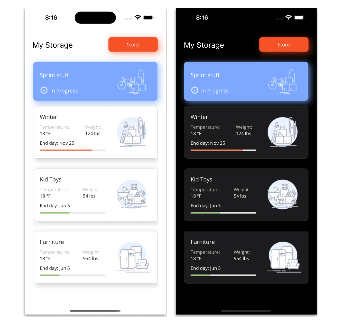
Note: To enhance the app’s appearance when the user switches between light and dark modes, I have added the AppThemeBinding extension markup to the background color. This allows you to include specific colors, in addition to the default ones, for the controls.
Title, temperature, and weight
We have the structure of the cards completed, so now we need to add the following elements inside each card:
- Title.
- Temperature.
- Weight.
Refer to the following code example.
<!--Title-->
<Label Grid.Row="0" Grid.Column="0" Text="{Binding Name}" FontSize="17" Margin="0,0,0,10"/>


<!--Temperature & weight columns-->
<Label Grid.Row="1" Grid.Column="0" Text="Temperature:" TextColor="Silver" FontSize="14"/>
<Label Grid.Row="2" Grid.Column="0" Text="{Binding Temperature}" FontSize="14"/>
<Label Grid.Row="1" Grid.Column="1" Text="Weight:" TextColor="Silver" FontSize="14"/>
<Label Grid.Row="2" Grid.Column="1" Text="{Binding Weight}" FontSize="14"/>


<!-- Add all the code explained in the following section here -->
End day
The End day title requires a combination of fixed and variable information, which we set up using the StringFormat property.
<!--End day-->


<!-- Title -->
<Label Grid.Row="3" Grid.Column="0" Text="{Binding Path=EndDate, StringFormat='End day: {0}'}" FontSize="14" Margin="0,10"/>


<!-- Add all the code explained in the following section here -->
Progress
To track progress in each card, we will utilize the Syncfusion Linear ProgressBar.
<!-- Progress -->
<progressBar:SfLinearProgressBar Grid.Row="4" Grid.Column="0" Grid.ColumnSpan="2" Progress="{Binding Progress}" TrackFill="#e8e7e8" ProgressFill="{Binding ProgressColor}" TrackCornerRadius="5" WidthRequest="200" HorizontalOptions="Start"/>


<!-- Add all the code explained in the following section here -->
Image
Finally, let’s add the images for each card, like in the following code example.
<!--Image-->
<Image Grid.Row="0" Grid.Column="2" Grid.RowSpan="5" Source="{Binding Picture}" Aspect="Fill" WidthRequest="115" HeightRequest="110" HorizontalOptions="End"/>
Now let’s see the final result of our UI in both light mode and dark modes!
GitHub reference
You can check out the complete code of the replicated storage UI in .NET MAUI on GitHub.
Conclusion
Thanks for reading! We hope this blog has provided valuable insight into enhancing your XAML skills while developing a storage UI using Syncfusion .NET MAUI controls. This robust framework offers a plethora of tools and features to help you effortlessly create top-notch, cross-platform apps.
We would love to hear your thoughts and suggestions on our MAUI tools, so please feel free to share them with us in the comment section below.
For current customers, the new Essential Studio® version is available for download from the License and Downloads page. If you are not a Syncfusion customer, you can always download our free evaluation to see all our controls.
You can contact us through our support forum, support portal, or feedback portal. Our team is always on hand to help you overcome any challenges or issues you may encounter.


 No spam, just valuable updates.