Simple and Elegant .NET MAUI ProgressBar
- Linear or circular progress bars visualize progression elegantly.
- Secondary progress can be shown like YouTube buffering.
- Indeterminate state allows you to show the progress interruption.
Trusted by the world’s leading companies

Overview
The .NET MAUI ProgressBar is a control that shows task progress with customizable visuals. It has features to display progress in rectangular and circular shapes, determinate and indeterminate states, segments, smooth animation, customizable content, and define ranges with different colors.
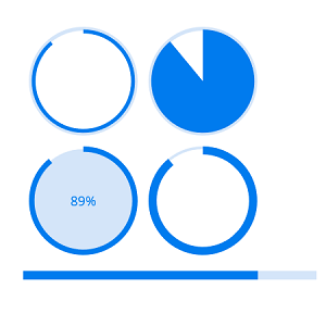
Types
Visualize progress in different shapes (rectangle, circle, and semi-circle) to give a unique appearance to your app design.


States
Visualize the progress in different modes such as determinate, indeterminate, and buffer.

Determinate
Use the determinate state progress bar when the progression can be estimated.

Indeterminate
Use the indeterminate state progress bar when it is impossible to predict or calculate the progression. It can be combined with determinate state to let users know that the app is estimating the progress before the actual progress starts.

Buffer
Use a secondary progress bar when the primary task depends on the secondary task to be shown like YouTube buffering. This will allow users to visualize the progression of both primary and secondary tasks, simultaneously.
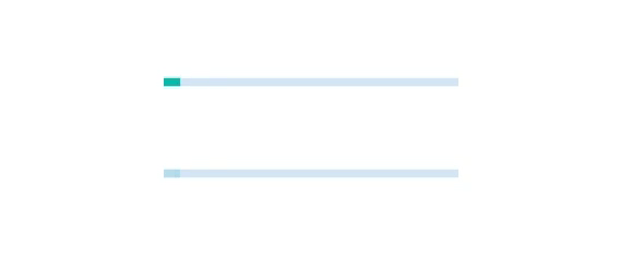
Segments
Avoid writing several lines of code to create and position multiple progress bars: just split a progress bar into multiple segments to visualize the progress of multiple sequential tasks.

Angle
Customize the start and end angles of the circular progress bar to give a unique style to the progress bar.

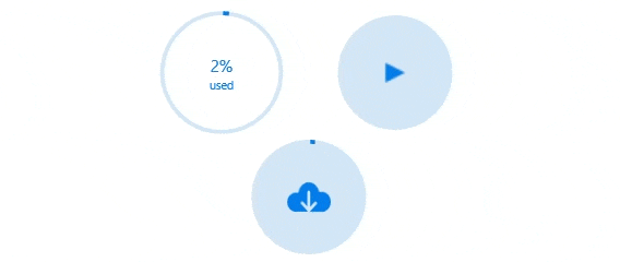
Custom content
Add any view to the center of a circular progress bar as a content to: indicate the completion of a task or process; add start, pause, or cancel buttons to control the progress interactively; add an image that indicates the actual task in progress; and add custom text that conveys the progress unit.
Visualize multiple ranges
Along with visualizing the progression of a task, users can also visualize multiple ranges with gradient colors or solid colors based on the range to enhance readability.
Appearance
The appearance of a .NET MAUI ProgressBar is highly customizable.
Thickness
Tweak the thickness of the track and progress indicator to render the .NET MAUI ProgressBar in different sizes.

Colors
Apply appealing colors to the track and progress indicator to match your app theme.

Corner radius
The corner radius of the .NET MAUI ProgressBar can be customized.
 95+ UI controls
200+ interactive .NET MAUI demos
3.2M+ downloads
95+ UI controls
200+ interactive .NET MAUI demos
3.2M+ downloads
.NET MAUI DataViz & UI Controls
Standalone UI SDKs
Integrate the DataGrid, Chart, Scheduler, and Rich Text Editor UI components into applications to enable rich interaction and visualization, delivering a seamless user experience.
Document Solutions
Integrate the PDF Viewer, DOCX Editor, Spreadsheet Editor, and document-processing libraries into the .NET MAUI applications to enable a smooth user experience.
Our Customers Love Us


See Real Success Stories
Developers around the world trust Syncfusion’s Essential Studio to simplify complex projects and speed up delivery. With a vast library of UI controls, powerful SDKs, and reliable support, Essential Studio helps teams build enterprise-ready applications with confidence.
Read Our Customer StoriesIndustry
Software development
75% Cost reduction
50% Faster development
Industry
Utilities (oil and gas)
450+ hours saved
Streamlined processes and hours of development effort saved.
Advanced, flexible features
Empowered users through robust and versatile functionality.
Industry
Software and technology
1000+ of hours saved
Accelerated development with enterprise-ready UI components.
Efficient file management
Streamlined workflows with document libraries without building them from scratch.
Industry
Software and technology
2 Years of delay avoided
Two years of delays prevented with proactive planning.
On-time delivery
Projects delivered on schedule using trusted controls.
Industry
IT services and IT consulting
Improved performance
Large datasets handled with easy customization and quick debugging.
Highly customizable
Plug-and-play controls with quick template integration.
Industry
Professional services
Instant access
Quick availability of features and resources.
Reduced dependencies
Fewer dependencies for faster development.
Rated by users across the globe


Awards
Greatness—it’s one thing to say you have it, but it means more when others recognize it. Syncfusion® is proud to hold the following industry awards.

