
 Prashant Yadav
Welcome to the third blog of the series “Designing a React E-Commerce App for Digital Products”. In the first part, we created an architectural diagram to get an idea about the user navigation and wireframes. We also set up the boilerplate, complete with public and private routes.
In the second part, we delved into implementing the web app’s authentication and authorization. This involved the creation of signup and login pages and their integration with a database for data persistence and session maintenance.
In this part, we’ll focus on creating a product management dashboard. This will enable us to add, update, and preview products effectively.

Designing the layout of the dashboard
Upon successful login, users will land on the dashboard page. It has a uniform layout for seamless navigation across various pages. To create this page, we’ll construct a wrapper encompassing a sidebar with navigational links, a header, and a main section for content display.
We’ll utilize Syncfusion’s React Sidebar component to create a docked drawer with a slight style modification. This wrapper will be employed across all pages within the admin section or post-login pages. We can use this wrapper as a standalone or higher order component (HOC).
In this instance, I’ve chosen to use it as a component, placed under each page rather than at the router level, as I believe it offers superior abstraction.
Wrapper.js
import "@syncfusion/ej2-layouts/styles/material.css";
import "@syncfusion/ej2-react-buttons/styles/material.css";
import "@syncfusion/ej2-base/styles/material.css";
import "@syncfusion/ej2-react-navigations/styles/material.css";
import { ButtonComponent } from "@syncfusion/ej2-react-buttons";
import "./wrapper.css";
import { Link, NavLink } from "react-router-dom";
import { SidebarComponent } from "@syncfusion/ej2-react-navigations";


const Wrapper = ({ children }) => {
  return (
    <div className="wrapper">
      <header>
        <Link className="title" to="/dashboard" title="visit dashboard">
          Geva Digital Shop
        </Link>
        <span className="username">Hello Prashant</span>
      </header>
      <main>
        <SidebarComponent id="default-sidebar" className="e-card sidebar">
          <nav>
            <ul className="menu">
              <li>
                <NavLink
                  to="/dashboard"
                  className={({ isActive }) => (isActive ? "active" : "")}
                >
                  Dashboard
                </NavLink>
              </li>
              <li>
                <NavLink
                  to="/manage-products"
                  className={({ isActive }) => (isActive ? "active" : "")}
                >
                  Manage Products
                </NavLink>
              </li>
            </ul>
          </nav>
          <ButtonComponent
            cssClass="e-danger e-block"
            onClick={() => {}}
            style={{ fontSize: "1.2em" }}
          >
            Logout
          </ButtonComponent>
        </SidebarComponent>
        <section className="e-card" id="main-area">
          {children}
        </section>
      </main>
    </div>
  );
};

export default Wrapper;
Wrapper.css
* {
  box-sizing: border-box;
}

.wrapper header {
  padding: 20px 30px;
  display: flex;
  align-items: center;
  justify-content: space-between;
  box-shadow: 0 1px 3px 0 rgba(0, 0, 0, 0.5);
  max-width: calc(100% - 40px);
  margin: 10px auto 0 auto;
}

.wrapper .title {
  font-size: 1.5em;
  text-decoration: none;
  color: #000;
  font-weight: bold;
}

.wrapper main {
  display: flex;
  align-items: stretch;
  justify-content: flex-start;
  flex-wrap: wrap;
  padding: 20px;
}

.wrapper .sidebar {
  flex: 0 250px;
  padding: 10px;
  display: flex;
  align-items: center;
  justify-content: space-between !important;
  position: relative;
  height: auto;
}

.wrapper .username {
  font-size: 18px;
  font-weight: bold;
}

.wrapper section {
  flex: 1;
  height: calc(100vh - 120px);
  margin-left: 20px !important;
  padding: 10px;
}

.wrapper .menu {
  margin: 0;
  display: flex;
  align-items: center;
  justify-content: flex-start;
  padding: 0;
  flex-wrap: wrap;
}

.wrapper .menu > li {
  flex: 0 100%;
  list-style-type: none;
}

.wrapper .menu > li > a {
  text-align: center;
  padding: 10px;
  display: block;
  text-decoration: none;
  font-size: 1.2em;
  color: #000;
  background: #eee;
  border-bottom: 1px solid #f7f7f7;
  transition: all 0.2s ease;
}

.wrapper .menu > li > a.active {
  background-color: #3f3c3c;
  color: #fff;
}

.wrapper .menu > li > a:hover {
  background-color: #3f3c3c;
  color: #fff;
}

.e-card,
.e-card:hover {
  box-shadow: 0 1px 3px 0 rgba(0, 0, 0, 0.5);
}

.e-card {
  justify-content: unset;
}
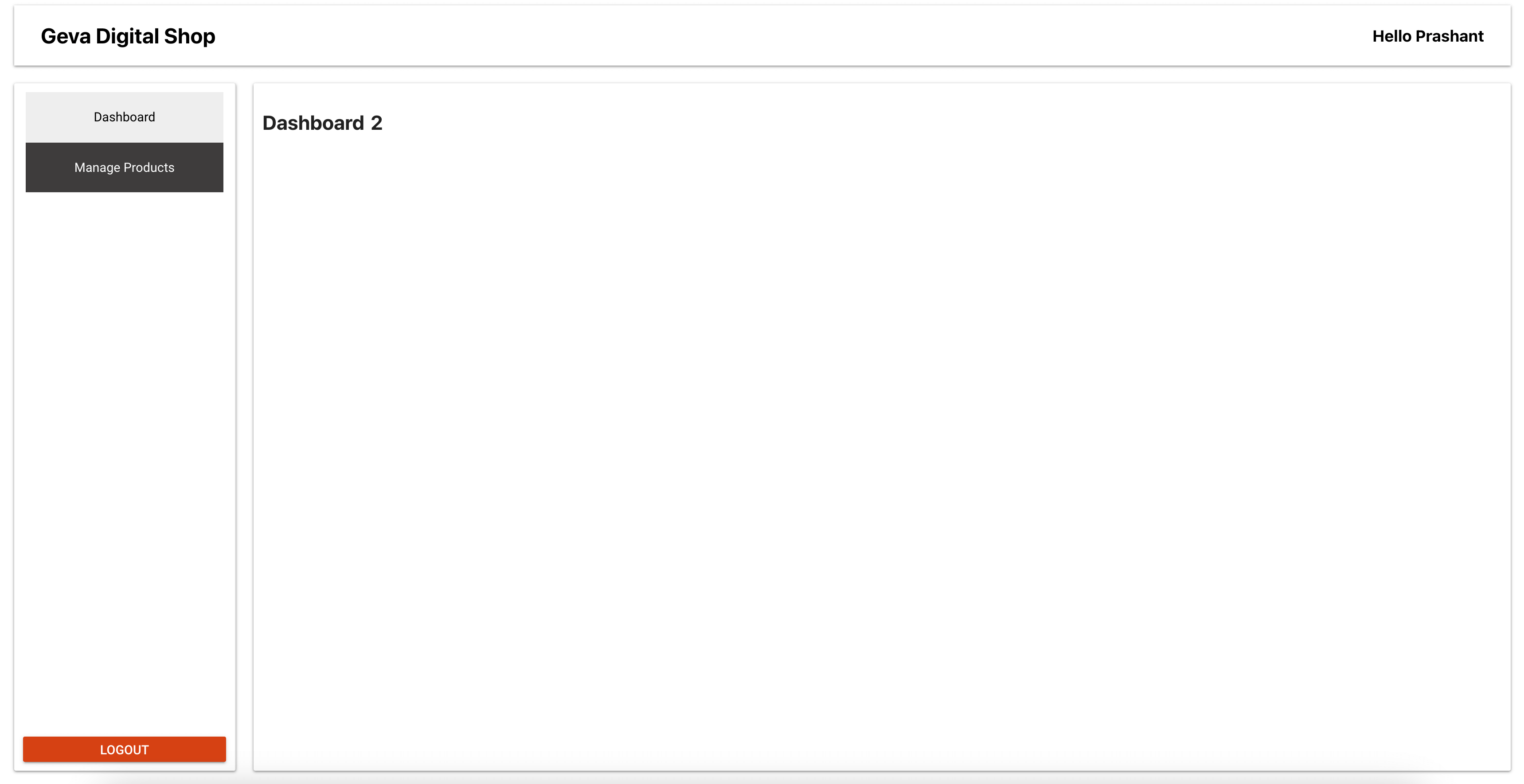
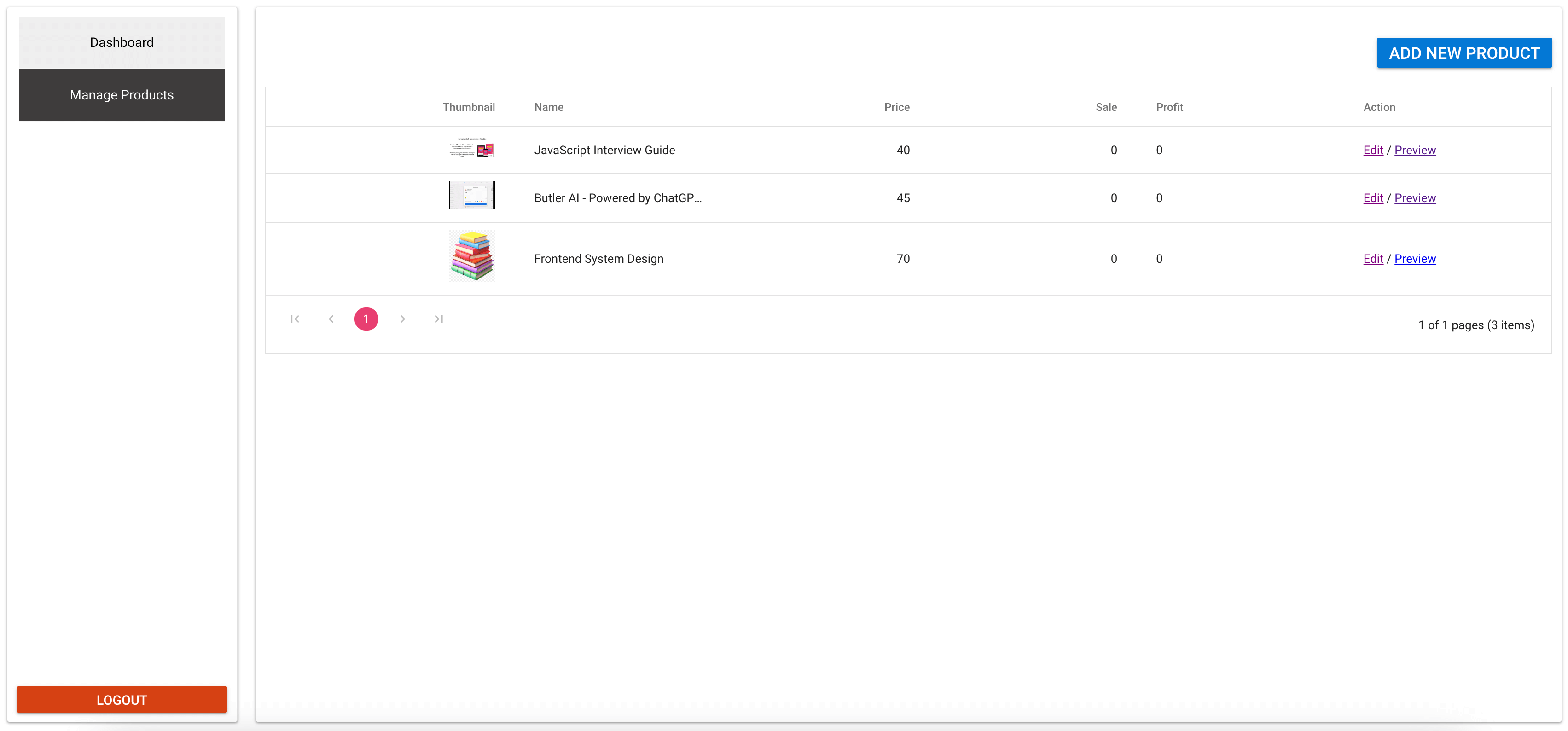
I want to design this platform with simplicity and user-friendliness in mind, featuring two primary pages:
- Dashboard: This home page serves as a comprehensive hub for all post-sales metrics. It gives users a snapshot of their sales performance, including key metrics and trends to help drive business decisions.
- Manage Products: This is a dedicated page where users can perform various product-related tasks. Users can add new products to the catalog, update existing product information, and preview product content before it is made live. This ensures that users have complete control over the products they offer.
In addition to these pages, we’ll incorporate a log out button for user convenience. This allows users to securely log out from the app, ensuring the safety of their account and data.
The header of our platform is designed to be informative and welcoming. On the left, we display the website title, reminding users of the platform they are on. On the right, we display the user’s name, adding a personal touch to the user experience. This balance of information and personalization helps create a comfortable and engaging environment for our users.
Refer to the following image.
 Now, we can create the previously mentioned pages and pass the content that will be visible inside the wrapper. The links will be highlighted on the active page.
Designing the Dashboard page
Refer to the following code example to configure the Dashboard page.
Dashboard.js
import Wrapper from "./wrapper";

const Dashboard = () => {
  return (
    <>
      <Wrapper>
        <h1>Dashboard 2</h1>
      </Wrapper>
    </>
  );
};

export default Dashboard;
Now, we include this page in the available routes that are accessible after login.
App.js
import { BrowserRouter, Routes, Route } from "react-router-dom";
import Login from "./pages/login";
import Signup from "./pages/signup";
import PrivateRoutes from "./routes/private";
import PublicRoutes from "./routes/public";
import Dashboard from "./pages/dashboard";
import NotFound from "./pages/404";

const App = () => {
  return (
    <BrowserRouter>
      <Routes>
        <Route path="/" element={<PublicRoutes />}>
          <Route index element={<h1>Browse</h1>} />
          <Route path="product-list" element={<h1>Product List</h1>} />
          <Route path="login" element={<Login />} />
          <Route path="signup" element={<Signup />} />
        </Route>
        <Route path="/" element={<PrivateRoutes />}>
          <Route path="dashboard" element={<Dashboard />} />
          <Route path="checkout" element={<h1>checkout</h1>} />
          <Route path="thank-you" element={<h1>Thank You</h1>} />
        </Route>
        <Route path="*" element={<NotFound />} />
      </Routes>
    </BrowserRouter>
  );
};

export default App;
Now that we have the dashboard structure ready, we can start constructing the product management flow.
Designing the Manage Products page
Let’s begin managing the products. We’ll divide the product management process into the following three distinct flows:
- Adding a new product.
- Editing an existing product.
- Previewing the created product.
Each flow will be categorized into individual entities, adhering to the hook/view pattern. This means the logic will be housed in the hook, while the view will be solely responsible for rendering the content.
First, we create the entry page for managing products, which we’ll call manageProducts.js.
manageProducts.js
import { useState } from "react";
import Wrapper from "./wrapper";
import "@syncfusion/ej2-react-buttons/styles/material.css";
import { ButtonComponent } from "@syncfusion/ej2-react-buttons";
import "./manageProduct.css";

const ManageProduct = () => {
  return (
    <Wrapper>
      <div className="manage-product"></div>
    </Wrapper>
  );
};

export default ManageProduct;
I incorporate this page into the routing configuration in the App.js file.
App.js
import { BrowserRouter, Routes, Route } from "react-router-dom";
import PrivateRoutes from "./routes/private";
import ManageProduct from "./pages/manageProduct";

const App = () => {
  return (
	<BrowserRouter>
  	 <Routes>
    	  <Route path="/" element={<PrivateRoutes />}>
      	   <Route path="manage-products" element={<ManageProduct />} />
    	  </Route>
  	 </Routes>
	</BrowserRouter>
  );
};
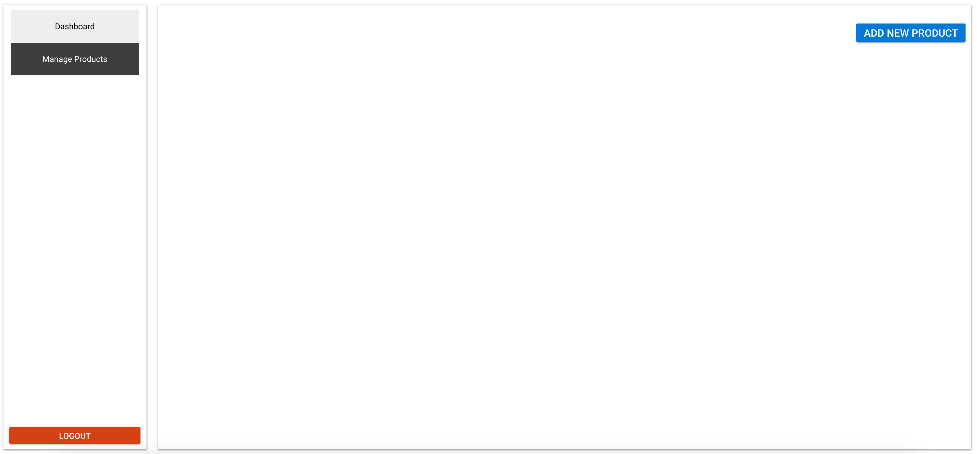
export default App;Add product
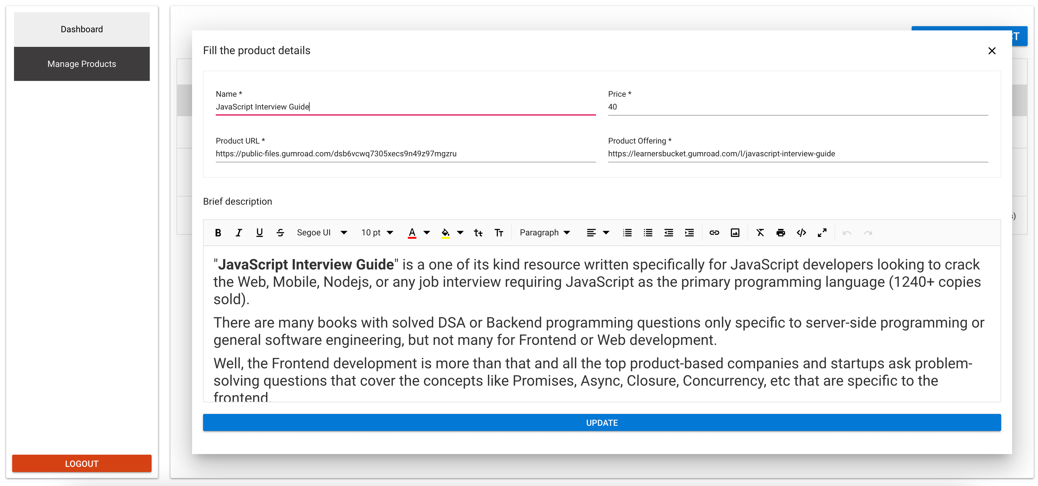
The first workflow we’re introducing under the Manage Products section is adding a new product. This process begins with a button in the page’s top-right corner. A modal will appear on the screen on clicking this button, rendering the Add Product component.
This modal is created using Syncfusion’s React Dialog component. We’ve designed it as a common component to reuse during the product editing workflow, thus ensuring consistency and reducing redundancy.
Here’s the code for our Modal.js component.
import "@syncfusion/ej2-base/styles/material.css";
import "@syncfusion/ej2-react-buttons/styles/material.css";
import "@syncfusion/ej2-react-popups/styles/material.css";
import { DialogComponent } from "@syncfusion/ej2-react-popups";

const Modal = ({ showModal, handleClose, children }) => {
  const dialogClose = () => {
	handleClose();
  };

  return (
	<div className="modal" id="dialog-target">
  	 <DialogComponent
    	   width="95%"
    	   close={dialogClose}
    	   header="Fill the product details"
    	   target={"#main-area"}
    	   visible={!!showModal}
    	   showCloseIcon={true}
    	   position={{ X: "center", Y: "center" }}
  	 >
    	  {children}
  	 </DialogComponent>
	</div>
  );
};
export default Modal;
A modal will appear on the screen when clicking the ADD NEW PRODUCT button. This modal serves as a container for the ProductAdd component. The ProductAdd component handles the functionality of adding a new product.
Here’s the code in the manageProduct.js file to accomplishes this.
import { useState } from "react";
import Wrapper from "./wrapper";
import "@syncfusion/ej2-react-buttons/styles/material.css";
import { ButtonComponent } from "@syncfusion/ej2-react-buttons";
import "./manageProduct.css";
import Modal from "../components/Modal";
import ProductAdd from "./productAdd";

const ManageProduct = () => {
  const [showModal, setShowModal] = useState(false);

  return (
	<Wrapper>
  	 <div className="manage-product">
    	  <div className="add-product">
      	   <ButtonComponent
        	cssClass="e-info"
        	onClick={() => {
          	setShowModal(true);
        	}}
        	style={{ fontSize: "1.2em" }}
      	   >
        	Add new product
      	   </ButtonComponent>
    	  </div>
    	  <Modal
      	     showModal={showModal}
      	     handleClose={() => {
        	setShowModal(false);
      	     }}
    	  >
      	    <ProductAdd />
    	  </Modal>
  	</div>
      </Wrapper>
  );
};

export default ManageProduct;
manageProduct.css
.add-product {
  text-align: right;
  margin: 20px 0;
}
Refer to the following image.
We’ve set up the initiation flow for adding a product. Let’s create the component to manage the product addition functionality. This component will encompass everything, from the input components to the API call required to create a new product.
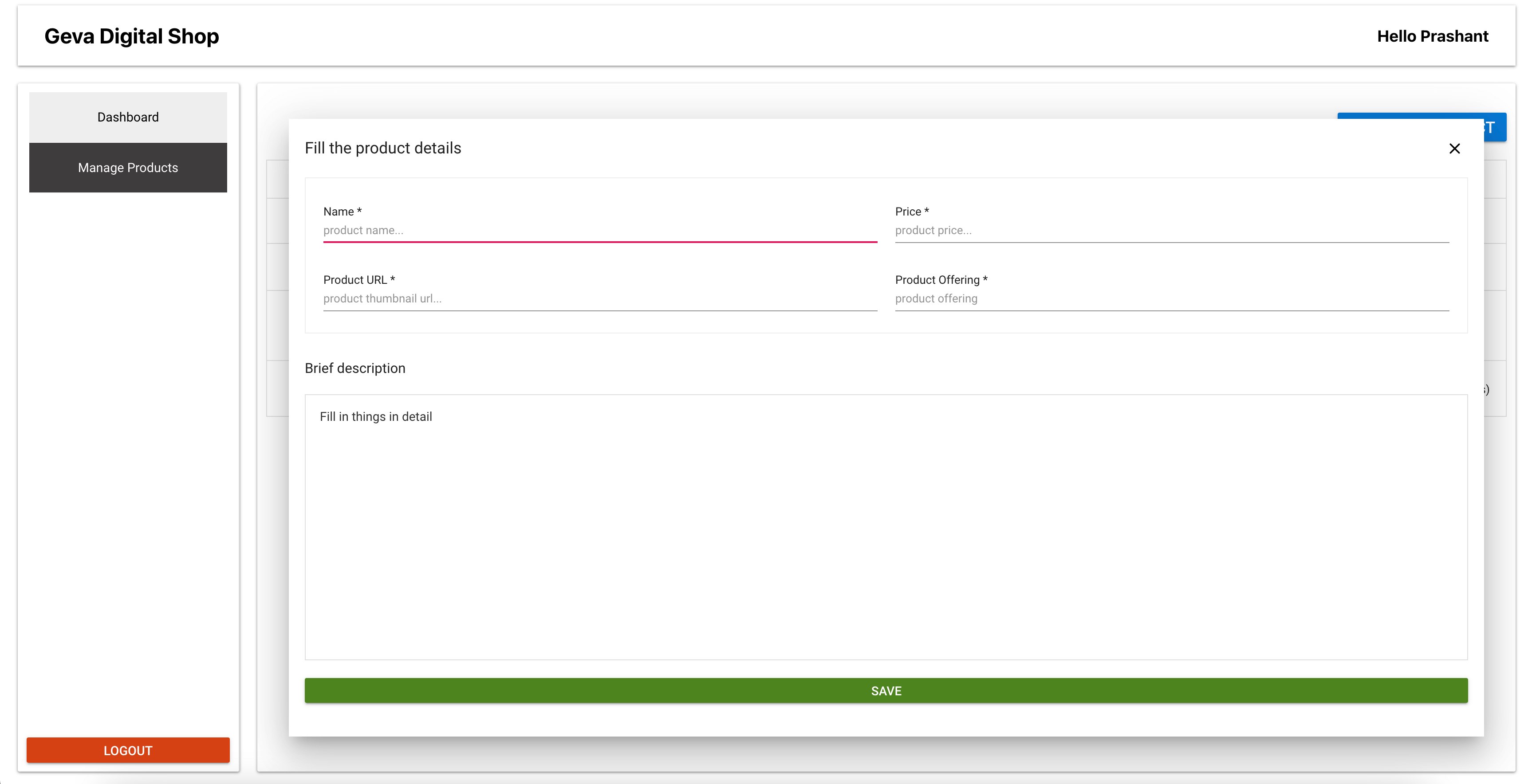
The component will include four input fields and a rich text editor for the product description:
- Name of the product (input field)
- Price of the product (input field)
- Image URL of the product (input field)
- After purchase redirect URL (input field)
- Description of the product (rich text editor)
We won’t store any images in SupaBase. Instead, we will request the URLs of the images after the product’s sale. For example, after purchasing an ebook, the customer will be redirected to a Google Drive link that contains the downloadable PDF.
The data recorded by these input fields will be stored in the SupaBase database. As such, our first step will be to create a products table in the database. This table will store all the information related to the products.
create table
  public.products (
	id bigint generated by default as identity,
	created_at timestamp with time zone not null default now(),
	product_details text null,
	product_name character varying null,
	product_price character varying null,
	product_thumbnail text null,
	user_details json null,
	product_offering text null,
	user_id character varying null,
	constraint products_pkey primary key (id)
  ) tablespace pg_default;
To create a new table, you can execute the appropriate query. This table will serve as a reference to the product, linked via the User ID. This linkage allows us to identify the users along with the products they have created, enabling us to display the relevant products on their dashboard.
Now, we can create the ProductAdd component. This component will handle the functionality of adding a new product.
productAdd.js
import "@syncfusion/ej2-layouts/styles/material.css";
import "@syncfusion/ej2-react-inputs/styles/material.css";
import "@syncfusion/ej2-react-buttons/styles/material.css";
import { ButtonComponent } from "@syncfusion/ej2-react-buttons";
import { useState, useRef } from "react";
import "./productAdd.css";
import TextEditor from "../components/TextEditor";
import useSupbase from "../hooks/supbase";
import Toast from "../components/Toast";
import productStore from "../store/products";

const ProductAdd = () => {
  const [productName, setProductName] = useState("");
  const [productPrice, setProductPrice] = useState("");
  const [productThumbnail, setProductThumbnail] = useState("");
  const [productOffering, setProductOffering] = useState("");
  const [toast, setToast] = useState({
	show: false,
	message: "",
	type: "error",
  });
  const productDescriptionRef = useRef();
  const SupaBase = useSupbase();
  const { productsList, setProductsList } = productStore((state) => state);

  const handleClick = async () => {
   try {
     const productDetails = productDescriptionRef.current.value;
      if (
    	productName ||
    	productPrice ||
    	productThumbnail ||
    	productDetails ||
    	productOffering
      ) {
      const { data, error: userError } = await SupaBase.auth.getSession();
      const { session } = data;

      const { data: newProduct, error: productError } = await SupaBase
      .from("products")
      .insert({
            product_name: productName,
            product_price: productPrice,
            product_thumbnail: productThumbnail,
            product_details: productDetails,
            product_offering: productOffering,
            user_details: session?.user,
            user_id: session?.user?.id,
      })
      .select();

      setProductsList([...productsList, ...newProduct]);

      setToast({
      	  message: "Successfully added a product",
      	  show: true,
      	  type: "success",
      });

      resetState();
      } else {
      console.log("Product detials missing");
      }
      } catch (e) {
  	console.error("An error occurred", e);
      }
  };

  const resetState = () => {
	setProductName("");
	setProductPrice("");
	setProductThumbnail("");
	setProductOffering("");
	productDescriptionRef.current.value = "";
  };

  return (
    <div>
      <div className="row">
    	<div className="field-area">
      	 <label htmlFor="product-name">Name *</label>
      	 <input
        	className="e-input"
        	type="text"
        	placeholder="product name..."
        	name="product-name"
        	id="product-name"
        	onChange={(e) => setProductName(e.target.value)}
        	value={productName}
        	required
      	 />
    	</div>

    	<div className="field-area">
      	 <label htmlFor="product-price">Price *</label>
      	 <input
        	className="e-input"
        	type="number"
        	placeholder="product price..."
        	name="product-price"
        	id="product-price"
        	onChange={(e) => setProductPrice(e.target.value)}
        	value={productPrice}
        	required
      	 />
    	</div>

    	<div className="field-area">
      	 <label htmlFor="product-thumbnail">Product URL *</label>
      	  <input
        	className="e-input"
        	type="url"
        	placeholder="product thumbnail url..."
        	name="product-thumbnail"
        	id="product-thumbnail"
        	onChange={(e) => setProductThumbnail(e.target.value)}
        	value={productThumbnail}
        	required
      	  />
    	</div>

    	<div className="field-area">
      	 <label htmlFor="product-offering">Product offering *</label>
      	  <input
        	className="e-input"
        	type="url"
        	placeholder="product offering"
        	name="product-offering"
        	id="product-offering"
        	onChange={(e) => setProductOffering(e.target.value)}
        	value={productOffering}
        	required
      	  />
    	</div>
      </div>

      <div>
       <label htmlFor="product-description" className="product-desc">
      	  Brief description
       </label>
       <TextEditor id="product-description" ref={productDescriptionRef} />
      </div>

      <ButtonComponent
    	className="e-success save-btn e-block e-large"
    	onClick={handleClick}
      >
    	Save
      </ButtonComponent>
      {toast.show && (
    	<Toast
      	  errorMessage={toast.message}
      	  type={toast.type}
      	  onClose={() => {
        	setToast({
          	  show: false,
          	  message: "",
          	  type: "error",
        	});
      	  }}
    	/>
      )}
    </div>
  );
};

export default ProductAdd;
productAdd.css
.field-area {
  flex: 1 50%;
  padding: 20px 10px 0 10px;
  text-align: left;
}

.save-btn {
  margin: 20px 0;
  font-size: 1.2em;
}

.product-desc {
  font-size: 1.2em;
  margin: 20px 0;
  display: inline-block;
}
The TextEditor.js file is designed to be a reusable component for the Rich Text Editor. By abstracting the styles and functionality into this component, you can easily incorporate a rich text editor in your app wherever needed, ensuring consistency and reducing code duplication. Refer to the following code example.
TextEditor.js
import "@syncfusion/ej2-base/styles/material.css";
import "@syncfusion/ej2-icons/styles/material.css";
import "@syncfusion/ej2-buttons/styles/material.css";
import "@syncfusion/ej2-splitbuttons/styles/material.css";
import "@syncfusion/ej2-inputs/styles/material.css";
import "@syncfusion/ej2-lists/styles/material.css";
import "@syncfusion/ej2-navigations/styles/material.css";
import "@syncfusion/ej2-popups/styles/material.css";
import "@syncfusion/ej2-richtexteditor/styles/material.css";

import {
  HtmlEditor,
  Image,
  Inject,
  Link,
  QuickToolbar,
  RichTextEditorComponent,
  Toolbar,
} from "@syncfusion/ej2-react-richtexteditor";

import { forwardRef } from "react";

const TextEditor = (props, ref) => {
  const toolbarSettings = {
	items: [
  	"Bold",
  	"Italic",
  	"Underline",
  	"StrikeThrough",
  	"FontName",
  	"FontSize",
  	"FontColor",
  	"BackgroundColor",
  	"LowerCase",
  	"UpperCase",
  	"|",
  	"Formats",
  	"Alignments",
  	"OrderedList",
  	"UnorderedList",
  	"Outdent",
  	"Indent",
  	"|",
  	"CreateLink",
  	"Image",
  	"|",
  	"ClearFormat",
  	"Print",
  	"SourceCode",
  	"FullScreen",
  	"|",
  	"Undo",
  	"Redo",
	],
  };
  const quickToolbarSettings = {
	image: [
  	"Replace",
  	"Align",
  	"Caption",
  	"Remove",
  	"InsertLink",
  	"OpenImageLink",
  	"-",
  	"EditImageLink",
  	"RemoveImageLink",
  	"Display",
  	"AltText",
  	"Dimension",
	],
  };

  return (
	<RichTextEditorComponent
  	 height={300}
  	 toolbarSettings={toolbarSettings}
  	 quickToolbarSettings={quickToolbarSettings}
  	 ref={ref}
	>
  	  <p>Fill in things in detail</p>
  	  <Inject services={[Toolbar, Image, Link, HtmlEditor, QuickToolbar]} />
	</RichTextEditorComponent>
  );
};

export default forwardRef(TextEditor);
The TextEditor component, defined in this file, utilizes the Syncfusion React Rich Text Editor component. The toolbarSettings and quickToolbarSettings determine the items displayed in the toolbar and the quick toolbar, respectively. The TextEditor component applies these settings and returns the RichTextEditorComponent.
The forwardRef function creates a reference and passes it as a property to the TextEditor component, enabling parent components to interact with the RichTextEditorComponent. You can incorporate this reusable component wherever your app requires a rich text editor. You can access the editor’s value through the forwarded reference.
The next step in the flow involves storing all the fetched products in a Zustand store. This implementation will occur in the store/products.js file.
store/products.js
import { create } from "zustand";

let store = (set) => ({
  productsList: [],
  setProductsList: (productsList) => set(() => ({ productsList })),
});

//create the store
let productStore = create(store);

export default productStore;
This file creates a Zustand store named productStore. This store contains a state variable, the productsList array, which holds all the fetched products. The function setProductsList updates the productsList state. Other components can import and use this store to access and update the product list, making it easier to manage and track its state across different components.
When a new product is successfully added, the Zustand store also updates the entry. This update ensures the immediate visibility of the newly added product on the frontend.
All the component’s fields are controlled components. This control means that the local state of these fields resets once a product is added, preparing them for the following product addition. The store will work with the products fetch list hook, retrieving the records from the database.
View products list
Creating a hook will be the first step in displaying the product list. This hook is designed to retrieve the product records from the database and store them in the Zustand store, allowing convenient access and display of the product list.
hooks/useProduct.js
import { useState, useEffect } from "react";
import useSupbase from "./supbase";
import productStore from "../store/products";

const useProducts = () => {
  const setProductsList = productStore((state) => state.setProductsList);

  const SupaBase = useSupbase();

  const fetchProducts = async () => {
	const { data: userData, error: userError } =
  	await SupaBase.auth.getSession();
	const { session } = userData;

	const { data: productData, error: productError } = await SupaBase
  	.from("products")
  	.select()
  	.eq("user_id", session?.user?.id);

	setProductsList(productData);
	try {
	} catch (e) {
  	console.error("Error while fetching products list");
	}
  };

  useEffect(() => {
	fetchProducts();
  }, []);
};

export default useProducts;
In this hook, the fetchProducts function is designed to retrieve product records from the database associated with the current user. Once fetched, these products are stored in the Zustand store using the setProductsList function. The useEffect hook ensures that the fetchProducts function is called when the component that uses this hook is mounted. This guarantees that the product list is retrieved and prepared for display as soon as the component loads. This hook can be imported and utilized in any product list component.
With the product store ready, it can render the list of products. For this rendering process, we’ll leverage Syncfusion React Data Grid. This component offers built-in features such as pagination, sorting, filtering, and grouping. It also supports templates. This means you can render custom HTML elements for any row’s value. This feature is useful for adding elements like the product thumbnail and the edit or preview buttons. Refer to the following code example.
DataGrid/index.js
import "@syncfusion/ej2-base/styles/material.css";
import "@syncfusion/ej2-buttons/styles/material.css";
import "@syncfusion/ej2-calendars/styles/material.css";
import "@syncfusion/ej2-dropdowns/styles/material.css";
import "@syncfusion/ej2-inputs/styles/material.css";
import "@syncfusion/ej2-navigations/styles/material.css";
import "@syncfusion/ej2-popups/styles/material.css";
import "@syncfusion/ej2-splitbuttons/styles/material.css";
import "@syncfusion/ej2-notifications/styles/material.css";
import "@syncfusion/ej2-react-grids/styles/material.css";

import {
  ColumnDirective,
  ColumnsDirective,
  GridComponent,
  Inject,
  Page,
} from "@syncfusion/ej2-react-grids";
import { Link } from "react-router-dom";
import * as React from "react";

const DefaultValueTemplate = (props) => {
  return props[props.column.field] || 0;
};

const ThumbnailTemplate = (props) => {
  return (
    <img
       src={props.product_thumbnail}
       alt={props.product_name}
       title={props.product_name}
       style={{ maxWidth: "50px" }}
    />
  );
};

const DataGrid = ({ data, ActionsTemplate }) => {
  return (
    <GridComponent
  	dataSource={data}
  	allowPaging={true}
  	pageSettings={{ pageSize: 6 }}
    >
    <ColumnsDirective>
      <ColumnDirective
      	field="product_thumbnail"
      	width="120"
      	textAlign="Right"
      	template={ThumbnailTemplate}
      	headerText="Thumbnail"
      />
      <ColumnDirective field="product_name" width="100" headerText="Name" />
       <ColumnDirective
      	 field="product_price"
      	 width="100"
      	 textAlign="Right"
      	 headerText="Price"
      	 template={DefaultValueTemplate}
       />
       <ColumnDirective
      	 field="product_sale"
      	 width="100"
      	 format="C2"
      	 textAlign="Right"
      	 headerText="Sale"
      	 template={DefaultValueTemplate}
       />
       <ColumnDirective
      	 field="product_profit"
      	 width="100"
      	 headerText="Profit"
      	 template={DefaultValueTemplate}
       />
       <ColumnDirective
      	 field="action"
      	 width="100"
      	 template={ActionsTemplate}
      	 headerText="Action"
       />
     </ColumnsDirective>
     <Inject services={[Page]} />
    </GridComponent>
  );
};
export default DataGrid;
We are passing the ActionTemplates as it triggers state updates to view the modal for editing a product. Thus, we will pass the component rather than passing the state as prop.
productsList.js
import "./productList.css";
import { useState } from "react";
import { Link } from "react-router-dom";
import ProductEdit from "./productEdit";
import Modal from "../components/Modal";
import useProducts from "../hooks/useProducts";
import productStore from "../store/products";
import DataGrid from "../components/DataGrid";

const ProductList = () => {
  const [productToEdit, setProductToEdit] = useState({});
  const [showModal, setShowModal] = useState(false);
  useProducts();
  const productsList = productStore((state) => state.productsList);

  const ActionsTemplate = (e) => {
     const product = productsList.filter((f) => f.id === e.id)[0] || [];
     return (
      <span>
    	<span
      	  onClick={() => {
        	setProductToEdit(e);
        	setShowModal(true);
      	  }}
      	  className="edit-product"
    	>
      	  Edit
        </span>
        </>
        <Link to={`/product/${e.id}`} title={`preview ${e.Name}`}>
      	  Preview
        </Link>
      </span>
     );
  };

  return (
    <div className="product-list">
      <DataGrid data={productsList} ActionsTemplate={ActionsTemplate} />
      <Modal
    	  showModal={showModal}
    	  handleClose={() => {
      	    setShowModal(false);
      	    setProductToEdit({});
    	  }}
       >
    	  <ProductEdit product={productToEdit} />
       </Modal>
     </div>
  );
};

export default ProductList;
productLists.css
.row {
  display: flex;
  align-items: center;
  justify-content: flex-start;
  text-transform: capitalize;
  flex-wrap: wrap;
  text-align: center;
  padding: 10px;
  border: 1px solid #eee;
  margin-bottom: 10px;
}

.row > span {
  flex: 0 calc(100% / 6);
}

.row > span > img {
  width: 80px;
  vertical-align: middle;
}

.bold {
  font-weight: bold;
  line-height: 20px;
}

.edit-product {
  cursor: pointer;
  text-decoration: underline;
  color: purple;
}

.product-list {
  min-height: 600px;
}
Now, we should add this product list in the manageProducts.js file to render and view the list.
import { useState } from "react";
import Wrapper from "./wrapper";
import "@syncfusion/ej2-react-buttons/styles/material.css";
import { ButtonComponent } from "@syncfusion/ej2-react-buttons";
import ProductList from "./productList";
import "./manageProduct.css";
import Modal from "../components/Modal";
import ProductAdd from "./productAdd";

const ManageProduct = () => {
  const [showModal, setShowModal] = useState(false);

  return (
    <Wrapper>
     <div className="manage-product">
       <div className="add-product">
      	<ButtonComponent
           cssClass="e-info"
           onClick={() => {
              setShowModal(true);
           }}
           style={{ fontSize: "1.2em" }}
      	>
        	Add new product
      	</ButtonComponent>
       </div>
       <Modal
      	 showModal={showModal}
      	 handleClose={() => {
        	setShowModal(false);
      	 }}
       >
      	<ProductAdd />
       </Modal>
       <ProductList />
     </div>
    </Wrapper>
  );
};

export default ManageProduct;
Refer to the following image.
As you may have noticed in the code and on the screen, each product has two call-to-action buttons: one for editing and another for previewing the product.
Editing a product
For the editing functionality, we’ve created a separate component. Although, we could have used the Add Product component, we’ve separated these concerns for better organization and clarity.
The Add Product and Edit Product components share the same user interface (UI). Therefore, you could create a common form component that both could use. In this case, I’ve rewritten the input components in both.
The Edit Product component accepts the product details that need to be edited. It then updates the local state of the fields with the product data. Since these are controlled components, any changes in the state are immediately reflected in the fields.
When you make a change and click the Update button, it triggers the update action. After the update, it fetches the updated record from the table. We then replace the Zustand store’s corresponding record with this new one.
productEdit.js
import "@syncfusion/ej2-layouts/styles/material.css";
import "@syncfusion/ej2-react-inputs/styles/material.css";
import "@syncfusion/ej2-react-buttons/styles/material.css";
import { ButtonComponent } from "@syncfusion/ej2-react-buttons";
import { useState, useRef, useEffect } from "react";
import "./productAdd.css";
import TextEditor from "../components/TextEditor";
import useSupbase from "../hooks/supbase";
import Toast from "../components/Toast";
import productStore from "../store/products";

const ProductEdit = ({ product }) => {
  const [productName, setProductName] = useState("");
  const [productPrice, setProductPrice] = useState("");
  const [productThumbnail, setProductThumbnail] = useState("");
  const [productOffering, setProductOffering] = useState("");
  const [toast, setToast] = useState({
	show: false,
	message: "",
	type: "error",
  });
  const productDescriptionRef = useRef();
  const SupaBase = useSupbase();
  const { productsList, setProductsList } = productStore((state) => state);

  const handleClick = async () => {
    try {
     const productDetails = productDescriptionRef.current.value;
       if (
    	  productName ||
    	  productPrice ||
    	  productThumbnail ||
    	  productDetails ||
    	  productOffering
  	) {
    	const { data, error: userError } = await SupaBase.auth.getSession();
    	const { session } = data;

    	const { data: updatedProduct, error: productError } = await SupaBase
      	.from("products")
      	.update({
             product_name: productName,
             product_price: productPrice,
             product_thumbnail: productThumbnail,
             product_details: productDetails,
             product_offering: productOffering,
      	})
      	.eq("id", product.id)
      	.select();

    	const filteredProducts = productsList.filter(
      	  (e) => e.id !== product.id
    	);

    	setProductsList([...filteredProducts, ...updatedProduct]);

    	setToast({
      	  message: "Successfully update the product",
      	  show: true,
      	  type: "success",
    	});
  	} else {
    	console.log("Product detials missing");
  	}
	} catch (e) {
  	console.error("An error occurred", e);
	}
  };

  useEffect(() => {
     const {
  	product_name,
  	product_price,
  	product_thumbnail,
  	product_offering,
  	product_details,
     } = product;

     setProductName(product_name);
     setProductPrice(product_price);
     setProductThumbnail(product_thumbnail);
     setProductOffering(product_offering);
     productDescriptionRef.current.value = product_details;
  }, [product]);

  return (
    <div>
      <div className="row">
    	<div className="field-area">
      	  <label htmlFor="product-name">Name *</label>
      	  <input
        	className="e-input"
        	type="text"
        	placeholder="product name..."
        	name="product-name"
        	id="product-name"
        	onChange={(e) => setProductName(e.target.value)}
        	value={productName}
        	required
      	   />
    	</div>

    	<div className="field-area">
      	  <label htmlFor="product-price">Price *</label>
      	  <input
        	className="e-input"
        	type="number"
        	placeholder="product price..."
        	name="product-price"
        	id="product-price"
        	onChange={(e) => setProductPrice(e.target.value)}
        	value={productPrice}
        	required
      	  />
    	</div>

    	<div className="field-area">
      	  <label htmlFor="product-thumbnail">Product URL *</label>
      	  <input
        	className="e-input"
        	type="url"
        	placeholder="product thumbnail url..."
        	name="product-thumbnail"
        	id="product-thumbnail"
        	onChange={(e) => setProductThumbnail(e.target.value)}
        	value={productThumbnail}
        	required
      	  />
    	</div>

    	<div className="field-area">
      	  <label htmlFor="product-offering">Product offering *</label>
      	  <input
        	className="e-input"
        	type="url"
        	placeholder="product offering"
        	name="product-offering"
        	id="product-offering"
        	onChange={(e) => setProductOffering(e.target.value)}
        	value={productOffering}
        	required
      	  />
    	</div>
     </div>

     <div>
    	<label htmlFor="product-description" className="product-desc">
      	  Brief description
    	</label>
    	<TextEditor id="product-description" ref={productDescriptionRef} />
     </div>

     <ButtonComponent
    	className="e-info save-btn e-block e-large"
    	onClick={handleClick}
     >
    	Update
     </ButtonComponent>
     {toast.show && (
    	<Toast
      	  errorMessage={toast.message}
      	  type={toast.type}
      	  onClose={() => {
            setToast({
          	show: false,
          	message: "",
          	type: "error",
            });
      	  }}
    	/>
      )}
    </div>
  );
};

export default ProductEdit;
Refer to the following image.
Preview a product
To enhance the product preview functionality, we’ll construct a distinct page. This page will be accessible via a public route, as authentication is not required to view a product. This page will be designed to accept the product ID as a URL parameter. Using this ID, we’ll fetch the corresponding product from the database and display it for preview.
This is how you can set up the route in your App.js file.
<Route path="/product/:id" element={<ProductPreview />} />In this code, a new route is defined for product previews. The :id in the path is a placeholder for the product ID. When a user navigates to this route, the ProductPreview component is rendered. This component is responsible for fetching the product data based on the ID in the URL and displaying it for preview. This setup allows each product to have its unique preview page, accessible via a unique URL.
productPreview.js
import { useEffect, useState } from "react";
import { useParams } from "react-router-dom";
import useSupbase from "../hooks/supbase";
import "@syncfusion/ej2-layouts/styles/material.css";
import "@syncfusion/ej2-react-buttons/styles/material.css";
import { ButtonComponent } from "@syncfusion/ej2-react-buttons";
import "./productPreview.css";
import useStore from "../store/user";

const ProductPreview = () => {
  const params = useParams();
  const [product, setProduct] = useState({});
  const isLoggedIn = useStore((state) => state.isLoggedIn);
  const SupaBase = useSupbase();

  useEffect(() => {
	fetchProduct();
  }, [params.id]);

  const fetchProduct = async () => {
    try {
      const { data: productData, error: productError } = await SupaBase
    	.from("products")
    	.select()
    	.eq("id", params.id);

      setProduct(productData.length ? productData[0] : {});
    } catch (e) {
  	console.error(`There was an error while fetching the product with the id:
    	${params.id}`);
    }
  };

  const isProductFetched = Object.keys(product).length > 0;

  const userMetaData = product?.user_details?.user_metadata;
  const userName = `${userMetaData?.firstName} ${userMetaData?.lastName}`;

  return (
    <div className="product-preview">
      {isProductFetched ? (
    	<div>
      	  <div className="hero-image e-card">
             <img src={product.product_thumbnail} alt={product.product_name} />
      	  </div>
      	  <div className="product-details">
             <section className="e-card section-right">
               <h1>
            	 {product.product_name} | From: {userName}
               </h1>
               <div
            	 dangerouslySetInnerHTML={{ __html: product.product_details }}
               ></div>
             </section>
             <section className="e-card section-left">
               <h2>Price: ${product.product_price}</h2>
          	 {!isLoggedIn && (
            	   <ButtonComponent className="e-success">
              	       Purchase
            	   </ButtonComponent>
          	 )}
             </section>
      	  </div>
    	</div>
  	) : (
    	<h1>No Product found</h1>
      )}
    </div>
  );
};

export default ProductPreview;
In this file, the ProductPreview component is defined. This component fetches the product data based on the ID in the URL and displays it for preview. If the product data is successfully fetched, it is displayed in a structured layout. If not, a message indicating that no product was found is displayed. This component can be imported and used in any product preview component.
productPreview.css
.product-preview {
  padding: 10px;
  max-width: 1000px;
  margin: 0 auto;
}

.product-preview .hero-image {
  margin-bottom: 10px;
  align-items: center;
  padding: 10px;
}

.product-preview .hero-image img {
  max-width: 1000px;
  width: 100%;
}

.product-preview .product-details {
  display: flex;
  justify-content: space-between;
  flex-wrap: wrap;
  align-items: stretch;
}

.product-preview .product-details .section-right {
  flex: 0 70%;
  padding: 10px;
}

.product-preview .product-details .section-left {
  flex: 0 29%;
  padding: 10px;
}

.product-preview .product-details h1,
.product-preview .product-details h2 {
  text-transform: uppercase;
  padding-bottom: 15px;
  border-bottom: 1px solid #2d2b2b;
}
In this implementation, the product record is fetched directly within the component, as it’s not required elsewhere. However, you could create a separate hook dedicated to fetching the record.
The product list and preview components are designed to be reusable. This allows us to incorporate them into the home page easily to display all the products in the store.
What’s next?
In the next section, we’ll focus on creating the home page. This will include a comprehensive list of products. Additionally, we’ll implement the checkout flow. This process will allow users to complete their purchases and store the details of each order. This approach ensures a seamless shopping experience for users while maintaining a detailed record of all transactions.
Conclusion
We appreciate your time in reading this blog! We’ve walked through the process of building a product management dashboard, empowering us to add, update, and preview products in our React digital products e-commerce app. We urge you to apply what you’ve learned and share your journey in the comments below!
Syncfusion’s Essential Studio for React is a one-stop solution offering over 80 high-performance, lightweight, modular, and responsive UI components. It’s the perfect suite to build any web app.
For our existing Syncfusion users, the latest version of Essential Studio is available for download on the License and Downloads page. If you’re new to Syncfusion, we invite you to explore our products’ features and capabilities with our 30-day free trial.
For questions, you can contact us through our support forum, support portal, or feedback portal. We are always here to assist you!
See you in our next blog!


 No spam, just valuable updates.