
 Gowrimathi S
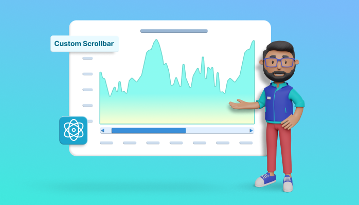
Charts are one of the most important and widely used data visualization elements for representing data in graphical form.
The Syncfusion React Chart component supports over 50 chart types with many feature sets. One of those features is scrollbars. They are used to pan on zoomed charts and load chart data on demand.
You can customize the scrollbar to enhance its visual appearance.
In this blog, we’ll see how to customize the scrollbar in the React Charts component to our specific application needs.

React Charts’ scrollbar elements
Before diving into the code, let’s ensure we understand the scrollbar’s structure. Knowing this is helpful when styling it with different properties. The following are the elements that make up a scrollbar:
- Thumb: The movable part of the scrollbar, it represents the current position in the chart. By clicking and dragging it, you can quickly scroll through the chart.
- Track: The area of the scrollbar that the thumb moves along. It represents the entire length of the chart.
- Arrow buttons: These are situated at the edge of the thumb and can be clicked and dragged to scroll through the chart.
- Grip: You can click and move the scrollbar using the dots inside the thumb, known as the grip.
Customizing the scrollbar elements in React Charts
We’ve seen the elements of the scrollbar in the React Charts. Let’s see how to customize them.
Arrow button
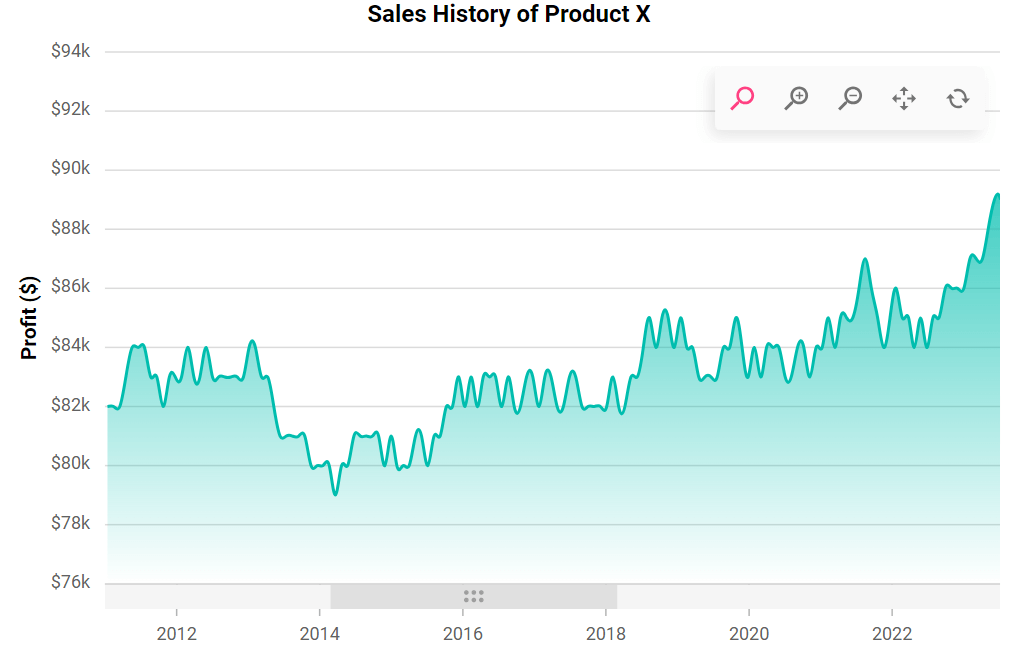
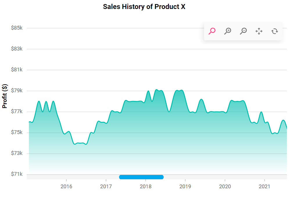
The scrollbar in the React Charts component typically includes zoom buttons at the ends, which allow us to perform zooming in and out actions. Here, we’re going to disable the zoom functionality.
So, let’s remove the buttons for the zooming options in the scrollbar as in the following code example.
<ChartComponent id='charts' primaryXAxis={{ valueType: 'DateTime' scrollbarSettings: { enableZoom: false} }} >

<ChartComponent/>
After executing this code example, the scrollbar will look like the following image.
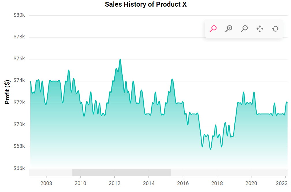
Grip
The grip is the draggable element that allows you to click and move the scrollbar. Sometimes, we prefer to remove the grip to achieve a cleaner appearance or when the scroll height doesn’t require dragging.
Following is an example of how to remove the grip on the scrollbar.
<ChartComponent id='charts' primaryXAxis={{ valueType: 'DateTime' scrollbarSettings: { enableZoom: false, gripColor:'transparent',} }} >

<ChartComponent/>
After executing the previous code example, the scrollbar will look like the following image.
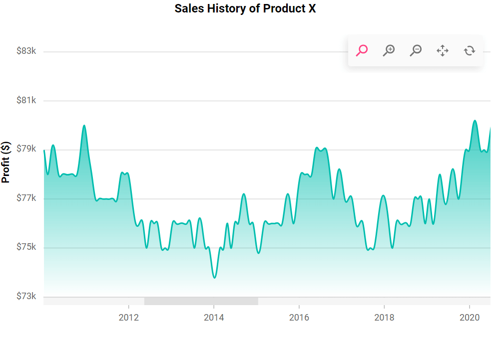
Size of scrollbar
By default, the scrollbar has a predefined height. But we can also adjust its size, especially for better visibility on mobile devices.
Refer to the following code example.
<ChartComponent id='charts' primaryXAxis={{ scrollbarSettings: { height: 10 } }} >

<ChartComponent/>
After executing the previous code example, the scrollbar will look like the following image.
Customizing the thumb
Next, let’s customize the color and corner radius of the scrollbar’s thumb to match our app’s design. You can achieve the desired appearance by modifying the scrollbar API.
<ChartComponent id='charts'
primaryXAxis={{ scrollbarSettings: { enableZoom: false, gripColor:'transparent', scrollbarColor:'#0ae, scrollbarRadius:5, height: 10 } }} >

<ChartComponent/>
After executing the previous code example, the scrollbar will look like the following image.
Customizing the track appearance
Like the thumb, you can also customize the color and corner radius of the track using the associated properties. Refer to the following code example.
<ChartComponent id='charts'
primaryXAxis={{ scrollbarSettings: { enableZoom: false, gripColor:'transparent', trackColor:'#cdcdcd', trackRadius:5, scrollbarColor:'#0ae, scrollbarRadius:5, height: 10 } }} >

<ChartComponent/>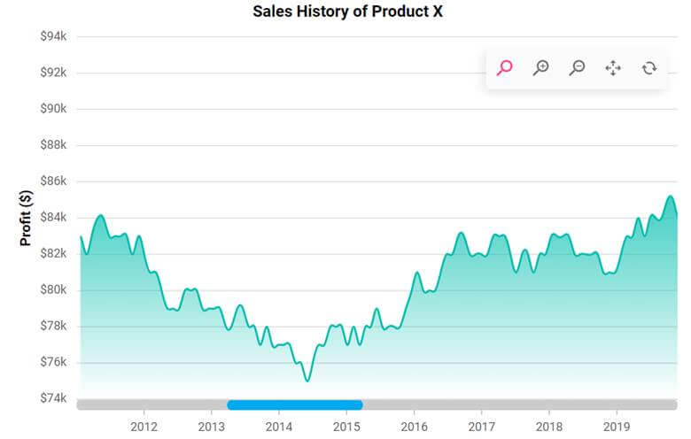
References
For more details, refer to the scrollbar customization in React Charts StackBlitz and web demos.

Conclusion
Thanks for reading! In this blog, you’ve seen how to customize the scrollbar in Syncfusion React Charts for better data visualization. We encourage you to try out these customization options and leave your feedback in the comments section below.
To try our Charts control in React, please download our free trial. You can also check out our online demos and documentation for a more in-depth look at what you can do with the React Charts component.
For questions, you can contact us through our support forums, support portal, or feedback portal. We are always happy to assist you!
 No spam, just valuable updates.