

We are thrilled to introduce the all-new WinUI Shimmer Control in our Syncfusion Essential Studio® 2023 Volume 3 release.
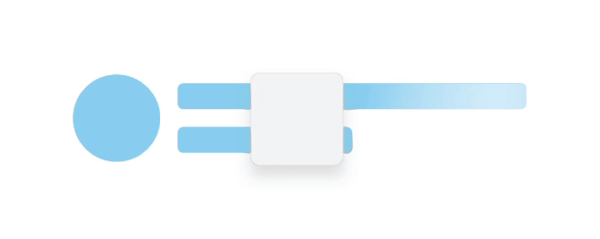
The WinUI Shimmer control is a cutting-edge tool designed to enrich the user interface of your applications. It introduces a stylish shimmer effect that becomes visible when the app loads data or processes tasks in the background. This innovative feature not only boosts the responsiveness of your apps, but it also infuses them with a modern and elegant aesthetic.
The shimmer effect is a visual indicator for users, signalling that the app is diligently processing their request. This clever design element keeps users engaged and patient, even during operations that might take some time.
Let’s explore the features of this new WinUI Shimmer Control and the steps to get started with it.
Key features
The key features of the control are:
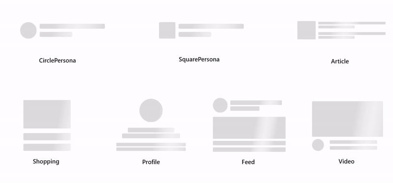
Built-in shimmer types
The WinUI Shimmer (SfShimmer) control offers various built-in shimmer types, each tailored to meet specific user interface needs. These built-in options simplify crafting engaging loading animations for your WinUI apps. The built-in shimmer types include CirclePersona, SquarePersona, Profile, Article, Video, Feed, and Shopping.
Custom shimmer type
The custom layout support in the WinUI Shimmer control gives you the creative freedom to design your unique shimmer types. This level of customization grants you complete control over crafting your desired shimmer effects.

Other customizations
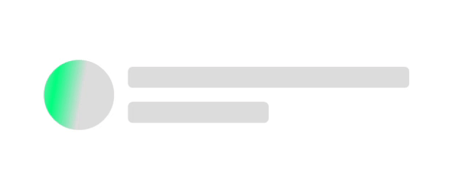
The WinUI Shimmer control also provides extensive customization options. You can fine-tune aspects like fill color, wave color, wave width, wave duration, and repeat count to apply the shimmer effect precisely with your app’s design.
Fill color
You can customize the shimmer view by changing the fill color according to your preferences. This feature allows for greater personalization and can be adjusted to match the overall aesthetic of the app.
Wave color
You can change the shimmer wave color to a desired color.

Wave width
The WinUI Shimmer control allows you to adjust the wave width to a preferred value. Whether aiming for a narrow, subtle wave or a wide, prominent one, you can make it happen.
Wave duration
You can customize the wave duration, which determines the duration of the animation wave in milliseconds.

Repeat count
You can also customize the number of times the shimmer effect repeats.

Note: For more details, refer to the WinUI Shimmer Control documentation.
Getting started with the WinUI Shimmer Control
Now that we have explored the key features of the WinUI Shimmer Control, let’s see how to seamlessly integrate it, specifically the built-in type Article, into your WinUI app.
Step 1: Create a WinUI application
First, create a simple project using the Creating app with Windows app SDK documentation.
Step 2: Add the Syncfusion.Core.WinUI NuGet package
Install the latest Syncfusion.Core.WinUI NuGet package in the app from NuGet Gallery or from the installed location: C:\Program Files (x86)\Syncfusion\Essential Studio®\WinUI\xx.x.x.xx\NuGetPackages.
Note: The xx.x.x.xx denotes the version of the installed Syncfusion WinUI Core package.
Step 3: Add the namespace
Now, include the Syncfusion.UI.Xmal.Core namespace in your XAML file.
xmlns:syncfusion="using:Syncfusion.UI.Xaml.Core"
Step 4: Initialize the WinUI Shimmer Control
Finally, initialize the WinUI Shimmer Control with the desired shimmer type. Here, we’ll use the Article shimmer type.
Refer to the following code example.
<Page
    x:Class="GettingStarted.MainPage"
    xmlns="http://schemas.microsoft.com/winfx/2006/xaml/presentation"
    xmlns:x="http://schemas.microsoft.com/winfx/2006/xaml"
    xmlns:local="using:GettingStarted"
    xmlns:d="http://schemas.microsoft.com/expression/blend/2008"
    xmlns:mc="http://schemas.openxmlformats.org/markup-compatibility/2006"
    xmlns:syncfusion="using:Syncfusion.UI.Xaml.Core"
    mc:Ignorable="d"
    Background="{ThemeResource ApplicationPageBackgroundThemeBrush}">
    <Grid>
      <syncfusion:Shimmer Type="Article">
        <syncfusion:Shimmer.Content>
         …….
        </syncfusion:Shimmer.Content>
      </syncfusion:Shimmer>
    </Grid>
</Page>
After executing the above code example, we’ll get the shimmer effect for our article content, like in the following image.

GitHub reference
For more details, refer to the WinUI Shimmer Control GitHub demos.
Conclusion
Thanks for reading. In this blog, we explored the features of the new Syncfusion WinUI Shimmer Control available in our 2023 Volume 3 release. Now, you’re all set to enhance your WinUI app’s user experience with our Shimmer Control. Enjoy the benefits of improved responsiveness and engaging loading animations.
Also, check out our Release Notes and What’s New pages to see other new updates in this release. Try them out and leave your feedback in the comments section below!
The new version is available for existing customers from the License and Downloads page. If you are not a Syncfusion customer, try our 30-day free trial to check out our newest features.
You can also contact us through our support forums, support portal, or feedback portal. We are always happy to assist you!
Related blogs
- Syncfusion Essential Studio® 2023 Volume 3 Is Here!
- Unleashing the Power of Navigation and Filtering with WinUI Segmented Control
- Chart of the Week: Creating a WinUI Spline Area Chart for Top Google Investing Searches in 2022
- Chart of The Week: Creating A WinUI 100% Stacked Column Chart for Global Distribution of Cloud Provider Data Centers

