
 Anandhan Rajagopal
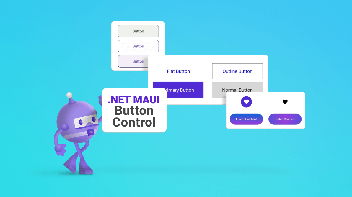
Get ready to revolutionize your .NET MAUI applications with the all-new Syncfusion .NET MAUI Button control, unveiled in our latest release, 2023 Volume 3. It isn’t just a button; it’s a powerhouse of customization. With features that allow you to set icons, background images, and corner edge radii, you can create a button that truly represents your brand. Plus, you can tailor the appearance for different visual states with the Visual State Manager.
Let’s explore the key features of this groundbreaking .NET MAUI Button control and the steps to get started with it.
Key features
The .NET MAUI Button control supports many user-friendly features. Some of them are:
Image support
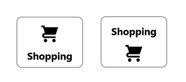
Incorporating images into your mobile app’s buttons can greatly enhance their visual appeal. The .NET MAUI Button control supports image integration, allowing you to create a sophisticated appearance that aligns perfectly with your app’s style.
ShowIcon
With the ShowIcon property, you can easily enable or disable the display of an icon image within the Button control. This provides flexibility in choosing when to show or hide the associated image.
ImageSource
The ImageSource property allows you to customize the Button icon image by adding a custom image, giving you complete control over the visual representation.
ImageSize and ImageAlignment
You can fine-tune the width and alignment of the icon image using the ImageSize and ImageAlignment properties, respectively. You can position the icon at the button’s start, end, top, bottom, left, or right positions, providing extensive design possibilities.
 |
 |
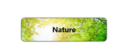
Background image support
The .NET MAUI Button control allows you to customize the background using the BackgroundImageSource property.
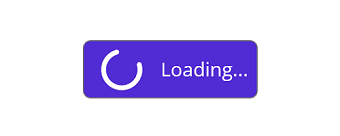
Custom content
With the .NET MAUI Button control, you can use any custom views as templates, enabling you to create buttons with unique and complex content.
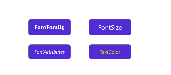
Font customizations
Tailor the font style and appearance to your specific needs with the FontSize, FontFamily, FontAttributes, and TextColor properties. Whether you require pixel precision or standard options like small, medium, or large fonts, the choice is yours.
Border customizations
Buttons often need distinctive borders to stand out. The .NET MAUI Button control also supports customizing its various border elements.
Border color
The border color of the Button can easily be customized to any desired color.
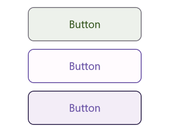
Border thickness
Control the thickness of the Button’s border, allowing for variations in visual style. If a border is not needed, you can remove it altogether.
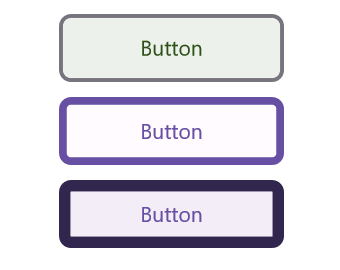
Corner radius
Create buttons with rounded edges by customizing the corner radii, adding a touch of elegance to your app’s design.
UI customizations
The .NET MAUI Button control offers various visual styles to cater to your app’s specific needs. Let’s see them.
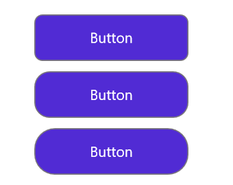
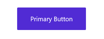
Primary buttons
A primary button is the default button style with an accent color as the background.
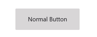
Normal buttons
A normal button is a button with a traditional look and appearance.
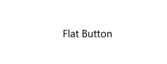
Flat buttons
For a sleek and minimalistic design, you can customize the .NET MAUI Button control to be devoid of border or background color. This allows for a clean, uncluttered aesthetic that focuses on functionality.
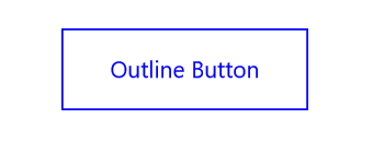
Outline buttons
You can create a unique and crisp appearance for the Button by defining an outline with a border while opting for no background color.
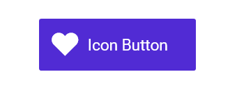
Icon buttons
The .NET MAUI Button control empowers users to add icons and captions to it.
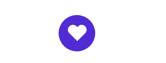
Circular buttons
You can craft a unique style by defining the shape of a button with rounded edges and incorporating font icons. This customization offers a distinctive and appealing aesthetic to your user interface.
Note: For more details, refer to the .NET MAUI Button documentation.
Getting started with the .NET MAUI Button control
We have seen the key features of the .NET MAUI Button control. Now let’s learn how to integrate it into your .NET MAUI app and utilize its features:
Step 1: Create a .NET MAUI app
First, create a .NET MAUI application.
Step 2: Add the required NuGet package
Syncfusion .NET MAUI controls are available on the NuGet Gallery. To add the .NET MAUI Button control to your project, open the NuGet package manager in Visual Studio. Search for Syncfusion.Maui.Buttons and then install it.
Step 3: Register the handler
Register the handler for the Syncfusion core in the MauiProgram.cs file.
using Microsoft.Maui;
using Microsoft.Maui.Hosting;
using Microsoft.Maui.Controls.Compatibility;
using Microsoft.Maui.Controls.Hosting;
using Microsoft.Maui.Controls.Xaml;
using Syncfusion.Maui.Core.Hosting;
namespace ButtonSample
{
  public static class MauiProgram
  {
	public static MauiApp CreateMauiApp()
	{
	   var builder = MauiApp.CreateBuilder();
	   builder
	      .UseMauiApp<App>()
	      .ConfigureSyncfusionCore()
	      .ConfigureFonts(fonts =>
	      {
	         fonts.AddFont("OpenSans-Regular.ttf", "OpenSansRegular");
	      });
	   return builder.Build();
        }
   }
}
Step 4: Add the namespace
Add the Syncfusion.Maui.Buttons namespace in your XAML page.
xmlns:buttons="clr-namespace:Syncfusion.Maui.Buttons;assembly=Syncfusion.Maui.Buttons"
Step 5: Initialize the Syncfusion .NET MAUI Button control
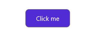
Finally, initialize the Syncfusion .NET MAUI Button control. Refer to the following code example.
<buttons:SfButton x:Name="button" WidthRequest="100" Text = "Click me" TextColor ="White"/>
After executing these code examples, we’ll get a button control like the following image.
GitHub references
For more details, refer to the .NET MAUI Button Control demo on GitHub.
Conclusion
Thanks for reading! In this blog, we’ve explored the features of the new Syncfusion .NET MAUI Button control that rolled out in the 2023 Volume 3 release. You can learn more about the latest .NET MAUI advancements on our Release Notes and What’s New pages. Try them out and leave your feedback in the comments section below!
Download Essential Studio® for .NET MAUI to start evaluating them immediately.
If you have any questions, you can also contact us through our support forum, support portal, or feedback portal. We are always happy to help you!


 No spam, just valuable updates.